Redesign of a ride booking app, boosting usability & engagement

Manu Vithayathil George
Mobile Designer
UX Designer
UI Designer
Figma
Notion
Platform – Mobile App
Expertise – Lead UX Designer
User flow – Ride Scheduling
Deliverables – UI design, UX Research
Client – Route Mentor
Industry – Transportation, Commute
About The Product
RM Employee App is Route Mentor’s flagship product that helps employees of different organizations schedule recurring rides or make ad-hoc bookings according to their unique work schedules.
Key features:
Schedule cabs based on work schedule
Track their cab and connect with it’s passengers
Mark their attendance using Bluetooth, QR, or OTP
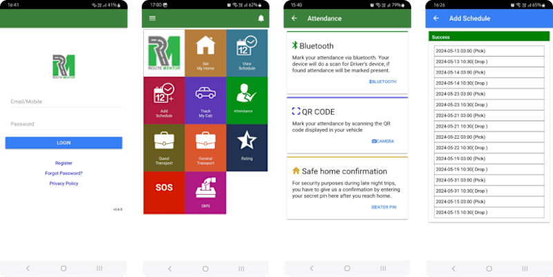
Old version
The Problem
The current app presents significant usability challenges and an outdated design, leading to user frustration, low engagement, and loss of business.
Why redesign?
Users must navigate through 21 taps to schedule a single ride, with no option to plan multiple trips simultaneously, compounding their inconvenience.
Feedback from Google Play Store reviews highlights the app's outdated design and inefficient user flows.
The existing design features overly complex journeys and interactions that are not user-centered, resulting in a steep learning curve and diminished user satisfaction.
Furthermore, the app lacks a polished, consistent, and visually appealing design, adversely affecting user engagement and overall satisfaction.
These issues have led to losing clients and business opportunities to competition.
The redesign aims to simplify user flows, enhance navigation, and introduce essential usability features to create a more user-centered experience.
Google Play Store Reviews

Review

Review
“To improve is to change; to be perfect is to change often.” Winston Churchill
My Role
The management at Route Mentor approached me to help them redesign this app, seeking expertise in user experience and interface design to drive business growth and increase profitability. Due to existing problems of the app, they were losing business deals and clients to competition and also garnering negative reviews on the play store.
As the Lead User Experience Designer for this project, I led the research and designs collaborating with the stakeholders at Route Mentor. My first step was to sit down with the Technical Lead and Developer to understand their product and business.
Given that this was an existing product, my initial step involved breaking down the existing flow and functionality based on the first principle thinking. Subsequently, my role was to simplify the process as much as possible and ensure it was intuitive for users.
My responsibilities:
Project management
UX Research
UI Design
Ensuring developers adhere to the integrity of the designs
The Process
In this case study, primary focus will be on how a usable home screen was designed, simplified steps required to schedule a trip was done and how I addressed the challenge of scheduling for multiple dates.
Discover
The redesign process began with a thorough audit of existing workflows, identifying pain points and opportunities for improvement.
To begin with, two proto persona’s representing different employee types were made, ensuring that user needs and goals were at the forefront of every decision. Next, the current user journey for the scheduling process to identify areas for streamlining and improvement was mapped.
Subsequently, an improved and shorter flow was created by removing steps that were irrelevant. Following this, a user journey map of the new flow was created to visualize the enhancements and consider for essential usability features to ensure a seamless user experience.
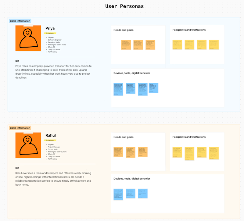
Proto–persona
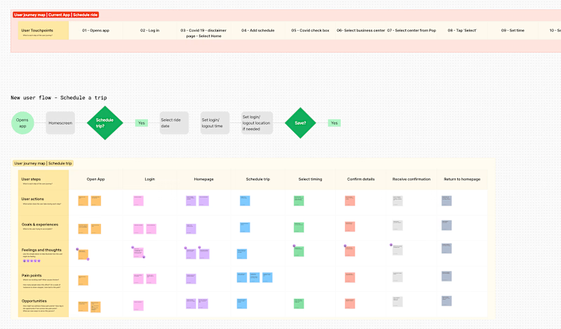
UX Workshops done on Miro — Existing journey (top), improved user flow (middle), user journey mapping of schedule flow (below)
Observations:
Faster Login: Play store reviews highlighted that the app failed to remember login details, requiring users to manually enter their credentials each time. To enhance user convenience and speed up the login process, I decided to implement a biometric login feature. Employees are usually in a hurry and it can get very frustrating if it takes a lot of time just to log in.
Trip Overview: Considering the app's use cases, it was evident that users would benefit from easily viewing their upcoming scheduled trips and knowing their statuses. I prioritized redesigning the home screen interface to prominently display this information.
Multi-Date Scheduling: Users needed the ability to schedule rides for multiple dates and adjust timings due to varying shifts. The challenge lay in the cumbersome process of individually changing timings and locations as users tend to schedule rides up to a month.
Notification System: There was a clear need for a robust notification system to promptly update users on trip statuses, attendance, safe arrival marking etc.
These workshops and their results were discussed with stakeholders and fine-tuned to ensure alignment with user needs and business goals.
Designing
Sketches
I’m the kind of designer who prefers to use pen and paper to quickly sketch out and test ideas and concepts during the initial design phase. This hands-on approach allows for rapid iteration and easy adjustments.
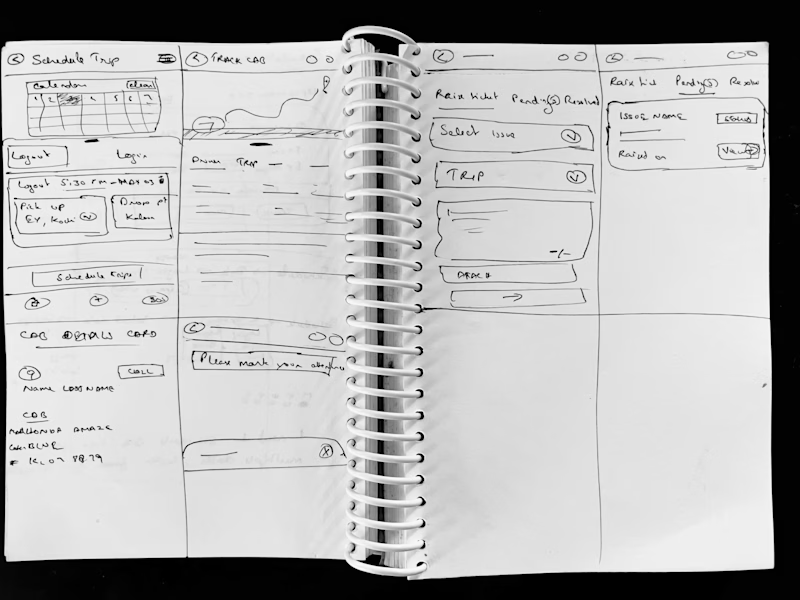
Sketches before moving to Figma
Visual Design
A new visual design language was developed, aligning with the company's brand while also enhancing the user experience. Consistency was key, ensuring that all elements from buttons to icons followed a cohesive style.
Typography
When it comes to UI design, I give a lot of importance to typography. Oliver Reichenstein, founder of Information Architects Inc. says 95% of UI is type. Typography is about organizing information in an objective way. Its main focus is information and how we present it to the reader. Size, spacing, colors and fonts are just tools that help us shape it.
Type must be selected based on the content that will be used. One feature I needed in the type based on the content was forced small caps and that helped me narrow down the typeface to Source Sans 3, a free Adobe typeface. In addition to its forced small caps feature, I chose Source Sans 3 for designing this app due to its excellent readability, versatile weight options, and modern, clean aesthetic.
This font ensures a professional appearance while enhancing the user experience with clear and legible text across various screen sizes and resolutions.
New design
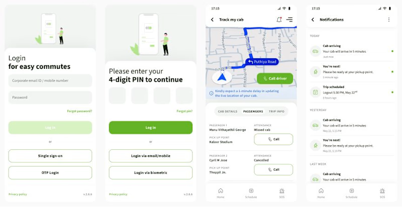
Some screens for the new design
Design Thinking
Homescreen
When an employee opens this app, it is most likely when they are preparing to go to the office in the morning or heading home after a long day at work. Given the urgency in the morning and the fatigue in the evening, users need to quickly and effortlessly access their ride details.
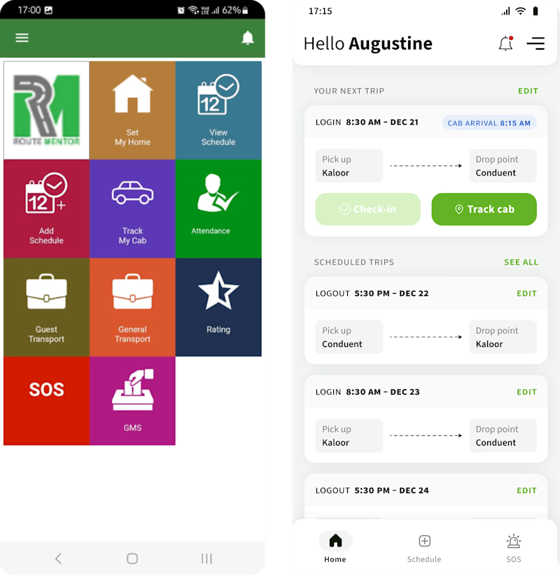
Old vs New Homescreen
Challenges in the old version:
Visual Hierarchy: All the modules in the app is simply laid out on the home screen without any order of priority from a users stand point. There is no clear visual hierarchy to guide the user's attention to the most important features or tasks, making it hard to determine where to start or what actions are most critical.
Information Architecture: All features are given equal prominence with large buttons, and related features are not grouped together logically; prioritizing key actions and placing secondary actions in submenus could streamline the interface.
Visual Consistency: The lack of visual consistency in icon styles and colors makes the interface appear disjointed.
Solutions in the new version:
Immediate Access to Upcoming Trip Details: The user's next trip information is prominently displayed at the top, including login time, cab arrival time, pick-up, and drop-off points, making it easy for users to see their most immediate plans at a glance.
Easy Trip Management: Each trip card includes an "Edit" button, allowing users to quickly make changes to their scheduled trips without navigating through multiple screens.
Quick Action Buttons: The home screen features large, distinct buttons for "Check-in" and "Track cab,", placed on the current trip card. This enables users to perform these actions swiftly and intuitively.
Comprehensive Overview of Scheduled Trips: Below the next trip details, a section for scheduled trips provides a clear overview of all upcoming trips with options to see all and edit each one, helping users manage their schedules effectively.
Consistent and Intuitive Navigation: The bottom navigation bar is simple and consistent, providing quick access to the main sections of the app.
Visual Hierarchy: The use of different font weights and sizes establishes a clear visual hierarchy, making it easier for users to scan and understand the information presented.
Ride Schedule
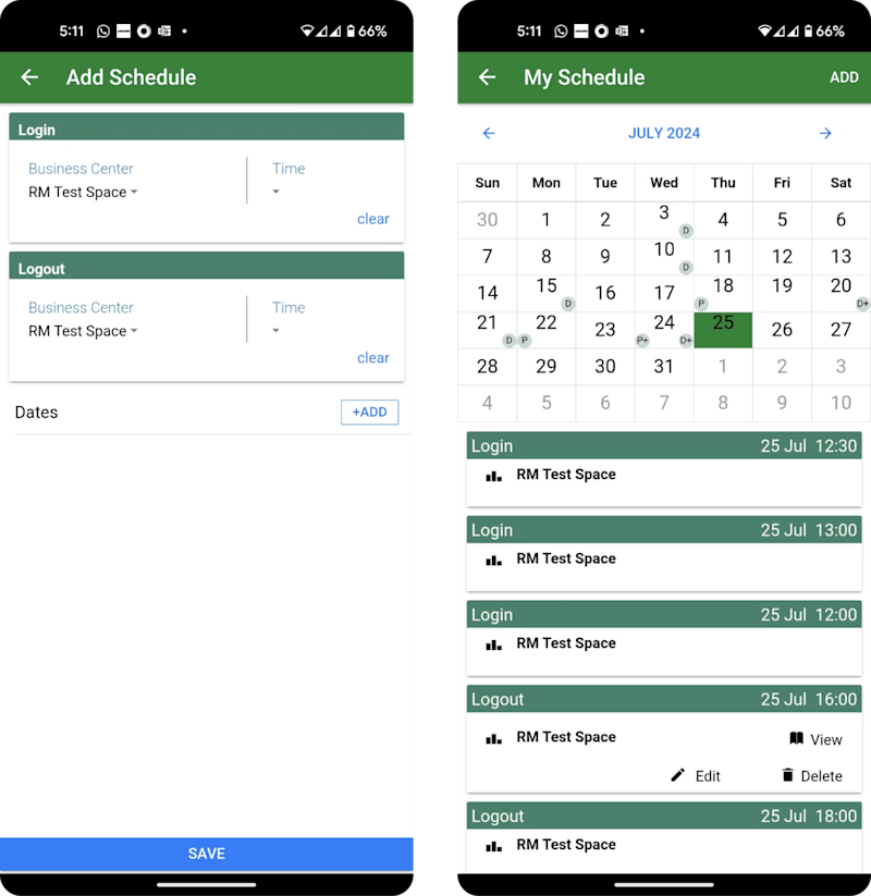
Old ride scheduling screens
Challenges in the old version:
Inefficient Scheduling Process: The current ride scheduling flow involves 21 steps to schedule a single ride.
Redundant Steps: This flow contains redundant steps, such as Covid-19 disclaimer screens and checkboxes, which is irrelevant now.
Limited Date Selection: Employees cannot select multiple dates and must update time and location each time, even when the office and home locations remain the same.
Tedious Ride Planning: Scheduling rides for an entire week or month is a cumbersome and time-consuming task.
Usability Issues: Furthermore, issues related to visual hierarchy, information architecture, and visual consistency are prevalent here as well.
Solutions in the new version:
In the new solution (image b), I proposed default company timings and locations be pre-selected when users choose a date based on company data which is accessible. This approach reduces touch points to 3 when no changes are needed, and to 14, if time and location needs to be changed.
Implemented a category tab to help users easily filter through rides. (image b)
Enabled bulk updates for time or office location changes, allowing users to apply modifications across multiple ride dates as needed. (image e)
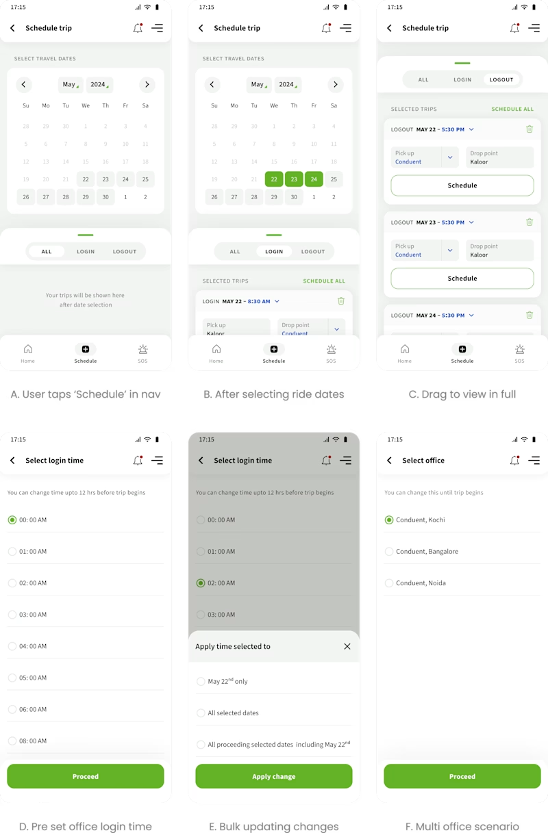
Implementation
The implementation was done module by module and I would hold meeting with the developers to highlight areas that could be overlooked during coding. Developers often miss details such as spacing, alignments, typography, color accuracy, icons, interactions etc.
Impact
At this moment, the updated designs are being coded, so it is too early to gauge their market impact. Additionally, due to the absence of user testing, we lack data in that regard. But I will be updating this section once the new design is live.
However, the team at Route Mentor was pleasantly surprised by the results of applying UX and UI expertise to their product and has already hinted at seeking my expertise in their web app project.
Learnings
Successful project outcomes result from strong collaboration with cross-functional teams, stakeholders, and users. In this case, although I did not have direct access to their users, I was able to gather their pains and frustrations through their reviews on the app store.
This project reinforced the importance of user-centered design to create impactful design solutions.


