Oficial Concursos: Educational Brand Identity
Perez Jesus Nascimento
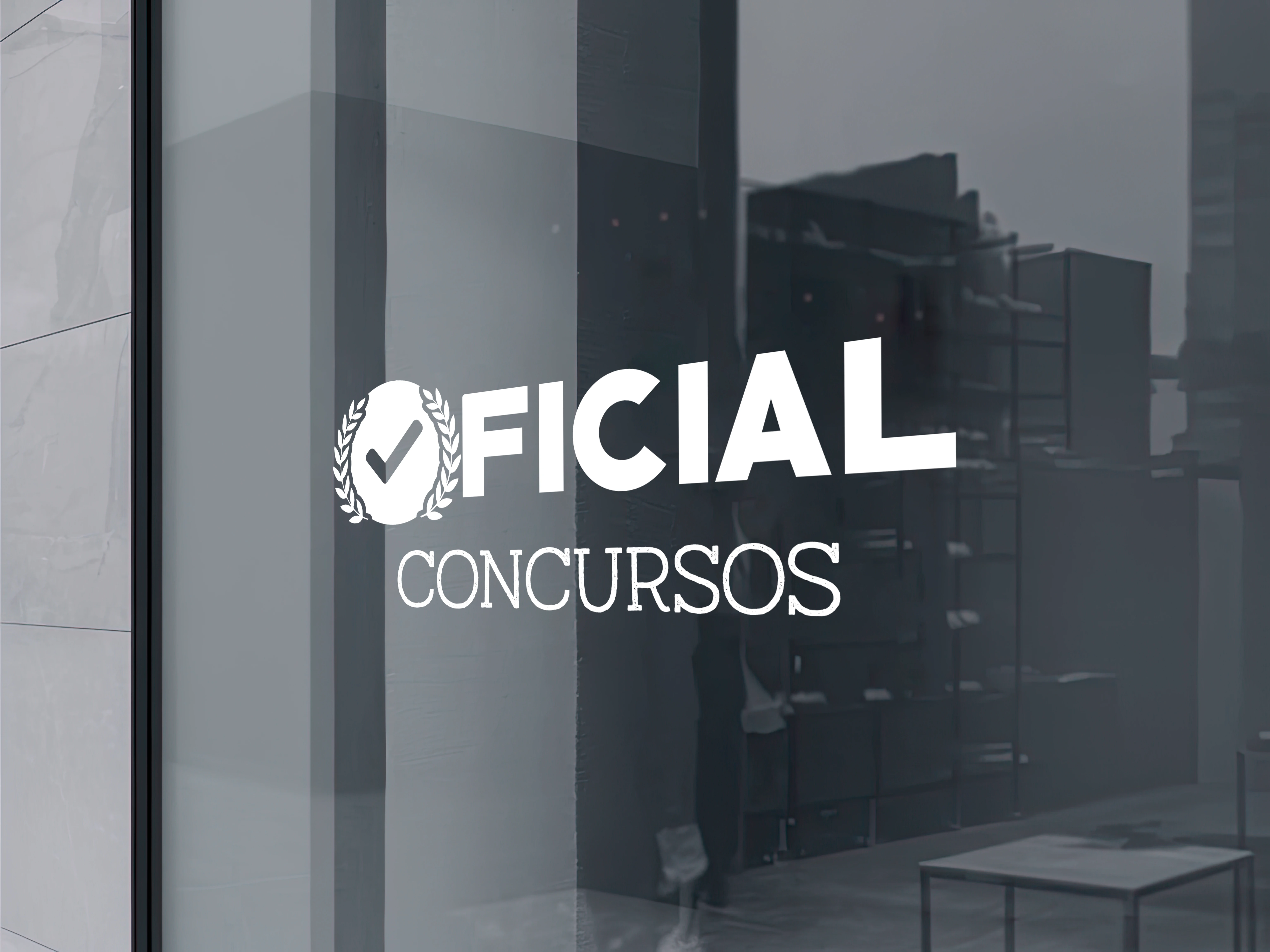
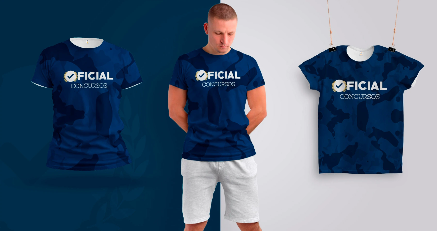
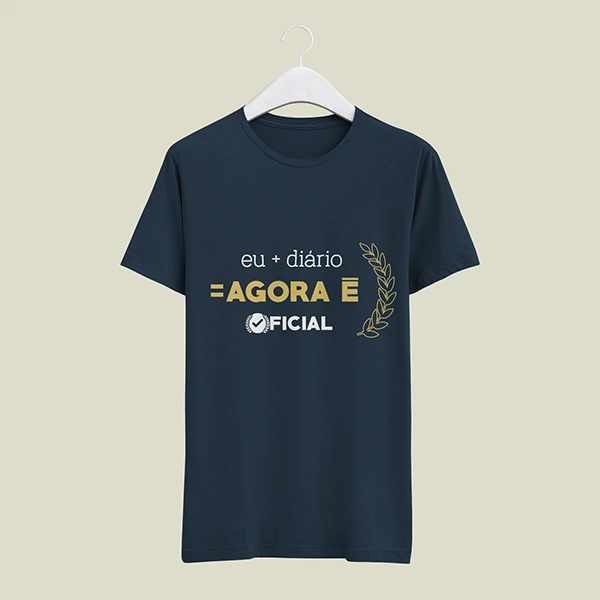
Brand Identity: Oficial Concursos
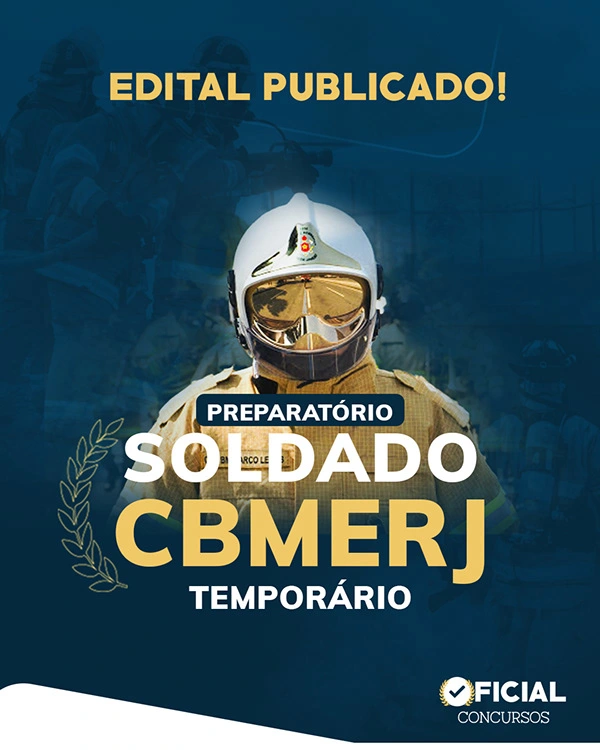
A comprehensive visual identity for a top-tier educational preparatory course in Rio de Janeiro, specializing in rigorous military, municipal, and civil service exams.
The Concept
The objective was to create a simple, direct, and highly authoritative mark. The design needed to appeal to young candidates while instantly communicating the seriousness of public security and military careers.
Integrated classic iconography—such as the checkmark and laurel wreath—to symbolize approval, achievement, and official readiness.


Typography & Symbolism
Utilized two distinct typefaces to visually describe the brand's core qualities, balancing institutional strength with student accessibility.
Authority & Discipline: The primary font features strong, geometric lines that convey grandeur, balance, and strict discipline, reinforcing the weight of the word "Official."
Human Connection: The secondary cursive typeface adds a hand-drawn, approachable aesthetic, fostering immediate identification and connection with the younger student demographic.

Like this project
Posted Apr 13, 2026
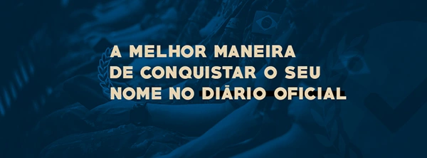
An authoritative visual identity for a military service preparatory course, utilizing typographic contrast and symbolic iconography.