
pro
Edgar Vallejo
Visualizing data to make stronger decisions
New to Contra
Edgar is building their profile!
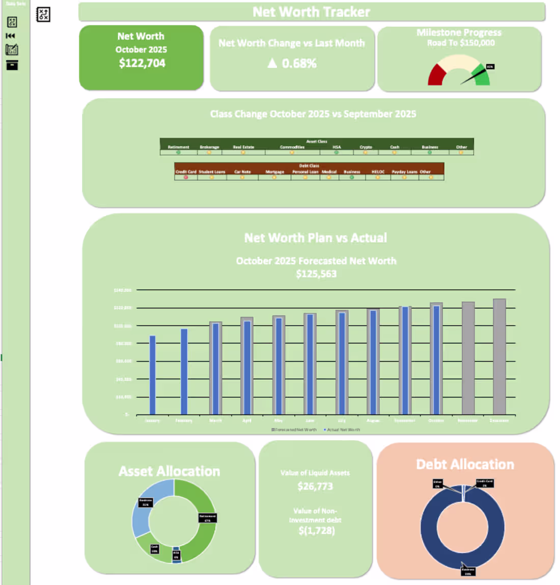
Tracking Net Worth has led to a ~$40K increase for this user in 10 months. I designed an Excel Dashboard that allows users to track their net worth & visualize where their assets & debts are.
Creating a pie chart for asset allocation allowed the user to understand he was concentrated in one asset class without needing to be. The user now has a more diversified asset allocation between their business, retirement, cash, and their HSA by dividing their contributions to each account.
Additionally, I added a forecast function to the dashboard where depending on the amounts added by the user, it will forecast future values. This was built into the model to motivate the user to continue contributing to their accounts.
Visualizing this data has helped the user focus on his goal of growing his net worth.
2
26
213
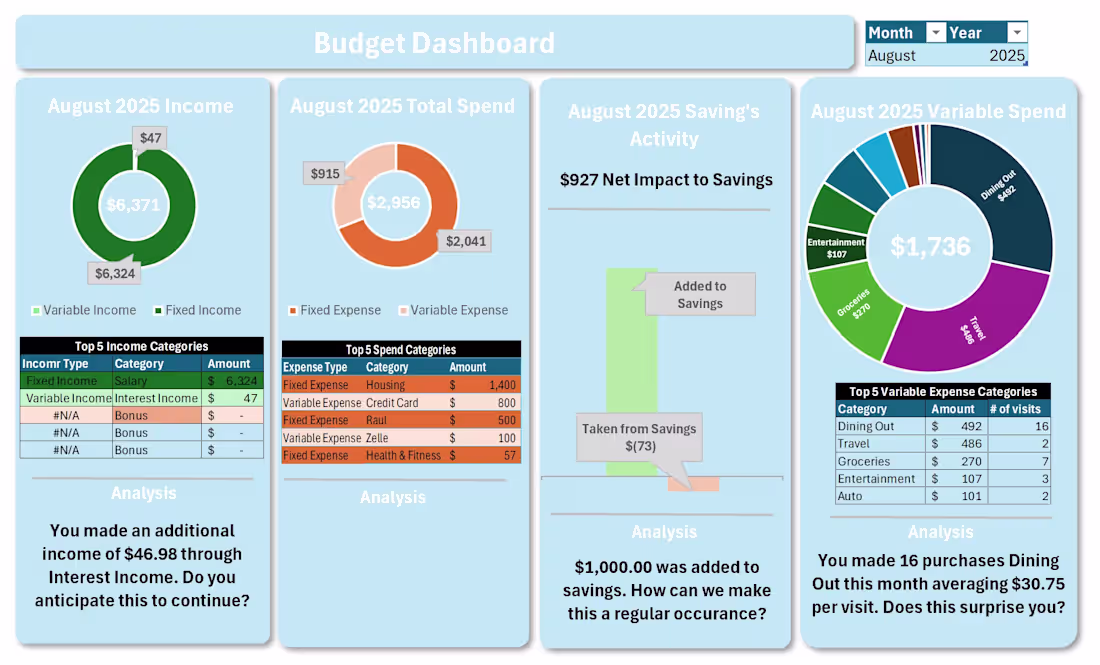
Visualizing data helps build stories. Below, I visualized the financial statements I received from a client. I added an analysis portion at the bottom of each chart that questions the user's behavior & allows users to reflect on their spending.
For example, a large portion of this user's discretionary spending was on dining out. The user recognized that dining out made a big portion of the pie chart. Additionally, the dashboard asked the user if dining 16 times during the month was a surprise to the them. Most individuals don't know how much they spend each month and this was a reality check for the user. Through analysis & visualization, the user has a better understanding of their financial situation & began better spending habits.
1
27
208