
Rapid Figma UI/UX Design Expert 🚀



UI/UX Designer | Fintech, EdTech, SaaS, B2B & B2C Designer
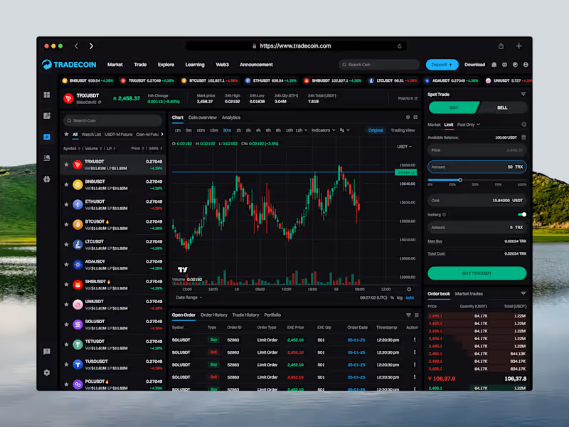
Tradecoin is a crypto trading web platform that helps users track the market and trade with confidence. This shot shows the Spot Trading screen in Buy mode, designed to let users analyze the market and place a buy order in one workspace.
The coin list on the left lets users switch pairs quickly, while the center holds a candlestick chart with timeframes, indicators, and volume. In Buy mode, the right panel turns green and shows Market, Limit, and Post Only orders, amount controls, and a live order book. Open orders, order history, trade history, and portfolio sit below the chart.
The Challenge
Trading screens can feel crowded and risky. Users switch between charts, order forms, and order books, and it’s easy to confuse a buy with a sell.
The goal was to create a focused trading experience with clear Buy and Sell states, so users always know what action they’re taking and can place orders with confidence.
Key Features
→ Green Buy mode with clear color feedback
→ Live ticker with top trading pairs
→ Coin list with search, filters & watchlist
→ Pair stats: price, 24h change, high, low & volume
→ Candlestick chart with timeframes & indicators
→ Market, Limit & Post Only order types
→ Amount slider with instant cost calculation
→ Iceberg order option
→ Max Buy & Total Cost details
→ Real-time order book & market trades
→ Open orders, history & portfolio tabs
1
67
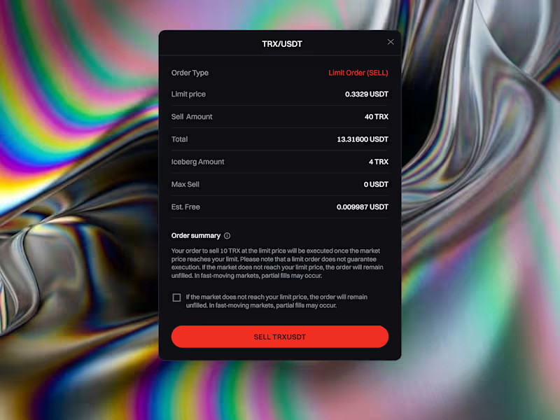
Tradecoin is a crypto trading web platform that helps users track the market and trade with confidence. This shot focuses on the Order Confirmation modal, which lets users review every detail of a limit sell order before they commit.
Placing a trade is a high-stakes moment. Users can make costly mistakes when order details are unclear or when they don’t fully understand how a limit order behaves.
The goal was to create a clear, trustworthy confirmation step that shows all order details, explains the risks, and helps users confirm with confidence.
I provide:
> UI/UX & Product Design
> Mobile App UI/UX Design
> Web & SaaS Design
> Landing Page & Website Design
> UX Research & User Flow
> Wireframing & Prototyping
> Design Systems & UI Components
> UX Audit & Usability Improvements:
> Responsive & Design QA
> MVP & Product Design
> Branding & Visual Design
> Pitch Deck Design
3
117
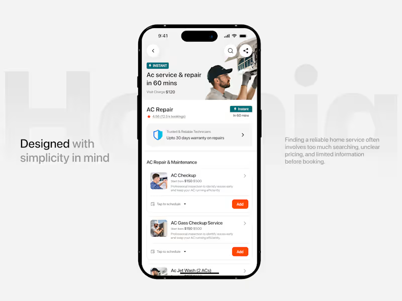
Homiq is a mobile home services platform that makes everyday home maintenance easier and more convenient. The experience helps users quickly discover nearby services, explore trusted professionals, understand pricing, and book services without going through complicated steps.
The homepage focuses on fast service discovery, while the service detail experience provides important information such as ratings, pricing, availability, warranty, and service options before booking.
The Challenge
Finding a reliable home service often means too much searching, unclear pricing, and limited information before you book.
The goal was to create a simple, trustworthy, and easy-to-navigate experience that helps users move from discovering a service to booking it with confidence.
Key Features
→ Location-based service discovery
→ Quick service search
→ Popular & categorized services
→ Ratings & booking information
→ Clear service pricing
→ Instant service availability
→ Warranty & trust information
→ Flexible service scheduling
→ Add multiple services before booking
4
189

UI/UX Designer crafting intuitive, modern digital experience
New to Contra
UI/UX Designer crafting intuitive, modern digital experience
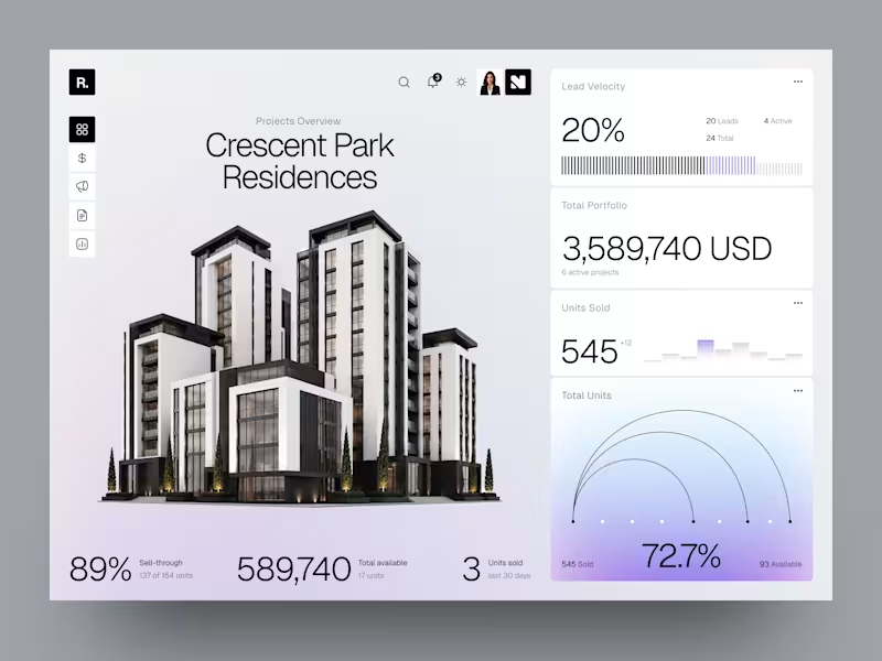
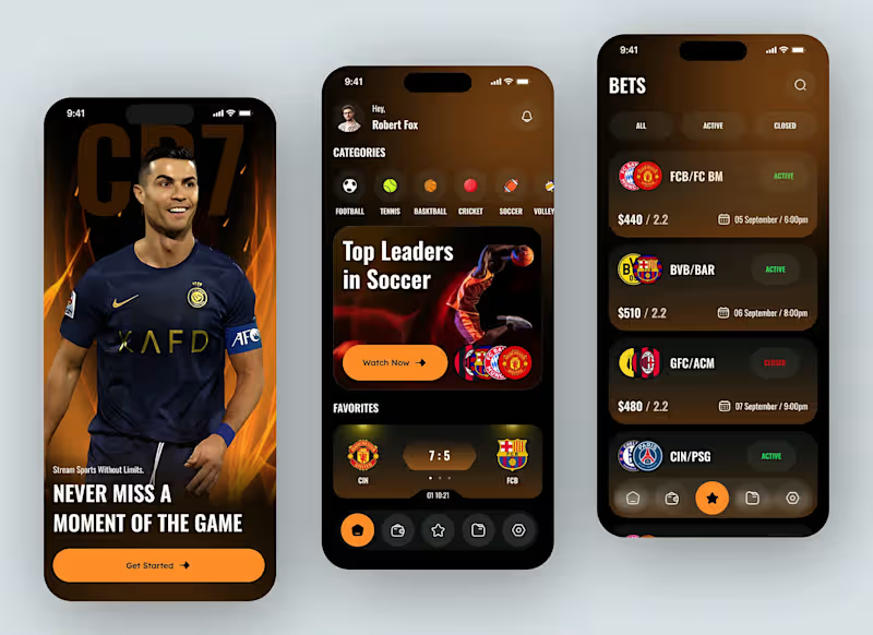
We design MVP apps that help startups move fast, validate ideas, and launch with confidence. Our focus is on building only what matters—clear user flows, essential features, and a product experience that’s easy to understand and test.
0
63
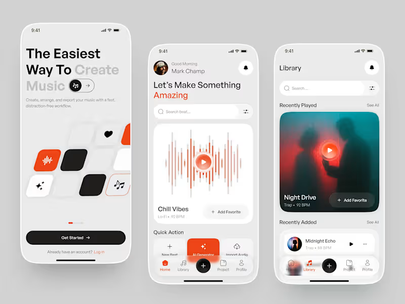
Music creation experience designed to make producing music feel simple, fast, and distraction-free.
The concept explores a smooth workflow for creating beats, generating music with AI, discovering sounds, and managing projects—all within a minimal and intuitive interface.
The visual direction combines soft neutrals, bold orange accents, rounded cards, and spacious layouts to create a friendly yet premium music-production experience.
Designed with a focus on simplicity, discoverability, and effortless music creation.
0
73
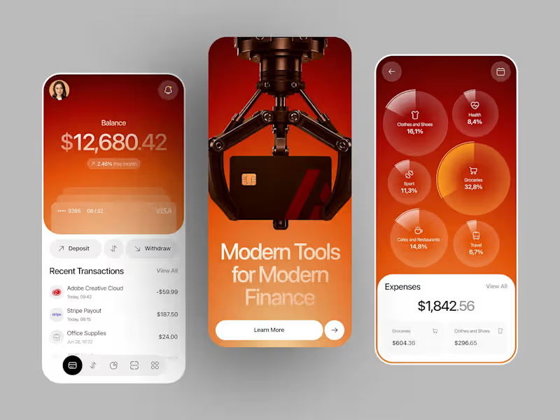
A modern personal finance mobile app designed to give users a clear view of their money in one place. The experience combines account balances, cards, recent transactions, deposits and withdrawals with visual expense tracking across categories like groceries, travel, health, and shopping.
Bold gradients and data-driven visuals bring a distinctive identity to an otherwise practical everyday banking experience.
0
64

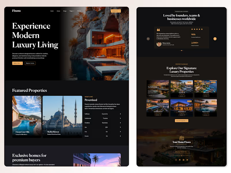
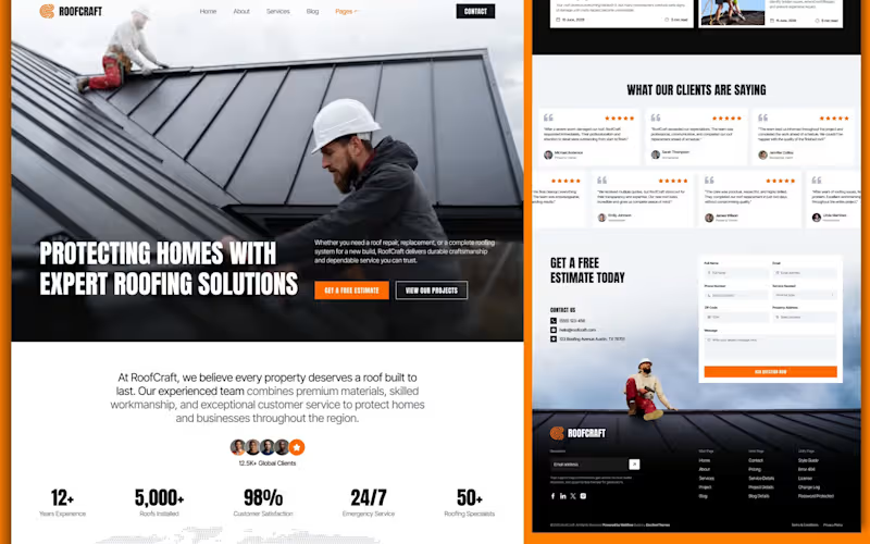
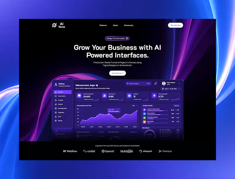
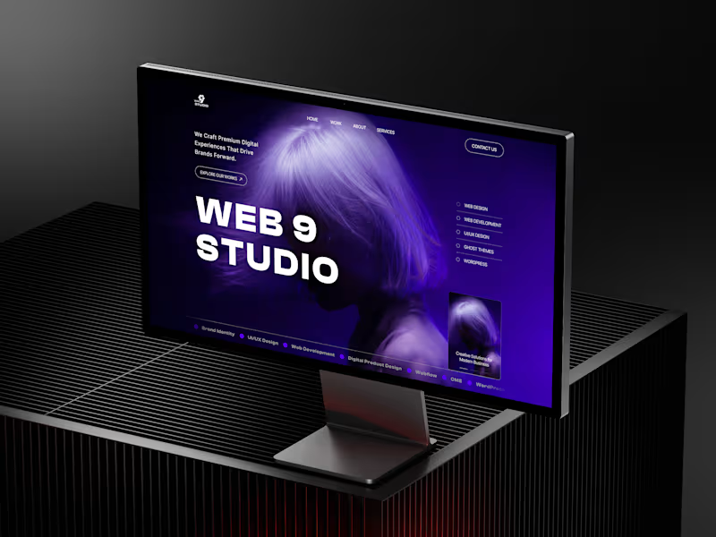
Creative Product developer on Webflow and Framer
Creative Product developer on Webflow and Framer

Hi there
I’m MD: Shahidul Islam. Working as a UI/UX Designe
- 12
- Followers
Hi there
I’m MD: Shahidul Islam. Working as a UI/UX Designe

Strategic Brand Identity & Logo Studio ↴
New to Contra
Strategic Brand Identity & Logo Studio ↴
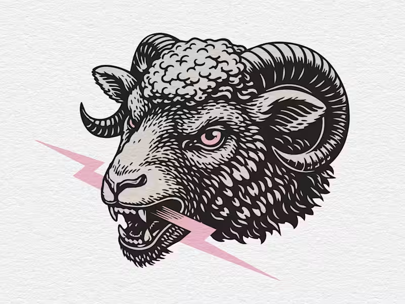
Electric Ram – Vintage Engraving & Bold Mascot Illustration
A fierce, vintage-inspired ram illustration combining traditional engraving techniques with a bold, rebellious attitude.
The artwork features a powerful ram with dramatic curved horns, sharp fangs, and an intense expression. Intricate hand-drawn linework, rich black shading, and subtle pink accents create a striking contrast, while the lightning bolts add energy and movement to the composition.
Inspired by classic woodcut illustrations, vintage tattoo art, and rock 'n' roll aesthetics, this design blends old-school craftsmanship with a modern edge.
A distinctive illustration created to make an impact, perfect for apparel, merchandise, alternative branding, and statement graphics.
0
87
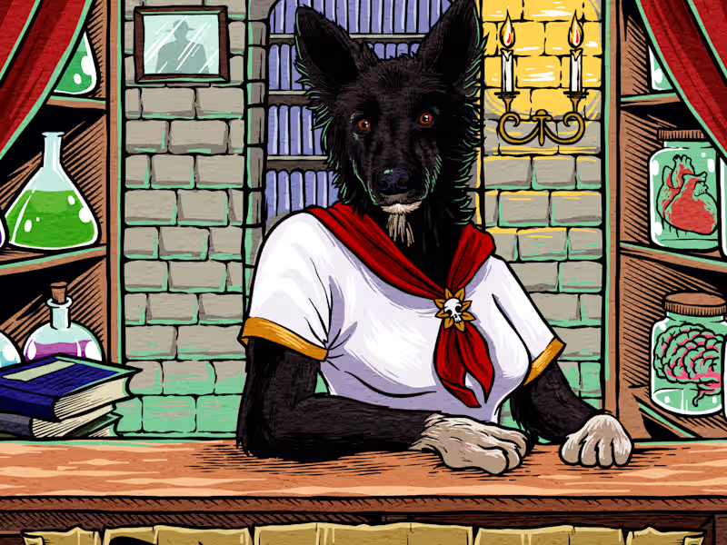
The Mysterious Alchemist – Vintage Gothic Dog Illustration
A whimsical, vintage-inspired illustration featuring a mysterious black dog dressed as an alchemist, surrounded by curious scientific experiments and gothic laboratory details.
The richly detailed scene combines colorful potion bottles, anatomical specimens, ancient books, and candlelit stone walls to create an atmosphere of mystery and dark fantasy. Bold hand-drawn linework, expressive character design, and textured colors give the artwork a distinctive retro storybook aesthetic.
A unique blend of gothic illustration, anthropomorphic character design, and imaginative storytelling, bringing a playful twist to the world of alchemy and the supernatural.
0
58
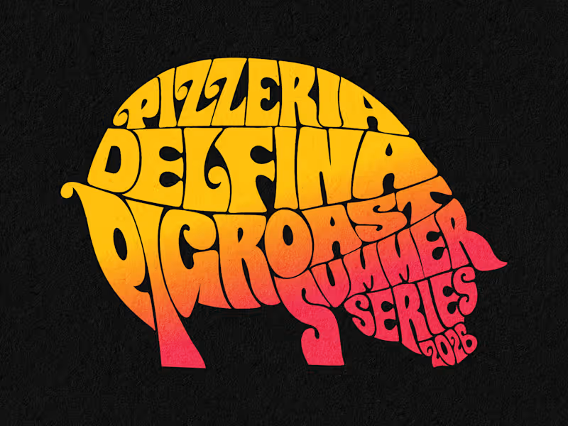
Pizzeria Delfina — Custom Psychedelic Typography
A bold exploration of retro-inspired typography, combining playful letterforms, vibrant gradients, and a psychedelic 70s aesthetic.
Created as part of a personal typography series, this piece explores how custom lettering can become a powerful visual statement through expressive shapes, flowing compositions, and striking color combinations.
0
59

modernlogos,branding,craftingbold,memorablevisuals,identity.
modernlogos,branding,craftingbold,memorablevisuals,identity.
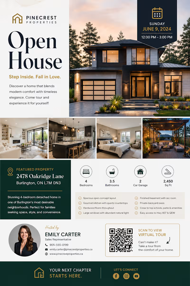
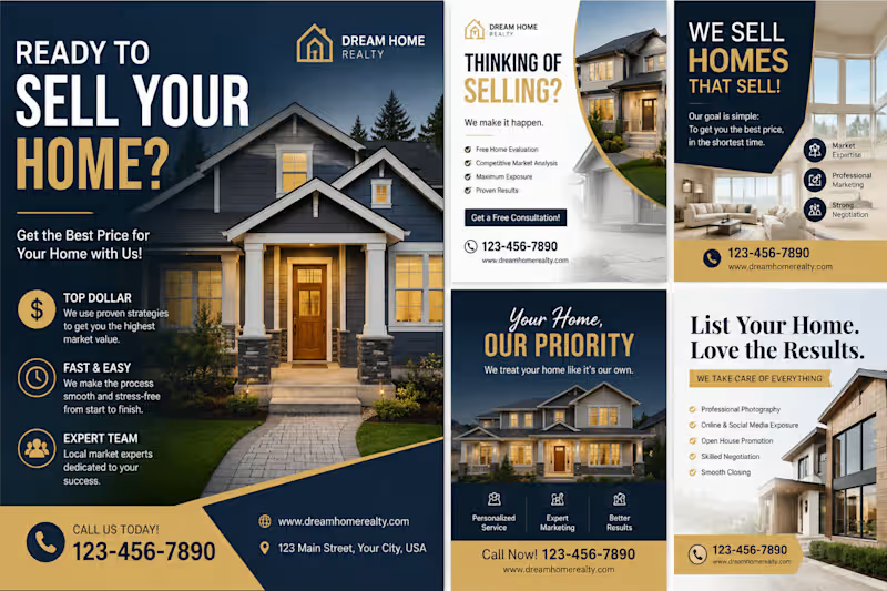
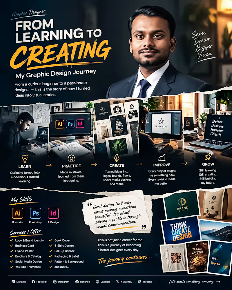
From Learning to Creating. My Graphic Design Journey 🎨
Every designer has a beginning.
Mine started with curiosity, uncertainty and a simple decision: I wanted to learn how to turn ideas into communication.
At the beginning I didn't know everything. I made mistakes struggled with typography, colors, layouts, software and countless small details that experienced designers make look easy.
I kept learning.
Step by step I improved my skills in Adobe Illustrator, Photoshop and InDesign. I started creating logos, branding materials, flyers, social media designs, packaging, thumbnails, posters and many other visual projects.
The biggest lesson I have learned is this:
Good design's n't only about making something beautiful. Good design is about solving a problem through communication.
Every project has taught me something. Every revision has made me better. Every difficult brief has pushed me to think creatively.
Today I’m still learning, still experimenting and still improving.
My journey isn't finished—. Thats what makes it exciting.
I’m building my career one design, one project and one client relationship at a time.
This is not a career, for me. This is a journey of becoming a designer every day.
If you're also building something from zero remember:
Start where you are. Learn what you don't know. Keep creating. Don't stop.
🚀 The journey continues.
#GraphicDesigner #GraphicDesign #DesignJourney #CreativeJourney #DesignerLife #AdobeIllustrator #AdobePhotoshop #AdobeInDesign #BrandIdentity #LogoDesign #FreelanceDesigner #CreativeDesigner #DesignPortfolio #VisualCommunication #Freelancing
0
53
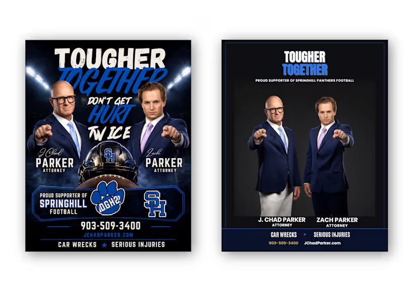
From Cluttered to Clear — Attorney Football Supporter Flyer Redesign
Client: “We have all the information we need, but the flyer doesn't communicate it clearly enough.”
My response:
“I’ll restructure the visual hierarchy, simplify the layout, strengthen the typography, and make the attorneys and contact information easier to recognize—while keeping the football-supporter identity.”
Result:
A cleaner Before → After transformation with stronger hierarchy, improved readability, better visual balance, and a more professional attorney-focused presentation.
Client Problem
The original flyer had strong content, but the overall design felt visually crowded and overly promotional. Too many elements competed for attention, making it difficult to immediately understand the attorneys, their names, services, contact information, and football sponsorship message.
BEFORE — Client's Problem:
The original concept contained all the necessary information, but the visual hierarchy was weak. Multiple headlines, images, football graphics, logos, and contact details competed for attention.
AFTER — My Solution:
I transformed the layout into a more structured and professional composition with a clear hierarchy, stronger typography, improved spacing, focused imagery, and easier-to-find contact information.
Final Result
The goal wasn't simply to make the flyer look different. The goal was to make the information easier to understand, strengthen the professional presentation, and preserve the client's football-supporter identity.
I redesigned this attorney promotional flyer by solving a common communication problem: too much information competing for attention.
The original design had strong imagery and messaging, but the hierarchy was crowded. I reorganized the content, strengthened typography, improved spacing, created a clearer information structure, and balanced the football-supporter theme with a professional legal identity.
The result: a cleaner, more focused flyer that communicates the message faster while keeping the original brand personality.
Tools: Adobe Photoshop, Adobe Illustrator
Service: Flyer Design • Graphic Design • Print Design • Layout Design • Advertising Design
Focus: Visual Hierarchy • Typography • Information Architecture • Branding • Readability
Hashtags
#GraphicDesign #FlyerDesign #FlyerRedesign #BeforeAndAfter #DesignCaseStudy #AdobeIllustrator #AdobePhotoshop #PrintDesign #AdvertisingDesign #Typography #VisualHierarchy #Branding #CreativeDesigner #AttorneyMarketing #ProfessionalDesign
0
38