Freelancers using BricksFreelancers using BricksSoftware Development Agency Website
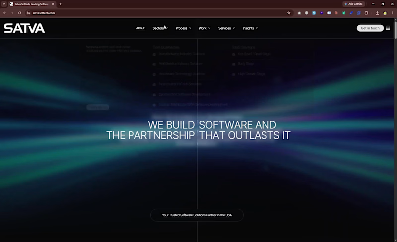
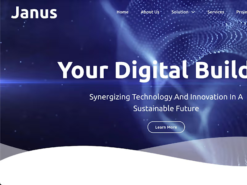
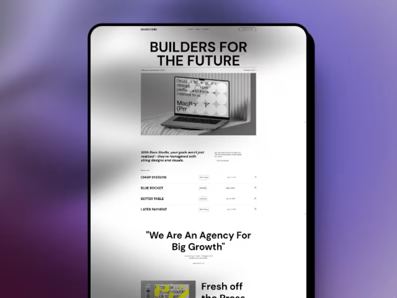
I worked on a software development agency website based in Raleigh, USA, designed to showcase the company’s services, technical expertise, and case studies. The project focused on creating a polished, modern online presence that clearly communicated the agency’s capabilities while maintaining strong performance and a smooth user experience.
Overview: A software development agency website based in Raleigh, USA, highlighting services, expertise, and case studies.
Key Contribution: Used the Bricks theme extensively to achieve a custom, high-quality design while maintaining strong performance standards.
Key responsibilities included:
- Building and customizing website sections to present the agency’s services, expertise, and case studies
- Using the Bricks theme to create flexible, visually refined layouts with a custom feel
- Designing responsive pages that delivered a consistent experience across desktop, tablet, and mobile devices
- Organizing content to clearly communicate the agency’s offerings, process, and project experience
- Developing intuitive navigation to help visitors quickly explore services, case studies, and company information
- Writing custom PHP, JavaScript, HTML, and CSS to support tailored functionality and design requirements
- Optimizing performance to ensure the website remained fast, efficient, and user-friendly
- Fixing bugs and maintaining smooth functionality across the site
- Supporting ongoing improvements to enhance usability, presentation, and overall engagement
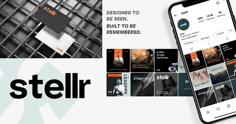
Best part: Playing with Bricks theme elements to get the best results and create a custom design that looked great while still performing well. Stellr — From "another branding agency" to the only name CEOs remember
Stellr walked in with a problem most personal branding agencies never admit to: their own site couldn't tell you who it was for. Heavy visuals, scattered messaging, three different service blocks all competing for attention, and zero clear answer to "why should I care?"
The fix wasn't more design. It was restraint.
We rebuilt the homepage around one audience-first headline: "We build the world's most visible leaders," and let everything else earn its place around it. The abstract hero background got replaced with a real photo. Four competing CTAs became one repeated "Work With Us," appearing exactly where a decision actually gets made. Whitespace stopped being empty space and started doing the work of pacing the story: who this is for, what we do, how it works, proof, one clear next step.
Nothing on the page is decoration. Every pixel is either building trust or moving someone toward a decision, and for a brand whose entire business is making other people look unmistakably credible, the site finally does too. 
![Cover image for Chipotle Menu With Price [ Updated September 2024 ]](https://media.contra.com/image/upload/q_auto:good,w_800/ckdflhdxbkb8fsc41d28.avif)