

Vintage Racing T-Shirt Design | Apparel Branding & Graphic Design
A custom vintage-inspired racing T-shirt concept created with a focus
on bold typography, distressed textures, and classic motorsport
aesthetics. This project includes the complete design presentation—from
artwork creation and print-ready layout to realistic mockups and
lifestyle visualization.
💼 What I worked on:
- Vintage racing-inspired graphic design
- Typography composition
- Distressed texture creation
- Front & back apparel design
- Brand identity direction
- Print-ready artwork
- Product presentation mockups
- Lifestyle visualization
Designed to demonstrate my ability to create apparel graphics that are both visually impactful and production-ready.
2
351
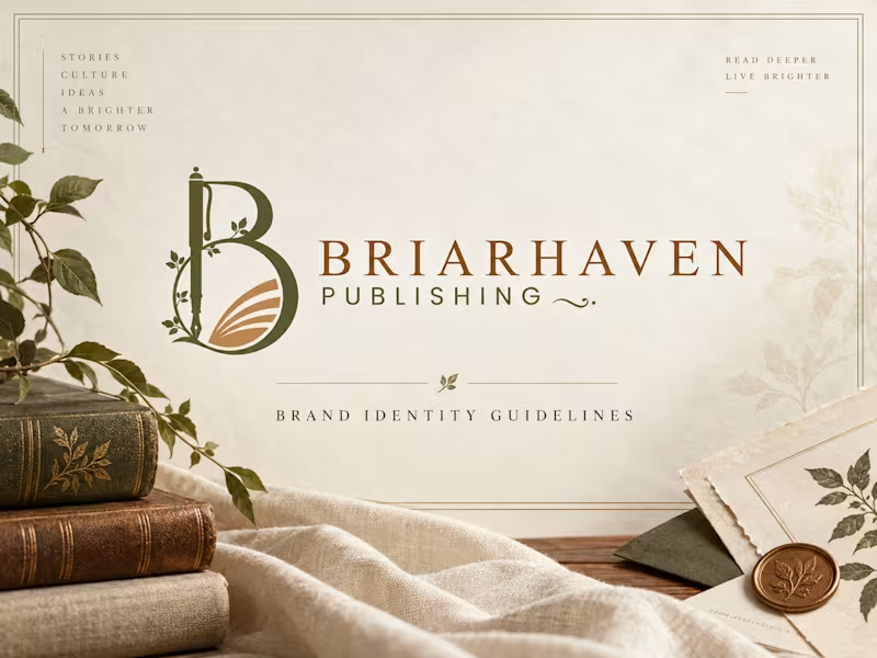
Briarhaven Publishing — Premium Brand Identity & Visual System
A refined, literary-inspired brand identity created for Briarhaven Publishing, designed to feel timeless, intelligent, warm, and deeply connected to storytelling.
The visual direction blends classic editorial elegance with a natural, contemporary sensibility. Rich olive tones, warm copper accents, parchment-inspired neutrals, botanical details, and sophisticated typography come together to create a publishing brand that feels established, thoughtful, and premium.
The existing logo was preserved and developed into a complete visual system that works consistently across both print and digital applications.
The Creative Direction
The identity was built around the idea of stories, culture, ideas, and a brighter tomorrow.
Rather than making the brand feel overly traditional, I created a balance between heritage and modernity. Editorial typography, soft natural textures, botanical elements, book-inspired compositions, and generous spacing give Briarhaven a distinctive visual language that feels both literary and contemporary.
What I Developed
Brand identity direction
Brand guidelines / brand book
Logo usage system
Light and dark logo applications
Clear-space and sizing guidelines
Premium color palette
Typography hierarchy
Editorial layout system
Business card and stationery concepts
Book cover applications
Bookmark design
Tote bag and merchandise direction
Notebook and print collateral
Website visual direction
Digital brand applications
High-end brand mockups Brand Applications The visual identity was extended across multiple touchpoints to demonstrate how the system can grow beyond the logo. From books, stationery, business cards, bookmarks, and journals to website design and branded merchandise, each application follows the same visual principles—creating a cohesive and recognizable experience wherever the audience encounters the brand. Project Outcome The final identity gives Briarhaven Publishing a more polished, credible, and memorable market presence while maintaining the warmth and character expected from a thoughtful publishing house.
The system is flexible enough to support future books, campaigns, digital platforms, editorial content, author communications, and branded experiences without losing consistency.
2
353
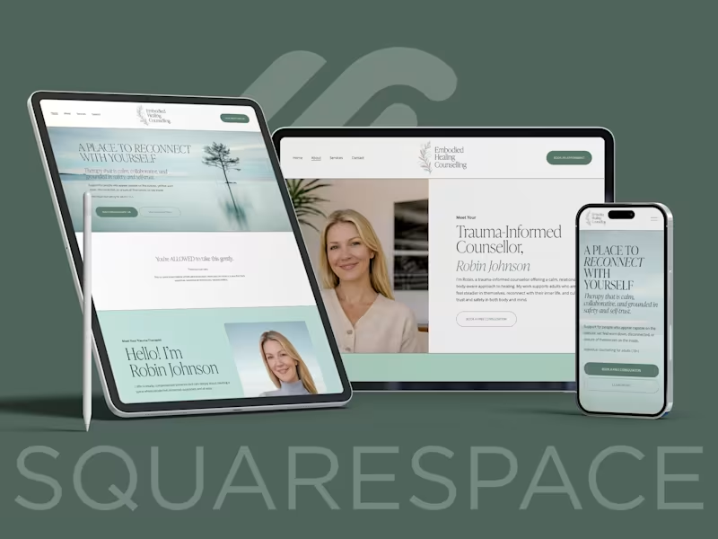
Embodied Healing Counselling needed a cohesive brand and website that reflected trauma-informed, body-aware therapy while maintaining professionalism and warmth. I led a full rebrand, redesigning the logo, refining the visual identity, and rebuilding the website on Squarespace.
The focus was to create a calm, grounded presence that builds trust from the first scroll. Soft typography, nature-inspired tones, and structured layout were used to balance emotional safety with clarity.
The result is a cohesive brand and digital experience that supports connection, credibility, and client inquiries.
0
117

"The mission was to build a colony. The reality is a fight for survival. This trailer introduces a sci-fi horror concept where the Artemis III crew discovers a hidden crater and accidentally wakes up an ancient lunar monster. 4 astronauts. 1 mission. No way home."
Why I Created This:
As a designer, I wanted to push the boundaries of "NASA punk" aesthetics. My goal was to use AI to create a high end cinematic teaser that blends technical realism with deep space dread.
The Workflow:
I brought this vision to life using a complete Runway AI pipeline. Every element you see from the detailed character assets and creature designs to the cinematic camera movements and atmospheric lighting was generated and animated entirely through the Runway workflow.
Submitted for the #RunwayBigPitchContest.
0
302
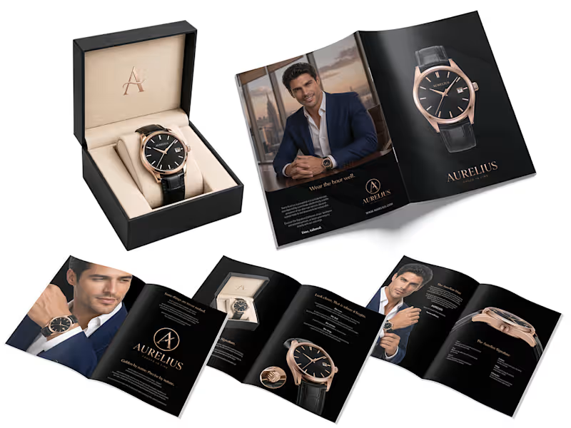
Aurelius — Luxury Watch Brochure Design
An eight-page brochure concept for Aurelius, a luxury watch brand built around the idea “Time, tailored.”
The design brings together a black-and-rose-gold palette, restrained typography, generous space, and product-led layouts. The pages move from the brand story to watch details, lifestyle imagery and a closing brand message.
At the centre is an emblem combining the letter A, a clock hand and the blade of a tailor’s shears—a visual connection between two crafts shaped by precision.
A print-ready brochure design.
1
46




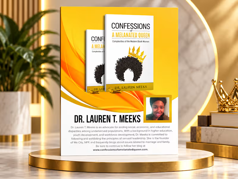
Confessions of a Melanated Queen – Promotional Flyer Design
A bold and elegant promotional flyer created for Confessions of a Melanated Queen by Dr. Lauren T. Meeks. The design combines vibrant gold tones, clean typography, book imagery, and author information to create a strong, professional visual suitable for book promotion, social media, events, and marketing campaigns.
2
435
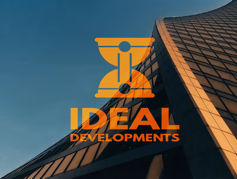
Ideal Developments is a forward-thinking brand operating at the intersection of modern engineering, sustainability, and technological innovation. The goal of this branding project was to elevate the traditional construction and development aesthetic, transforming it into a sleek, modern identity that speaks to precision, reliability, and the future of the built environment.
At the core of the visual identity is a highly intentional and clever logo design. I developed a conceptual mark featuring an inverted construction helmet that masterfully utilizes negative space to form an hourglass shape. This hidden, structural detail serves as a powerful symbol for the brand’s core operational pillars: uncompromising efficiency, strategic time management, and a commitment to delivering projects on schedule.
To ground this conceptual logo, I curated a strong, industrial yet sophisticated color palette. Featuring Golden Ochre, Midnight Slate, Foundation Charcoal, and Steel Mist, the brand colors were specifically chosen to evoke a sense of structural stability, premium quality, and industrial strength. Together, these elements create a cohesive, authoritative brand presence that confidently positions Ideal Developments as an innovative leader in modern construction.
0
49