Freelance Packaging Designers in Western Cape
Sign Up
Post a job
Sign Up
Log In
Filters
2
Projects
People
Atlas Digital Azaad
Cape Town, South Africa
AI, Web, Mobile & Business Software Solutions
5.0
Rating
2
Followers
Follow
Message
AI, Web, Mobile & Business Software Solutions
1
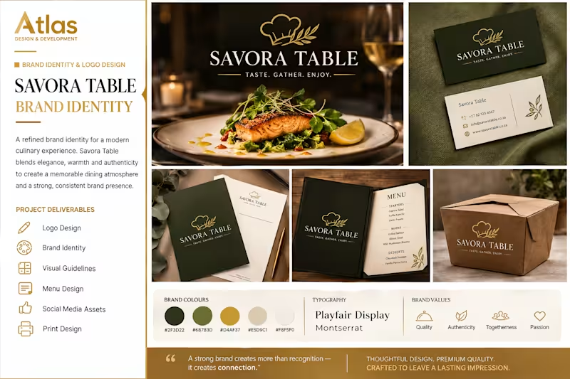
BRAND IDENTITY & LOGO DESIGN The Problem Savora Table needed a distinctive brand identity that would capture the warmth, quality, and refined experience of modern dining while creating a strong and memorable visual presence. The Solution I developed a complete visual identity featuring an elegant logo, refined typography, a sophisticated colour palette, and branded assets including stationery, menus, packaging, and social media visuals. The Result The final identity creates a premium and cohesive brand experience that feels warm, authentic, and memorable across both digital and physical touchpoints.
1
91
1
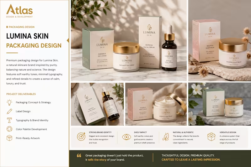
Lumina Skin Packaging Design The Problem Lumina Skin needed packaging that would communicate quality, trust, and a premium natural skincare experience while standing out in a competitive beauty market. The Solution I created a refined packaging system using soft earthy tones, elegant typography, clean layouts, and subtle gold details. The design was developed to create a consistent visual identity across multiple skincare products. The Result The final packaging delivers a sophisticated and cohesive brand presence that feels premium, natural, and trustworthy. The flexible design system allows the brand to maintain consistency while easily expanding its product range.
1
91
1
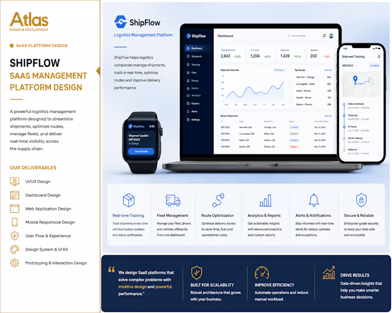
SaaS Logistics Management Platform The Problem Logistics businesses often struggle to manage shipments, fleet operations, route planning, and delivery updates across multiple systems. ShipFlow needed a centralized platform that would provide real-time visibility and make daily operations easier to manage. The Solution I designed a modern SaaS management platform with real-time shipment tracking, fleet management, route optimization, analytics, reporting, and responsive dashboards. The interface was designed to make complex logistics data easy to understand across desktop and mobile devices. The Result The final platform delivers a streamlined and professional user experience that gives logistics teams greater visibility, improved operational control, and a more efficient way to manage their supply chain.
1
118
1
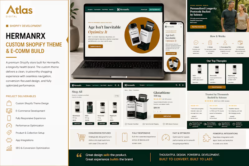
Custom Shopify Theme & E-Comm Build The Problem HermanRx needed a premium e-commerce experience for its longevity-focused product range. The existing shopping journey needed to communicate trust, simplify product discovery, and make a complex range of products feel clear and accessible across desktop and mobile devices. The Solution Atlas designed and developed a custom Shopify e-commerce experience with a sophisticated, conversion-focused interface. The project included custom storefront design, responsive layouts, product and collection pages, streamlined navigation, clear calls to action, product presentation, app integrations, and performance-focused optimization. The visual system combined a clinical, premium aesthetic with a strong emphasis on usability and trust. The Result The finished store provides a polished and consistent shopping experience across devices, making products easier to discover and evaluate while creating a stronger premium brand presence. The conversion-focused structure, responsive design, optimized performance, and streamlined purchasing journey create a scalable foundation for continued e-commerce growth.
1
128
Packaging Designer
(2)
Follow
Message
Nadia Ariefdien
Cape Town, South Africa
Brand & Web Designer
1x
Hired
5.0
Rating
21
Followers
Follow
Message
Brand & Web Designer
1
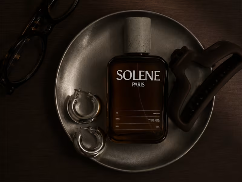
SOLENE Paris Visual Identity & Packaging Design
1
0
1
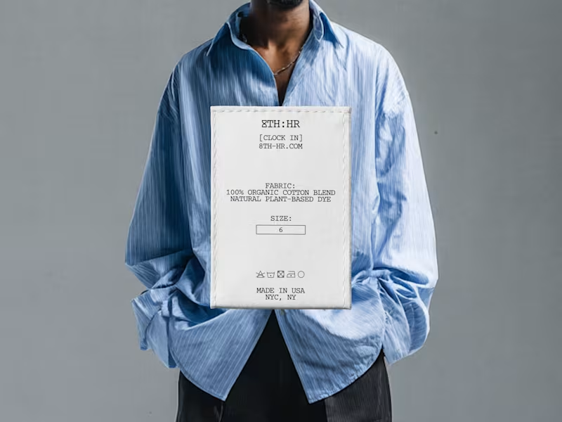
8TH:HR — Brand Identity Design
1
5
1
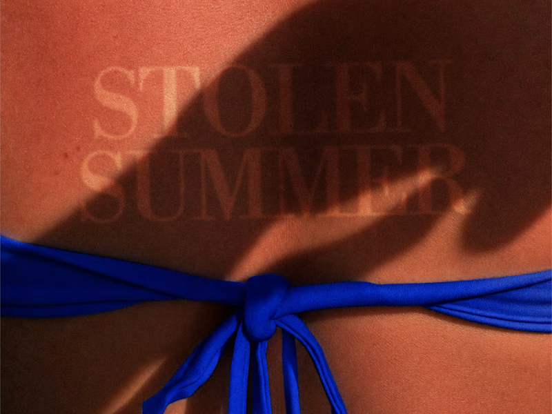
Stolen Summer Brand Identity Design
1
5
1
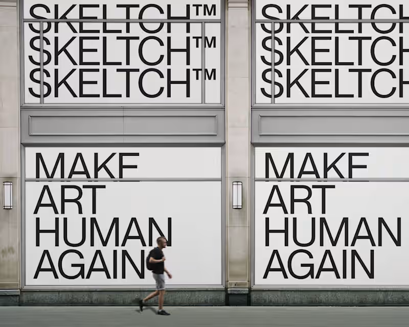
SKELTCH™ Branding Project
1
6
Packaging Designer
(1)
Follow
Message
Nimi Pretorius
pro
Cape Town, South Africa
Building brands people feel something for
$1k+
Earned
4
Followers
Follow
Message
Building brands people feel something for
0
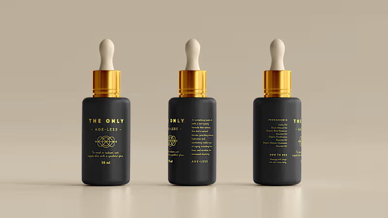
THE ONLY OIL The only one you need: brand creation, packaging design and copywriting for a luxury South African skincare oil Brand creation, product naming, creative direction, packaging design and copywriting across a range of organic handcrafted facial oils. THE STORY Luxury skincare is one of the most crowded shelves in the world. Every brand promises transformation. Every brand reaches for the same words. Pure. Radiant. Restore. After a while it all blurs into the same thing. The Only was built to cut through that quietly. A South African skincare brand rooted in organic, handcrafted facial oils made from rare local ingredients. Clinically tested. Carefully formulated. The kind of product that doesn't need to shout because it already knows what it can do. I created the brand from scratch, starting with the name. The Only. Two words that don't hedge, don't qualify, don't ask permission. Everything else followed from that conviction. The product names, Age-Less, Rooted, Ultimate, Calm, Nourish, Soothe, Revitalise, each share a feeling rather than a feature. The kind of names that make sense the moment you read them and stay with you. The visual identity is deep matte black and gold. Minimal by design, because the product deserved space to breathe. The copy took the same approach: warm and purposeful, never overwrought. Skincare writing has a habit of tipping into the breathless. This couldn't afford to. When the ingredients are this good and the formulation is this considered, the writing just needs to show up with the same integrity and get out of the way. WHAT IT TAUGHT ME That restraint is its own kind of confidence. The Only doesn't try to convince anyone. It simply presents itself and trusts that the right person will understand immediately. Learning to write like that, to say less and mean more, is a practice that never really ends.
0
130
0
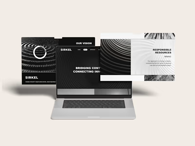
SIRKEL Closing the loop: brand strategy, creative direction and copywriting for a global investment venture Brand strategy, naming, creative direction, visual identity, website and copywriting for Sirkel Ventures, an investment business working across renewable energy, mining and global markets. THE STORY Sirkel was built around a simple idea: seemingly separate opportunities are often part of something much bigger. The business works across industries, markets and geographies, connecting capital, expertise and opportunity. I wanted the brand to make those connections visible. That led naturally to the idea of the circle, and to Sirkel. From there, I built the visual and verbal world around movement, connection and impact. Circles, ripples, loops and repeating forms became a way to show how one investment can create effects far beyond its starting point. The language followed the same thinking. “Bridging continents. Connecting innovators.” “Embracing diversity and creating opportunity.” “Join our Sirkel of change and impact.” The result was a bold, stripped-back identity that could move comfortably between mining, renewable energy and investment without belonging too obviously to any one of them. WHAT IT TAUGHT ME That a good brand idea can do more than hold a business together. It can help make sense of a business that operates across very different worlds. And that sometimes the simplest shape gives you the biggest world to build from.
0
75
0
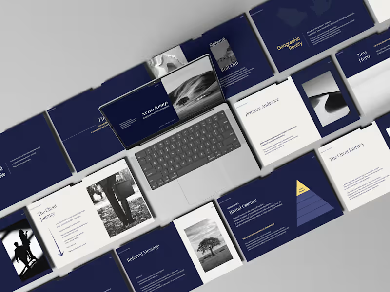
ARNO KEMP The room behind the decision: brand strategy, creative direction and copywriting for an executive coach Brand strategy, positioning, creative direction, visual identity and copywriting for executive coach Arno Kemp. THE STORY Leadership gets lonelier the more senior you become. By the time someone reaches the top of an organisation, they’re usually very good at looking like they know what they’re doing. But behind the decisions, the meetings and the performance, there’s another conversation happening. The one about whether the role still fits. What comes next. And the things you can’t necessarily say to anyone else in the room. That was the territory I wanted to build Arno Kemp’s brand around. I kept coming back to the space before the visible decision. The thinking, doubt and uncomfortable honesty that happens privately, before a leader walks back into the room. That led to the central idea: “The room behind the decision.” From there I built a visual and verbal world that felt intelligent, quiet and assured. Less like traditional executive coaching and more like a private conversation between two people who understand the stakes. The writing followed the same principle. The role used to fit. This isn’t confusion. It’s consequence. What leaders stop saying out loud. You’re still performing. That’s not the same as fitting. The idea carried through the identity, presentation material, social content and wider brand system. WHAT IT TAUGHT ME That the most interesting thing about a service isn’t always what happens in it. Sometimes it’s the moment that makes someone realise they need it. And that when you’re speaking to accomplished people, you don’t need to tell them how to lead. You need to show them that you understand what leadership feels like.
0
38
0
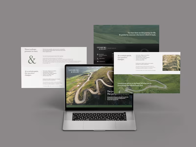
GINSBURG & SELBY The journey is yours. The perspective is ours: brand strategy, creative direction and copywriting for an independent wealth firm Brand strategy, creative direction, visual identity, website and copywriting for an independent private wealth business. THE STORY Money is personal. And the more of life you've lived, the more complicated the decisions around it can become. Ginsburg & Selby had been advising people on those decisions for nearly thirty years. I wanted the brand to feel like that. Experienced, calm and thoughtful, without falling into the usual world of wealth management clichés. I kept coming back to the idea of a journey. By the time someone sits down with a wealth adviser, they've already travelled quite a long way. They've built businesses, raised families, made good decisions and probably a few bad ones. They're not looking for someone to take over the journey. They're looking for perspective on what comes next. That led to the central thought: “The journey is yours. The perspective is ours.” From there I built the visual and verbal world around roads, paths and changing perspectives. The ampersand became an important part of the identity too. It gave me a simple way to talk about the relationship at the heart of the business: client and adviser, experience and perspective, what has been and what comes next. I also wanted the writing to feel unusually unhurried for financial services. Held, not hurried. Knowing what not to change is as hard as knowing what to. You only take this journey once. We have taken it many times. The idea eventually found its way into everything from the website and identity to business cards, outdoor, digital screens, social and print. WHAT IT TAUGHT ME That sometimes the best way to make a financial brand feel more credible is to make it feel more human. And that experience doesn't need to announce itself loudly. Sometimes it can simply say: I've seen this road before.
0
52
Packaging Designer
(1)
Follow
Message
Rebecca Hayter
Cape Town, South Africa
Creative Director/Creative All-Rounder
5.0
Rating
4
Followers
Follow
Message
Creative Director/Creative All-Rounder
0
Conscious Kids
0
11
0
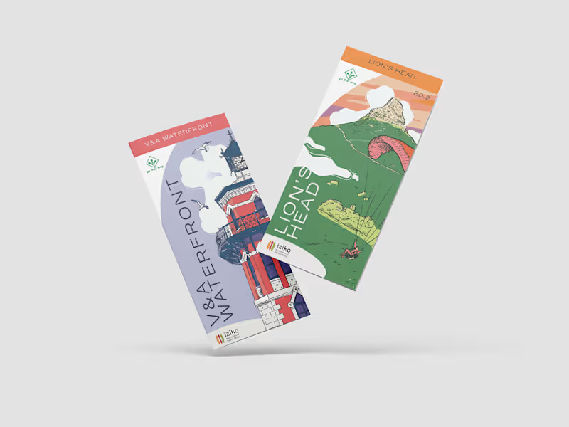
Go That Way Brochures
0
24
0
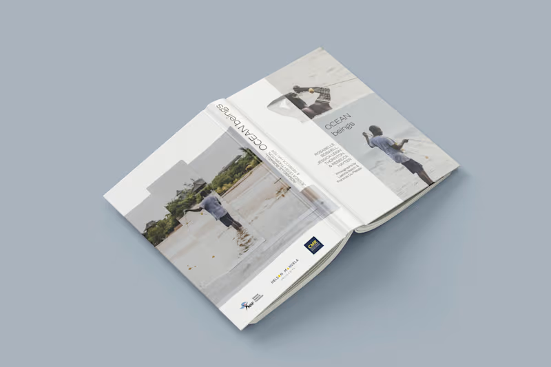
Ocean Beings
0
18
0
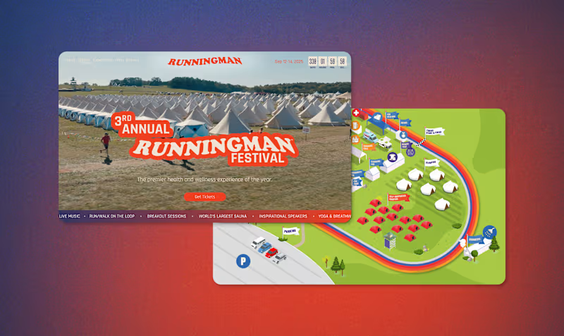
Runningman Festival
0
16
Packaging Designer
(1)
Follow
Message
Ludwig Breedt
pro
Cape Town, South Africa
Brand designer partnering with founders & entrepreneurs.
New to Contra
Follow
Message
Brand designer partnering with founders & entrepreneurs.
0
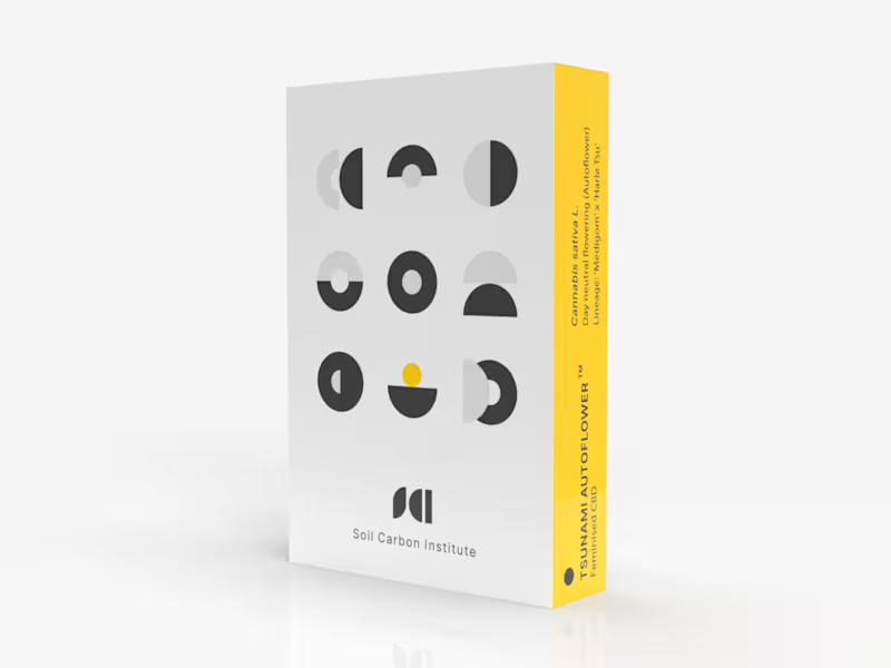
SCI Pod Visual Identity & Packaging Design
0
1
0
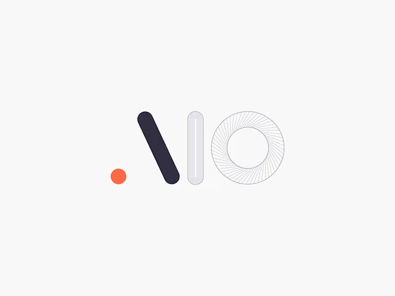
Visual Identity Design for AIO
0
1
0
Visual Identity Design for AKEY
0
2
0
Visual Identity & UI Design - MINT App
0
1
Packaging Designer
(1)
Follow
Message
Varaidzo 'Vee' Chitimira
Cape Town, South Africa
Holistic Designer: Templates, Copy & Strategy Expert
Follow
Message
Holistic Designer: Templates, Copy & Strategy Expert
0
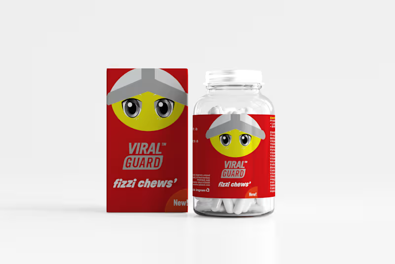
Package Design Project
0
20
0
Textbook Digitisation
0
29
0
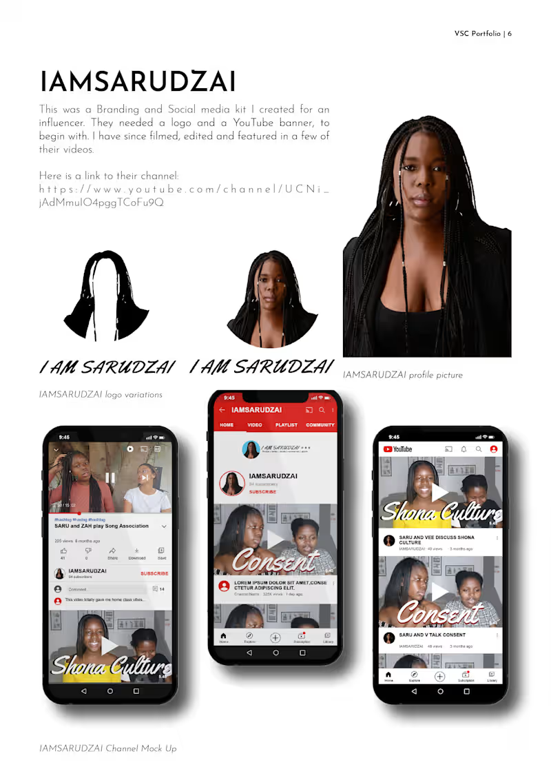
SARU and ZAH play Song Association Game and sings Justin Bieber…
0
28
View more →
Packaging Designer
(1)
Follow
Message
Bianca Berg
Cape Town, South Africa
Designing brands that stand out!⚡️❤️🔥

Follow
Message
Designing brands that stand out!⚡️❤️🔥
0
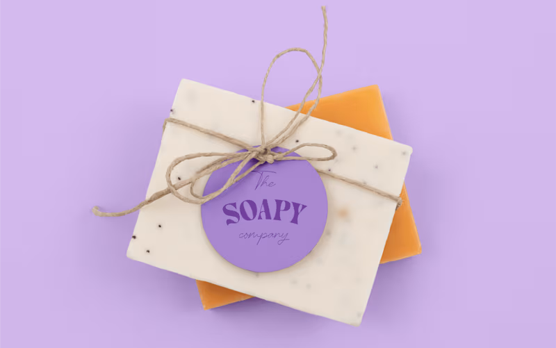
Soapy | Brand Design
0
9
0
The Sparkle Bar | Graphic Design
0
11
0
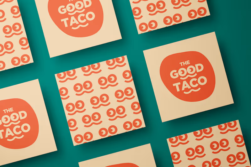
The Good Taco | Brand Design
0
28
0
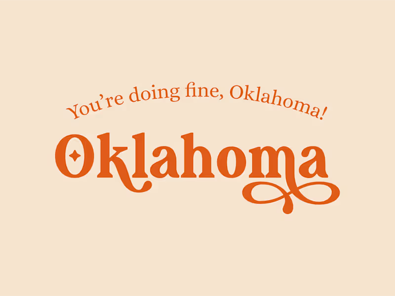
Oklahoma | Mini Brand Design
0
14
Packaging Designer
(1)
Follow
Message
Ovahiwa Thodi
Stellenbosch, South Africa
Building brands with soul✨
Follow
Message
Building brands with soul✨
0
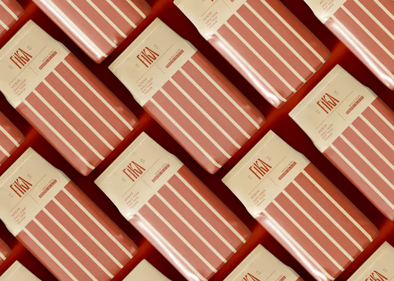
Fika - Packing Design for a Coffee Brand
0
31
0
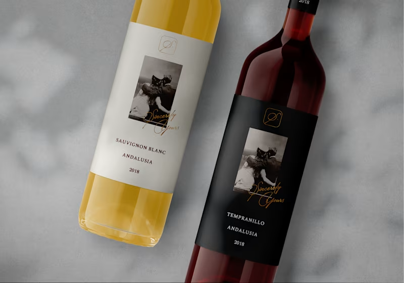
Sincerely Yours - Brand Identity for a Spanish Restaurant
0
41
0
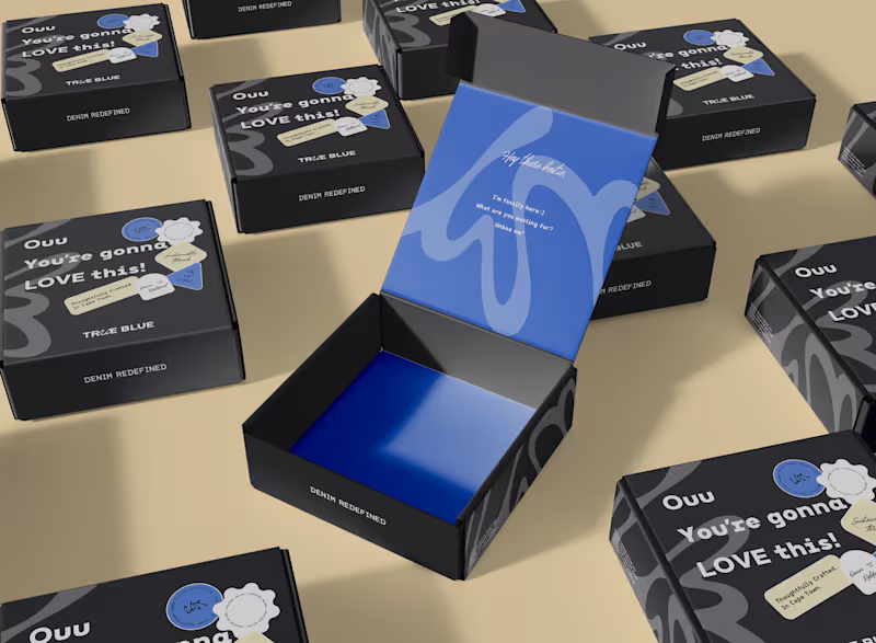
True Blue - Brand Identity + Packaging and Social
0
35
0
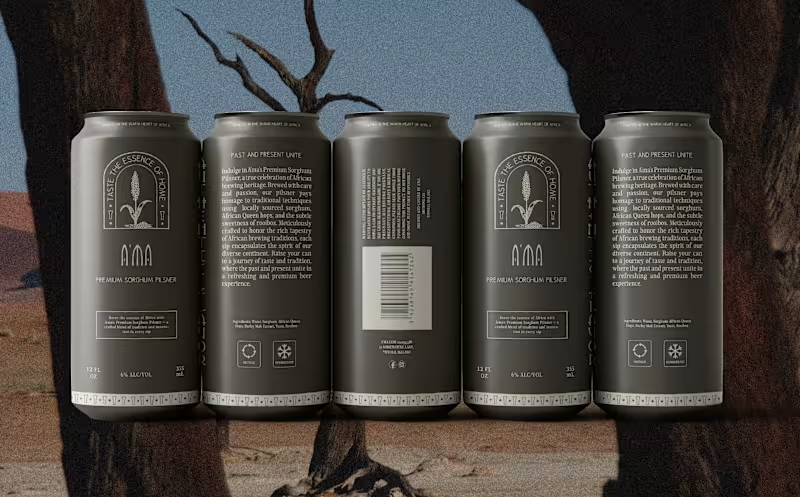
A'ma - Brand Identity + Social Posts for an African Restaurant
0
28
Packaging Designer
(1)
Follow
Message
Explore people