Freelance Brand Designers in Western Cape
Sign Up
Post a job
Sign Up
Log In
Filters
2
Projects
People
Nadia Ariefdien
Cape Town, South Africa
Brand & Web Designer
1x
Hired
5.0
Rating
21
Followers
Follow
Message
Brand & Web Designer
1
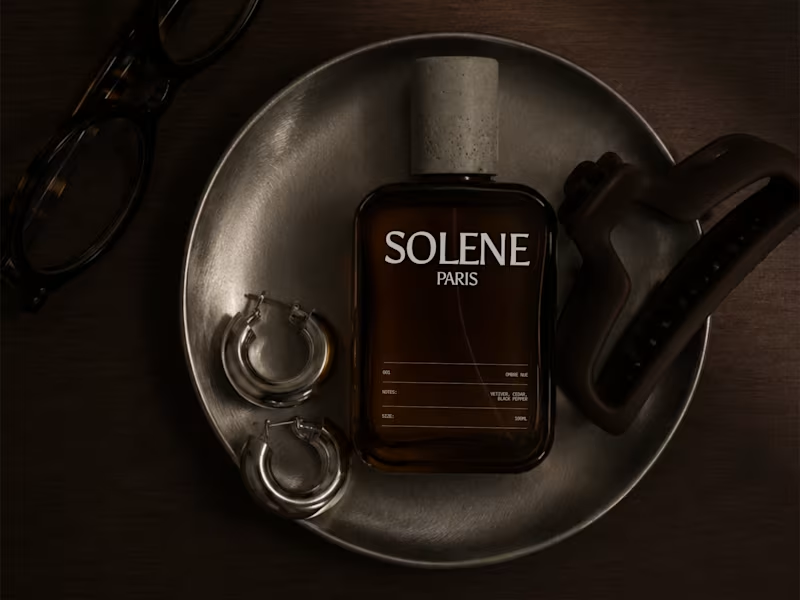
SOLENE Paris Visual Identity & Packaging Design
1
0
1
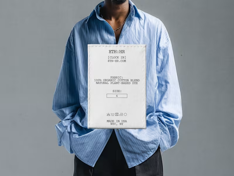
8TH:HR — Brand Identity Design
1
5
1
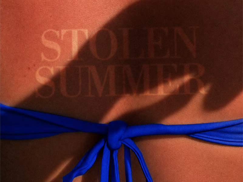
Stolen Summer Brand Identity Design
1
5
1
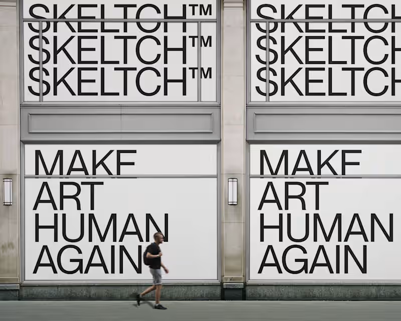
SKELTCH™ Branding Project
1
6
Brand Designer
(5)
Follow
Message
Nimi Pretorius
pro
Cape Town, South Africa
Building brands people feel something for
$1k+
Earned
4
Followers
Follow
Message
Building brands people feel something for
0
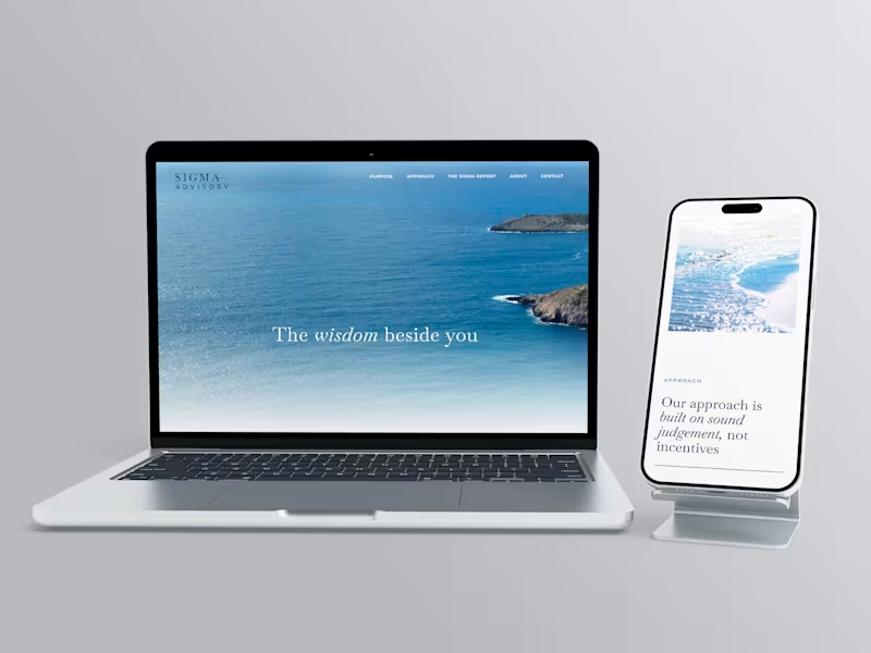
SIGMA ADVISORY When less is the whole point: brand development for Sigma Advisory Brand direction, visual identity and creative positioning for a private wealth advisory firm. THE STORY Financial advisory is a category where everyone says the same things. Trust. Expertise. Partnership. The words have been borrowed so many times they've stopped meaning anything. Sigma Advisory is a firm that helps growth-minded businesses replace operational chaos with clear systems and capable leadership. The work is serious and the clients are serious. What they needed wasn't a louder way to say the usual things. They needed a brand that could hold the same quiet authority they hold in a room. Deep navy. Clean serif. A horizontal rule that separates the name into two parts without breaking it. Nothing decorative. Nothing that reaches. The identity doesn't announce itself. It assumes its own credibility, which is exactly how the firm operates. The voice followed the same logic. Clarity as confidence, not performance. WHAT IT TAUGHT ME Restraint is a decision that has to be made repeatedly. Every element you leave out is a choice. The discipline is in knowing what the brand can carry without being said.
0
78
0
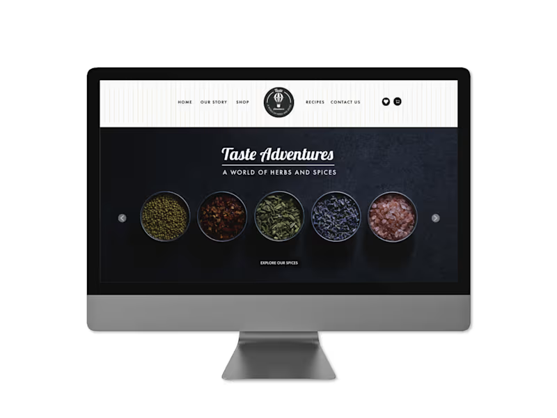
TASTE ADVENTURES A world of herbs and spices: packaging design, naming and copywriting for a travel-inspired spice brand Brand creation, product naming, copywriting and creative direction across a range of internationally inspired spice blends. THE STORY Some of the best ideas start with a feeling rather than a brief. Three friends had spent years travelling together, eating their way through markets and street corners and other people's kitchens. They wanted to bring something back. Not souvenirs. The real thing. The flavours that made them stop mid-bite and ask what on earth was in this. Taste Adventures was built around that feeling. A spice brand organised not by ingredient but by journey. My job was to create the whole world: the name, the products, the visual language, the words on every surface. The product names came first, because everything else had to follow from them. Mississippi Magic. Pride of India. Mama Africa. Each one needed to evoke a place without reducing it, to feel like a destination rather than a description. Get those wrong and the whole range falls flat. The design gave each SKU its own cultural visual language: Mardi Gras tilework, Indian mandala patterning, West African textile motifs. Distinct enough to stand alone. Connected enough to belong to the same story. The hot air balloon in the brand mark tied it all together quietly, a symbol of curiosity and movement that didn't need to shout. The copy on each pack had one job: make someone feel something before they even open it. Like they're already halfway there. WHAT IT TAUGHT ME That a range is only as strong as its internal logic. The moment one product feels like it slipped in from somewhere else, the whole idea loses its nerve. Here, consistency wasn't a creative constraint. It was the whole point.
0
54
1
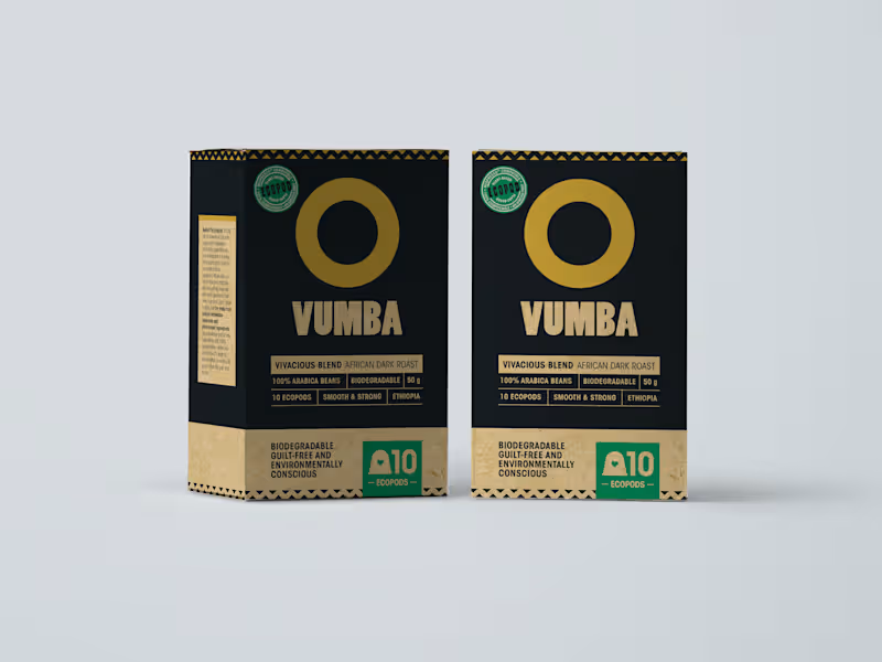
VUMBA COFFEE Rich, robust and guilt-free: packaging design and copywriting for a South African artisinal coffee brand Brand creation, creative direction, packaging design and copywriting for a Nespresso-compatible ecopod coffee brand. THE STORY There are coffee brands that compete on convenience. There are coffee brands that compete on credentials. Vumba was built to do both, without apology. The name comes from the early morning mist that settles over the Bvumba Mountains. That specific quality of stillness. The moment before the day begins. It's a perfect name for a coffee brand, and it arrived with its own mood already intact. A South African-born artisinal coffee brand, hand-roasted in Kommetjie, Cape Town, and delivered in fully compostable ecopods compatible with Nespresso machines. The brief was to create something that felt premium without feeling cold. Dark and rich without feeling heavy. Proudly local without feeling small. The visual identity followed from the name: deep black, warm gold, bold geometry drawing from African pattern tradition. The kind of packaging that earns its place on a kitchen counter and doesn't apologise for being there. The copy across the pack had to work on multiple registers at once. The front needed to communicate quality and confidence in a single glance. The back needed warmth and personality, including a mascot moment for the ecopod itself that explained composability in a way that felt charming rather than preachy. Getting a brand to be both serious and playful on the same piece of cardboard is harder than it sounds. Vumba is the kind of brand that reminds you why origin matters. Not as a marketing claim. As something you can actually taste. WHAT IT TAUGHT ME That the best brand names don't describe the product. They evoke a feeling that the product then has to live up to. Vumba set a high bar. That was the whole point.
1
59
0
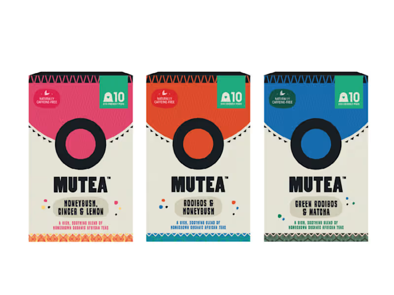
MUTEA Proudly African, naturally caffeine-free: packaging design and copywriting for an organic South African tea brand Creative direction, packaging design and copywriting across a range of rooibos ecopod teas. THE STORY Rooibos is one of those things South Africans grow up taking for granted. It's just there, in the cupboard, at the end of a long day. The rest of the world is still discovering it. Mutea was made for that moment of discovery. An organic South African tea brand bringing rooibos to a broader market in a format that felt as considered as the product itself: plant-based ecopods, compostable, clean. No compromise on what goes in or what gets left behind. My job was to build the world around it. The visual language draws from African textile and craft traditions, bold colour blocking, geometric pattern, warmth you can feel before you've even read a word. Each SKU has its own colour and personality. Rooibos and Chai. Rooibos and Vanilla. Rooibos and Honeybush. But together they feel like they've always belonged on the same shelf. The copy took its cues from the design: direct, warm, quietly confident. A voice that knows what it is and doesn't feel the need to convince anyone too hard. Because when the product is this good, and this honest, the writing just needs to get out of the way and let it breathe. WHAT IT TAUGHT ME That the best packaging feels inevitable. Like there was never any other way it could have looked. Getting there takes longer than people think. But when it lands, you just know.
0
81
Brand Designer
(5)
Follow
Message
Gideon Phillip
pro
Cape Town, South Africa
I help Architecture firms with premium brands.
$1k+
Earned
5.0
Rating
18
Followers
Follow
Message
I help Architecture firms with premium brands.
0
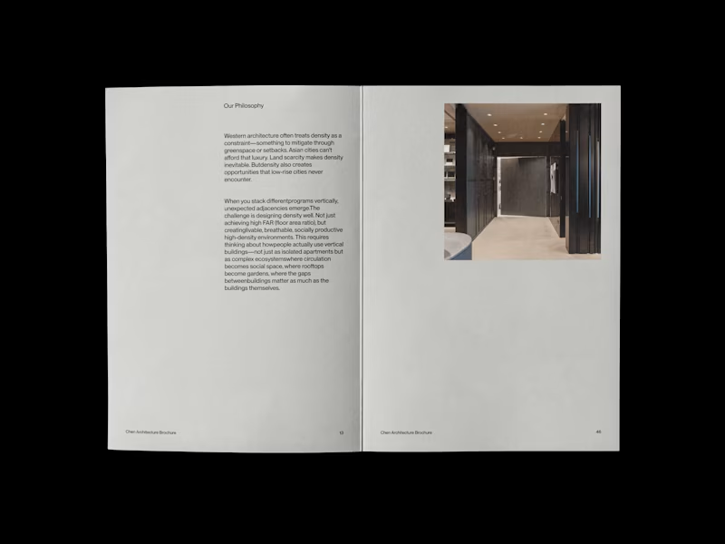
Chen Architecture is a Singapore-based architecture firm specializing in high-density design for the rapidly evolving cities of Southeast and East Asia. Founded by Eleanor Chen in 2019, the studio operates at the intersection of Asian spatial intelligence and contemporary architectural practice—rejecting both Western mimicry and nostalgic traditionalism.
0
129
0
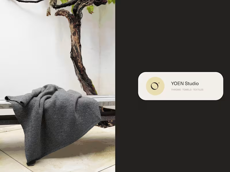
YOEN® is a luxury textile house dedicated to the art of considered making. Founded on the belief that the objects closest to our bodies deserve the same rigour applied to architecture — every thread chosen, every weight calibrated, every texture a dialogue between material and maker. We work in cashmere, merino, alpaca and their rarest blends. Our throws, towels and textiles are not decorative objects — they are tactile experiences, designed to hold warmth, absorb light and endure. YOEN® pieces belong to rooms that breathe: minimalist interiors, thoughtful homes, places where stillness is a form of luxury. Yoen's mission remains the same: To create textiles of genuine permanence — pieces that are felt before they are seen, that outlast trends, and that reward daily use with deepening softness and quiet beauty. Such a wonderful experience to finally see this work done!
0
145
0
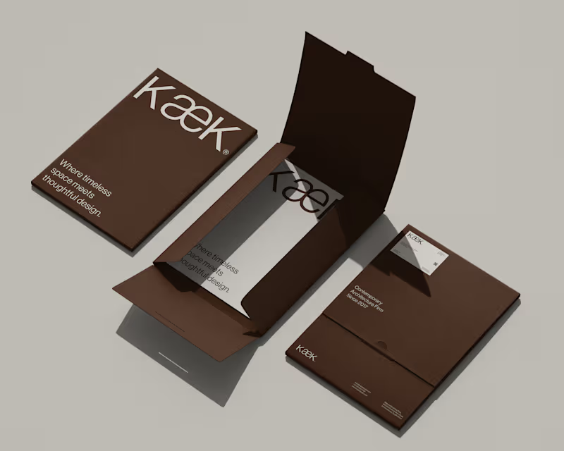
KæK / Brand Identity
0
8
0
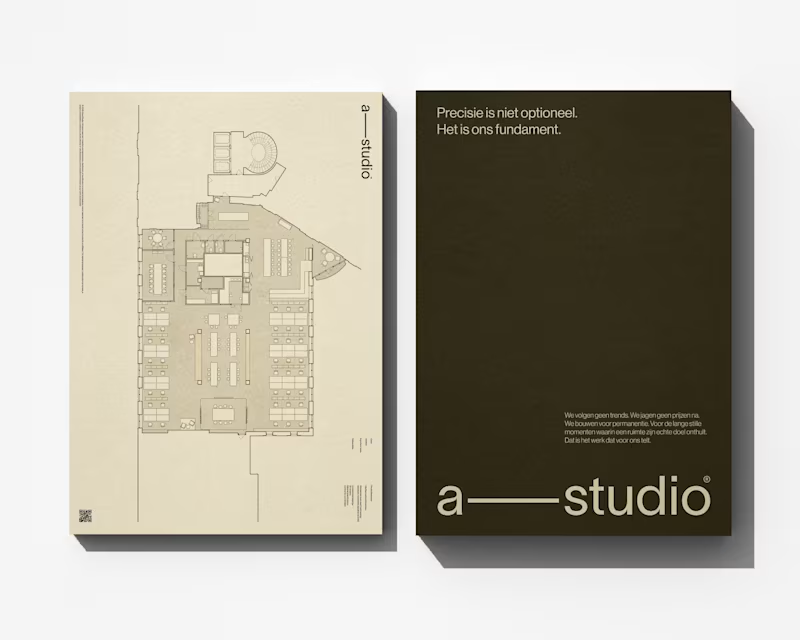
Alima Studio® / Brand Identity
0
7
Brand Designer
(9)
Follow
Message
Atlas Digital Azaad
Cape Town, South Africa
AI, Web, Mobile & Business Software Solutions
5.0
Rating
2
Followers
Follow
Message
AI, Web, Mobile & Business Software Solutions
1
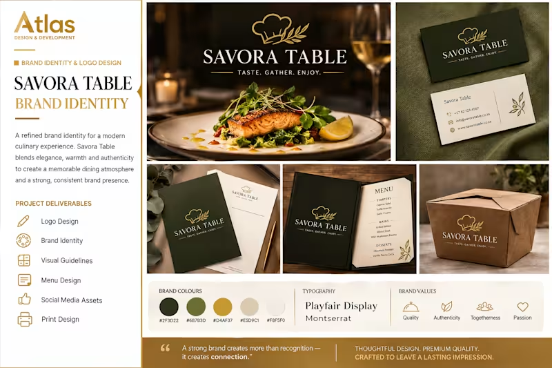
BRAND IDENTITY & LOGO DESIGN The Problem Savora Table needed a distinctive brand identity that would capture the warmth, quality, and refined experience of modern dining while creating a strong and memorable visual presence. The Solution I developed a complete visual identity featuring an elegant logo, refined typography, a sophisticated colour palette, and branded assets including stationery, menus, packaging, and social media visuals. The Result The final identity creates a premium and cohesive brand experience that feels warm, authentic, and memorable across both digital and physical touchpoints.
1
91
1
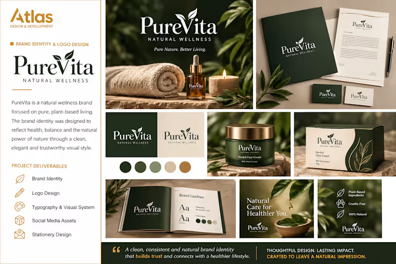
PureVita — LOGO DESIGN & BRAND IDENTITY The Problem PureVita needed a clean and trustworthy visual identity that would communicate its focus on natural wellness, plant-based products, and healthy living. The Solution I created a refined brand system built around an elegant logo, organic visual elements, natural colours, typography, packaging concepts, stationery, and social media assets. The Result The final brand identity gives PureVita a cohesive, premium, and professional presence that builds trust and creates a strong foundation for future product and brand growth.
1
91
1
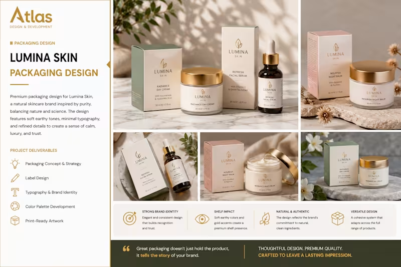
Lumina Skin Packaging Design The Problem Lumina Skin needed packaging that would communicate quality, trust, and a premium natural skincare experience while standing out in a competitive beauty market. The Solution I created a refined packaging system using soft earthy tones, elegant typography, clean layouts, and subtle gold details. The design was developed to create a consistent visual identity across multiple skincare products. The Result The final packaging delivers a sophisticated and cohesive brand presence that feels premium, natural, and trustworthy. The flexible design system allows the brand to maintain consistency while easily expanding its product range.
1
90
1
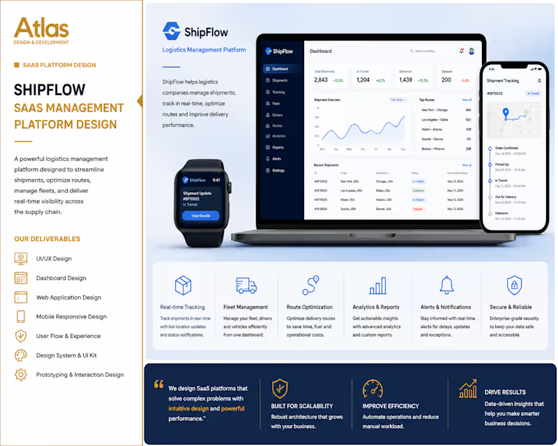
SaaS Logistics Management Platform The Problem Logistics businesses often struggle to manage shipments, fleet operations, route planning, and delivery updates across multiple systems. ShipFlow needed a centralized platform that would provide real-time visibility and make daily operations easier to manage. The Solution I designed a modern SaaS management platform with real-time shipment tracking, fleet management, route optimization, analytics, reporting, and responsive dashboards. The interface was designed to make complex logistics data easy to understand across desktop and mobile devices. The Result The final platform delivers a streamlined and professional user experience that gives logistics teams greater visibility, improved operational control, and a more efficient way to manage their supply chain.
1
118
Brand Designer
(3)
Follow
Message
Rebecca Hayter
Cape Town, South Africa
Creative Director/Creative All-Rounder
5.0
Rating
4
Followers
Follow
Message
Creative Director/Creative All-Rounder
0
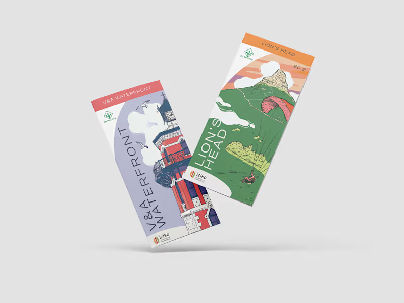
Go That Way Brochures
0
24
0
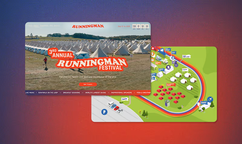
Runningman Festival
0
16
1
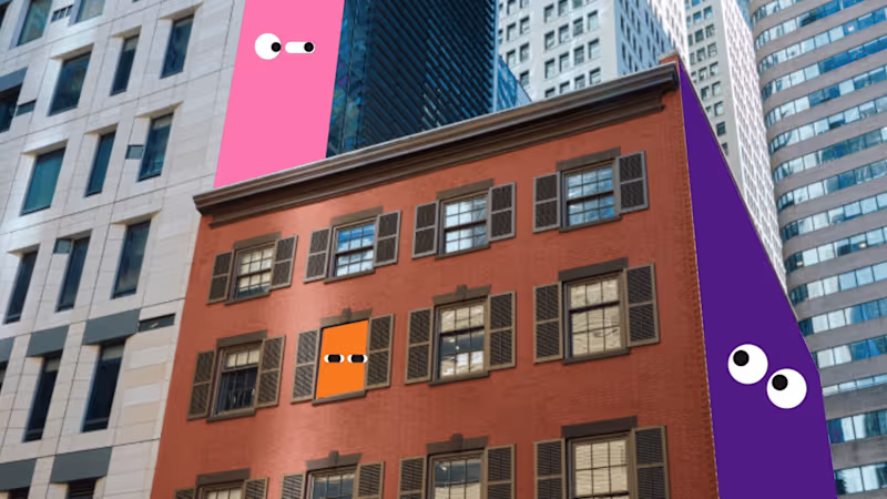
PS 150 NYC Public School Rebrand and Web Design
1
13
0
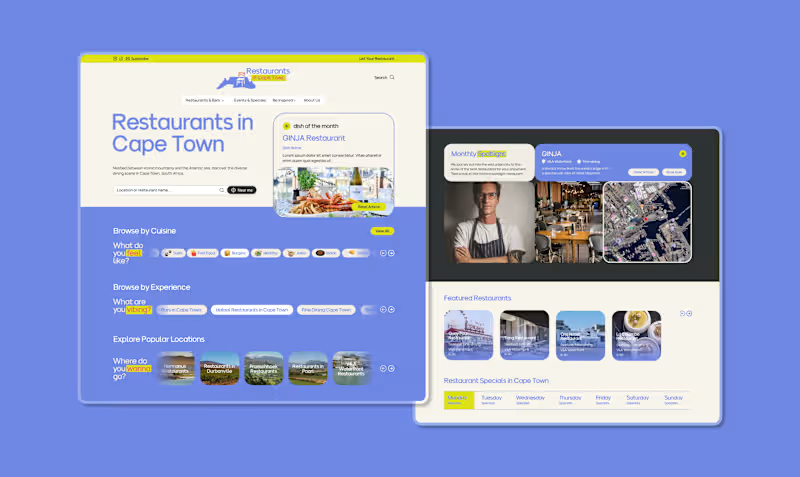
Restaurants in Cape Town
0
9
Brand Designer
(5)
Follow
Message
Jordan Talbot
Cape Town, South Africa
Branding Specialist | Bold Identities That Connect
5.0
Rating
3
Followers
Follow
Message
Branding Specialist | Bold Identities That Connect
1
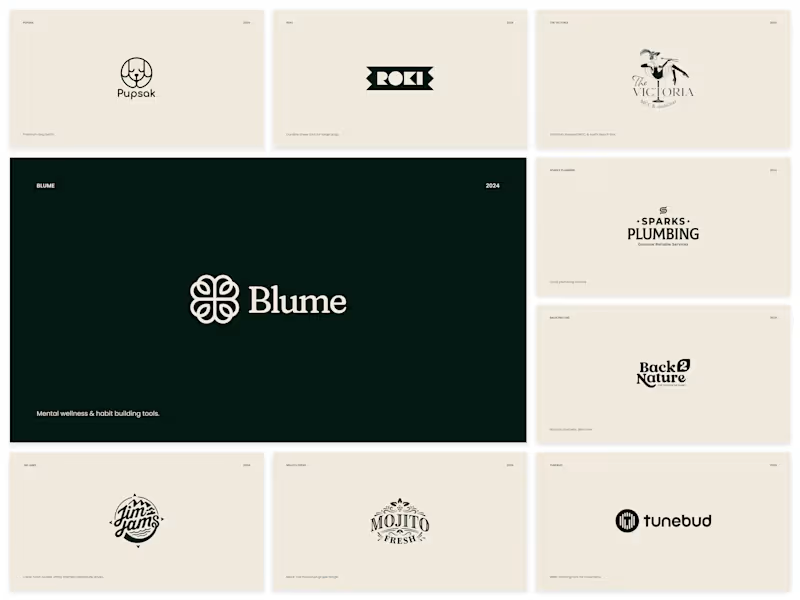
2024 Logofolio
1
16
0
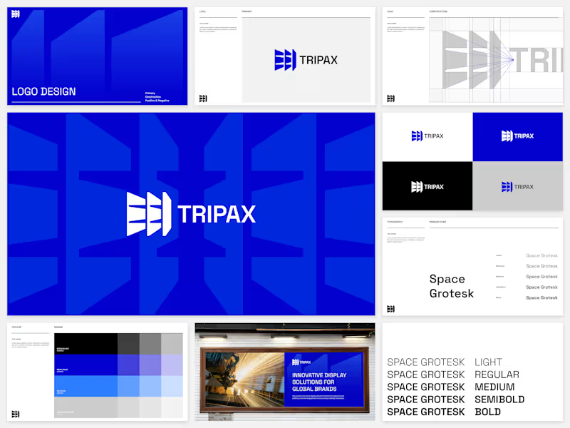
Tripax Display (Light Brand Design)
0
10
1
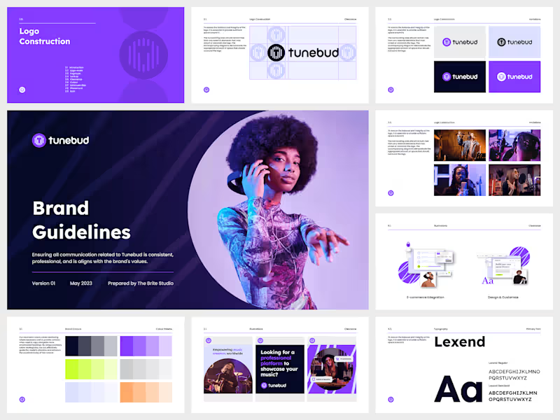
Tunebud (Medium Brand Design)
1
15
1
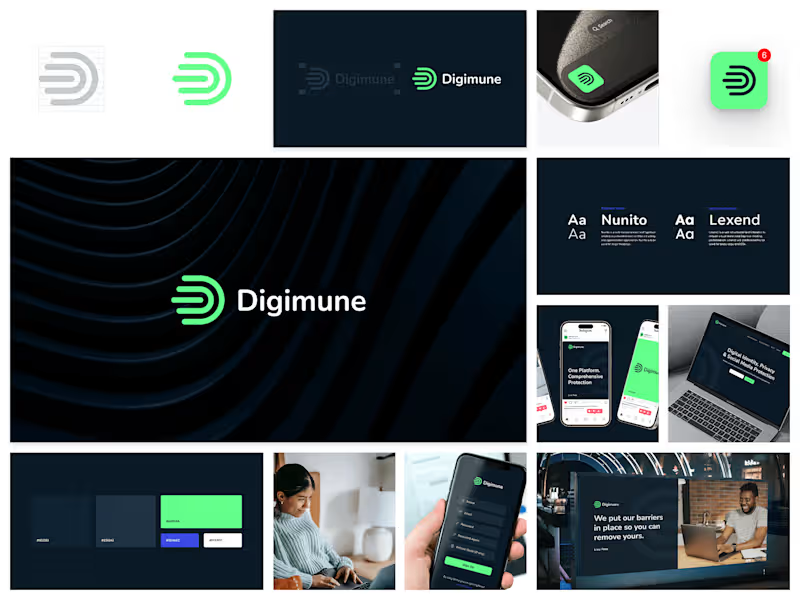
Digimune (Light Brand Design)
1
13
Brand Designer
(5)
Follow
Message
Ludwig Breedt
pro
Cape Town, South Africa
Brand designer partnering with founders & entrepreneurs.
New to Contra
Follow
Message
Brand designer partnering with founders & entrepreneurs.

0
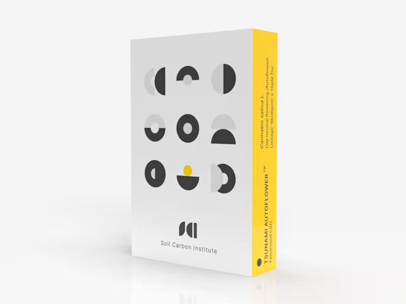
SCI Pod Visual Identity & Packaging Design
0
1
0
Atlas Visual Identity & Website Design
0
2
0
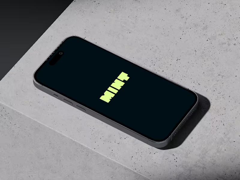
Visual Identity & UI Design - MINT App
0
1
0
Visual Identity Design for AIO
0
1
Brand Designer
(3)
Follow
Message
Jonah Lewis
Cape Town, South Africa
Brand Strategy, Design, Messaging, Websites & Video
5.0
Rating
3
Followers
Follow
Message
Brand Strategy, Design, Messaging, Websites & Video
0
Brand Development for IYO Burgers
0
9
0
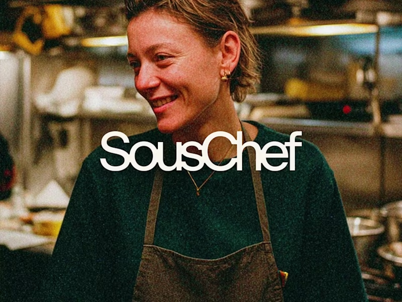
Brand Development for Sous Chef
1
0
13
0
Brand Development for Gimi
1
0
16
0
Explainer Video for GIMI
0
44
Brand Designer
(3)
Follow
Message
Explore people