Freelancers using Renoise in Warsaw
Freelancers using Renoise in Warsaw
Sign Up
Post a job
Sign Up
Log In
Filters
2
Projects
People
Kris Anfalova
pro
Warsaw, Poland
Premium UI/UX & Web Design for Fintech, SaaS & Web3 | Framer
1x
Hired
5.0
Rating
322
Followers
expert
expert
+1
Follow
Message
Premium UI/UX & Web Design for Fintech, SaaS & Web3 | Framer
66
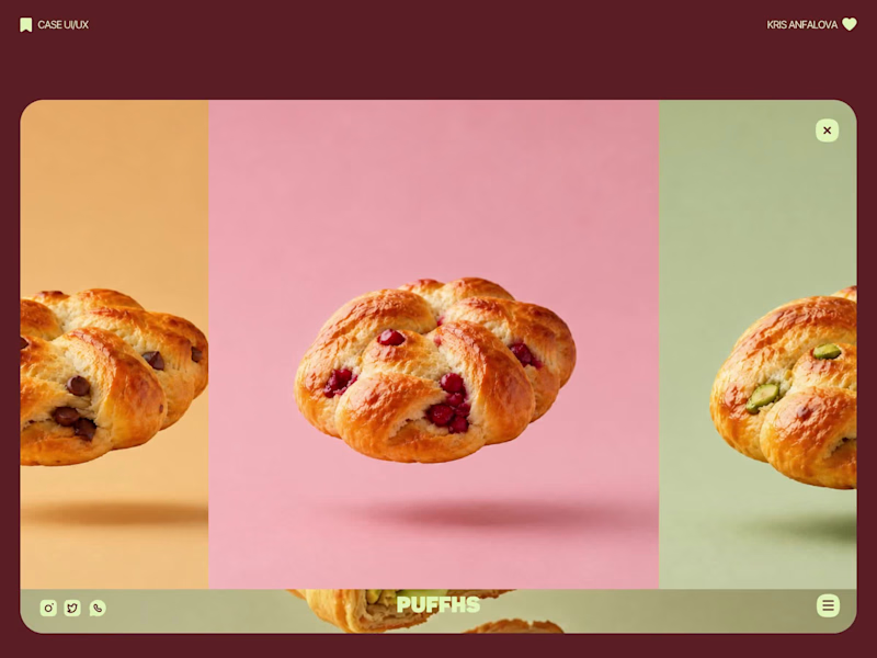
PUFFHS: Artisanal Pastry Landing Page Concept Welcome to PUFFHS, a conceptual landing page designed for a premium artisanal bakery specializing in gourmet cream puffs. This project reimagines how we browse and buy high-end digital food products. Most food e-commerce platforms and delivery apps rely on static, uninspiring grid layouts that fail to capture the true tactile appeal of the product. The challenge was to break away from standard UI patterns and create a digital shopping experience that is as mouth-watering and engaging as the pastries themselves, all while keeping complex dietary information accessible To solve this, I experimented with a highly interactive, motion-driven approach. The core UX innovation is the "Reveal the Puff" mechanic. Instead of forcing users to read long paragraphs about the ingredients, I designed a seamless micro-interaction that allows them to virtually "slice" the dessert with a single click, instantly revealing the rich filling and texture.
19
66
3.7K
1
Cadvel Brand Identity Design
1
6
4
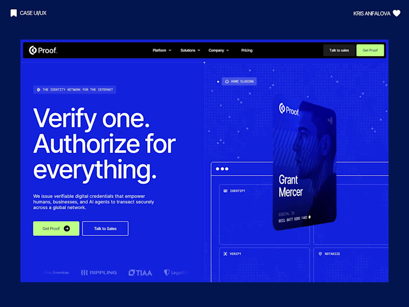
B2B SaaS website design for Proof — an identity platform that lets AI agents act on behalf of real people, built to convert enterprise security buyers. Proof issues cryptographically verified credentials: a human verifies once, and their AI agent is then authorized to sign, notarize or transact for them. The site had to sell a category most buyers had never heard of — agent authorization — to security, compliance and engineering leads at banks, law firms and hospitals, and move them into a sales conversation instead of a bounce. The hero says it in five words — "Verify one. Authorize for everything." — next to a live credential card, so an abstract protocol becomes something you can see in two seconds. The page alternates near-black, white and electric blue, and every switch marks a new argument: the risk, the mechanism, the network, the platform, the API. That rhythm keeps a 14-section B2B SaaS website scannable in a single scroll. I built 20+ Lottie animations for the parts copy can't carry — credential signing, the authorization handshake, the global network map — kept light enough not to cost load time. For imagery I wrote a style recipe for AI generation (one lens, one lighting setup, one grade) so the finance, legal and healthcare scenes read as one commissioned shoot rather than stock AI. Technical buyers get a real code block with real API calls, because that section is what they scroll to find. 14+ sections, desktop and mobile designed separately, a component library, Lottie files ready for the dev team, and a written art-direction guide for generating new imagery in-brand.
2
4
133
15
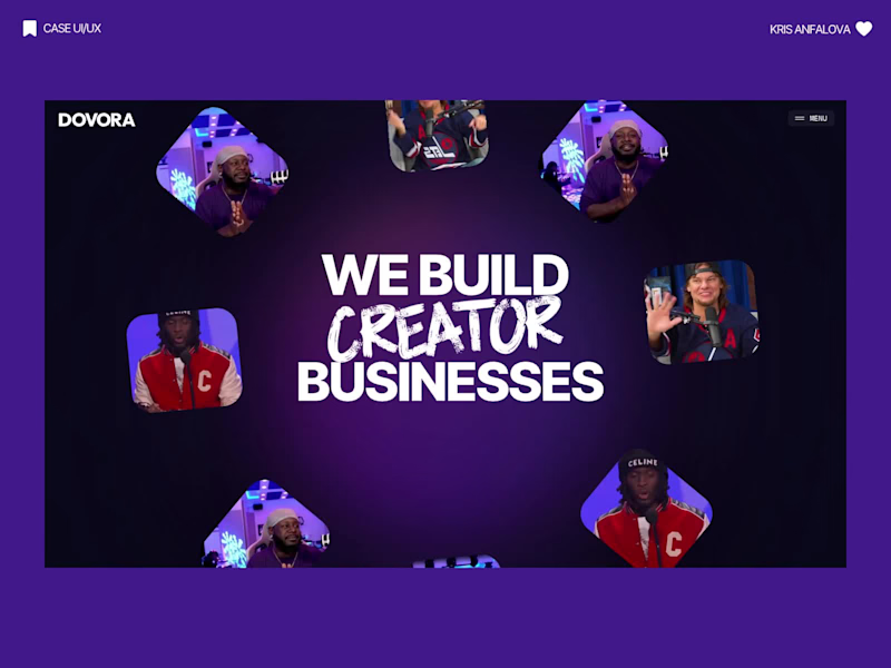
Designed the website for Dovora — an agency that builds businesses for creators, not brand deals. "We don't represent brands, we don't split focus" is basically the whole pitch, and I wanted the site to feel just as uncompromising. So no polished stock creator-economy visuals. The hero is a wall of real streamer/podcast footage arranged in overlapping diamonds and rounded frames — actual creators, mid-stream, mid-laugh — with a glowing gradient orb behind bold "WE BUILD CREATOR BUSINESSES" type. It reads more like a highlight reel than a landing page, which felt right for an audience that lives on camera. The second section flips the energy completely — dark, minimal, almost aggressive typography ("BUILT EXCLUSIVELY FOR CREATORS. FULL STOP.") paired with huge chrome-and-neon 3D letterforms spelling out CREATORS. It's loud in a completely different way than the hero, and that contrast is intentional — this isn't a buttoned-up agency deck, it's built for people who make content for a living. Genuinely fun brief to lean all the way into.
7
15
426
Renoise
(1)
Follow
Message
Explore people