Projects for "Graphic Designer" in VenrayProjects for "Graphic Designer" in VenraySearch results for 'Graphic Designer'
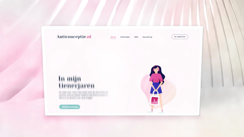
Organon is a global healthcare company with a strong focus on women’s health. One of its flagship public-facing initiatives is Anticonceptie.nl (http://Anticonceptie.nl), the Netherlands’ most widely consulted online platform for information on contraception. The platform functions as an authoritative and accessible resource, offering evidence-based guidance on contraceptive methods, effectiveness, side effects and decision-making support.
Scope & Roll
For the redesign of Anticonceptie.nl (http://Anticonceptie.nl), Organon commissioned Happy horizon to develop a completely renewed website, including its visual identity and digital experience. Within this multidisciplinary team, my role was to translate complex medical and educational content into a coherent visual language through illustration and animation.
Visual System & Motion Design
The illustrations were developed to clarify and humanize a wide range of sensitive and information-dense topics across the platform. Following positive client feedback on the static visuals, I proposed extending the system into motion by introducing short, looping animations. This approach was adopted across the site, allowing all illustrations to be animated in a subtle and functional manner. The resulting motion design enhances comprehension, adds rhythm to the interface and contributes to a more engaging, contemporary user experience without detracting from the platform’s informational credibility. BENGglas is an innovative glass supplier, recognized for delivering high-quality insulating glass products. After years of steady growth, the brand reached a point where its visual presence no longer reflected its technical maturity, reliability, and future-oriented ambitions.
They approached me to develop a refined strategy and visual identity: a comprehensive rebranding designed to articulate their expertise, innovation, and established position within the industry.
Strategic Brand Session
We began with a strategic brand session aimed at redefining the organization’s core values and clarifying the foundation of the brand. Through an interactive workshop, we explored the company’s deeper purpose, the principles guiding their daily operations, and the value they aim to deliver in the long term. This process also created space to discuss preferences, aspirations, and practical challenges. For BENGglas, the founders emphasized a clear ambition: to elevate the brand and align its visual presence with the quality of its product offering.
Research & Strategy
The process continued with extensive research into the glass industry, particularly within the vacuum-glass segment. One striking conclusion emerged: despite the highly technical nature of the field, visual branding across the sector is remarkably outdated. Most competitors invest minimally in design, resulting in uninspired wordmarks or overly literal logos featuring gradients, shadows, and illustrated glass panes.
This lack of strong visual competition revealed a significant opportunity. A well-structured, recognizable, and modern identity would allow BENGglas to stand out immediately: especially by conveying innovation and professionalism.
Colour choices in the market also follow predictable patterns:
Blue for reliability and professionalism.
Grey and white for a clean, glass aesthetic.
Green for sustainability narratives
Occasional outliers aiming for exaggerated luxury or iridescent light-reflection effects
Audience research showed that the target group values clarity and functionality above all. They expect a logo to create a clear connection to the product without relying on literal imagery. Subtle abstraction is perceived as more professional, more timeless, and thus more trustworthy.
Strategic Direction
For BENGglas, we adopted an approach that embraces the technical character of the industry while ensuring a distinct, contemporary, and recognisable identity. Subtle references to glass are integrated through colour, geometry, and structure, without resorting to clichés.
Where many brands rely on predictable blue-grey palettes, we explored modern variations that maintain sector familiarity while giving BENGglas a unique, ownable presence. The resulting identity is visually refined and highly practical across all applications, from brochures and trade-show materials to online communication and installation documentation.
Persona Development
To accurately represent the primary audience, a persona was established: Mark, the Glass Installer.
Profile
Age: 30–55 (with an upper range to 70)
Profession: Experienced glass installer (independent or working within a company)
Experience: 15+ years in construction
Personality: Practical, solution-oriented, no-nonsense
Meet Mark
Mark is a seasoned craftsman who values durability, clear information, and efficient installation. He works according to the latest insulation standards (BENG-norms) and relies on accurate specifications. He prioritises materials he can trust and suppliers who communicate clearly and deliver on time.
What does he look for in a supplier?
Glass that meets legal and technical requirements
Fast delivery and transparent communication
Straightforward installation with no complications
How do we speak to him?
The communication strategy reflects Mark’s mindset: direct, functional, and without unnecessary decoration. He appreciates clarity, recognizable industry terminology, and an honest tone. No vague marketing promises; only concrete benefits and straight facts.
Market & Behavioural Psychology
The rebranding is grounded in behavioural insights showing that clarity, structure, and recognizability strongly influence trust in technical industries. The visual system uses geometric forms that evoke construction and glass, supported by colour cues that signal strength, precision, and accessibility. A minimalist, structured design enhances credibility, while consistent application across all materials strengthens brand memory and reinforces long-term trust.
Tone of Voice
Clear. Direct. Uncompromisingly honest.
The communication style mirrors the audience: straightforward, confident, and factual. No marketing jargon. No inflated claims. No unnecessary embellishment.
Imagery System
The imagery system is built around three pillars; People, Product, and Placement. People photography, focusses on authentic situations: real glass installers in real working environments, captured with high contrast, deep saturation, and natural textures to emphasize craftsmanship. Product images highlight material quality through sharp details, realistic reflections, and controlled light that conveys precision and innovation. Placement imagery shows BENGglas products installed in real contexts, such as heritage buildings, with subtle turquoise reflections that unify the entire visual identity. Across all three pillars, the imagery balances technical authority with human realism.
Three Strategic Pillars
Reliability & Trust
Communicated through consistent application, geometric precision, and a structured visual system that conveys stability while rounded edges ensure accessibility.
Technical Excellence & Quality
Expressed through honest, factual communication and visual clarity that emphasises performance, durability, and engineering integrity.
Professionalism & Innovation
Positioning BENGglas as a contemporary leader in a visually stagnant sector, with an identity that reflects its advanced technology and elevated service level.
Visual Identity
The typography is deliberately squared yet softened with rounded edges to preserve a human, approachable character. The logo mark literally symbolises vacuum glass without resorting to clichés common in the industry. Opposing arrows represent the directional pressure applied during vacuum installation, while the central rectangle signifies the titanium-based vacuum glass. Together, they form a stylised rounded-corner window; instantly recognizable and directly tied to the product.
The colour palette draws inspiration from authentic glass tints. It is built around the signature blue from the previous identity to maintain continuity, complemented by a deeper royal blue that signals technical authority with a subtle turquoise-green hue inspired on natural glass edges. A bright accent colour provides energy and emphasis for call-to-action elements.
Outcome
The final identity combines technical quality, professionalism, and trustworthiness. In a market where visual investment is rare, BENGglas now differentiates itself by communicating at the level of its expertise.
The service has matured, the products have evolved, and the brand now visually embodies that progression. This rebranding positions BENGglas as a modern, credible, and technically advanced market leader; precisely where it belongs. Acknowledge ICT is a forward-thinking technology partner known for its innovative digital solutions and human-centred approach. As the company entered a new phase marked by a complete rebranding, they sought a compelling way to introduce their renewed identity to the market. To support this transition, I was commissioned to design and animate a series of brand-reveal assets tailored for their digital launch.
Project scope
The initial brief focused on creating animation concepts to highlight the evolution of the brand, while emphasizing Acknowledge ICT's core pillars. Produced in three formats suitable for multiple digital platforms. These variations ensured flexibility across social feeds, stories, and widescreen displays.
Concept Development
Concept 1. Transition From Old to New
The first animation concept visualised the transformation by showing the old logo seamlessly evolving into the new. This narrative underscored the continuity of the brand while signalling progress and refinement. After the transition, each organisational pillar was showcased through dynamic motion, forming a strong introduction to the renewed brand identity.
Concept 2. Immediate Brand Confidence
The second concept adopted a more direct approach. It focuses on the new logo and brand mark, immediately establishing the updated brand presence. Sequential highlights of the core pillars follow, supported by a strong motion system that reinforced attention and remembrance.
Visual Style & Motion System
The visual style of the animations is grounded in the newly developed brand identity, matching to the updated colour palette, typography, and geometric forms defined in the brand documentation. At the client’s request, the visual system should aim to elevate beyond what is presented in the new brand manual, adding more dynamism, depth, and visual impact appropriate for a brand-reveal moment.
A central element in this elevation is the use of the brandmark; internally known as the “Ackie.” Within the animation, the Ackie moves fluidly through the composition, at times even in a therefore created 3D form, leaving behind a recognizable visual trail. This motion reinforces the brand’s technical expertise while generating a sense of momentum and transformation.
Because a brand reveal must instantly capture attention, the animation is designed to make an impact within the first three seconds. The introduction is concise and direct, immediately drawing the viewer in before transitioning into smoother, fully eased movements of the Ackie and the supporting pillars. All shapes follow a motion system rooted in fluidity, precision, and digital finesse; reflecting both the renewed visual identity and the technological strength of Acknowledge ICT.
Emotion & Motion Language
The emotional tone of the animation was designed to reflect the inherently digital nature of Acknowledge ICT. Movements are fast, smooth, and deliberately catchy; mirroring the efficiency, agility, and technical sharpness of the services the company provides. The motion system leverages clean accelerations, decisive transitions, and rhythmic visual pacing to create an energetic yet coherent flow.
By developing the brand mark into a refined 3D asset, the animations gain depth and dimensionality. One recurring sequence features the signature brand shape sweeping dynamically over the previous logo, giving rise to the new mark in a fluid, almost swoosh-like gesture. This not only symbolises progression but also maximises the forward thinking mindset of the brand.
Sound Design
Alongside the visuals, I developed the full sound design to enhance the impact of the brand reveal. The audio direction aligns with the highly digital character of Acknowledge ICT: sharp glitches, rapid electronic textures, and impactful transitions support the sensation of technological precision. The composition remains intentionally bold and bombastic, appropriate for announcing something monumental and new.
To reinforce brand recognition, a custom outro jingle was created. Its melody is built from tonal “bleeps” shaped around the phonetic sound of “Á”, the first audible element in the brand name ''Acknowledge''. This sonic signature introduces a memorable, ownable sound identity, ensuring continuity across future communication touchpoints.
Formats & Deliverables
Each concept was delivered in the three required formats: 1080×1350, 1080×1920, and 1920×1080 pixels. Optimised for performance across Instagram, Snapchat, LinkedIn, and widescreen channels. This ensured a cohesive brand reveal across every touchpoint, regardless of device or platform.
Outcome
The final animations offered Acknowledge ICT a polished and compelling launch asset for their rebranding. By pairing strategic storytelling with refined motion design, the brand reveal successfully communicated both continuity and evolution, positioning Acknowledge ICT as a confident, modern leader within the ICT landscape.