Projects in Veliko TarnovoProjects in Veliko TarnovoNew site, new chapter! ⛰️
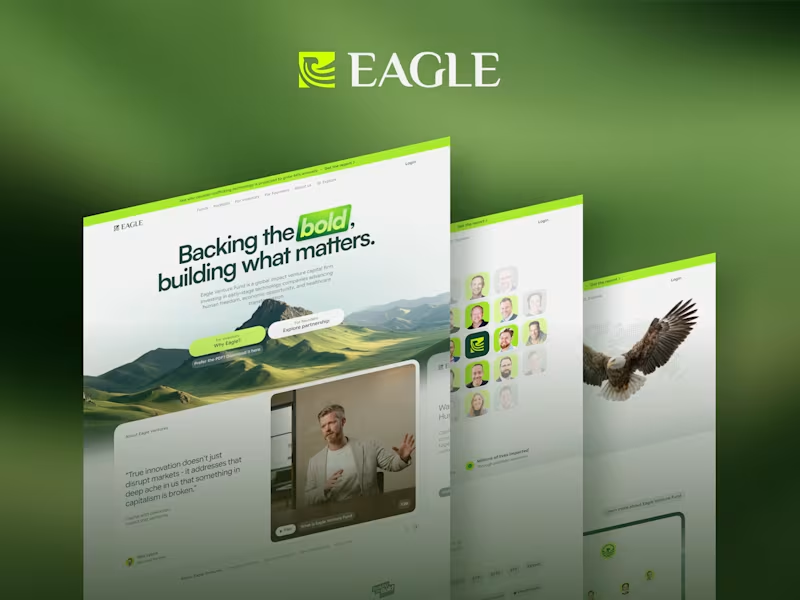
Excited to share that the new Eagle Venture Fund site is officially live — www.eagleventurefund.com (http://www.eagleventurefund.com)
Had the pleasure of shaping the visual identity and design for this launch, working alongside our incredible team who brought it all together. 💚
A few words from EAGLE:
"Sometimes the hardest part isn't building a website. It's finding the words that truly reflect who you are.
Over the past several months, we've challenged ourselves with some simple but important questions.
Who are we?
What do we believe?
How do we explain why Eagle exists in a way that feels authentic?
As our portfolio has grown and our vision has evolved, we realized our website no longer reflected the organization we had become. This wasn't about a new logo or a new look. It was about clarity.
Clarity around our investment philosophy. Clarity around the founders we back. Clarity around our belief that capital can be a powerful force for innovation, human flourishing, and lasting change.
The finished website isn't the destination. It's simply a better reflection of who we are today, and where we're headed.
We're grateful to everyone who helped bring it to life, and even more grateful to the founders, investors, advisors, and partners who continue building this mission alongside us.
If you haven't visited in a while, we'd love for you to take a look.
We're just getting started." 🌸 Spring Awakening: Mobile Hero Banners for CosmeticStoreBG 🌸
Excited to share my latest visual design project! With spring in full swing, I partnered with CosmeticStoreBG to refresh their mobile storefront with a vibrant, seasonal campaign.
The Concept
The goal was to bring a fresh, airy, and inviting feel to their mobile platform. I blended soft, dreamy pastel skies with delicate cherry blossoms to create a striking backdrop that allows the skincare products to truly take center stage.
Project Highlights:
Mobile-First Design: Crafted specifically for mobile users, ensuring crisp typography, balanced composition, and a prominent, tap-friendly CTA ("Разгледай" / Explore) for seamless navigation.
Brand Synergy: Beautifully integrated top-tier skincare lines while maintaining CosmeticStoreBG's core identity.
ProfiDerm: Highlighting their clinical SOS Pimple Liquid Spot Patch with the messaging "Professional care for every skin type."
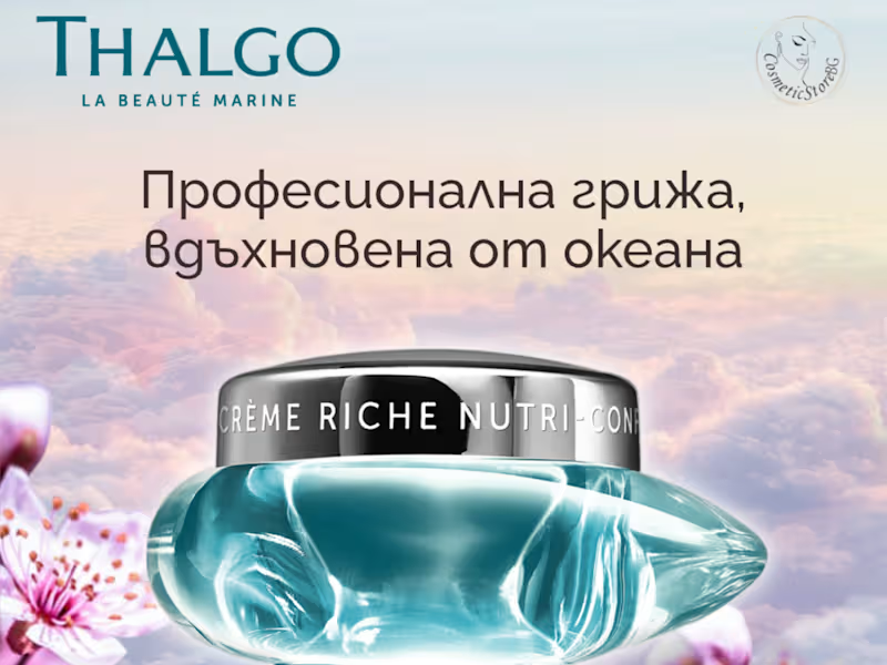
THALGO: Showcasing the luxurious Crème Riche Nutri-Confort with the messaging "Professional care inspired by the ocean."
I absolutely loved bringing this fresh, floral aesthetic to life for the beauty e-commerce space. Let me know what you think of these spring vibes! 👇
If you're a brand looking to elevate your digital storefront or seasonal campaigns, let's connect and create something beautiful together. ✨