
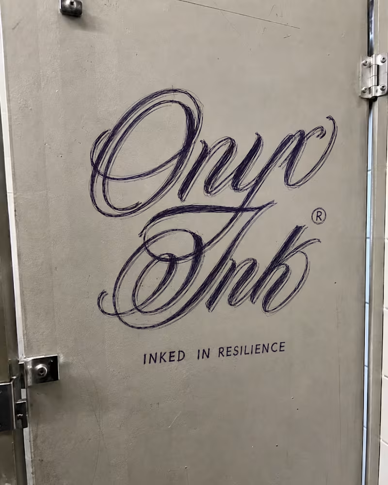
I developed Onyx Ink as a Black tattoo magazine concept centered on artistry, identity, culture, and the stories carried through ink. I designed the publication’s logo and visual identity around the phrase “Inked in Resilience,” using an expressive script wordmark paired with a bold black-and-gold color system to give the brand a look that feels artistic, elevated, and rooted in tattoo culture.
I extended the identity into a full editorial direction, creating magazine covers, feature spreads, media-kit layouts, press materials, and promotional applications using photography of real tattooed models. The layouts balance strong imagery with refined typography and generous editorial space, allowing the tattoos and the people wearing them to remain the focus while maintaining a recognizable Onyx Ink visual language throughout.
The project demonstrates how I take a brand from an initial logo concept into a cohesive publication system that can work across print, digital, editorial, and promotional touch points.
0
143


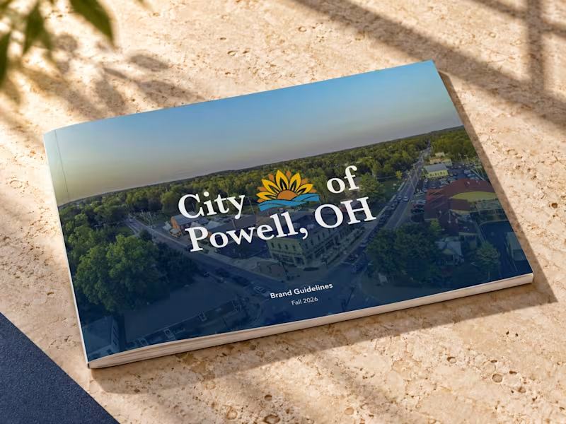
A city’s identity should reflect more than where it is. It should represent what makes it special.
A look at the brand guidelines concept I developed for the City of Powell, Ohio. Inspired by the city’s natural landscape, community, and character, the goal was to create a cohesive visual identity that feels timeless, recognizable, and built to grow alongside the city.
From the logo to its real-world applications, every detail was designed with consistency, flexibility, and longevity in mind.
An independent concept project exploring what thoughtful civic branding can look like.
4
390
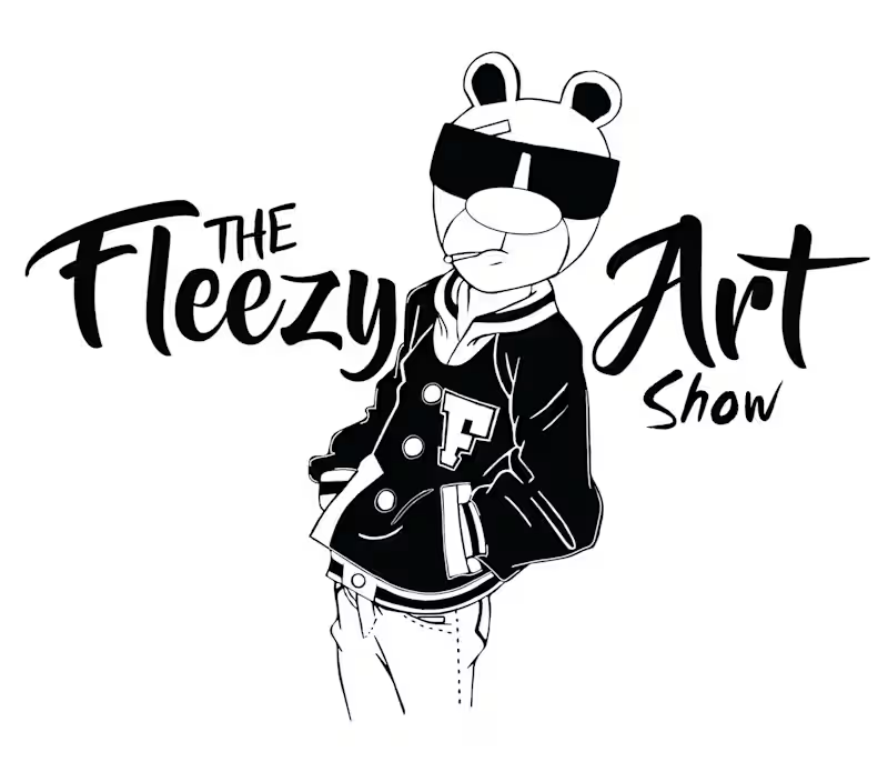
This logo was developed as a collaboration for visual artist Fleezy Art and his art show brand. The original character illustration was created by the artist, and my role was to transform that artwork into a cohesive, usable logo system.
I developed the typography, composition, hierarchy, and overall logo structure, exploring different ways to balance the illustrated character with the “Fleezy Art Show” wordmark. The goal was to create an identity that felt bold, expressive, and rooted in the artist’s personality while remaining recognizable across event graphics, merchandise, signage, and promotional materials.
This project highlights my approach to collaborative branding—respecting an existing artist’s work while building the visual system around it.
My role: Logo development, typography, layout, composition, and brand identity direction.
Character illustration: Fleezy Art.
1
156


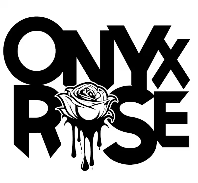
Onyx Rose is a brand identity concept based on my online persona. I created the logo to reflect a balance of softness and edge through bold typography and a stylized rose mark. The visual direction is rooted in a monochrome, high-contrast aesthetic that feels modern, wearable, and adaptable across multiple branded applications.
This mockup demonstrates how the identity can extend into a cohesive merchandise system, including merch boxes, shopping bags, hang tags, apparel graphics, and garment labels. The project was created to show how a logo can function as part of a larger brand world rather than as a standalone mark.
Services shown: logo design, brand identity, typography, creative direction, and packaging/merch design.
1
166

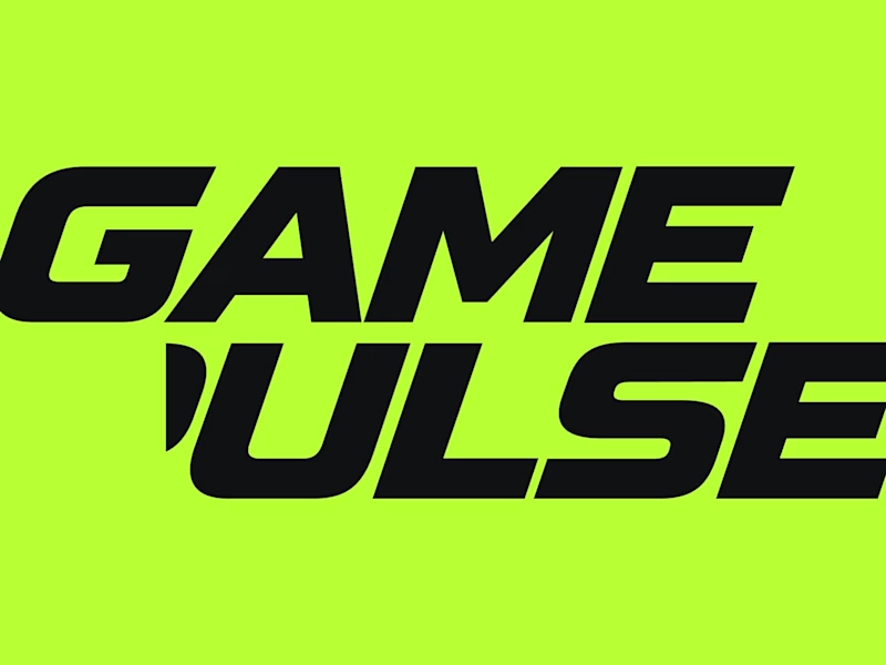
Had a great time working on this brand identity for Game Pulse, a sports media company focused on capturing the energy and excitement of sports.
I wanted to create something that felt bold, modern, and full of movement. We landed on a custom wordmark and lightning-inspired symbol that bring that energy together, paired with a vibrant green that helps the brand stand out across just about any application.
Really enjoyed seeing this one come together.
2
6
476

A little look at the logo I designed for COPE, the personal brand of motivational speaker Josh Copeland.
The goal was to create something simple, recognizable, and meaningful that could grow alongside Josh and his message.
Pretty cool to see this one go on to receive recognition and earn a spot in LogoLounge Book 15 alongside some incredible identity work from around the world.
Always rewarding when a project you believe in gets recognized beyond the original brief.
2
8
654
