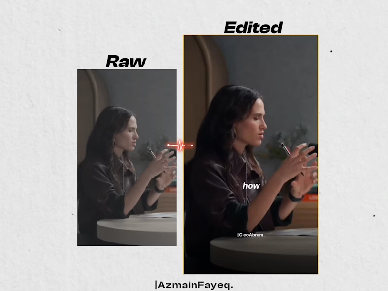
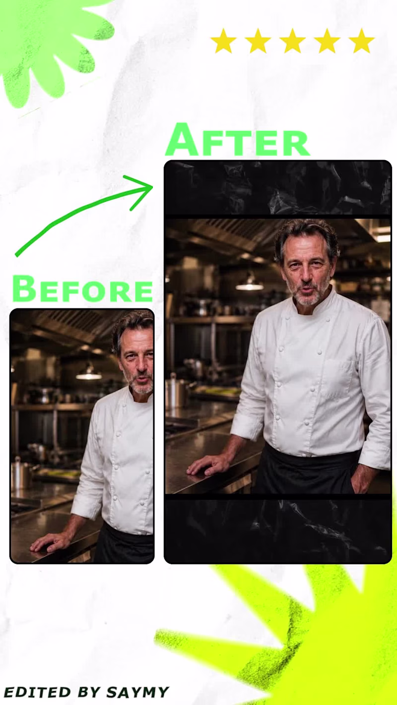
Projects in Sylhet DivisionProjects in Sylhet Division
Cover image for ๐„๐ฑ๐œ๐ข๐ญ๐ž๐ ๐ญ๐จ ๐ฌ๐ก๐š๐ซ๐ž ๐ฆ๐ฒ ๐ฅ๐š๐ญ๐ž๐ฌ๐ญ
๐„๐ฑ๐œ๐ข๐ญ๐ž๐ ๐ญ๐จ ๐ฌ๐ก๐š๐ซ๐ž ๐ฆ๐ฒ ๐ฅ๐š๐ญ๐ž๐ฌ๐ญ ๐’๐š๐š๐’ ๐ฐ๐ž๐›๐ฌ๐ข๐ญ๐ž ๐ญ๐ž๐ฆ๐ฉ๐ฅ๐š๐ญ๐ž โ€” ๐…๐ข๐ง๐ž๐ฑ๐š ๐ŸŽ‰ ๐‹๐ข๐ฏ๐ž ๐จ๐ง A modern finance & budget management website design built for fintech startups and AI-driven finance platforms. Includes: โœ” ๐ป๐‘–๐‘”โ„Ž-๐‘๐‘œ๐‘›๐‘ฃ๐‘’๐‘Ÿ๐‘ก๐‘–๐‘›๐‘” ๐‘™๐‘Ž๐‘›๐‘‘๐‘–๐‘›๐‘” ๐‘๐‘Ž๐‘”๐‘’ โœ” ๐ท๐‘Ž๐‘ โ„Ž๐‘๐‘œ๐‘Ž๐‘Ÿ๐‘‘ ๐‘๐‘Ÿ๐‘’๐‘ฃ๐‘–๐‘’๐‘ค ๐‘ ๐‘’๐‘๐‘ก๐‘–๐‘œ๐‘›๐‘  โœ” ๐‘ƒ๐‘Ÿ๐‘–๐‘๐‘–๐‘›๐‘” & ๐‘๐‘™๐‘œ๐‘” ๐‘๐‘Ž๐‘”๐‘’๐‘  โœ” ๐ด๐‘ข๐‘กโ„Ž ๐‘ ๐‘๐‘Ÿ๐‘’๐‘’๐‘›๐‘  โœ” ๐น๐‘ข๐‘™๐‘™๐‘ฆ ๐‘œ๐‘Ÿ๐‘”๐‘Ž๐‘›๐‘–๐‘ง๐‘’๐‘‘ ๐น๐‘–๐‘”๐‘š๐‘Ž ๐‘“๐‘–๐‘™๐‘’ Perfect if you're launching a finance SaaS and want a professional, investor-ready website design. Download now: https://contra.com/products/27Cbznkb-finexa-finance-and-budget-management-website-or-saa-s-templates #SaaSDesign (https://www.instagram.com/explore/tags/saasdesign/)ย #FintechUI (https://www.instagram.com/explore/tags/fintechui/)
1
88
Cover image for You spent 3 hours on
You spent 3 hours on that design. Your audience spent 3 seconds on it. And in those 3 seconds, their eyes never even landed on your CTA. Here is the uncomfortable ๐˜๐—ฟ๐˜‚๐˜๐—ต most ๐—ฑ๐—ฒ๐˜€๐—ถ๐—ด๐—ป๐—ฒ๐—ฟ๐˜€ and ๐—ฐ๐—ฟ๐—ฒ๐—ฎ๐˜๐—ผ๐—ฟ๐˜€ ignore. You are designing based on what looks ๐—ด๐—ผ๐—ผ๐—ฑ ๐˜๐—ผ ๐˜†๐—ผ๐˜‚. Not based on where ๐—ฒ๐˜†๐—ฒ๐˜€ actually go. Then, Lemme tell you something! ๐Ÿ™ƒ You place your headline in the center because it feels balanced. You drop your CTA in the bottom-right because that is where it fits. You fill the top of your carousel with a logo instead of a hook. Meanwhile, your viewer's brain already decided to scroll past. The hot zone on any design is the top-left and center. That is where eyes land first. Every single time. If your most important message is not sitting there, it is invisible. The bottom-right corner? That is the dead zone. Almost nobody looks there. And that is exactly where most people put their call to action. Here is the 3-second rule I follow for every design now. 1. Hot zone gets the ๐—ต๐—ฒ๐—ฎ๐—ฑ๐—น๐—ถ๐—ป๐—ฒ. Top-left and center. No exceptions. 2. ๐—›๐—ผ๐—ผ๐—ธ first on carousels. The ๐˜๐—ผ๐—ฝ ๐Ÿฎ๐Ÿฌ% of your slide gets ๐Ÿด๐Ÿฌ% of attention. 3. Move the ๐—–๐—ง๐—” ๐˜‚๐—ฝ. If it is in the bottom corner, it does not exist. 4. Banner ๐—ฏ๐—น๐—ถ๐—ป๐—ฑ ๐˜€๐—ฝ๐—ผ๐˜ is real. The far-right edge of your LinkedIn banner gets almost zero eyes. 5. The warm middle earns the proof. After the hook lands, eyes drift to center body. Put your strongest point there. Stop designing for ๐—ฎ๐—ฒ๐˜€๐˜๐—ต๐—ฒ๐˜๐—ถ๐—ฐ๐˜€. Start designing for ๐—ฎ๐˜๐˜๐—ฒ๐—ป๐˜๐—ถ๐—ผ๐—ป. Save this infographic. Send it to someone whose CTA is sitting in a dead zone right now.
2
2
43