Humanizing vector drawings

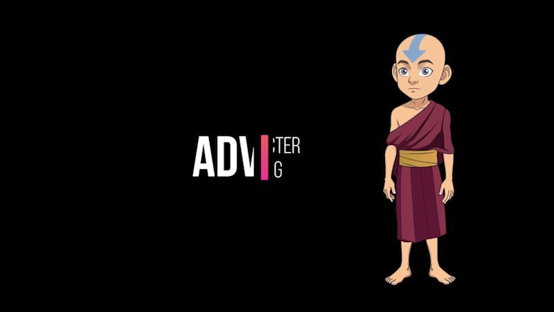
I’m excited to share a look into my latest character project built in Rive. Unlike static illustrations, these vector assets are designed for the modern web—fully scalable, lightweight, and ready for real-time interaction.
6
20
1.3K
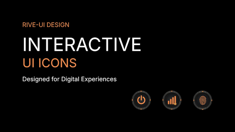
From Static Designs to Interactive UI Experiences ⚡
I’ve been working on a futuristic UI icon pack in Rive, exploring how clean vector shapes, consistent visual language, and subtle details can bring a digital interface to life.
The goal: create visually consistent icons that can fit naturally into modern dashboards, SaaS products, and technology interfaces.
I focus on:
Clean, scalable vector artwork
Consistent icon systems
Rive-ready assets for interactive experiences
Thoughtful details that support great UI design
Looking for custom vector icons or Rive-ready UI assets for your next product?
Let’s connect and build something great.
#Rive #VectorDesign #UIUX #IconDesign #FreelanceDesigner
3
270


modernlogos,branding,craftingbold,memorablevisuals,identity.
modernlogos,branding,craftingbold,memorablevisuals,identity.
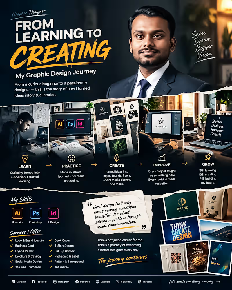
From Learning to Creating. My Graphic Design Journey 🎨
Every designer has a beginning.
Mine started with curiosity, uncertainty and a simple decision: I wanted to learn how to turn ideas into communication.
At the beginning I didn't know everything. I made mistakes struggled with typography, colors, layouts, software and countless small details that experienced designers make look easy.
I kept learning.
Step by step I improved my skills in Adobe Illustrator, Photoshop and InDesign. I started creating logos, branding materials, flyers, social media designs, packaging, thumbnails, posters and many other visual projects.
The biggest lesson I have learned is this:
Good design's n't only about making something beautiful. Good design is about solving a problem through communication.
Every project has taught me something. Every revision has made me better. Every difficult brief has pushed me to think creatively.
Today I’m still learning, still experimenting and still improving.
My journey isn't finished—. Thats what makes it exciting.
I’m building my career one design, one project and one client relationship at a time.
This is not a career, for me. This is a journey of becoming a designer every day.
If you're also building something from zero remember:
Start where you are. Learn what you don't know. Keep creating. Don't stop.
🚀 The journey continues.
#GraphicDesigner #GraphicDesign #DesignJourney #CreativeJourney #DesignerLife #AdobeIllustrator #AdobePhotoshop #AdobeInDesign #BrandIdentity #LogoDesign #FreelanceDesigner #CreativeDesigner #DesignPortfolio #VisualCommunication #Freelancing
0
60
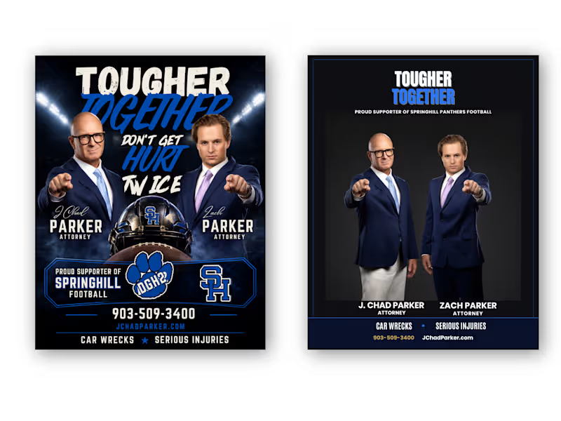
From Cluttered to Clear — Attorney Football Supporter Flyer Redesign
Client: “We have all the information we need, but the flyer doesn't communicate it clearly enough.”
My response:
“I’ll restructure the visual hierarchy, simplify the layout, strengthen the typography, and make the attorneys and contact information easier to recognize—while keeping the football-supporter identity.”
Result:
A cleaner Before → After transformation with stronger hierarchy, improved readability, better visual balance, and a more professional attorney-focused presentation.
Client Problem
The original flyer had strong content, but the overall design felt visually crowded and overly promotional. Too many elements competed for attention, making it difficult to immediately understand the attorneys, their names, services, contact information, and football sponsorship message.
BEFORE — Client's Problem:
The original concept contained all the necessary information, but the visual hierarchy was weak. Multiple headlines, images, football graphics, logos, and contact details competed for attention.
AFTER — My Solution:
I transformed the layout into a more structured and professional composition with a clear hierarchy, stronger typography, improved spacing, focused imagery, and easier-to-find contact information.
Final Result
The goal wasn't simply to make the flyer look different. The goal was to make the information easier to understand, strengthen the professional presentation, and preserve the client's football-supporter identity.
I redesigned this attorney promotional flyer by solving a common communication problem: too much information competing for attention.
The original design had strong imagery and messaging, but the hierarchy was crowded. I reorganized the content, strengthened typography, improved spacing, created a clearer information structure, and balanced the football-supporter theme with a professional legal identity.
The result: a cleaner, more focused flyer that communicates the message faster while keeping the original brand personality.
Tools: Adobe Photoshop, Adobe Illustrator
Service: Flyer Design • Graphic Design • Print Design • Layout Design • Advertising Design
Focus: Visual Hierarchy • Typography • Information Architecture • Branding • Readability
Hashtags
#GraphicDesign #FlyerDesign #FlyerRedesign #BeforeAndAfter #DesignCaseStudy #AdobeIllustrator #AdobePhotoshop #PrintDesign #AdvertisingDesign #Typography #VisualHierarchy #Branding #CreativeDesigner #AttorneyMarketing #ProfessionalDesign
0
43