Freelance Logo Designers in Sunamganj
Freelance Logo Designers in Sunamganj
Sign Up
Post a job
Sign Up
Log In
Filters
2
Projects
People
Mahdia Ahmed
Sunamganj, Bangladesh
Social media designer
12
Followers
Follow
Message
Social media designer
1
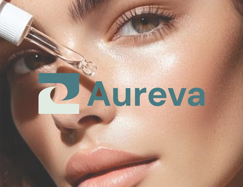
Brand style guide for skincare brand
1
2
7
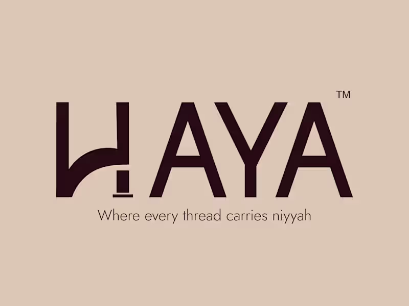
What do you think guyzzzz!!! 🥹 Am here with a more refine and updated version, even though, it was my first logo branding for a fashion clothing brand. Lemme know your opinions. Btw, I landed on two directions I genuinely love for different reasons. And now I'm stuck. 😅 So I'm opening it up — which one says "The Haya" to you? Drop a 1 or 2 in the comments. If you're a brand looking for a designer, who treats every project like it's the only one that matters — let's talk. 🤍
6
7
150
3
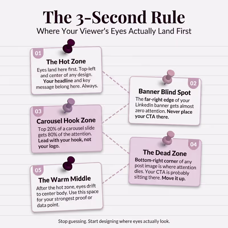
You spent 3 hours on that design. Your audience spent 3 seconds on it. And in those 3 seconds, their eyes never even landed on your CTA. Here is the uncomfortable 𝘁𝗿𝘂𝘁𝗵 most 𝗱𝗲𝘀𝗶𝗴𝗻𝗲𝗿𝘀 and 𝗰𝗿𝗲𝗮𝘁𝗼𝗿𝘀 ignore. You are designing based on what looks 𝗴𝗼𝗼𝗱 𝘁𝗼 𝘆𝗼𝘂. Not based on where 𝗲𝘆𝗲𝘀 actually go. Then, Lemme tell you something! 🙃 You place your headline in the center because it feels balanced. You drop your CTA in the bottom-right because that is where it fits. You fill the top of your carousel with a logo instead of a hook. Meanwhile, your viewer's brain already decided to scroll past. The hot zone on any design is the top-left and center. That is where eyes land first. Every single time. If your most important message is not sitting there, it is invisible. The bottom-right corner? That is the dead zone. Almost nobody looks there. And that is exactly where most people put their call to action. Here is the 3-second rule I follow for every design now. 1. Hot zone gets the 𝗵𝗲𝗮𝗱𝗹𝗶𝗻𝗲. Top-left and center. No exceptions. 2. 𝗛𝗼𝗼𝗸 first on carousels. The 𝘁𝗼𝗽 𝟮𝟬% of your slide gets 𝟴𝟬% of attention. 3. Move the 𝗖𝗧𝗔 𝘂𝗽. If it is in the bottom corner, it does not exist. 4. Banner 𝗯𝗹𝗶𝗻𝗱 𝘀𝗽𝗼𝘁 is real. The far-right edge of your LinkedIn banner gets almost zero eyes. 5. The warm middle earns the proof. After the hook lands, eyes drift to center body. Put your strongest point there. Stop designing for 𝗮𝗲𝘀𝘁𝗵𝗲𝘁𝗶𝗰𝘀. Start designing for 𝗮𝘁𝘁𝗲𝗻𝘁𝗶𝗼𝗻. Save this infographic. Send it to someone whose CTA is sitting in a dead zone right now.
2
3
90
1
🚀 Is your LinkedIn profile helping you attract clients—or making them scroll past? Your banner is often the first thing people notice when they visit your profile. In just a few seconds, it can communicate your expertise, build trust, and position you as the obvious choice in your industry. ✨ A strategic LinkedIn banner can help you: ✔ Strengthen your personal brand ✔ Build instant credibility ✔ Stand out from competitors ✔ Create a memorable first impression ✔ Attract ideal clients and opportunities Stop blending in with generic profiles. Start building a LinkedIn presence that works for you 24/7. 💬 Ready to transform your profile into a client-attracting asset? Let's connect. #LinkedInBranding #LinkedInBanner #PersonalBranding #LinkedInMarketing #BrandIdentity #DigitalBranding #LinkedInTips #ProfessionalBranding #FreelancerLife #BusinessGrowth #LeadGeneration #MarketingStrategy #Entrepreneurship #SocialMediaMarketing #ClientAttraction #PersonalBrand #BrandStrategy #LinkedInProfile #ContentMarketing #OnlinePresence
1
72
Logo Designer
(3)
Follow
Message
Explore people