

Exploring the future of AI-assisted frontend development 🚀
I created five different landing page concepts using Base44 to showcase how quickly ideas can be transformed into high-quality web experiences.
As a Full Stack Developer, I always look for tools that improve my workflow, speed up the creative process, and help turn concepts into production-ready ideas.
What impressed me about Base44 was its ability to generate unique website concepts with clean layouts, modern UI patterns, and strong attention to user experience.
These five HTML landing pages were designed from different client perspectives — considering common website challenges like outdated designs, poor structure, weak conversion flow, and lack of modern user experience.
While Base44 can be used for many different purposes, I found its design capabilities especially interesting. It helped me explore new approaches to frontend development and quickly visualize ideas before moving into implementation.
I’m sharing these concepts to showcase how AI tools can support developers in the design and prototyping phase.
Built with: @Base44 + Frontend Design Exploration
1
232


Novio is a premium EdTech frontend platform spanning more than 30 pages, independently designed and developed from the ground up by Syed Ahmer Shah. Built using HTML5, CSS3, JavaScript, Bootstrap, and LocalStorage, the platform provides a complete learning experience with features such as course discovery, advanced search and filtering, user authentication, checkout, enrollment, progress monitoring, personalized dashboards, and automated certificate generation. Its modular structure, responsive interface, lazy-loading techniques, SEO enhancements, and accessibility-focused implementation ensure a high-performance, scalable, and intuitive experience for learners.
1
65
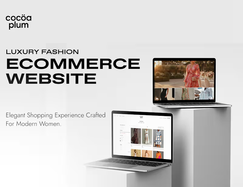
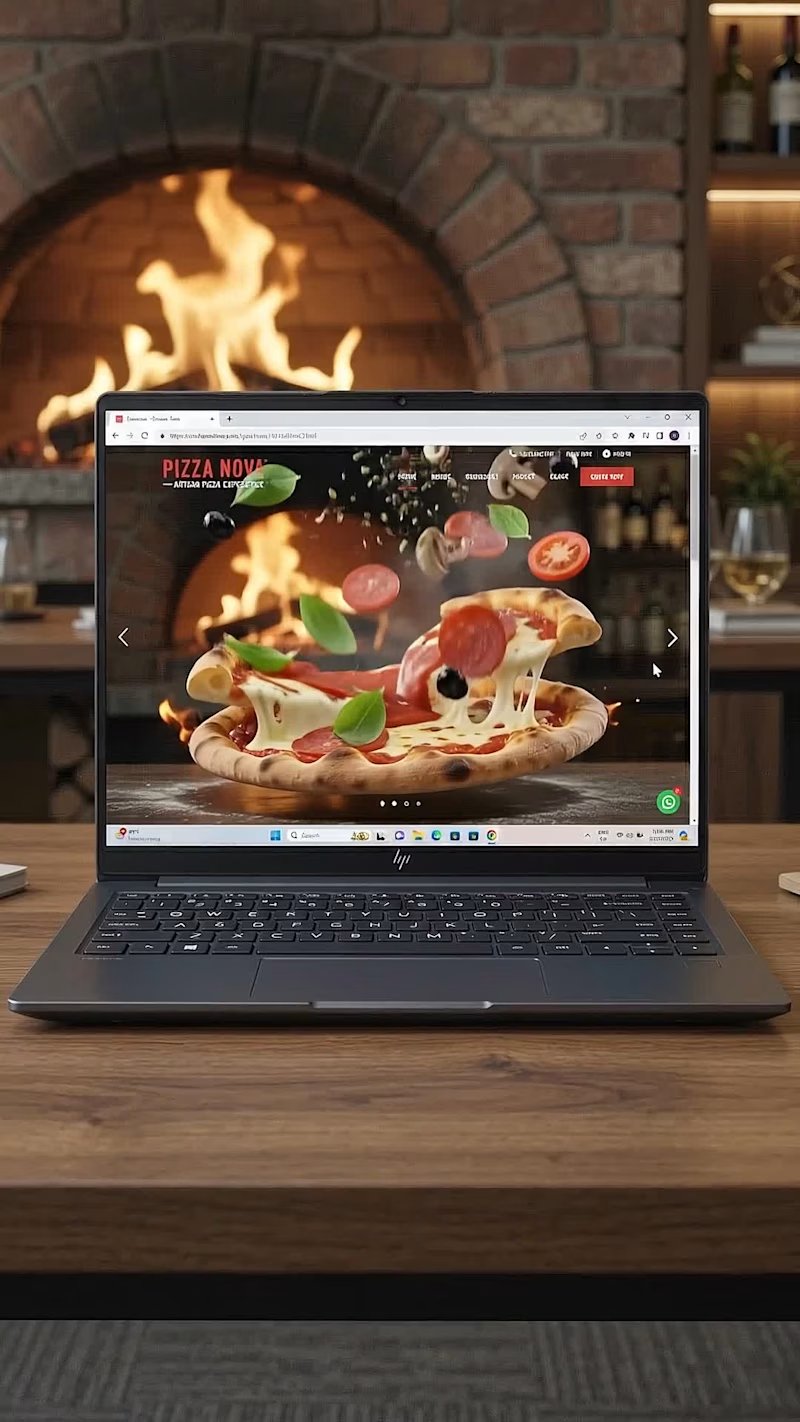
🚀 Creating immersive digital experiences that bring brands to life.
Designed & developed by Usman DevHub Tech & Creative Studio.
We craft:
✨ Premium Website Designs
✨ Smooth & Engaging Web Animations
✨ Interactive User Experiences
✨ Modern UI/UX Solutions
✨ Creative Digital Experiences for Growing Brands
Your website is more than just a page — it’s your digital identity. 🌐
Looking for a premium animated website that makes your business stand out?
📩 DM us and let’s discuss your next digital project.
#WebDevelopment #WebsiteDesign #WebAnimation #UIDesign #CreativeStudio #UsmanDevHub
12
10
1.2K
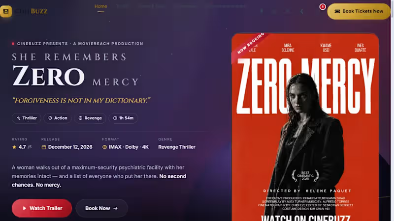


🛠️ 𝐂𝐮𝐫𝐫𝐞𝐧𝐭𝐥𝐲 𝐰𝐨𝐫𝐤𝐢𝐧𝐠 𝐨𝐧 𝐭𝐡𝐢𝐬 𝐨𝐧𝐞
Started with the visual direction for this work management experience, then took the design straight into Webflow to see how it actually behaves outside Figma.
The interesting part is making the pieces work together, the landing page, product sections, dashboard visuals, responsive layouts, and mobile views, while keeping the same visual language throughout.
Right now I’m refining the details that you don't really notice until they're wrong:
✨ spacing & typography
🖥️ responsive behavior
⚡ interactions & transitions
📱 mobile layouts
🧩 reusable Webflow components
Still building, still refining. 👨💻🎨
UI/UX • Web Design • Webflow • Product Design
2
2
156
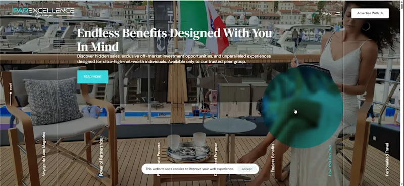
Developed the WordPress website for Par Excellence VIP, a luxury media platform covering yachting, private aviation, luxury real estate and high end lifestyle. The website brings together magazine content, luxury services, partner profiles, articles and advertising opportunities. I handled the WordPress development, page structure, content layouts, category sections, partner listings, magazine and article sections, along with the overall responsive experience.
0
85


Designed and built the digital experience for Jiggy Jerky, a premium protein snack brand, focusing on creating a bold, modern, and conversion-driven eCommerce interface.
The main goal was to improve product discovery and make the shopping experience more engaging through strong visual hierarchy, clean layout structure, and a simplified purchase flow. I focused on designing a user journey that highlights product appeal while keeping navigation fast and intuitive for users browsing different flavors and categories.
Special attention was given to optimizing the storefront experience for mobile users, ensuring smooth browsing, quick product access, and a frictionless checkout experience. The design balances brand identity with performance-driven UX to support better engagement and conversions.
UI/UX Design
eCommerce Web Design
Conversion Optimization
Product Page UX
Responsive Design
Tools & Technologies:
Shopify, Webflow, Figma, HTML, CSS, JavaScript
0
101
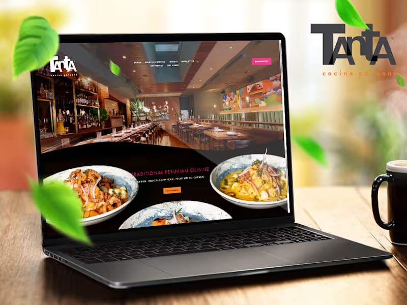
Tanta Chicago; https://www.tantachicago.com/ was built with a very different intention from a performance product site, but the same principle at its core: clarity, emotion, and a smooth path from curiosity to action.
Where KALA focused on precision and science, Tanta is about atmosphere, culture, and appetite. The website was designed to feel like an extension of the restaurant itself, warm, expressive, and inviting, while still staying clean enough that users never get lost.
The experience centers around one idea: when someone lands on the site, they should almost be able to “taste” what Tanta offers before they even book a table.
• A visually rich layout that highlights Peruvian cuisine, cocktails, and the restaurant’s energetic dining experience without feeling cluttered
• A storytelling-driven structure that blends food, culture, and hospitality, giving users a sense of place, not just a menu
• Clear pathways to action, making reservations and menu exploration feel effortless rather than forced
• Thoughtful use of imagery and spacing to let dishes and ambiance breathe, instead of overwhelming the user with too much at once
• A mobile first experience designed for real restaurant behavior, quick browsing, fast decisions, and easy booking on the go
• A design tone that reflects Tanta’s identity: vibrant, social, and rooted in authentic Peruvian dining culture
Overall, the goal was to translate the energy of a busy, high quality restaurant into a digital experience that feels alive but controlled, inviting users in, building appetite, and making the decision to visit feel natural rather than transactional.
If KALA is about performance and precision, then Tanta is about emotion and experience, both designed with the same discipline, just expressed differently.
1
277
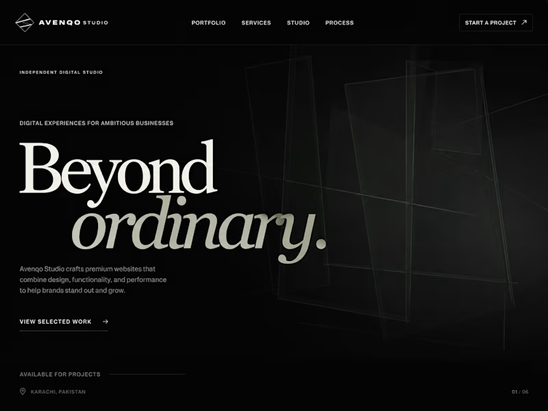

Built a Full Responsive Website Frontend featuring interactive React components for Internee.pk (http://Internee.pk).
Designed an adaptable layout with smooth transitions, responsive navigation, client-side validation, and dynamic content sliders.
Focused on cross-device layout consistency, component-based interactivity, and UI/UX performance.
2
87
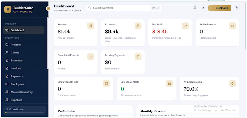
BuilderSuite Contractor OS is a business management dashboard concept designed for contractors and construction businesses that need a clearer view of their projects, finances, and day-to-day operations.
The goal is to bring essential business information into one organized interface, helping business owners monitor activity and manage routine workflows more easily.
Key Features
Executive Dashboard: A central view of revenue, expenses, profit, project activity, and pending payments.
Project Management: Organize project records and monitor progress.
Client Management: Keep client information accessible within the workspace.
Estimates & Invoicing: Structure estimates, invoices, and payment tracking.
Material Inventory: Monitor stock levels and identify potential shortages.
Operations Overview: Bring employee, supplier, and business activity into one interface.
Business Insights: Present financial trends and operational indicators through charts and summary cards.
Design Approach
The interface uses a clean dashboard layout, clear navigation, structured data cards, and a navy-and-gold visual identity to make complex business information easier to scan.
The concept focuses on usability, information hierarchy, and a consistent experience across desktop and mobile layouts.
My Focus
The project demonstrates my approach to business dashboard design, operational workflow organization, and practical internal tools for small businesses.
Interested in a similar solution? Send me a message about your current workflow and the business processes you want to organize.
Project note: This is a dashboard concept/demo. Features shown in the visuals should be treated as implemented only where they are available and working in the actual demo.
0
23