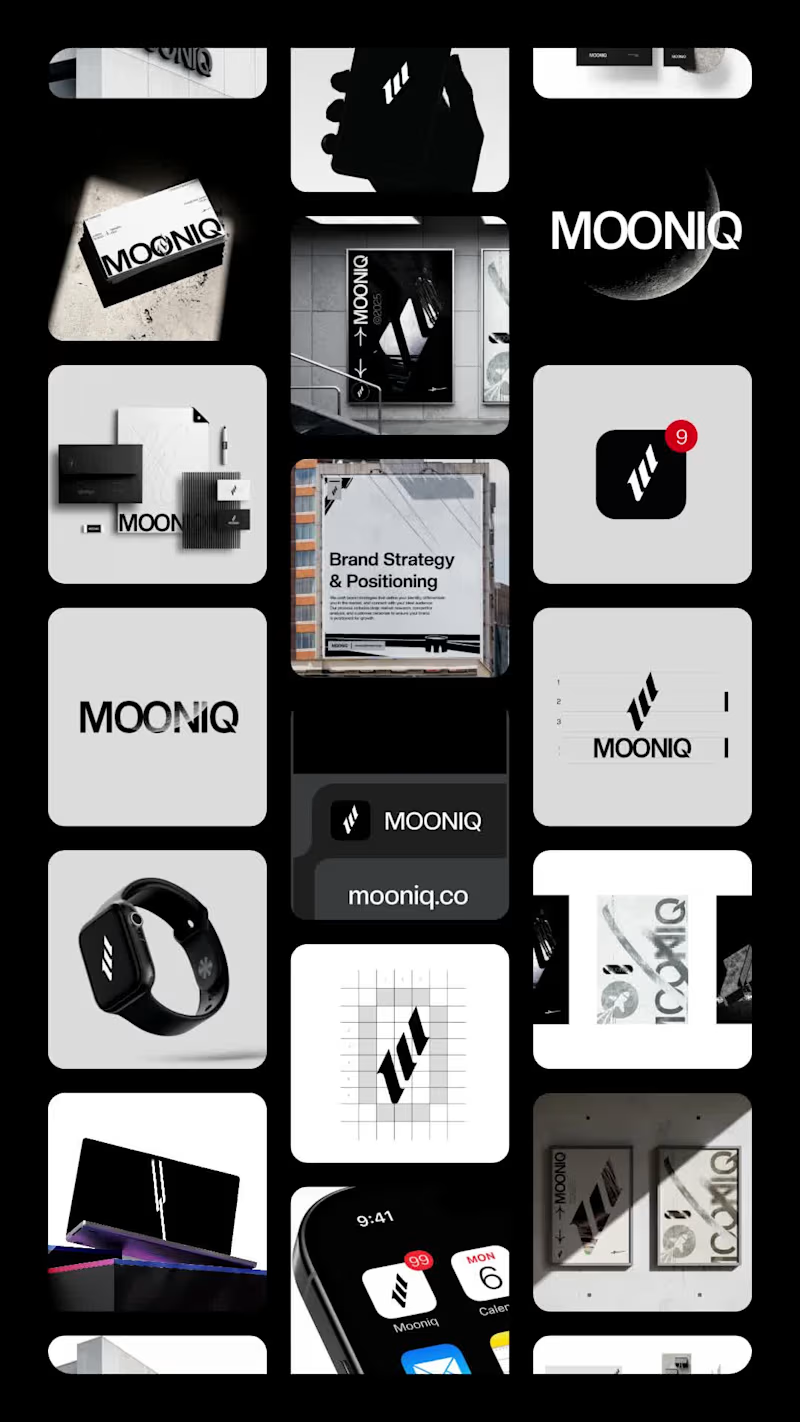
Projects using Adobe Illustrator in Santo Domingo ProvinceProjects using Adobe Illustrator in Santo Domingo ProvinceMOONIQ — Visual Identity System
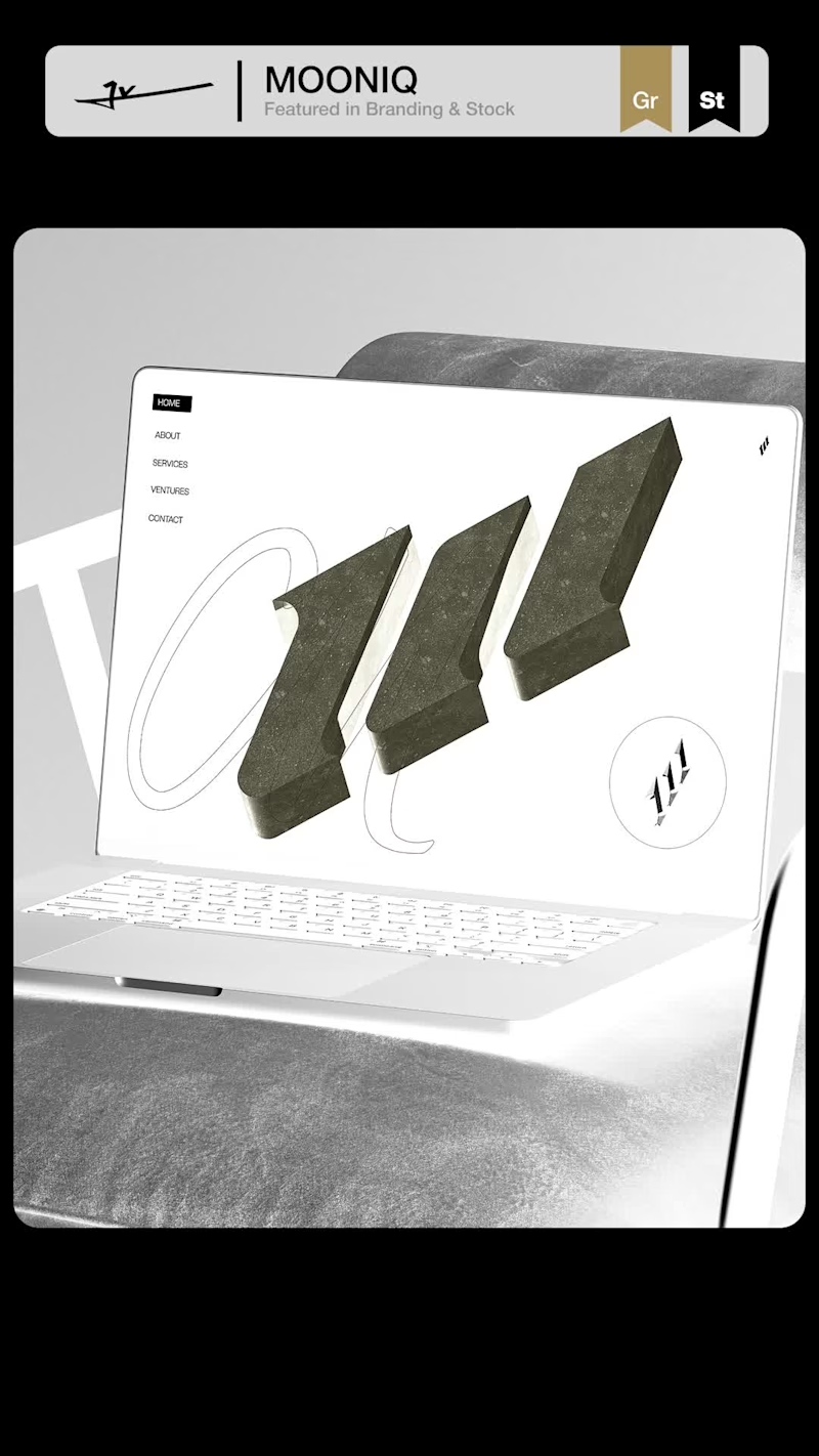
Mooniq is a leading digital marketing agency specialized in social media, blockchain, and Web2 consulting. Its new identity reflects a bold and futuristic vision, inspired by exploration and constant innovation. A system built to express ambition, trust, and elegance, positioning Mooniq as a guide for brands reaching new heights.
The brand required an identity that could embody its innovative spirit, strategic mindset, and futuristic vision.
This visual identity was designed to capture Mooniq’s essence: a forward-thinking agency inspired by the concepts of exploration, technology, and limitless growth. Every element of the system —from the logo to the typographic and chromatic choices— was created to establish a sophisticated and aspirational brand presence.
2025© - Jv® Studio. — Enmanuel Jimenez V. All rights reserved.
Featured project in Graphic Design / Branding & Stock by Behance
You can view the entire project here: Contra (https://contra.com/p/APbrvZOR-mooniq-visual-identity-system?r=enmanueljv) MARKS & FORMS — 2026
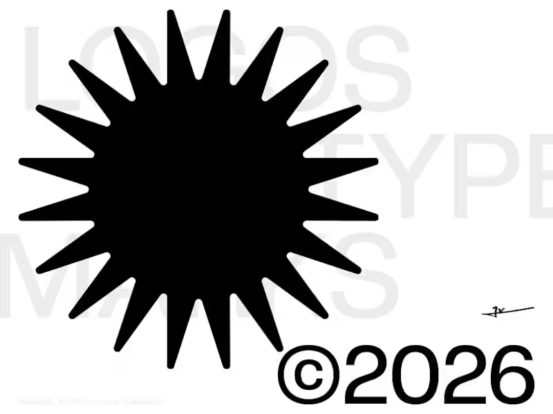
A curated collection of logos and marks exploring identity through form, concept, and visual precision.
MARKS & FORMS returns with its 2026 edition, continuing an ongoing exploration of logo design, visual identity, and the many ways a simple mark can communicate an idea.
This volume brings together a new selection of logos developed throughout the year, ranging from commissioned identities to independent explorations. Each mark represents a different approach to form, typography, symbolism, and reduction, while sharing a common pursuit: creating identities that are distinctive, intentional, and built to last.
Rather than following a single visual style, MARKS & FORMS celebrates the diversity of logo design. Monograms, custom lettering, abstract symbols, geometric constructions, and expressive marks coexist within the same collection, revealing how different visual languages can emerge from the same fundamental discipline.
Every logo begins with an idea. Through refinement, proportion, balance, and thoughtful reduction, that idea becomes a recognizable form. The process is not about adding more, but about discovering what is essential and giving it enough strength to stand on its own.
The 2026 edition reflects another chapter in that process — a growing archive of marks shaped by different challenges, industries, concepts, and creative directions. Together, they document an evolving approach to identity design and a continued commitment to creating work with clarity, character, and purpose.
MARKS & FORMS is an ongoing study of the relationship between form and meaning. Each edition captures a moment in that journey, preserving selected marks not simply as finished logos, but as records of experimentation, refinement, and creative growth.
Now live on Behance
(https://www.behance.net/gallery/254382515/MARKS-FORMS-2026)
2026© - Enmanuel Jimenez V. — Jv® Studio. All rights reserved. No.ex — Next Operational Experience
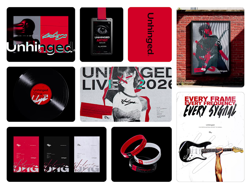
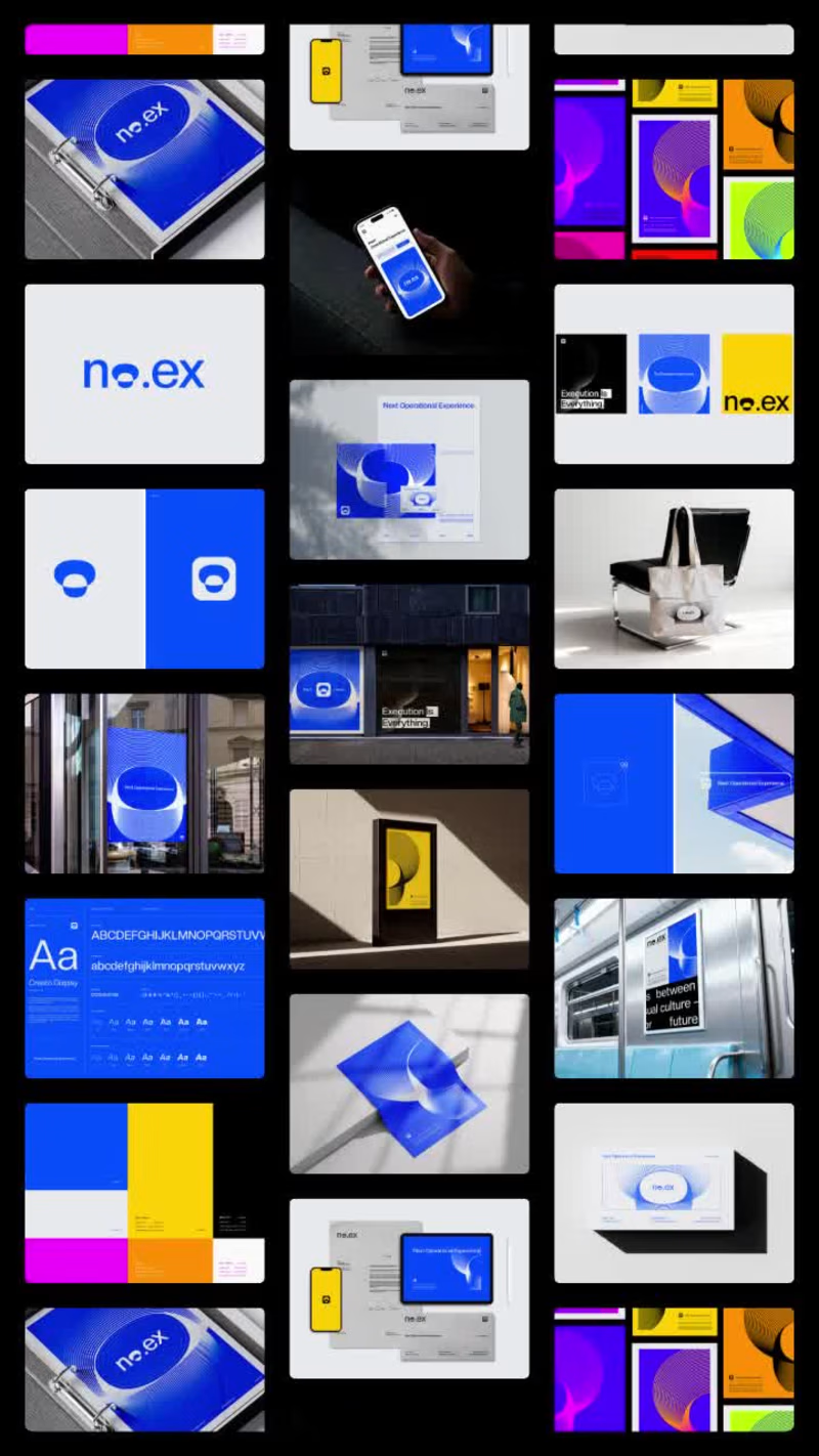
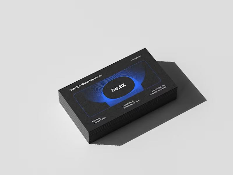
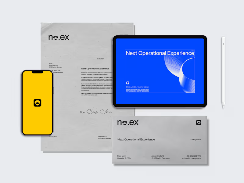
No.ex is a conceptual visual identity exploring how modern systems behave, evolve, and communicate through design.
Positioned between digital experimentation and physical presence, No.ex combines editorial structure, immersive visual direction, and future-oriented aesthetics to create a dynamic and adaptive identity language.
The project investigates movement, signal, structure, and interaction through posters, large-scale applications, environmental graphics, and visual systems designed for both digital and real-world spaces.
Rather than functioning as a traditional brand, No.ex exists as a visual framework — one that reflects contemporary culture, technological progression, and the constant evolution of modern communication.
2026© AMNE Studio.
Enmanuel Jimenez V.
Jv® Studio. —
All rights reserved. MOONIQ — Visual Identity System
Mooniq is a leading digital marketing agency specialized in social media, blockchain, and Web2 consulting. Its new identity reflects a bold and futuristic vision, inspired by exploration and constant innovation. A system built to express ambition, trust, and elegance, positioning Mooniq as a guide for brands reaching new heights.
The brand required an identity that could embody its innovative spirit, strategic mindset, and futuristic vision.
This visual identity was designed to capture Mooniq’s essence: a forward-thinking agency inspired by the concepts of exploration, technology, and limitless growth. Every element of the system —from the logo to the typographic and chromatic choices— was created to establish a sophisticated and aspirational brand presence.
2025© - Jv® Studio. — Enmanuel Jimenez V. All rights reserved.
Featured project in Graphic Design / Branding by @behance (https://www.instagram.com/behance/) Most people notice the logo.
Few notice the grid behind it.
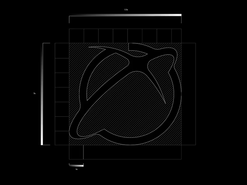
A strong branding project is not built on aesthetics alone. Behind every balanced logo, every editorial layout, and every consistent visual system, there is structure.
Grid systems create alignment, rhythm, hierarchy, and scalability. They allow brands to grow without losing clarity, ensuring that every application — from digital platforms to printed materials — feels connected and intentional.
Without a system, design becomes decoration.
With a system, design becomes communication.
The difference between a logo and a brand often lies in the invisible decisions that hold everything together.
If you're building a new brand or looking to elevate an existing one, I help businesses create strategic visual identities designed for consistency, recognition, and long-term growth.
Available for Brand Identity Design, Logo Design, and Creative Direction.
Let's build something meaningful. LOGOS & MARKS — ARCHIVED.O1
An ongoing archive of symbols & wordmarks.
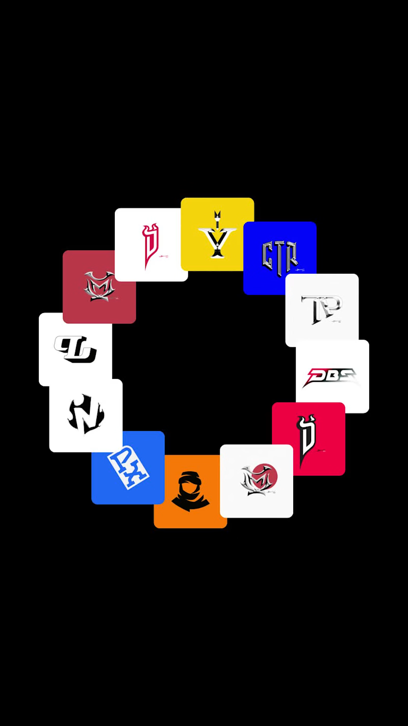
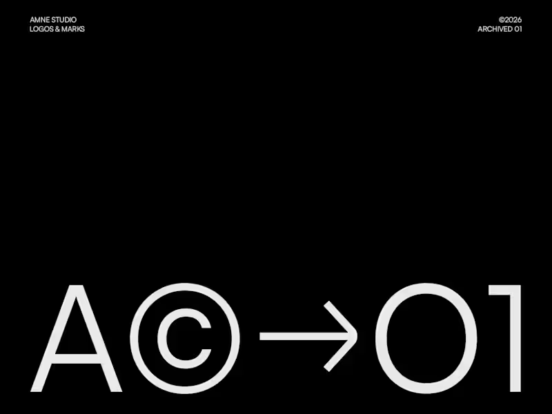
LOGOS & MARKS — A.O1 is the first archived collection from AMNE Studio, featuring a curated selection of logo designs, symbols, and visual identity explorations developed for clients, concepts, and independent creative initiatives.
Rather than presenting individual case studies, this collection serves as a visual archive that highlights the diversity of industries, challenges, and creative directions explored through the identity design process. Each mark represents a unique approach to communication, balancing strategic thinking with simplicity, recognition, and long-term usability.
From minimalist symbols and monograms to expressive wordmarks and contemporary brand signatures, the collection showcases a broad spectrum of visual solutions while maintaining a consistent focus on clarity, structure, and memorable design.
LOGOS & MARKS — A.O1 celebrates the ongoing practice of identity design, documenting a selection of work that reflects the evolution of AMNE Studio's visual language and commitment to creating distinctive, purposeful brands.
✦ Logos created between 2025 — 26
✦ Editorial layout crafted in Adobe InDesign
✦ Designed & curated by AMNE Studio
✦ A© →O1
2026© AMNE Studio.
Enmanuel Jimenez V.
Jv® Studio. —
All rights reserved. AMNE Studio — Visual Identity System
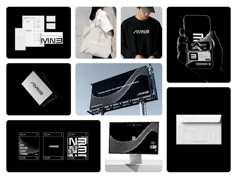
AMNE is a contemporary design studio built around precision, clarity, and intentional minimalism. The identity explores a geometric and modular approach, where each character is constructed with strict visual logic while maintaining a strong and distinctive presence.
The logotype is designed to function as both a wordmark and a flexible visual system. Its structure allows fragmentation, scaling, and adaptation across multiple formats without losing recognition — from full compositions to compact applications such as icons and digital interfaces.
A restrained color palette reinforces the brand’s positioning: deep black as a foundation for contrast and authority, supported by neutral greys and soft tones to create balance and versatility across light and dark environments.
The overall direction aims to communicate a sense of control, modernity, and quiet confidence — where every detail is intentional, and nothing is decorative without purpose.
AMNE is not just a visual identity, but a system designed to evolve.
Case Study — Contra (https://contra.com/p/6QO3N3M2-amne-studio-brand-identity?referralExperimentNid=DEFAULT_REFERRAL_PROGRAM&referrerUsername=enmanueljv)
I am looking for new job opportunities.
Interested in working together — DM.
2026© AMNE Studio. Enmanuel Jimenez V. Jv® Studio. —
All rights reserved.