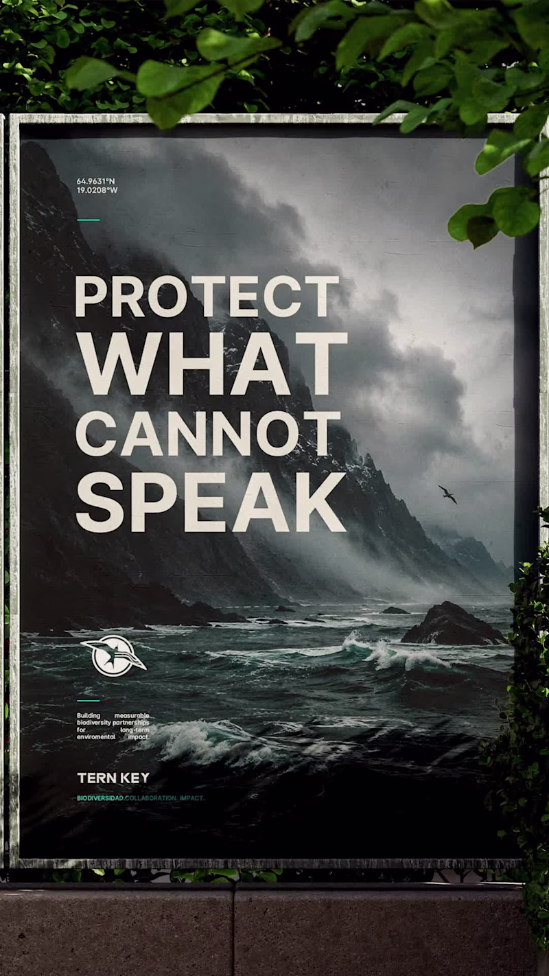
Graphic Design Projects in Santo Domingo ProvinceGraphic Design Projects in Santo Domingo ProvinceLOGOS & MARKS — ARCHIVED.O1
An ongoing archive of symbols & wordmarks.
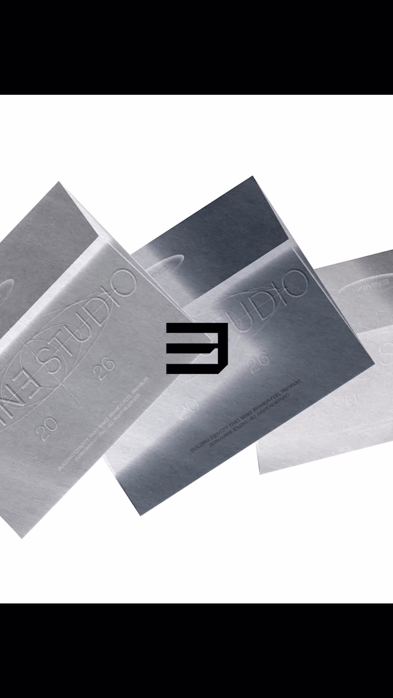
LOGOS & MARKS — A.O1 is the first archived collection from AMNE Studio, featuring a curated selection of logo designs, symbols, and visual identity explorations developed for clients, concepts, and independent creative initiatives.
Rather than presenting individual case studies, this collection serves as a visual archive that highlights the diversity of industries, challenges, and creative directions explored through the identity design process. Each mark represents a unique approach to communication, balancing strategic thinking with simplicity, recognition, and long-term usability.
From minimalist symbols and monograms to expressive wordmarks and contemporary brand signatures, the collection showcases a broad spectrum of visual solutions while maintaining a consistent focus on clarity, structure, and memorable design.
LOGOS & MARKS — A.O1 celebrates the ongoing practice of identity design, documenting a selection of work that reflects the evolution of AMNE Studio's visual language and commitment to creating distinctive, purposeful brands.
✦ Logos created between 2025 — 26
✦ Editorial layout crafted in Adobe InDesign
✦ Designed & curated by AMNE Studio
✦ A© →O1
2026© AMNE Studio.
Enmanuel Jimenez V.
Jv® Studio. —
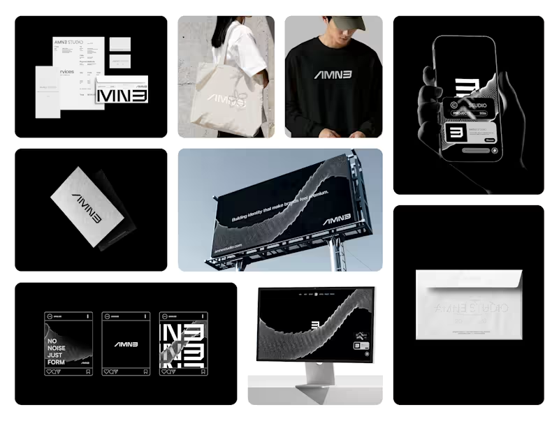
All rights reserved. AMNE Studio — Visual Identity System
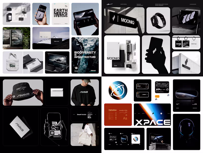
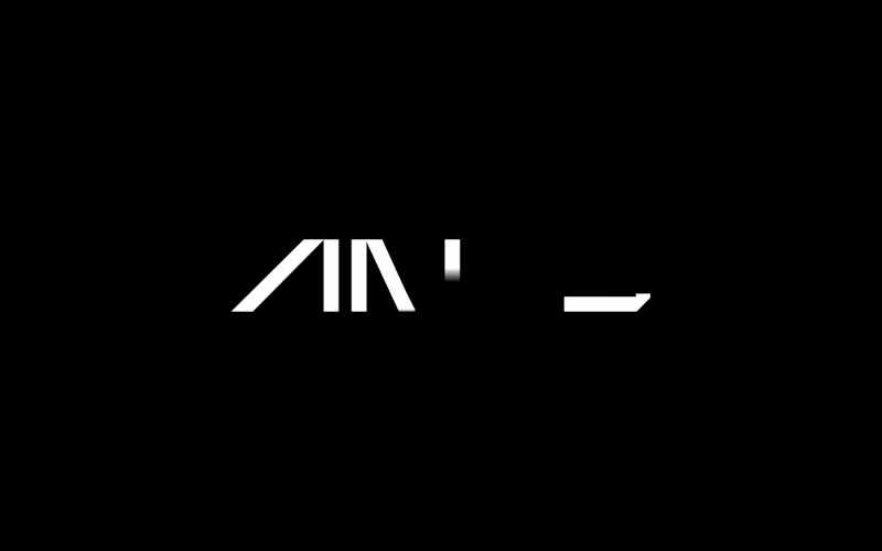
AMNE is a contemporary design studio built around precision, clarity, and intentional minimalism. The identity explores a geometric and modular approach, where each character is constructed with strict visual logic while maintaining a strong and distinctive presence.
The logotype is designed to function as both a wordmark and a flexible visual system. Its structure allows fragmentation, scaling, and adaptation across multiple formats without losing recognition — from full compositions to compact applications such as icons and digital interfaces.
A restrained color palette reinforces the brand’s positioning: deep black as a foundation for contrast and authority, supported by neutral greys and soft tones to create balance and versatility across light and dark environments.
The overall direction aims to communicate a sense of control, modernity, and quiet confidence — where every detail is intentional, and nothing is decorative without purpose.
AMNE is not just a visual identity, but a system designed to evolve.
Case Study — Contra (https://contra.com/p/6QO3N3M2-amne-studio-brand-identity?referralExperimentNid=DEFAULT_REFERRAL_PROGRAM&referrerUsername=enmanueljv)
I am looking for new job opportunities.
Interested in working together — DM.
2026© AMNE Studio. Enmanuel Jimenez V. Jv® Studio. —
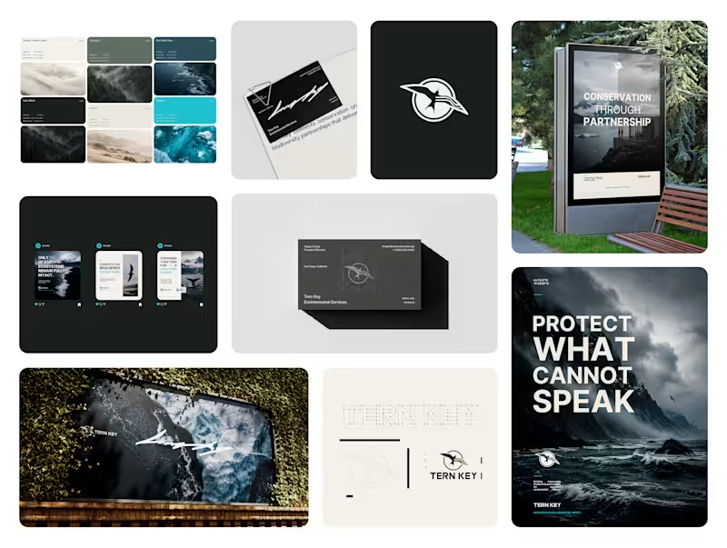
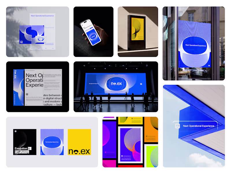
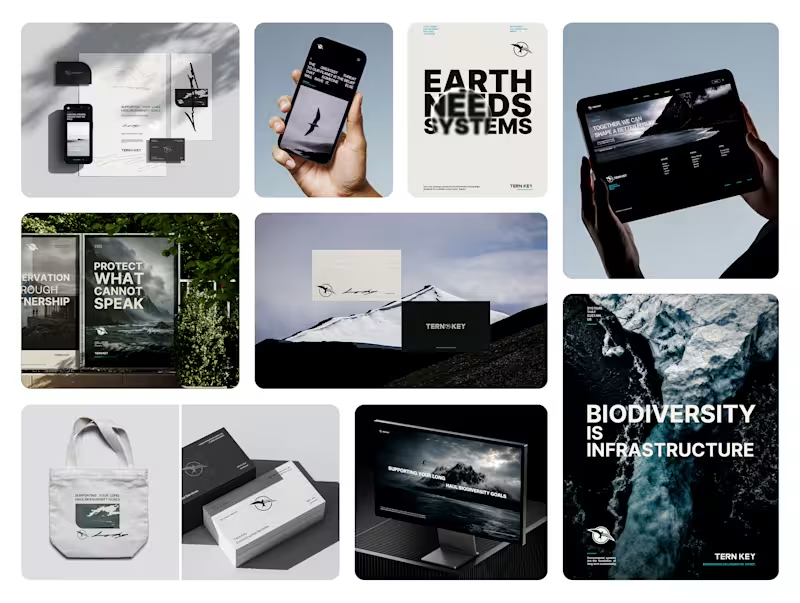
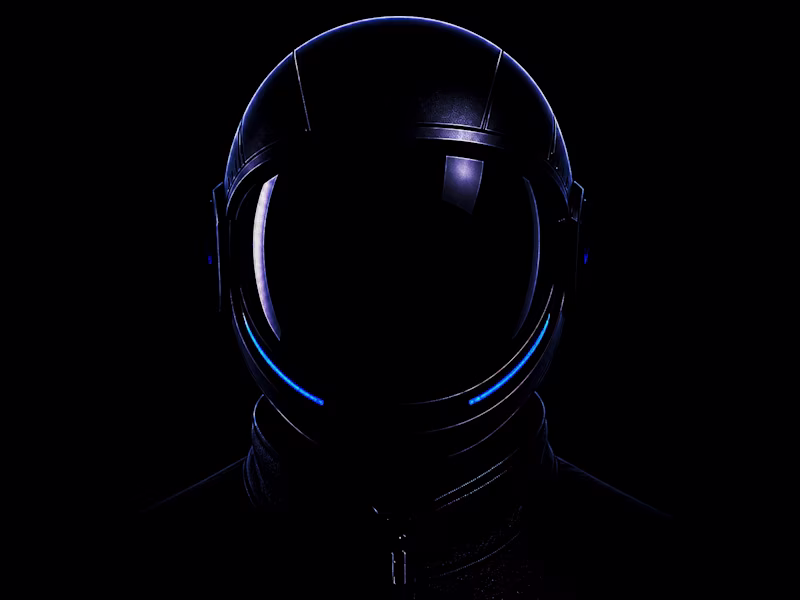
All rights reserved. No.ex — Next Operational Experience
No.ex is a conceptual visual identity exploring how modern systems behave, evolve, and communicate through design.
Positioned between digital experimentation and physical presence, No.ex combines editorial structure, immersive visual direction, and future-oriented aesthetics to create a dynamic and adaptive identity language.
The project investigates movement, signal, structure, and interaction through posters, large-scale applications, environmental graphics, and visual systems designed for both digital and real-world spaces.
Rather than functioning as a traditional brand, No.ex exists as a visual framework — one that reflects contemporary culture, technological progression, and the constant evolution of modern communication.
2026© AMNE Studio.
(https://www.instagram.com/amne.std/)Enmanuel Jimenez V.
(https://www.instagram.com/enma.jv/)Jv® Studio. (https://www.instagram.com/jv.std_/) —
All rights reserved. AMNE Studio — Visual Identity System
AMNE is a contemporary design studio built around precision, clarity, and intentional minimalism. The identity explores a geometric and modular approach, where each character is constructed with strict visual logic while maintaining a strong and distinctive presence.
The logotype is designed to function as both a wordmark and a flexible visual system. Its structure allows fragmentation, scaling, and adaptation across multiple formats without losing recognition — from full compositions to compact applications such as icons and digital interfaces.
A restrained color palette reinforces the brand’s positioning: deep black as a foundation for contrast and authority, supported by neutral greys and soft tones to create balance and versatility across light and dark environments.
The overall direction aims to communicate a sense of control, modernity, and quiet confidence — where every detail is intentional, and nothing is decorative without purpose.
AMNE is not just a visual identity, but a system designed to evolve.
2026© AMNE Studio.
Enmanuel Jimenez V.
Jv® Studio. —
All rights reserved. TYPE & MARKS — BEST OF 25
Form in its purest typographic state.
Is a typographic-focused project showcasing the strongest type-driven identities developed throughout 2025.
This collection is built entirely around letterforms — no symbols, no supporting graphic elements — only structured, intentional typographic marks designed to function as complete visual identities.
Each piece is developed with careful attention to spacing, proportion, weight, and rhythm. The goal is to push typography beyond simple readability and transform it into a distinctive and self-sufficient form. Every decision from kerning adjustments to structural refinements — is intentional, ensuring that the typography itself carries the full visual impact.
Rather than relying on icons or external elements, this project explores how form alone can define personality, tone, and brand presence. Some compositions are minimal and restrained, while others are bold and expressive, yet all remain grounded in precision and balance.
TYPE & MARKS — BEST OF 25 represents a focused study of structure, clarity, and typographic control.
A curated reflection of the most refined typographic explorations of the year — where letters are not just read, but experienced as identity.
✦ Logos created between 2025
✦ Editorial layout crafted in Adobe InDesign
✦ Designed & curated by EnmaJv
✦ Special Best of 25 Edition
2025© - Jv® Studio. — Enmanuel Jimenez V. All rights reserved.
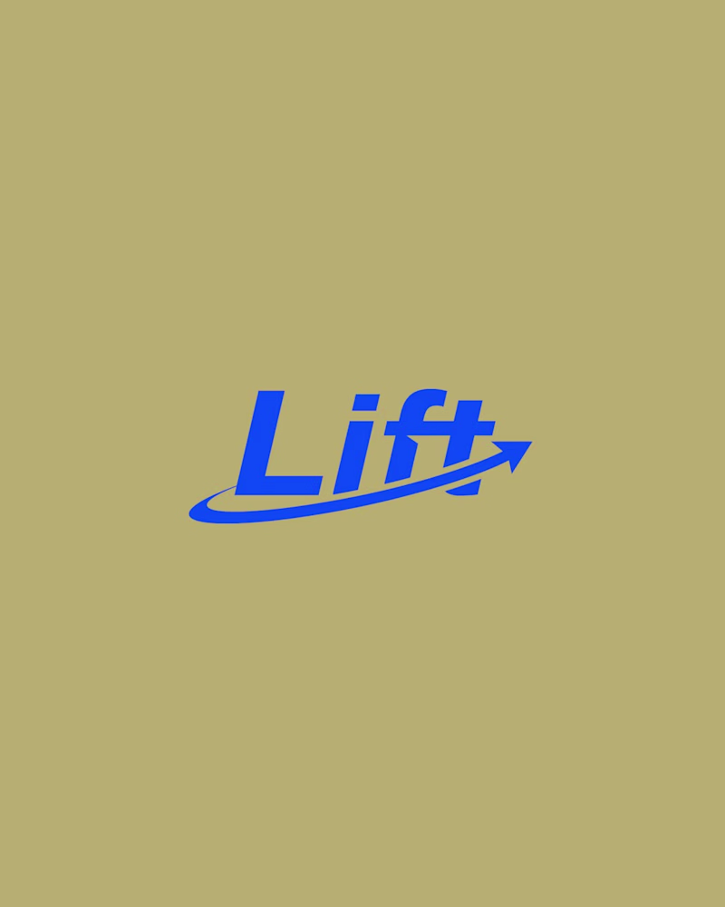
Featured project in Graphic Design - Logo by @behance (https://www.instagram.com/behance/)