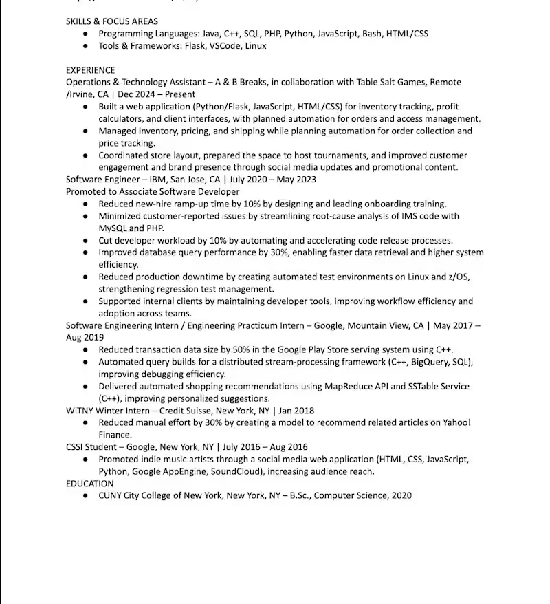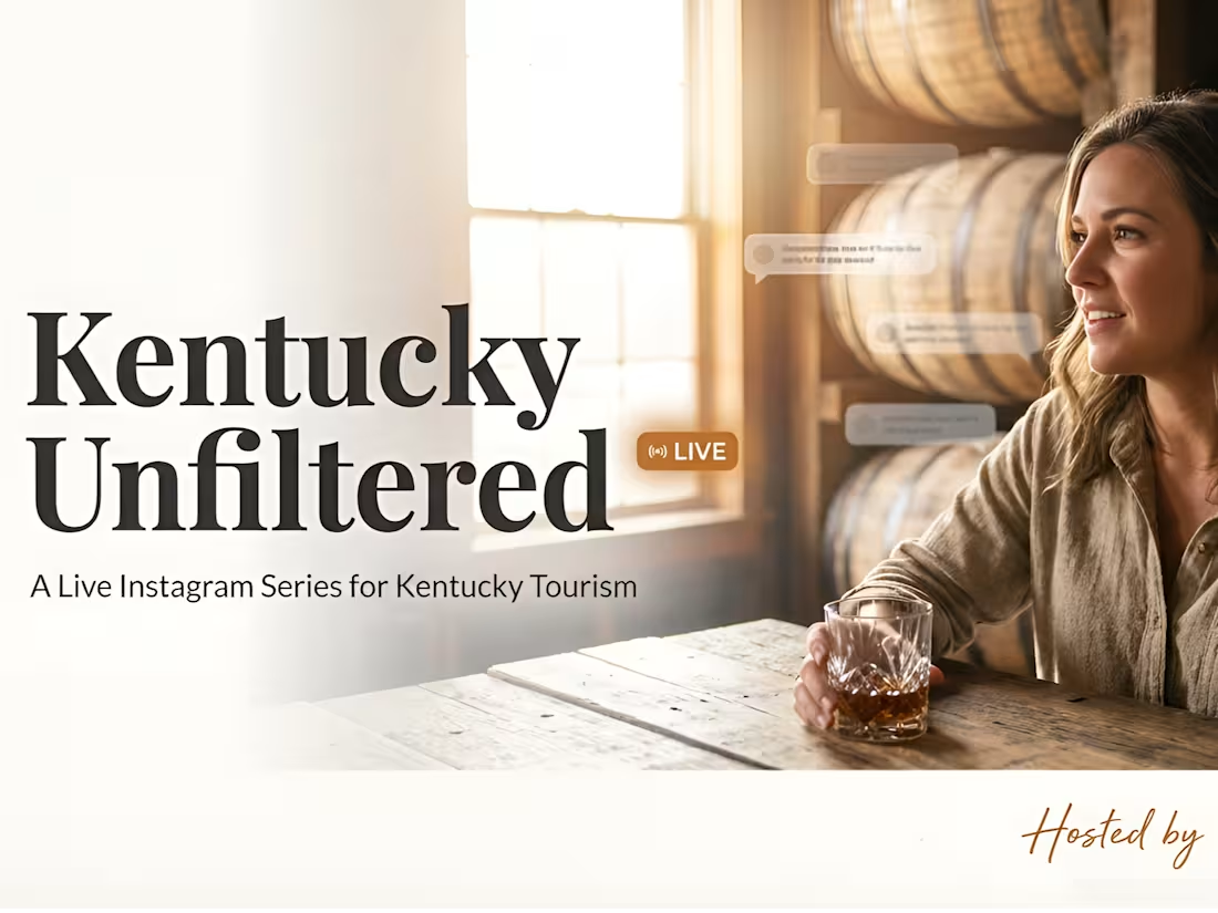
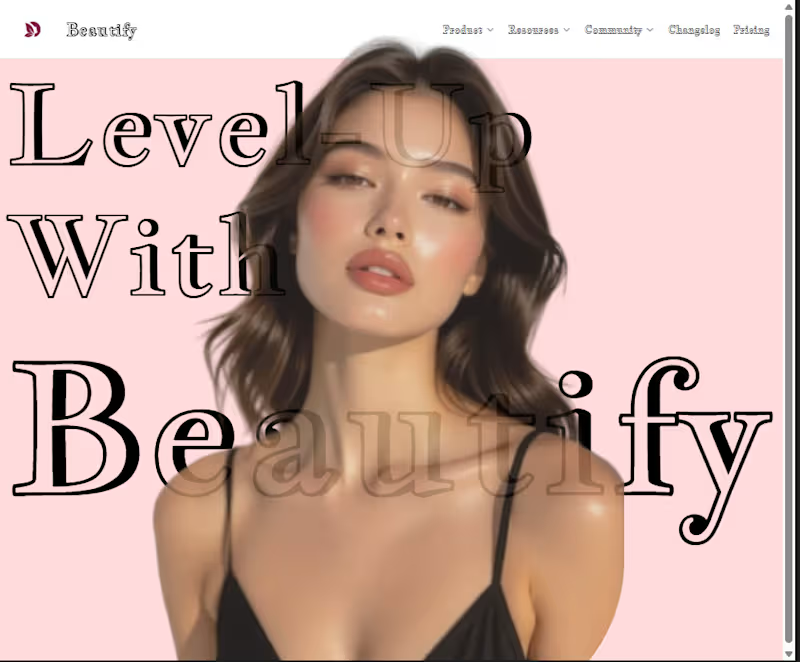

Luxury Social Media Design & Premium Brand Content
A premium social media design project created for a luxury brand seeking a sophisticated, elegant, and visually consistent online presence. The creative direction combines modern graphic design, luxury branding, refined typography, high-quality imagery, and strategic visual layouts to create engaging social media content.
The designs were developed to strengthen brand identity across digital platforms while maintaining a polished and cohesive visual style. Each social media graphic was carefully designed for readability, visual impact, and brand consistency across Instagram and other social media channels.
The project includes elegant social media posts, promotional graphics, branded content, campaign creatives, and visually engaging layouts designed to capture attention and communicate the brand message effectively.
Services
• Luxury Social Media Design
• Social Media Graphic Design
• Instagram Post Design
• Instagram Content Design
• Social Media Branding
• Luxury Brand Design
• Branded Social Media Templates
• Promotional Social Media Graphics
• Social Media Campaign Design
• Digital Content Design
• Creative Graphic Design
• Visual Content Creation
• Typography and Layout Design
• Brand Consistency
• Social Media Marketing Creatives
Project Focus
Luxury branding, premium visual identity, sophisticated social media graphics, Instagram content, elegant typography, modern layouts, promotional creatives, branded templates, engaging digital content, and consistent visual communication.
#SocialMediaDesign #LuxurySocialMediaDesign #SocialMediaGraphics #SocialMediaDesigner #InstagramDesign #InstagramPostDesign #InstagramContent #SocialMediaBranding #LuxuryBranding #LuxuryBrandDesign #GraphicDesign #DigitalDesign #ContentDesign #BrandIdentity #VisualBranding #DigitalBranding #SocialMediaContent #SocialMediaMarketing #CreativeDesign #PremiumBranding #InstagramBranding #BrandedContent #SocialMediaTemplates #ModernGraphicDesign #LuxuryDesign
0
99
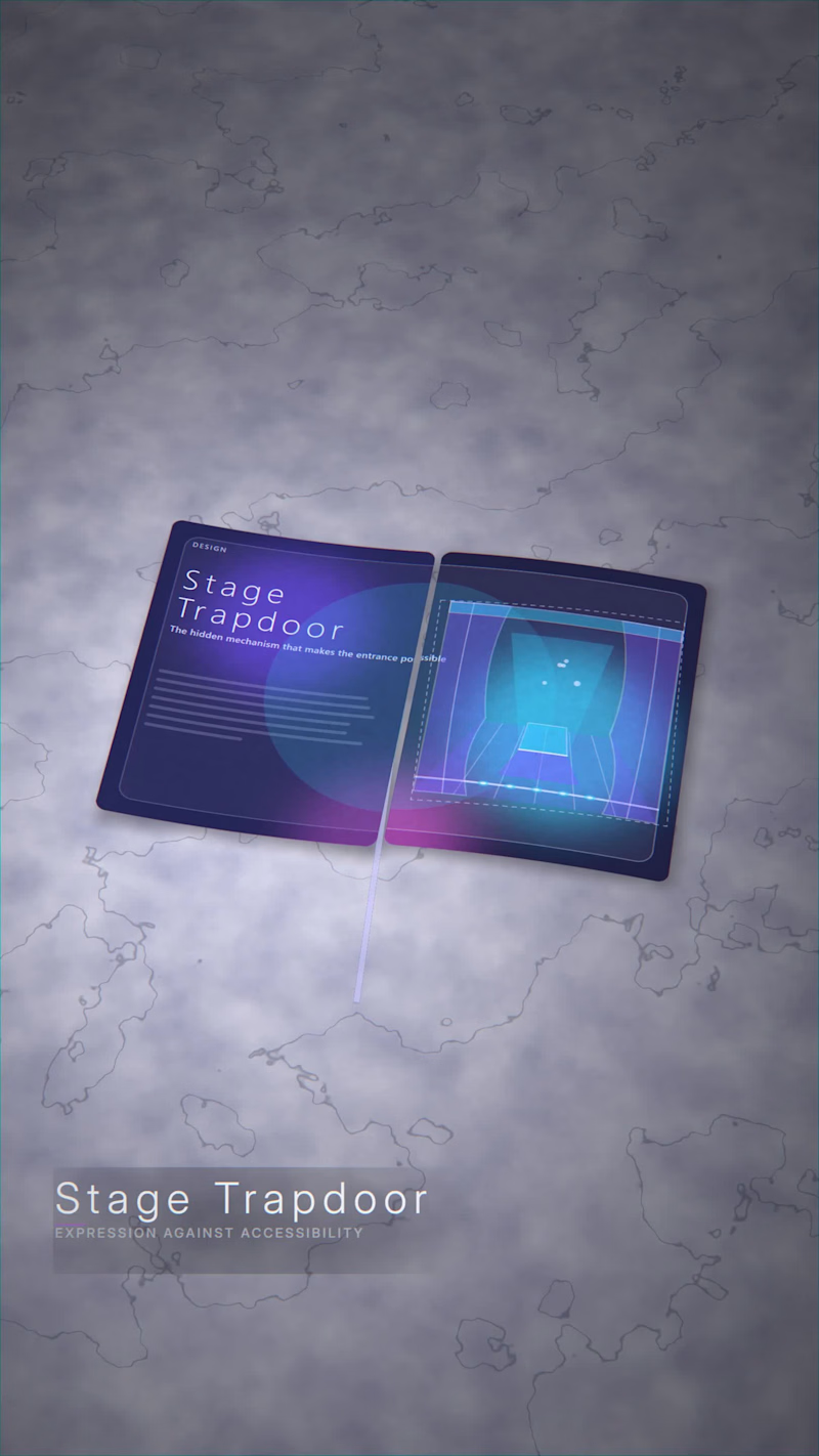
Locked in for 6 hours straight cooking up Stage Trapdoor—an exploration of Where Aluminium Meets Ink and the power of pure tunnel vision, warping out the noise to hyper-focus on one craft at a time.
Built different from the ground up using Blender, Canvas, FontTools, and FFmpeg (pushing 4GB+ of raw pipeline data) to bend static editorial layouts and schematics in real time.
1
178
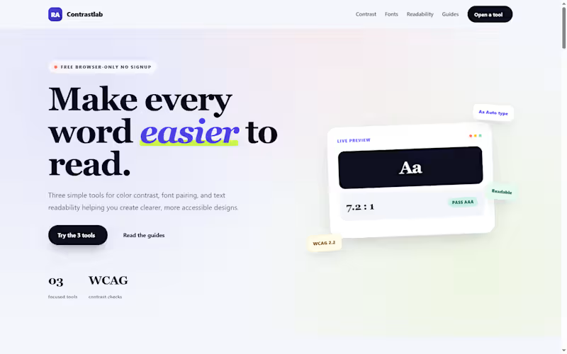
𝐂𝐨𝐧𝐭𝐫𝐚𝐬𝐭𝐋𝐚𝐛 — 𝐅𝐫𝐞𝐞 𝐀𝐜𝐜𝐞𝐬𝐬𝐢𝐛𝐢𝐥𝐢𝐭𝐲 𝐓𝐨𝐨𝐥𝐬 𝐖𝐞𝐛𝐬𝐢𝐭𝐞
𝐏𝐫𝐨𝐣𝐞𝐜𝐭 𝐎𝐯𝐞𝐫𝐯𝐢𝐞𝐰
ContrastLab (https://contrastlab.blogspot.com/) is a free, browser-based toolkit I built on Blogger to help designers, developers, bloggers, and content creators check the three most common readability problems: 𝐜𝐨𝐥𝐨𝐫 𝐜𝐨𝐧𝐭𝐫𝐚𝐬𝐭, 𝐟𝐨𝐧𝐭 𝐩𝐚𝐢𝐫𝐢𝐧𝐠, and 𝐭𝐞𝐱𝐭 𝐝𝐢𝐟𝐟𝐢𝐜𝐮𝐥𝐭𝐲. The site hosts three interactive tools a Color Contrast Checker, a Font Pairing Generator, and a Text Readability Checker all built from scratch with vanilla HTML, CSS, and JavaScript, and all running entirely in the browser with no signup, no downloads, and no server-side processing.
𝐓𝐡𝐞 𝐏𝐫𝐨𝐛𝐥𝐞𝐦
Most accessibility and typography tools fall into one of two camps. Either they are enterprise software with a subscription wall, or they are single-purpose checkers that do one thing and stop. A designer checking WCAG contrast has to open one tab, then a different tool for font pairing, then a third for readability. None of them talk to each other, and most require an account before you can test a single color pair.
For bloggers and small teams, the friction is worse. A content creator who wants to check whether a post is readable at grade 8 has to install a Chrome extension, or open Google Docs, or find a free calculator that only runs one formula. The tools that actually work are scattered, inconsistent, and rarely free.
𝐓𝐡𝐞 𝐒𝐨𝐥𝐮𝐭𝐢𝐨𝐧
ContrastLab consolidates the three most common readability checks into one free site:
𝐂𝐨𝐥𝐨𝐫 𝐂𝐨𝐧𝐭𝐫𝐚𝐬𝐭 𝐂𝐡𝐞𝐜𝐤𝐞𝐫 — Tests any foreground and background color pair against WCAG AA and AAA standards. Returns the exact contrast ratio, flags pass/fail at normal and large text sizes, and supports hex, RGB, and opacity values. Includes an image pixel sampler for text over photos.
𝐅𝐨𝐧𝐭 𝐏𝐚𝐢𝐫𝐢𝐧𝐠 𝐆𝐞𝐧𝐞𝐫𝐚𝐭𝐨𝐫 — Previews Google Fonts combinations at real heading and body sizes. Pick a category (sans, serif, display, or script), select a heading and body font, adjust the size sliders, and copy the production-ready CSS. The tool flags weak pairings so the output is usable without a second check.
𝐓𝐞𝐱𝐭 𝐑𝐞𝐚𝐝𝐚𝐛𝐢𝐥𝐢𝐭𝐲 𝐂𝐡𝐞𝐜𝐤𝐞𝐫 — Pastes any text and returns Flesch Reading Ease, Flesch-Kincaid Grade Level, Gunning Fog, SMOG, ARI, and Dale-Chall scores in a single pass. Also reports word count, sentence count, syllables, and complex words.
Every tool runs entirely in the browser using JavaScript. No text, color value, or image is sent to a server. Nothing is stored. When the user closes the tab, the data is gone.
𝐓𝐞𝐜𝐡𝐧𝐢𝐜𝐚𝐥 𝐇𝐢𝐠𝐡𝐥𝐢𝐠𝐡𝐭𝐬
Lightweight tool code: Each tool is a single HTML block with inline CSS and vanilla JavaScript. No jQuery, no external libraries, no build step.
Blogger-friendly integration: Tools are embedded directly into Blogger pages via HTML view, with no server-side dependencies.
Custom theme: Built on a customized Blogger theme with a responsive layout, gradient header cards, and mobile-first CSS.
Mobile-first design: All three tools use responsive grid layouts that collapse to single columns on mobile, with touch-friendly controls.
Zero data storage: No backend, no database, no cookies, no tracking on tool inputs. All processing happens client-side.
Copy-ready output: The font pairing tool exports production CSS; the contrast checker exports design tokens; the readability checker exports scores.
𝐒𝐄𝐎 𝐚𝐧𝐝 𝐂𝐨𝐧𝐭𝐞𝐧𝐭 𝐒𝐭𝐫𝐚𝐭𝐞𝐠𝐲
Beyond the tools themselves, the site includes a content strategy built around long-tail keyword clusters:
30+ planned posts per tool, each targeting a specific keyword group with no overlap.
FAQ schema, WebApplication schema, and Article schema on every page.
Internal linking between all three tools so users can move from contrast to typography to readability in one session.
Essential pages — About, Contact, Privacy Policy — written with E-E-A-T signals and structured data.
Answer-first formatting for AI search optimization (AEO), with direct answers in the first sentence of every H2 section.
The content is optimized for both traditional search engines and AI search surfaces, with specific data, named tools, and clear Q&A structures.
𝐃𝐞𝐬𝐢𝐠𝐧 𝐀𝐩𝐩𝐫𝐨𝐚𝐜𝐡
The site uses a colorful, card-based design that avoids the sterile look of most accessibility tools:
Gradient header cards in indigo, pink, teal, and amber — one color family per tool.
Icon circles and pill badges for visual hierarchy.
Live preview panels that update as the user types, so the tool feels responsive and immediate.
Verdict cards that explain why a result is what it is, not just report a number.
The design goal was to make accessibility checks feel approachable rather than clinical the kind of tool a blogger would use before publishing, not the kind of audit software an enterprise compliance team would run once a year.
𝐑𝐞𝐬𝐮𝐥𝐭𝐬 𝐚𝐧𝐝 𝐎𝐮𝐭𝐜𝐨𝐦𝐞𝐬
Three fully functional tools running entirely client-side on a free blogging platform.
No hosting costs, no server maintenance, no subscription fees the entire site runs on Blogger's infrastructure.
Structured data on every page WebApplication, FAQ, and Article schema for search visibility.
SEO content architecture covering 90+ planned posts across three tool categories.
Cross-tool internal linking so each tool page recommends the other two where relevant.
Mobile-first, all-device-friendly layout with responsive grids and touch-friendly controls.
1
0
34
Title
Premium Static Ad Concepts for Consumer Brands
Short blurb
A set of high-impact static ads exploring different visual directions for ecommerce and tech brands. I handled everything from concept and art direction to layout, lighting, and final production‑ready files.
Project overview
For this self‑initiated project, I designed a series of static ads to demonstrate how I approach brand‑level visuals for ecommerce campaigns. The goal was to create ads that feel polished enough for a global brand while still being performance-ready for use on Meta, display, and website placements. Each piece focuses on clear hierarchy, strong product presence, and a single, memorable visual idea.
I treated this like a real client engagement: establishing a visual direction, building a small system of layouts, and preparing clean exports suitable for paid campaigns and website assets. This aligns closely with the kind of ongoing design support brands need for static ads, banners, and hero imagery.
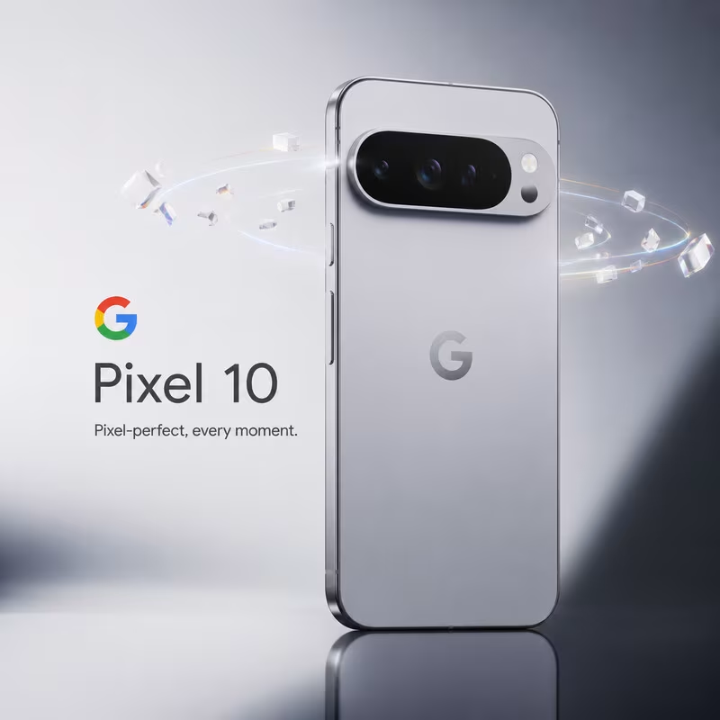
Pixel 10 flagship static ad
This concept imagines a launch visual for a flagship smartphone. I combined a minimal, high-key background with a hero device render and subtle particle effects to create a premium, futuristic feel. The layout puts the product first, with a clear hierarchy from logo to product name to tagline, mirroring how large tech brands structure their campaign key art.
Design focus areas:
Clean typography and generous negative space to keep the ad instantly readable in feed.
Realistic reflections and lighting to emphasize the hardware quality.
A single, simple tagline that reinforces the visual story instead of competing with it.
Lifestyle / audio comfort ad (polar bear)
This static concept explores a softer, lifestyle‑driven direction for an audio or wellness brand. The minimal composition and monochrome palette keep the focus on comfort and calm, while the oversized headphones and character choice immediately communicate the product category without needing heavy copy.
Design focus areas:
Visual storytelling that conveys product benefit (comfort, immersion, warmth) at a glance.
Strong subject isolation and clean background for easy cropping into multiple placements.
Brand‑ready layout that can accommodate logo, short headline, and CTA without clutter.
Music / entertainment poster-style ad (green “LOUDER INSIDE”)
This piece leans into a high-energy, poster‑style static ad for music, gaming, or streaming. The neon green palette, motion blur elements, and layered textures are designed to catch attention in a crowded feed, while the bold typography carries a clear emotional message.
Design focus areas:
Strong type hierarchy with an impactful main headline and supporting details.
Use of color and contrast to create a distinct visual identity for the campaign.
Composition that works both as a full poster and as cropped social placements or website banners.
Process and tools
Across these concepts, I followed a repeatable workflow similar to how I’d work with an ecommerce brand:
Concept development and moodboarding to define visual direction and tone.
Asset creation using AI image generation and/or 3D, followed by manual compositing, retouching, and lighting adjustments.
Typography, layout, and export optimization tailored for static ad placements (social feeds, stories, and website hero sections).
This project shows my ability to independently ideate, design, and deliver high-quality static ads that can plug directly into a marketing team’s campaigns and brand system—exactly what’s required for roles focused on static ads and website assets.
0
107
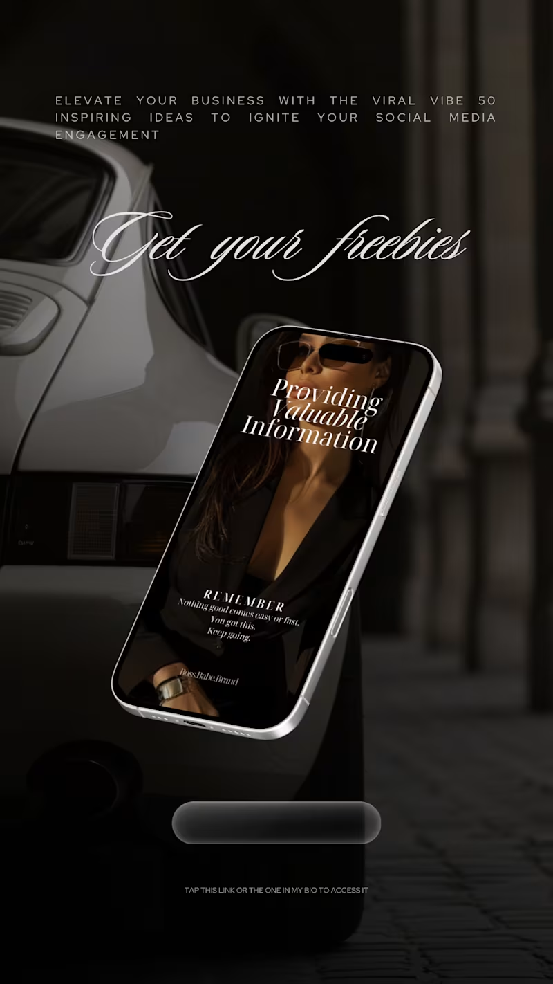
Boss Babe Brand - Story & Digital Product Design
Designed by Business Wifey Agency
The Project
Boss Babe Brand is a digital product and content brand built for ambitious women who are done playing small. BWA designed a full Instagram story series to promote their digital offerings - freebie funnels, stock image collections, and value-driven content - all wrapped in a dark, luxury aesthetic that makes every swipe feel intentional.
What We Created
Freebie Funnel Story → A cinematic dark-background story promoting their free resource - 50 viral social media ideas - presented on a floating phone mockup against a luxury car backdrop. Elegant script typography, a clear CTA, and a visual world that makes a free resource feel premium.
Dark Aesthetic Collection Promo → A full product story showcasing their 125-image dark aesthetic stock collection. Bold display type, editorial grid layout, product mockup on phone screens, and a complete product description that sells the value without overselling the copy.
Collection Launch Story → Three phones floating in a dark luxury interior - each displaying a different image from the collection. Minimal. Editorial. The kind of story that stops the thumb.
Why These Images Story → A split-layout story pairing editorial imagery with audience targeting copy - entrepreneurs, content creators, graphic designers, digital product sellers, and marketing experts. Clean and direct. Every word earns its place.
Note
This is a client story design project created by Business Wifey Agency for Boss Babe Brand's digital product promotion. ✦
Skills Used
Story Design · Digital Product Marketing · Funnel Design · Dark Aesthetic Direction · Typography · Instagram Content Design
0
67
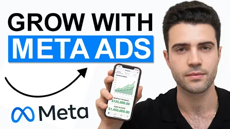
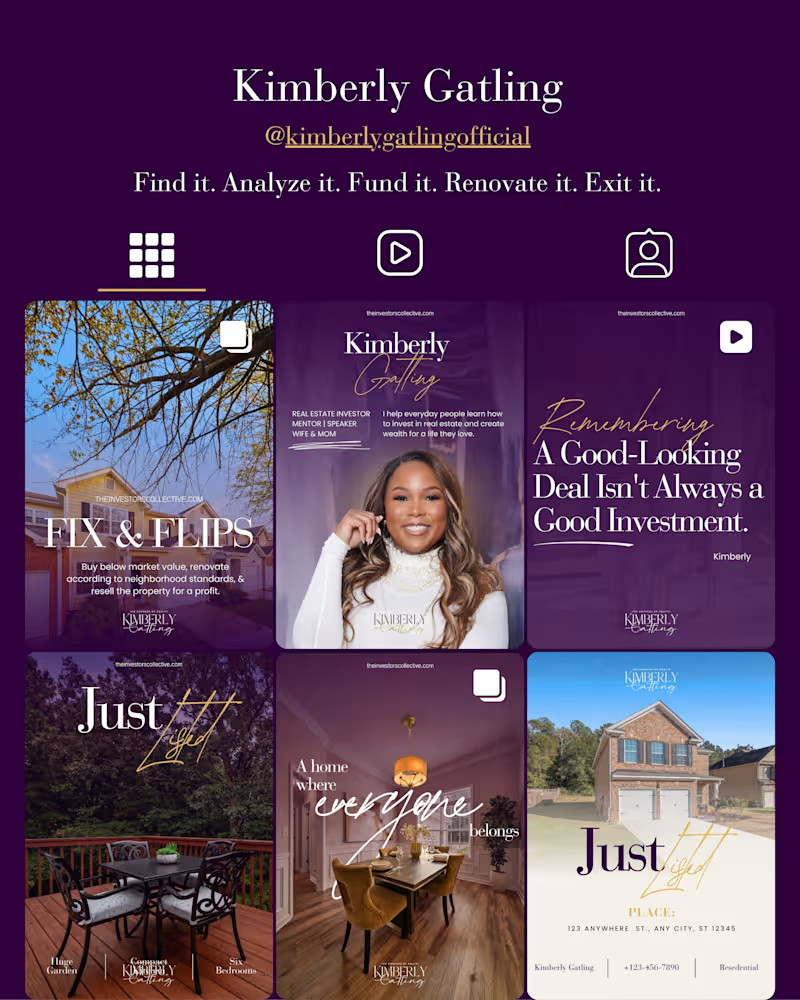
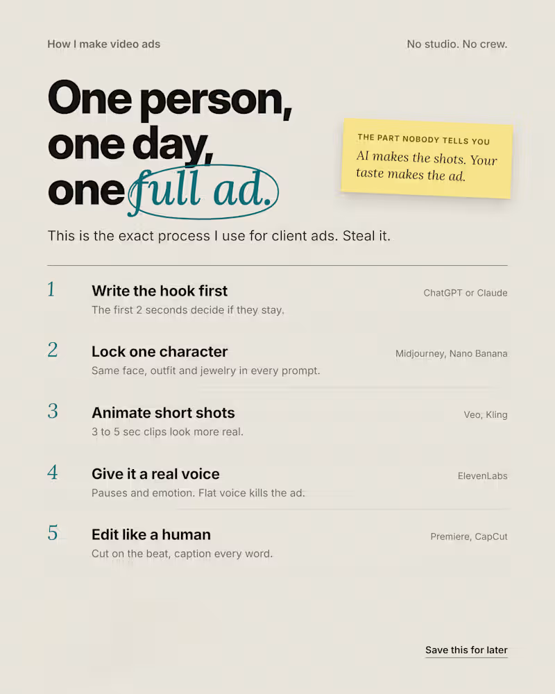

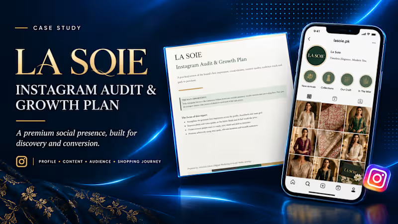
La Soie — Instagram Audit & Growth Strategy
Turning a Fashion Brand’s Instagram Presence into a More Premium, Discoverable and Shoppable Experience
Project Overview
Client: La Soie Pakistan
Project: Instagram Audit & Growth Plan
Services: Social Media Audit, Instagram Strategy, Content Strategy, Brand Positioning & Growth Recommendations
My Role: Digital Marketing Strategist
La Soie is a fashion brand with an opportunity to strengthen its digital presence and create a more compelling shopping experience through Instagram.
I developed a practical Instagram audit and growth plan to evaluate the brand’s profile presentation, visual identity, content quality, audience reach, and customer journey—from discovering a product to considering a purchase.
The goal was to move beyond simply publishing content and build a more strategic Instagram presence aligned with the expectations of a premium fashion audience.
The Challenge
Fashion brands compete in a highly visual environment where first impressions, product presentation, and trust influence purchasing decisions.
For La Soie, the opportunity was to make its Instagram presence feel more like a premium digital showroom: visually consistent, carefully curated, engaging, and easy for potential customers to explore.
The audit focused on four key questions:
Does the profile communicate the brand’s value and identity clearly?
Does the content showcase the quality, craftsmanship, and appeal of the products?
Does the content encourage people to engage, save, share, and discover more?
Is the path from Instagram discovery to purchase clear and convenient?
My Approach
I reviewed the brand’s Instagram presence through four strategic lenses.
1. Profile & Brand First Impression
Evaluated how effectively the profile communicates the brand, presents its visual identity, and guides visitors toward relevant products and information.
2. Content Quality & Visual Storytelling
Identified opportunities to improve product presentation, creative consistency, and fashion-led storytelling so content communicates the fabric, finish, fit, and overall value of the products more effectively.
3. Audience Reach & Growth Opportunities
Developed recommendations to create more engaging, shareable content and approach paid promotion strategically, using clear campaign objectives, relevant locations, audience interests, and testable audience segments.
4. Shopping Journey & Conversion
Considered how the Instagram experience could better guide potential customers from discovering a product to exploring collections, seeking information, and making a purchase.
The Strategy
The central recommendation was to position Instagram as a premium fashion showroom, supported by a more intentional content and growth strategy.
The proposed direction focused on:
Creating a more cohesive and premium-looking visual experience.
Improving product photography and video presentation.
Developing content people have a reason to watch, save, and share.
Making collections and products easier to discover.
Using targeted promotion to test relevant audiences and locations.
Strengthening the connection between content, customer interest, and purchase intent.
Rather than treating every post as an isolated piece of content, the strategy considers how the entire Instagram experience can work together to build interest and support conversion.
Project Deliverables
Instagram profile and first-impression audit
Visual identity and content-quality review
Audience reach and growth recommendations
Paid promotion and audience-targeting suggestions
Shopping journey and conversion improvement recommendations
Prioritized, actionable Instagram growth plan
The Value
The outcome was a practical strategic roadmap designed to help La Soie make more deliberate decisions about its Instagram presence, content, and promotional activity.
The report translates observations into clear improvement opportunities, giving the brand a structured foundation for strengthening its digital presentation, reaching more relevant audiences, and creating a smoother path from product discovery to purchase.
This project demonstrates my approach to social media strategy: combining creative judgment, audience understanding, brand positioning, and conversion-focused thinking to turn an audit into an actionable growth plan.
Project scope: Instagram audit and strategic recommendations. Growth results from implementing the recommendations have not been measured as part of this project.
0
14