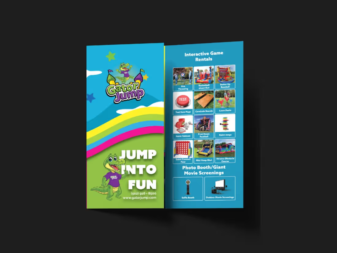
Print Design Projects in RajshahiPrint Design Projects in RajshahiI designed a strategic, high-impact tri-fold brochure for Gator Jump, an event rental company transitioning its focus toward large-scale corporate clients, churches, and schools. The primary challenge was balancing a wide product catalog—Inflatables (Bounce Houses, Slides, Obstacle Courses), Games, Photo Booths, and Giant Movie Screens—while distinctly guiding the viewer’s attention toward the premium, high-ticket items ideal for corporate events.
To solve this, I applied a strict visual hierarchy on the A4 tri-fold canvas. Obstacle Courses, Slides, and Games were given prominent placement with large, dynamic visuals on the most visible panels (front cover and center-fold), while secondary services like Bounce Houses and Photo Booths were positioned strategically on the back and side panels to ensure visibility without competing for the spotlight.
Visually, the client adored a specific rainbow gradient color palette, so I used it as the structural backbone of the design—allowing the colors to flow seamlessly across the front and back panels. This creates a cohesive, energetic brand experience and transforms the brochure from a simple price list into a professional statement. I paired this with bold, modern typography inspired by the Azo Sans family (avoiding their old website fonts as requested) to ensure high readability against the colorful backdrop.
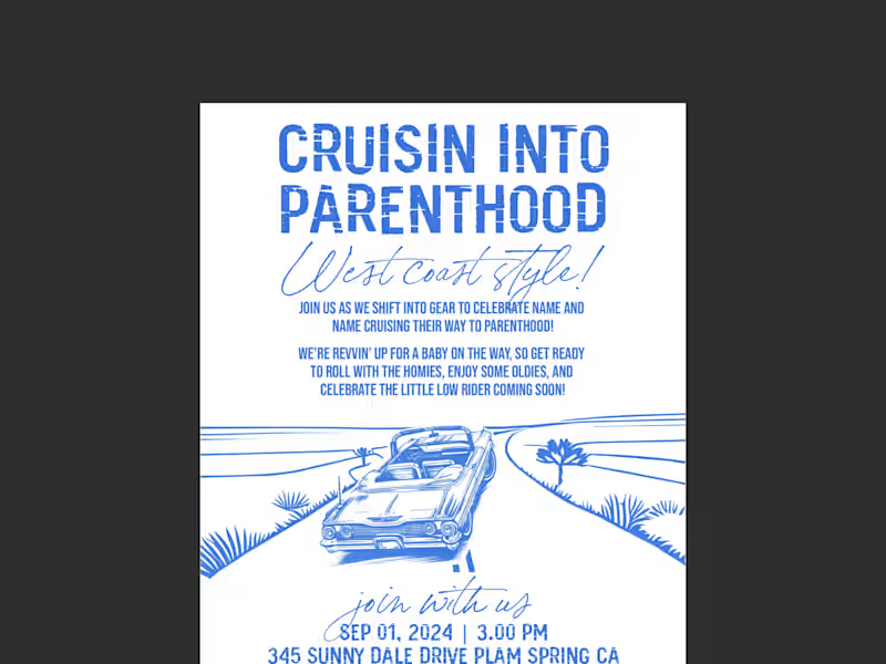
All required functional elements were integrated seamlessly: the logo and contact details on the front, categorized product grids inside, and a QR code, email, phone number, and the specific brand messaging on the back. The result is a print-ready, visually striking tri-fold brochure that captures the excitement of large events while maintaining the premium credibility needed to attract corporate clients. This project was a custom hand-drawn invitation design for a West Coast, lowrider-themed baby shower. The core challenge was beautifully balancing two seemingly opposing worlds—the gritty, nostalgic aesthetic of 90s car club culture (lowriders, oldies, hydraulics, and cruising) with the soft, joyful innocence of a baby celebration.
I leaned heavily into a hand-drawn illustration style to capture the authentic vintage feel of classic lowrider artwork. The composition centers on a lovingly detailed lowrider, but instead of standard rims, I infused baby elements—like a tiny rattle dangling from the rearview mirror and a crib-shaped 'bed' in the back—to bridge the two themes perfectly. I used a warm, sun-soaked West Coast color palette of pastel pinks, blues, and creams, contrasted with deep blacks and chrome greys to keep the 'car club' edge intact.
Typography was crucial; I paired a bold, graffiti-inspired script for the title ('Cruisin' into Parenthood') to capture the urban vibe, with a clean, readable sans-serif for the event details to maintain clarity. I carefully laid out all the supplied verbiage ('Rims, rides, and rattles') using a classic cruise-night poster layout, ensuring the flow felt like a vintage event flyer. The result is a nostalgic, humorous, and deeply personal invitation that makes the parents-to-be feel seen as a couple, while celebrating the exciting journey ahead into parenthood—proving that even a baby shower can have serious street cred.