Freelance UI Designers in Quebec
Sign Up
Post a job
Sign Up
Log In
Filters
2
Projects
People
Jay Nadeau
max
Montreal, Canada
Founder & Creative Director @Stōkt
$100k+
Earned
19x
Hired
5.0
Rating
387
Followers
expert
Hired
+2
Follow
Message
Founder & Creative Director @Stōkt
4
ENZO DREW Website
4
59
5
Broadway Venture Partners Interactive Web Design
5
85
13
Major Media Agency Website Design & Development
1
13
80
8
Lorikeet CX - Framer Web Development
8
74
UI Designer
(1)
Follow
Message
Karim Dari
pro
Montreal, Canada
Brand & Web Designer │ Helping you build on Webflow & Framer
$25k+
Earned
4x
Hired
5.0
Rating
254
Followers
Top
expert
+1
Follow
Message
Brand & Web Designer │ Helping you build on Webflow & Framer
5
Circuit ― Speed Dating Website & App Redesign
5
83
3
Toastcoin ― Web3 Crypto Brand & Website
3
66
20
Roamr ― Redefining Event Exploration
20
151
79
Post 2/3 for Forchetta 🍝 / Project Showcase / Creation of entire brand identity for Forchetta, an italian pasta company. What do y'all think of this one? 🧐
38
79
1.8K
UI Designer
(3)
Follow
Message
Claudio Rocha
Montreal, Canada
Framer Developer and Product Desginer
2x
Hired
5.0
Rating
38
Followers
expert
Follow
Message
Framer Developer and Product Desginer
0
DevX Meetups Landing Page
0
10
0
Framer Jaune Bank Landing Page
0
22
0
Patriot Cyber Website
0
10
0
OceanCove Resort & Beach Club Website
0
46
UI Designer
(3)
Follow
Message
Faadil Boussari
pro
Gatineau, Canada
Product Designer for AI & Digital Products
18
Followers
Follow
Message
Product Designer for AI & Digital Products
2
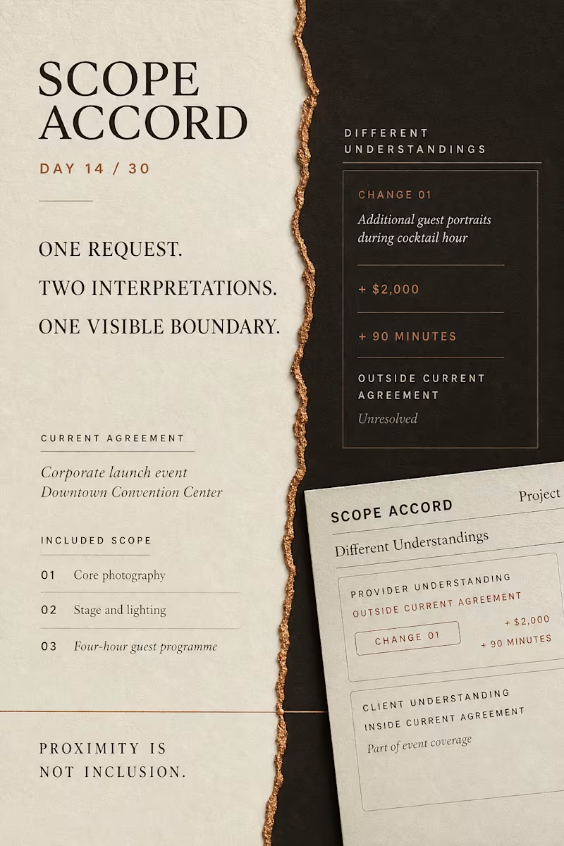
A request does not automatically change an agreement. Scope Accord is a five-state interaction prototype designed around a common service-project problem: a client may hear “already included,” while the provider means “additional scope, cost and time.” The proposed change remains structurally outside the current agreement until both parties express the same understanding of its impact. One request. Two interpretations. One visible boundary. Designed and built with React, TypeScript, CSS Grid and Playwright. Live prototype: https://scope-accord.vercel.app
2
92
1
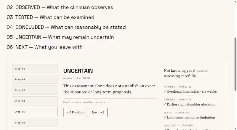
What if a clinic earned trust by clearly showing what it still does not know? I designed Meridian Physio, a fictional physiotherapy assessment experience built around one principle: Competence Before Commitment. The interface separates: REPORTED → OBSERVED → TESTED → CONCLUDED → UNCERTAIN → NEXT The most important state is UNCERTAIN. Instead of using confidence as a visual shortcut, the experience shows the boundary between evidence, interpretation, and what still requires further assessment. Built in Framer, with a custom product demo created using Remotion, Python, and FFmpeg. This is Day 10 of my 30 Days of Real Business Problems challenge. Memory hook: “A clinic willing to show what it does not know yet.” Full case study : https://contra.com/p/QFF2WWNU-meridian-physio-competence-before-commitment?r=faadil_boussari I would be interested to know whether this kind of transparency would increase your trust in a healthcare service.
1
111
4
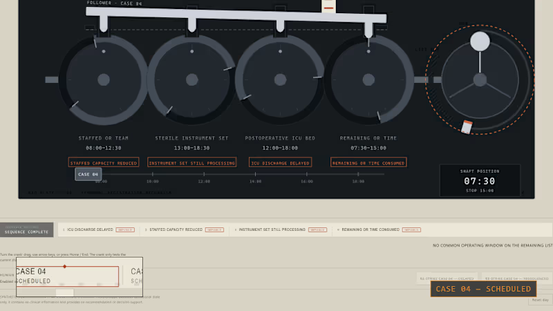
Day 5/30: MISREGISTER An operating-room case can still look ready on paper after it has stopped being operationally executable. I built MISREGISTER to make that gap physical. CASE 04 is connected to four changing dependencies: — staffed OR team — sterile instrument set — postoperative ICU bed — remaining operating-room time As those windows drift apart, the operating list stays unchanged. The signature moment: the crank freewheels to the end-stop while CASE 04 still reads SCHEDULED. Only after that failed test does a human re-strike the case as DELAYED or RESEQUENCED. This is not clinical decision support. It is a synthetic operational prototype exploring the difference between a scheduled slot and executable capacity. Built with React, TypeScript, SVG, Playwright, Remotion, Claude Code, Kimi, Agent Reach, ChatGPT, and AI33Pro. Live prototype: https://faadil1.github.io/misregister-day-5/ Source: https://github.com/Faadil1/misregister-day-5
4
4
361
1
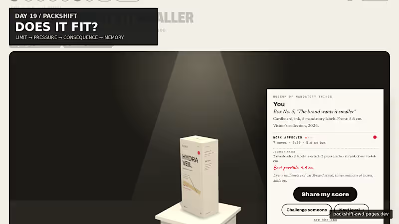
Packaging looks like graphic design. But every word takes physical space. For Day 19, I built PACKSHIFT an interactive packaging experience where claims, languages, warnings and data become pressure on a finite surface. It starts with the real 56 mm width of the carton. Then you try to make everything fit. Make the box smaller and the pressure becomes physical: 56 mm → pressure → CRACK → recovery → museum The final package doesn’t just show the solution — it remembers the negotiation that produced it. Underneath the public game is a deeper spatial compiler built with Blender + Three.js / React Three Fiber, where the same package can open, decompose, expose its dieline, redistribute information and refold. Packaging is not a file. It is a compiled surface. Full case study ↓ https://contra.com/p/3WBccUlM-packshift-packaging-is-a-compiled-surface Live experience ↓ https://packshift-awd.pages.dev/ GitHub ↓ https://github.com/Faadil1/PACKSHIFT Would love to know which moment lands most for you: Actual Size, the Hydraulic Press, or the Museum?
1
71
UI Designer
(3)
Follow
Message
Leslie A
Montreal, Canada
Design for consumer brands that know less is more.
29
Followers
expert
Expert
Follow
Message
Design for consumer brands that know less is more.
8
Config submission: 80%, a fashion discovery tool that analyses your outfit and gives you pointers on how to improve. My problem area: Finding clothing inspiration is very easy but the way it falls on you largely depends on proportions and other little factors. 80% would help the user through the aftermath of finding the right outfit and re-imagining what would make it better. How it works: 80% runs through Claude to make the prediction a bit more accurate and allows you to upload or take your picture live! Try 80% here: https://80percent.figma.site/ Community file: https://www.figma.com/community/file/1647380876591768991/80-percent
7
8
217
0
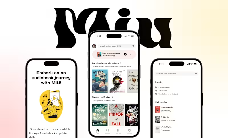
Audiobook app UI| Visual design
0
38
0
Logo and brand identity design for a fragrance brand
0
4
0
Brand Identity Design for Mental Health Coach
0
9
UI Designer
(2)
Follow
Message
nomi Designs
Montreal, Canada
Designing premium SaaS experiences that actually convert.
12
Followers
Follow
Message
Designing premium SaaS experiences that actually convert.

2
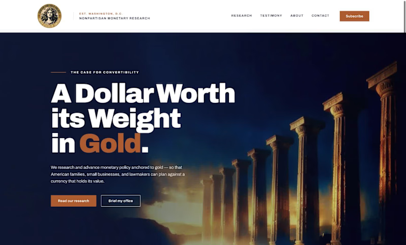
Client: A Washington, D.C.-based monetary policy research and advocacy organization (name withheld per client confidentiality). Direction: Modern, bold, and credible, with large confident typography, minimal color, and real editorial weight. What I delivered: A full brand style guide: color system, type scale, component specs, and logo usage rules A homepage built around a custom seal mark and a cohesive dusk-toned photographic treatment One deliberate accent color (terracotta) instead of predictable palette choices A custom architectural photography direction, anchored by an abstract Doric column hero image Available for similar work: advocacy organizations, think tanks, and institutional brands.
2
106
2
Create your own dither, noise backgrounds in 4k with a click, that too absolutely free with #meshup
2
132
1
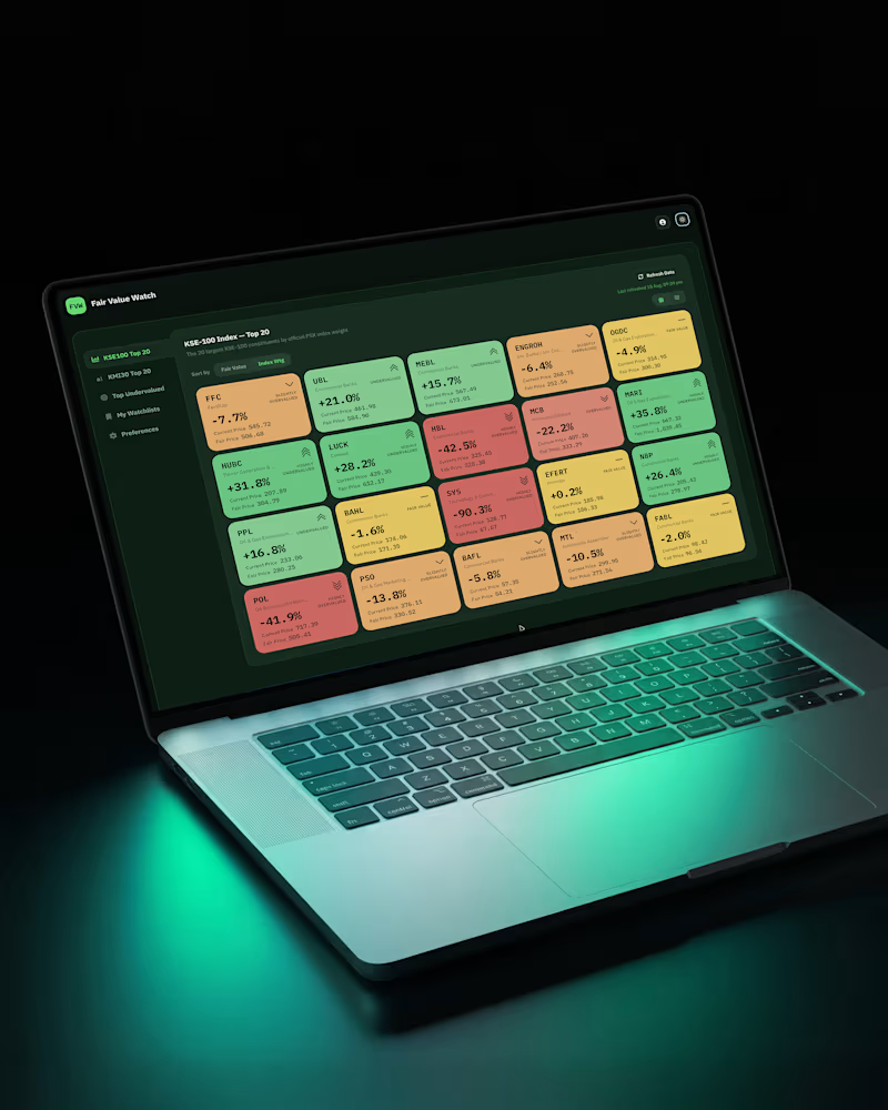
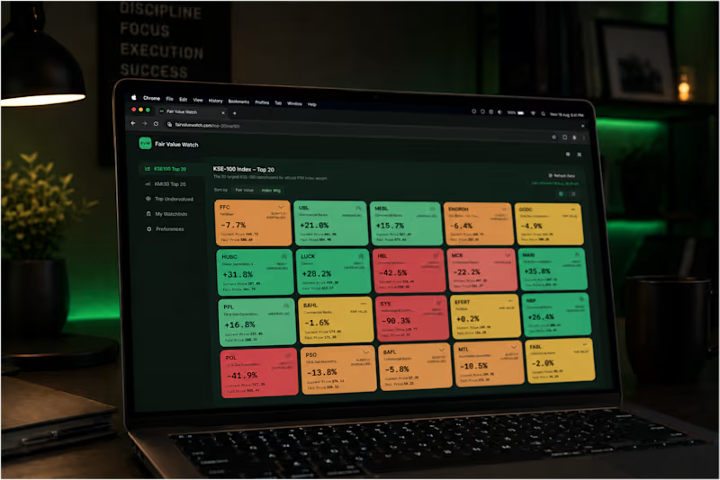
Exploring how color can make complex financial data feel instantly understandable. For this fintech concept, I’m using a six-step color scale to create visual hierarchy across valuation cards—making the data easier to scan without adding unnecessary UI noise. A small color decision can have a big impact on how information is perceived. #Fintech #UIDesign #ProductDesign #DataVisualization #UXDesign #VisualDesign
1
62
2
Fintech app design #wip
2
89
UI Designer
(14)
Follow
Message
Maxime Brodeur
Hemmingford, Canada
Websites, apps, automation & product design.
9
Followers
Follow
Message
Websites, apps, automation & product design.
0
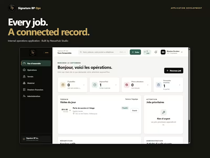
Signature BP Ops | Internal Operations App
0
2
0
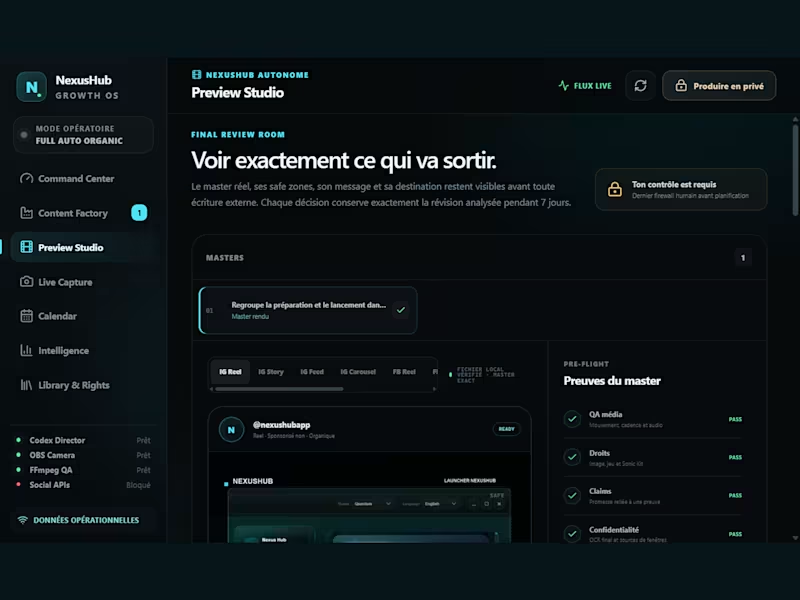
NexusHub Growth OS — Internal Marketing Tool
0
9
0
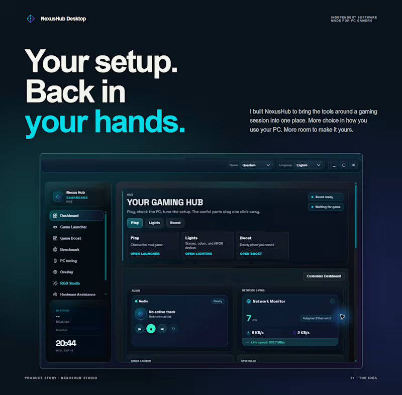
NexusHub Desktop | Your setup, back in your hands
0
9
3
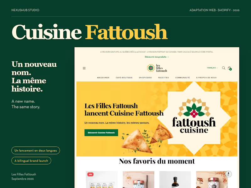
A new name. The same generous spirit. Les Filles Fattoush launched Cuisine Fattoush, and I helped bring that next chapter to their Shopify store. The challenge was to make the change feel clear and welcoming while keeping the products and familiar shopping experience in place. Working from the client’s brand guidelines and visual assets, I adapted the new identity into a homepage banner, an announcement window and an editorial section. Warm yellow, oversized patterns and a beige star frame the story, with two pita chips bringing the food into the composition. The launch announcement works in French and English, on desktop and mobile. Each entry point leads to the story behind the new name. Explore the full case study https://www.behance.net/gallery/256371269 See it live https://lesfillesfattoush.com Web adaptation and Shopify integration by NexusHub Studio. Brand identity and visual assets supplied by the client.
3
63
UI Designer
(3)
Follow
Message
Natacha Lang
Montreal, Canada
Innovative UX/UI/Prod. Designer 🌟
5.0
Rating
Follow
Message
Innovative UX/UI/Prod. Designer 🌟
0
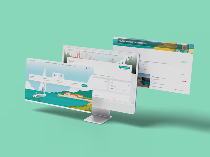
Touloisirs Website Redesign
0
24
0
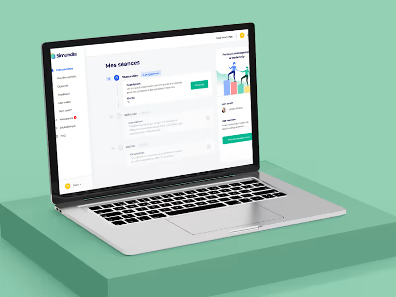
Redesigning Simundia's Coaching Session Booking Process
0
8
1
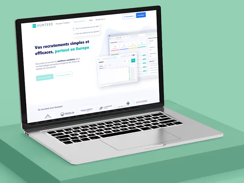
Hunteed Recruitment Platform Redesign
1
23
1
Redesign to sell better
1
36
UI Designer
(5)
Follow
Message
Explore people