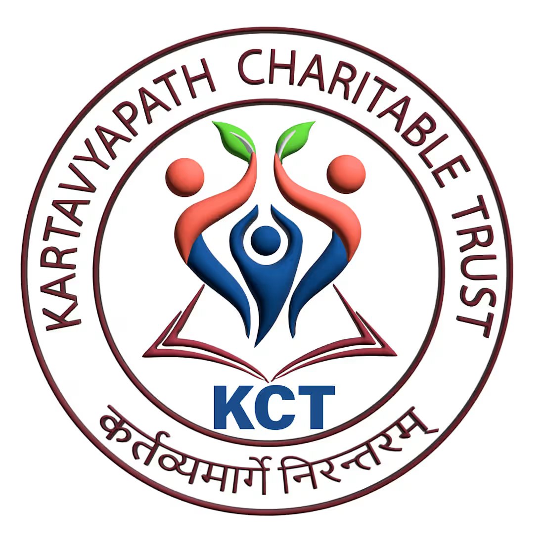
Art Projects in PuneArt Projects in PuneThis logo was designed for KartavyaPath Charitable Trust (KCT), a non-profit organization dedicated to education, community welfare, and social empowerment. The goal was to create a meaningful visual identity that reflects the organization's commitment to nurturing lives, creating opportunities, and building a brighter future for those in need. The logo prominently features the organization's name and initials, reinforcing its identity.
The concept combines symbolic elements that represent the trust's mission and values. The open book at the base signifies education, knowledge, and lifelong learning, while the three human figures illustrate unity, collaboration, and community support. The central figure represents individuals empowered through the organization's initiatives, while the upward-reaching figures holding green leaves symbolize growth, hope, sustainability, and positive transformation. The circular emblem conveys inclusivity, protection, and the continuous cycle of giving back to society. A palette of blue, red, and green was chosen to represent trust, compassion, vitality, and progress.
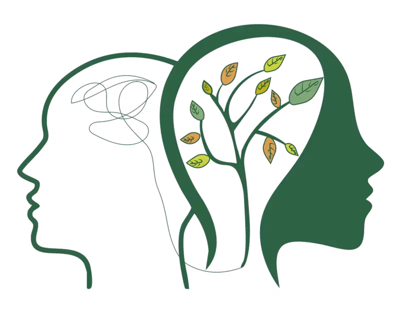
This project demonstrates my ability to create purpose-driven visual identities that communicate an organization's mission through thoughtful symbolism, balanced composition, and impactful branding, resulting in a logo that is both memorable and meaningful. This logo was designed for my friend's Instagram page, SoulSpring Insta page:https://www.instagram.com/soulspringcounseling?utm_source=ig_web_button_share_sheet&igsh=ZDNlZDc0MzIxNw== , a platform focused on mental well-being, self-growth, and emotional healing. The objective was to create a visual identity that communicates transformation, inner peace, and personal development through a clean and meaningful design.
The concept features two human profiles representing the journey from mental chaos to emotional clarity. The abstract scribbles inside the first silhouette symbolize stress, overthinking, and internal struggles, while the flourishing tree within the second profile represents healing, growth, resilience, and a renewed mindset. The tree's branches and colorful leaves reflect continuous personal development, balance, and the different stages of emotional well-being. A calming green color palette was chosen to evoke nature, renewal, hope, and tranquility, reinforcing the brand's focus on mindfulness and positive transformation.
This project highlights my ability to create thoughtful, concept-driven logos that tell a compelling visual story while aligning with a brand's purpose, values, and audience.