Freelance Canva Designers in Palampur
Sign Up
Post a job
Sign Up
Log In
Filters
2
Projects
People
Abhishek Sharma
Palampur, India
Designing scroll-stopping creatives for product brands.
New to Contra
Follow
Message
Designing scroll-stopping creatives for product brands.
0
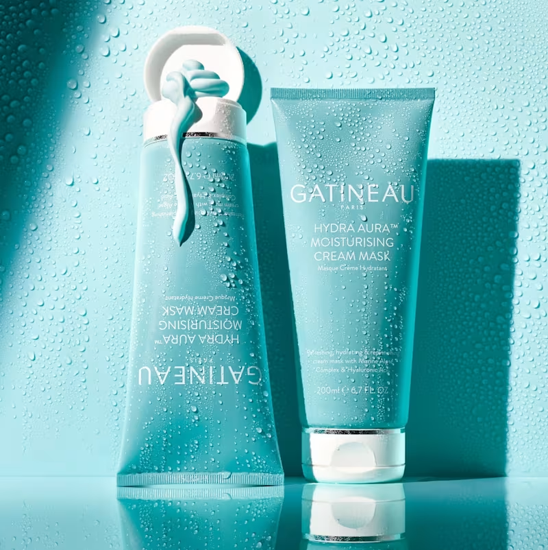
For this Gatineau creative, I placed the product on a reflective surface to create a mirrored duplicate beneath it, adding depth and a premium, editorial feel. I kept the entire scene in a cool teal tone to match the brand's packaging and added water droplets across the background to reinforce the "hydrating" and "moisturising" positioning of the product. The reflection and water texture work together to make the shot feel fresh, clean, and spa-like, while the lighting keeps the focus on the product without losing the mood of the scene.
0
49
1
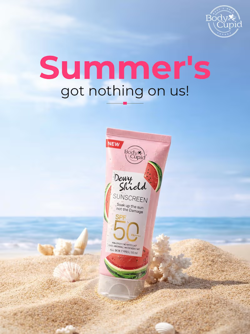
For this Body Cupid sunscreen creative, I started by selecting a bright, sunny beach background to set a summer mood. I then placed the product shot into the scene, blending it naturally into the sand using shadows and lighting adjustments so it looked like it belonged in the setting rather than pasted on top. I added shells and a watermelon slice around the product to reinforce the summer theme and tie into the "Dewy Shield" watermelon-inspired branding. For the headline, I used bold, playful typography in the brand's pink tone to grab attention immediately, then balanced it with a clean subheading. Finally, I made sure the SPF 50 and key product details stayed clearly visible so the creative looked appealing but also communicated the product's main benefit at a glance.
1
74
0
This project showcases a premium presentation layout highlighting a series of high-conversion Social Media Creatives. The design approach is engineered for direct-to-consumer (DTC) e-commerce brands in the wellness, beauty, and luxury lifestyle sectors, focusing on a seamless blend of elevated aesthetics and strategic marketing. Design Strategy & Layout Highlights Typography Hierarchy: The main presentation utilizes an elegant, high-contrast serif typeface for the headers ("SOCIAL MEDIA CREATIVES"), paired with a fluid, organic script accent for a touch of luxury. The ad creatives use clean, accessible sans-serif typography designed for maximum readability on mobile feeds. Color Story & Tone: A deeply cohesive, warm neutral color palette dominates the canvas—utilizing soft cream, warm beige, muted sage green, and striking contrast accents of deep charcoal and rich espresso brown. Multi-Product Mockup Integration: As showcased in the image, the composition features an array of modular square grid layouts alongside a central smartphone UI mockup. This setup effectively demonstrates how the campaign assets transition seamlessly from Instagram grid posts to high-impact mobile stories or reels. Visual Styling: The entire layout leverages soft, natural leaf and window-pane shadow overlays, raw stone styling elements, and warm, minimalist photography to communicate a sense of "quiet luxury" and organic purity.
0
23
0
This spread showcases the editorial layout of the CALMÉA Botanical Skincare Brand Style Guide. Designed to serve as the definitive blueprint for the brand's visual identity, the layout maintains a high-end, editorial feel with a focus on generous negative space and clear information hierarchy. Spread Layout & Specifications Left Page (Logo Systems & Usage): Dedicated to the structural core of the brand. It outlines the primary arched botanical logo mark, alternative circular sub-marks, and the precise clear-space grid construction. The lower section demonstrates icon versatility across dark, light, and inverted color blocks. Right Page (Color & Typography): Focuses on the core design systems. The top half displays the refined, earthy color palette blocks (charcoal, dusty rose, warm taupe, soft cream, and crisp white). The midsection dictates the typographic hierarchy, contrasting a bold serif display typeface with a clean, light serif/sans-serif body pairing. The bottom row highlights custom brand iconography for packaging use. Art Direction: Styled in a flat lay format featuring raw tactile fabric swatches, a minimalist matte pen, and delicate dried florals to reflect the organic essence of the brand.
0
31
Canva Designer
(2)
Follow
Message
Explore people