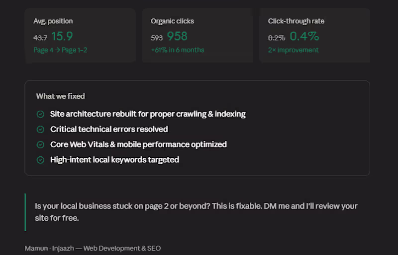
The designer that you can trust.
UI/UX Designer | CRO Driven e-Commerce Experiences Designer
UI/UX Designer | CRO Driven e-Commerce Experiences Designer
Web Dev | WP | PHP | MERN | AI/ML | UI/UX Design

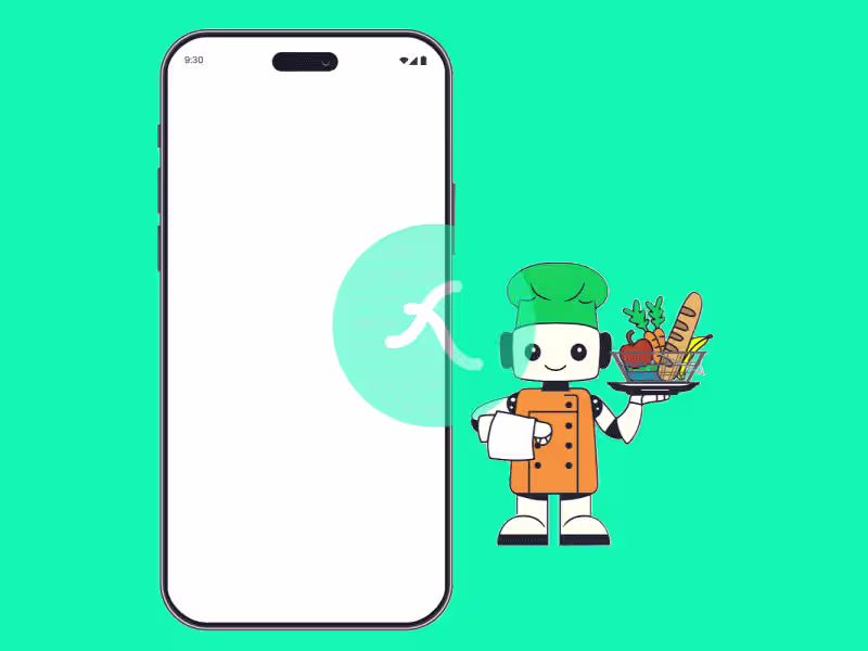
Lottie Animation is my maiden world

View more →
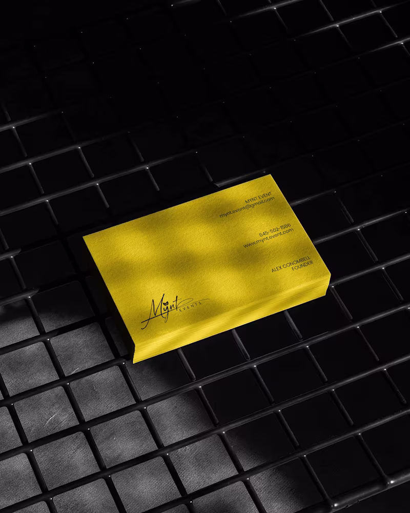
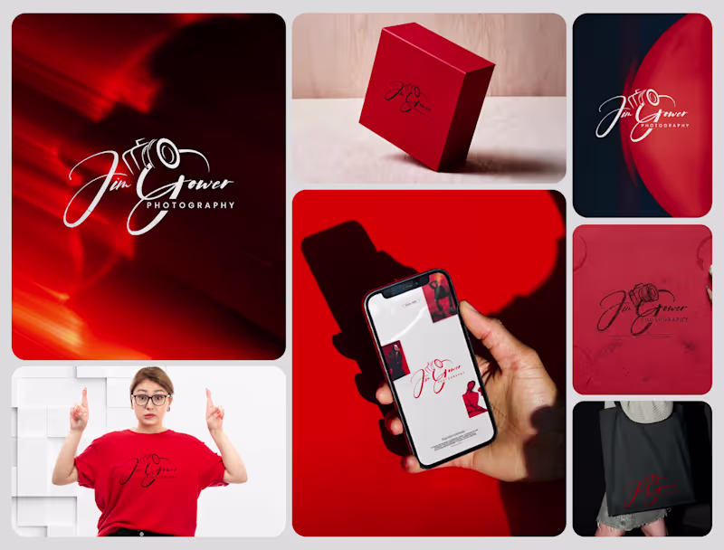
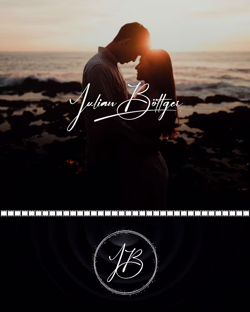
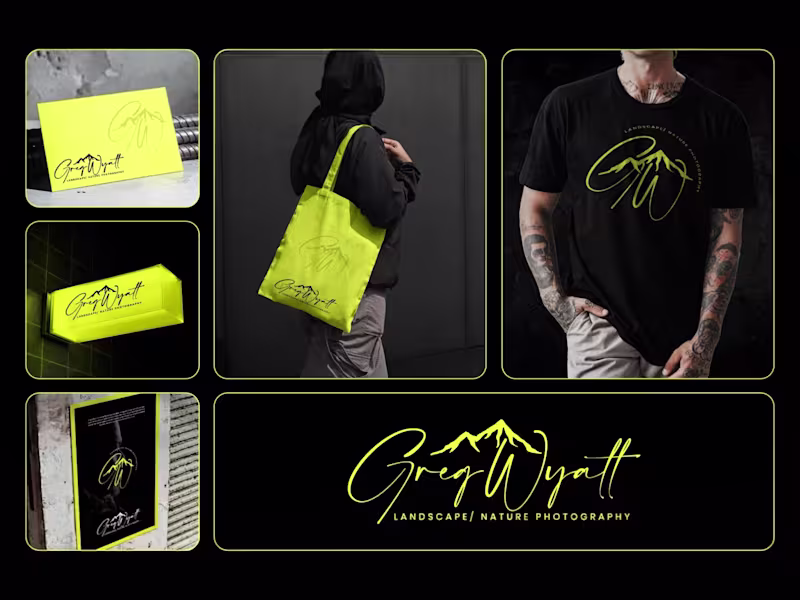
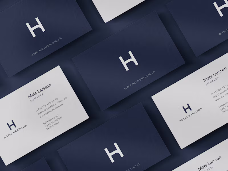
Brand Identity and Logo Design Expert
Brand Identity and Logo Design Expert


8+ yrs exp UX/UI Designer & Trainer
8+ yrs exp UX/UI Designer & Trainer
Expert UI/UX Designer with 7 years of Experience
Expert UI/UX Designer with 7 years of Experience

View more →