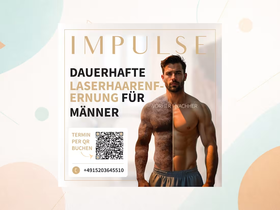
Creative Design Projects in NatoreCreative Design Projects in NatoreThis project was a targeted advertising campaign for a laser hair removal clinic, specifically designed to attract a male audience—a demographic often overlooked in the beauty and aesthetics industry. The primary challenge was to shift the perception of laser hair removal from a strictly 'female' treatment to a modern, practical, and aesthetically appealing choice for men.
The core visual strategy was built on a bold, immediately clear contrast: a split composition showing a male body with hair on one side and smooth, hair-free skin on the other. This instantly communicates the service's value without relying on long, tedious copy. I kept the color palette dark, clean, and highly masculine—using deep blacks, cool greys, and sharp whites to convey a premium, technical, and hygienic aesthetic that resonates with men. The typography was bold and direct, adhering strictly to the client's requirement of 'kurz und knapp' (short and concise).
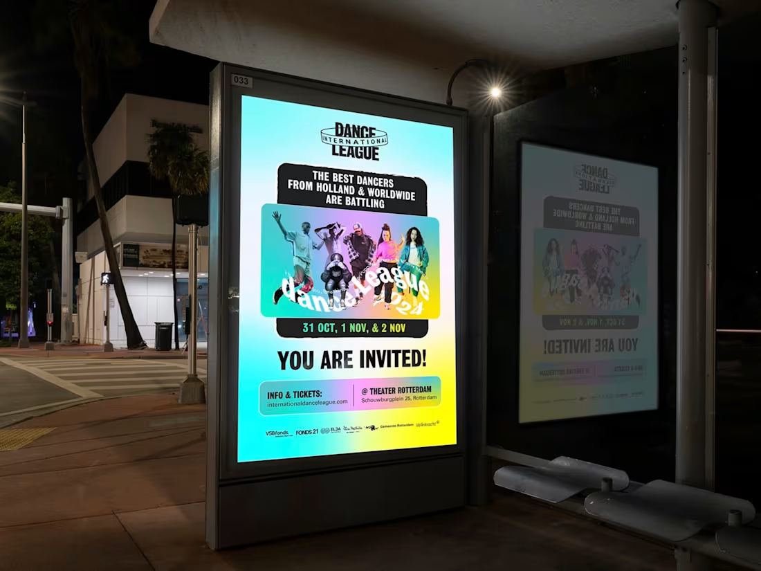
Crucially, I integrated the booking QR code (linking to the impulse-nbg.de/termin (http://impulse-nbg.de/termin) page and phone number) seamlessly into the composition without disrupting the visual flow, making the conversion path frictionless. The layout was designed to be highly adaptable, working flawlessly across the required formats—a square social media post, a flyer for print/digital distribution, and a full-screen vertical Instagram Story. The result is a cohesive, high-impact campaign that makes laser hair removal feel like a lifestyle upgrade for the modern man. I designed the key visual / poster campaign for the International Dance League, Rotterdam's premier hip-hop and street dance festival. The core challenge was balancing two opposing forces: the raw, competitive intensity of a 5v5 'Premier League' battle (featuring 60 dancers and international rivalries against France & Germany) with the need to feel welcoming and inclusive to a broad audience—from urban families to dedicated party kids.
To solve this, I moved away from the existing brand book's exact style while using its colors and shapes as a springboard for a fresher, more contemporary edge. I built a dynamic, layered composition centered on the team captains and dancers to showcase the spectacle of the event. To emphasize the 'battle,' I used bold, clashing typography and directional lines that create visual tension, representing the clash of dance styles (Hiphop, Afro, Breaking, House, Popping, Krump).
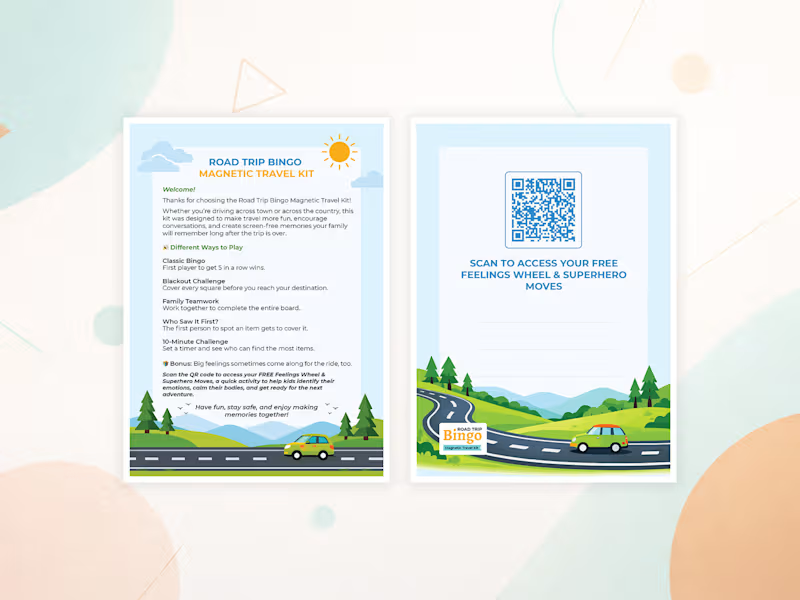
Crucially, I avoided stock imagery and utilized authentic dancer assets to build trust and community. I designed the visual hierarchy to appeal to all four target personas simultaneously: the scale appeals to the 'City Family,' the competitive clash hooks the 'Netflix Couple,' the artistic expression inspires the 'Musical Adventurer,' and the urban aesthetic draws in the 'Party Kid.' The final poster embodies the event's dual message—'Join the Movement' and 'Which Team Are You For?'—making it a powerful tool for both outdoor campaigns and digital engagement. I designed a complete 5×7 inch postcard insert for the Road Trip Adventure product line – a travel activity kit designed for families.
The front side features:
A bold title: "Road Trip Adventure Activity Collection"
A warm welcome message
5 different game modes: Classic Bingo, Blackout Challenge, Family Teamwork, Who Saw It First, and 10-Minute Challenge
A bonus section with a QR code linking to a free Feelings Wheel resource
A friendly footer message
The back side integrates a QR code with clear call-to-action text: "Scan to access your FREE Feelings Wheel & Superhero Moves."
The design includes custom vector illustrations (car, hills, trees, sun, clouds, road) and maintains a clean, modern, and cheerful aesthetic — perfect for retail packaging.
All files were delivered in print-ready formats:
Print-ready PDF with 0.125" bleed, safe zone, and CMYK color profile
High-resolution JPG preview
PNG with transparent background
SVG vector file
Adobe Illustrator source file (AI)
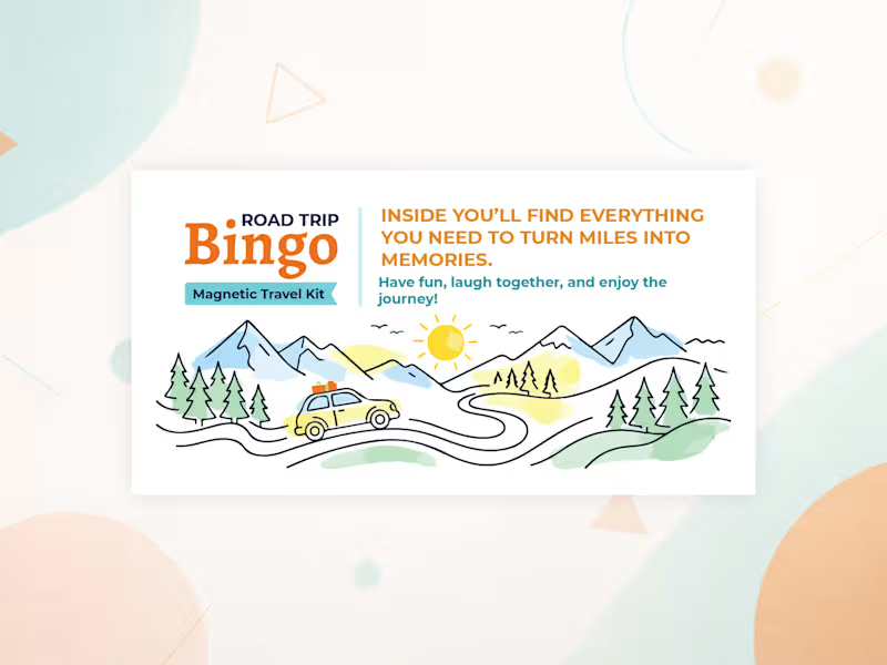
This project required careful typography, layout planning, and print preparation to ensure the final product meets professional printing standards. I designed a custom 3.5" × 1.7" sticker for the Road Trip Adventure product line — a travel activity kit for families.
The sticker was created for a burlap bag tag and required a premium, retail-ready look. It includes custom vector illustrations (car, hills, trees, sun, clouds, road) and bold, clean typography.
Deliverables:
Print-ready PDF with 0.125" bleed, safe zone, and CMYK setup
High-res JPG preview
PNG with transparent background
SVG vector file
Adobe Illustrator source file
The design is bright, cheerful, and adventure-themed — matching the client’s brand identity and packaging needs.