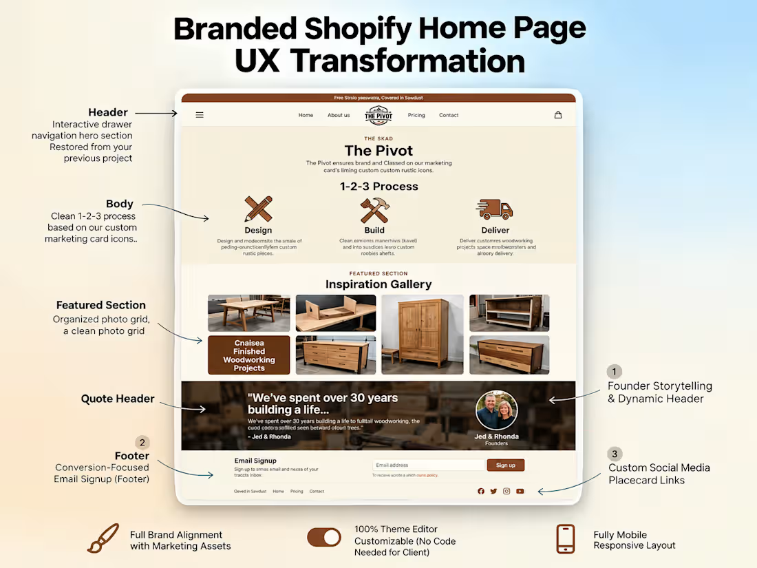
Case Study: From "Coding Hell" to a Premium Custom Shopify Store ✨
🚨 The Problem: A handmade furniture business owner tried using AI to generate code for their Shopify store. The result? A broken layout and a frustrated founder with zero coding experience who couldn't update their own site.
💡 The Solution: I stepped in to clean up the backend and rebuild the frontend architecture so it looked fully custom but was incredibly easy to manage.
Key Deliverables:
✔️ Erased the broken code and rebuilt the homepage using native Shopify sections.
✔️ Established a premium, rustic visual identity with custom typography.
✔️ Built a dynamic quote header and a conversion-focused footer email capture.
✔️ The Best Part: I mapped every single custom feature into the Shopify Theme Editor. The client now has complete freedom to manage text, fonts, and images entirely code-free.
Beautiful UI meets perfect usability. Drop a 🪵 in the comments if you love a rustic aesthetic, or send me a DM if your Shopify store needs a cleanup!
#ShopifyExpert #ShopifyDesign #FrontendDevelopment #EcommerceWebsite #FurnitureBrand
Option 3: Short & Punchy (Best for X / Twitter or a quick update)
AI generated code broke this handmade furniture brand’s Shopify layout, leaving the non-technical founder stuck in "coding hell." 🛑💻
I stepped in to clean up the mess. I rebuilt the homepage using native sections, added custom typography, a dynamic quote header, and a sleek email capture.
The biggest win? Moving the entire architecture into the Shopify Theme Editor so the client can manage their premium, rustic storefront 100% code-free. No more touching Liquid files! 🛠✨
#Shopify #UIUX #WebDev #Ecommerce
1
1
142
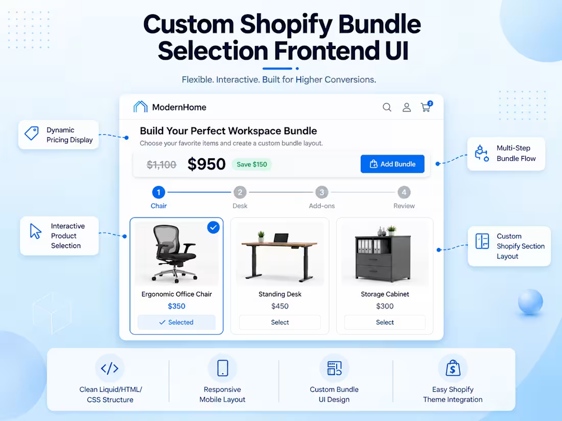
🛍️ Custom Shopify Bundle Builder UI | High-Converting Frontend Architecture
🪝 The Hook:
Standard Shopify themes only take you so far. When a client needed a dynamic, step-by-step bundle selection flow that felt both intuitive and premium, we moved beyond off-the-shelf solutions to build a custom frontend layout from the ground up. 🚀
🎯 The Project Vision:
The goal was to design a modern, visually striking bundle builder inspired by a high-performing reference site—but with a completely unique UX/UI tailored to the client’s specific brand identity. I architected a clean, conversion-optimized frontend layout that allows customers to visually build their bundles step-by-step with zero friction. ✨
⚙️ The Challenge & The Execution:
The main challenge was capturing the seamless behavioral flow of the reference site without creating an exact clone. I solved this by designing a custom UI structure with modern spacing, intuitive interactive states, and a crystal-clear navigation flow. The result is a Shopify-ready frontend layout perfectly prepped for backend functionality integration. 🛠️
📦 Key Frontend Deliverables:
🪜 Step-by-Step Visual Flow: Intuitive navigation that guides the user through the bundle process effortlessly.
💳 Dynamic Product Cards: Clean, engaging layouts with clear "selected" and "unselected" visual states.
📌 Sticky Pricing & Summary Area: Ensuring users always know their bundle status and total cost to reduce cart abandonment.
📱 Fully Responsive Architecture: A flawless experience across desktop, tablet, and mobile breakpoints.
💬 Looking for a custom UI/UX solution for your Shopify store? Let’s chat about how we can elevate your customer journey and boost your Average Order Value (AOV). 📈
0
75
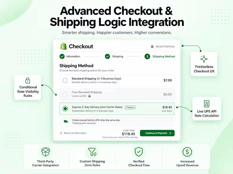
🚀 Stop Losing Sales at Checkout: How I Fixed Fatal Shipping Errors for an Established E-commerce Brand
Did you know that a "Shipping not available" error at checkout is the fastest way to lose a customer forever? 💸
An established e-commerce client came to me with a massive conversion roadblock. They wanted to offer a seamless "Free Standard Shipping over $50" alongside live-calculated "UPS 2-Day Express" rates. The problem? Overlapping Shopify shipping zones were triggering fatal checkout errors, and strict API verifications were blocking them from fixing their shipping profiles.
Here is how I turned their checkout from a bottleneck into a breeze:
🛠️ Full Backend Audit: I hunted down and resolved the overlapping zone conflicts that were breaking the checkout logic.
🔌 Seamless API Integration: I securely integrated and verified the official UPS application to successfully unlock real-time, automated rate calculations.
✨ UI/UX Cleanup: I streamlined the checkout interface. Customers now see a frictionless, crystal-clear choice between standard flat-rate shipping and live 2-day express.
The Result?
Zero checkout errors, a flawless customer experience, and an automated shipping logic that protects their profit margins while giving customers exactly what they want.
👉 Struggling with a clunky checkout or complex shipping rules on your store? Send me a message and let’s get your conversions back on track!
0
100
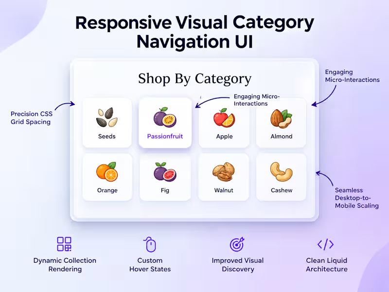
Custom Responsive Category Navigation UI for Shopify 🚀
Default Shopify themes don't always cut it. When a retail brand needed to upgrade their bulky homepage navigation to a sleek, visual grid, I built them a custom solution from the ground up.
The Build:
The Grid: Built a custom CSS Grid layout for a flawless 4-column (desktop) to 2-column (mobile) responsive shift.
The Feel: Integrated premium micro-interactions (soft hover lifts and color transitions) for a high-end, tactile user experience.
The Handoff: Engineered the section to be fully integrated with the Shopify Theme Editor, allowing the client to swap out categories and images without needing a developer on standby.
The result? A space-optimized, highly visual discovery tool that looks incredible on any device.
Option 3: Client-Centric & Benefit-Driven
Title: Giving Shopify Stores a High-End "SaaS" Feel 🎨
How do you make a growing catalog easy to navigate without cluttering the screen?
For my latest retail client, the answer was a custom, highly visual grid-based category navigation system. Their default theme was too bulky, so I coded a custom Shopify section designed specifically for elegant visual discovery.
What I Delivered:
Pixel-Perfect Scaling: A flawless 4-column to 2-column responsive shift powered by CSS Grid.
Elevated UX: Premium micro-interactions like soft hover lifts that make the e-commerce experience feel high-end and interactive.
Total Client Control: Built completely into the Shopify Theme Editor so the brand's team can update images and links on the fly.
Which style speaks to your portfolio the most—do you prefer focusing on the technical build, or the business value you brought to the client?
0
67
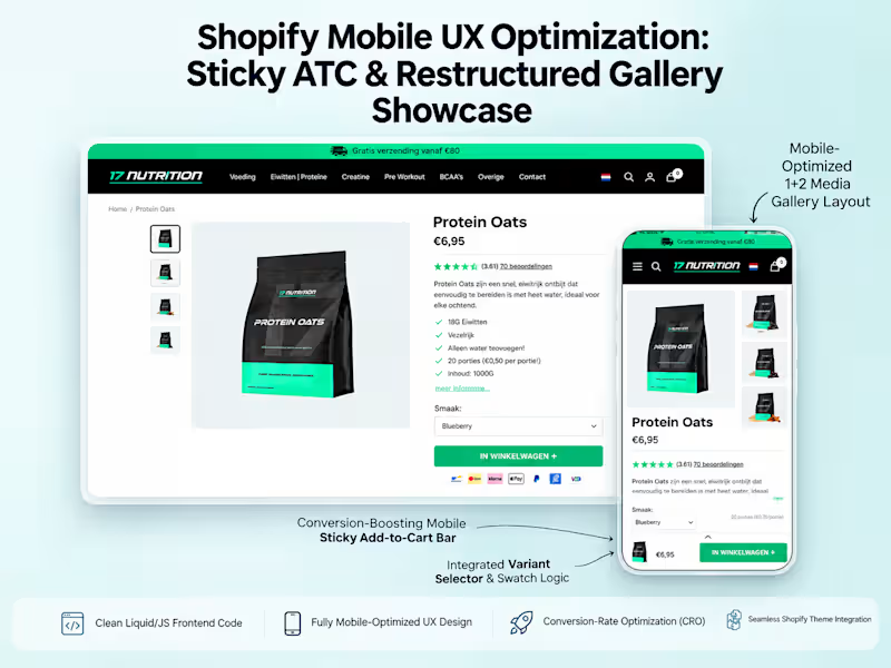
🚀 Your Shopify product page shouldn’t make mobile shoppers work to buy.
For this sports nutrition brand, the goal was simple: make mobile shopping faster, smoother, and more conversion-focused.
I rebuilt the product page with a custom, app-free Shopify 2.0 experience:
• 📱 Premium mobile media gallery — custom 1+2 split-grid layout with synced image previews
• 🛒 Sticky Add-to-Cart — persistent mobile ATC with variant selection and dynamic pricing
• ⏱️ Smart delivery engine — calculates delivery expectations using cutoff times, localization, and country-specific weekend rules
• 🔔 Back-in-stock flow — replaced generic “Sold Out” buttons with a Notify Me lead-capture experience
• ⭐ Smooth review navigation — frictionless scrolling directly to social proof
• ⚡ App-free implementation — lightweight custom Liquid + vanilla JavaScript for a faster experience
The result: a premium, SaaS-style mobile product page designed around one thing — reducing friction between “I want this” → “I’m buying this.”
I love projects where Shopify’s standard theme limitations aren’t enough and the solution needs to be engineered around the brand, UX, and conversion goals.
Need a custom Shopify product page that converts better on mobile? Let’s build it.
#Shopify #ShopifyDeveloper #Shopify2 #ShopifyLiquid #CRO #Ecommerce #ShopifyDesign #UXDesign #ConversionRateOptimization #DTC
1
2
222
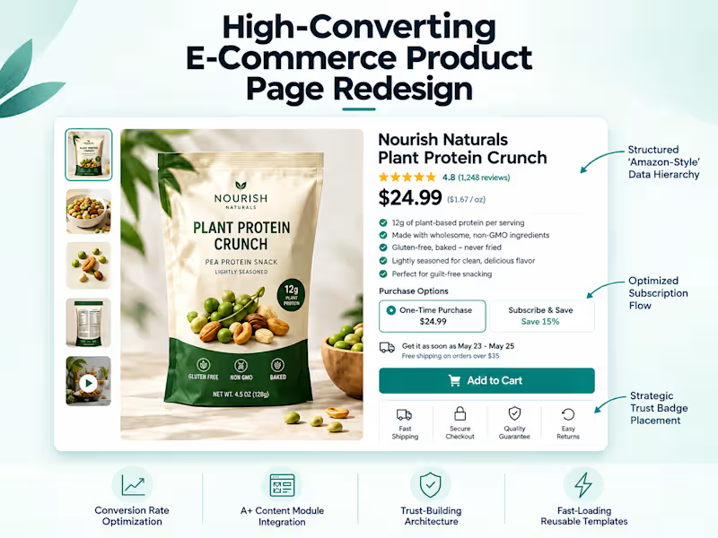
Ever wonder why Amazon converts at such a staggering rate? It all comes down to the ruthless efficiency of their Product Detail Page (PDP).
An expanding e-commerce food brand came to me with a clear mission: they wanted that Amazon-level structure to build trust, highlight benefits, and streamline their buying flow. Their existing setup was struggling under the weight of complex product descriptions, multiple variants, and a clunky subscription UI.
The Roadblocks
Reorganizing massive amounts of product data without shattering their existing theme was the first major hurdle. The client also desperately needed the equivalent of Amazon's visual "A+ Content" modules and dedicated trust signals, which their default theme completely lacked. To top it off, their subscription app's out-of-the-box layout was actively introducing friction.
The Overhaul
Custom Liquid Architecture: I engineered a highly structured, reusable product page template built to handle dense information cleanly.
The Ultimate Buy Box: I completely redesigned the purchase area to clearly separate "One-Time Purchase" from "Subscribe & Save." I wrote custom CSS to override the subscription app's messy default UI, making the choice intuitive and seamless.
Visual Conversion Boosters: I integrated custom blocks for Trust Badges and punchy bullet-point USP sections right above the fold so customers instantly see the value.
Frictionless Checkout: I replaced the standard, multi-step cart page with a sleek iCart slide-out drawer, which drastically improved the mobile conversion funnel.
The final result is a PDP that doesn't just look on-brand—it works incredibly hard. Customers now get a clear, trustworthy, and wildly smooth path to purchase from the second they land on the page.
What is the single biggest feature on a product page that makes you instantly trust an e-commerce brand? Drop your thoughts below—I’m always looking to test new conversion drivers! 👇
0
127
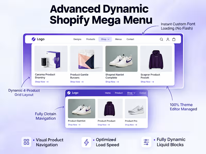
High CPA and abandoned carts? Here’s how I fixed a high-volume Shopify store's mobile UX in just 48 hours. 🚀
The Challenge
Heatmap data revealed a frustrating reality: mobile users were highly engaged but overwhelmed. Cluttered UI elements, mixed signals, and a hidden Add-to-Cart path were causing massive drop-offs right before checkout, leading to an unsustainable Cost Per Acquisition (CPA).
The Solution
I implemented a strict, data-driven 48-hour Conversion Rate Optimization (CRO) sprint to systematically identify and eliminate buying friction.
Sprint 1 Execution:
Decluttered the UI: Consolidated multiple distracting announcement bars into a single, clean message to reduce cognitive load.
Boosted Speed: Optimized image load times to ensure lightning-fast mobile browsing and keep users engaged.
Streamlined Purchasing: Built and deployed a persistent "Sticky Add-to-Cart" bar, keeping the primary action visible at all scroll depths.
The Result
By removing visual distractions and making the purchase path entirely frictionless, we successfully pushed more users deeper into the checkout funnel, lowering the CPA and recovering lost revenue.
Are mobile drop-offs hurting your bottom line? Send me a message and let's map out a customized CRO sprint for your storefront.
3
1
405
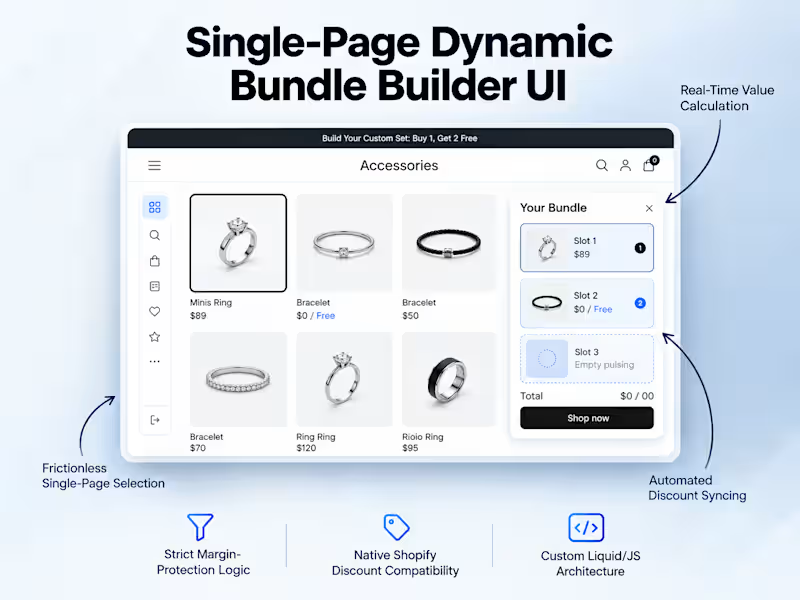
Ever tried building a high-converting "Buy 1, Get 2 Free" offer on Shopify without relying on clunky, multi-step popups? 🤔
Recently, a client wanted a frictionless, premium "Build Your Custom Set" experience on a single landing page. The catch? We needed strict margin-protection logic to prevent offer abuse.
The Challenge: Stop customers from bypassing rules (like adding three expensive rings instead of the intended 1 Ring, 1 Bracelet, 1 Pouch combo) while keeping the entire flow on one page.
The Solution: I engineered a custom one-page UI with a dynamic, sticky "Your Bundle" summary. Using custom JavaScript validation, categories instantly lock once an item is selected—forcing the exact required combination before the Add-to-Cart button activates.
The Result: A flawless, high-converting premium bundle experience that fully integrates with Shopify's native automatic discount engine. The merchant's profit margins are protected, and the customer gets a seamless shopping experience.
Looking to upgrade your store's custom UI and conversion rate? Check out the full project details on my profile and let's chat! 👇
0
119
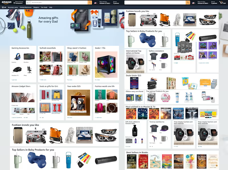
Pixel-Perfect Amazon Homepage UI Clone | Pure HTML5 & CSS3
I recreated the entire layout structure of Amazon’s desktop homepage using vanilla HTML5 and CSS3—focusing on responsive design, modern layout techniques, and strict adherence to brand design specifications.
Key Technical Highlights:
CSS Grid & Flexbox Architecture: Structured complex multi-column product cards, promo banners, and multi-tier grids without relying on external UI frameworks.
Complex Navigation & Search UI: Built a full-width header featuring a nested search bar, dynamic category dropdowns, account controls, and cart counters.
Modular Card Components: Engineered reusable CSS classes for varied product showcases, including 4-tile grid cards, single-item banners, deal listings, and horizontal scroll containers.
Cross-Browser Styling & Reset: Implemented custom box-sizing and CSS custom variables to ensure consistent spacing, font hierarchy, and color palettes across browsers.
Footer & Links System: Built a multi-tier site footer with full alignment accuracy and background styling matching the original Amazon desktop experience.
Tech Stack Used:
HTML5 (Semantic Markup)
CSS3 (Flexbox, CSS Grid, Custom Properties)
Tips for Maximum Reach on Contra:
Select Relevant Tags: Add tags like HTML5, CSS3, Front-End Development, UI/UX Design, Web Development, and Responsive Design.
Include Assets: Upload high-resolution screenshots showing close-ups of the navigation bar, product grid cards, and footer sections alongside the full-page preview.
Add a Live Demo Link: If you have GitHub Pages or Vercel hosting the code, include the live link so clients can inspect your code quality firsthand.
0
95
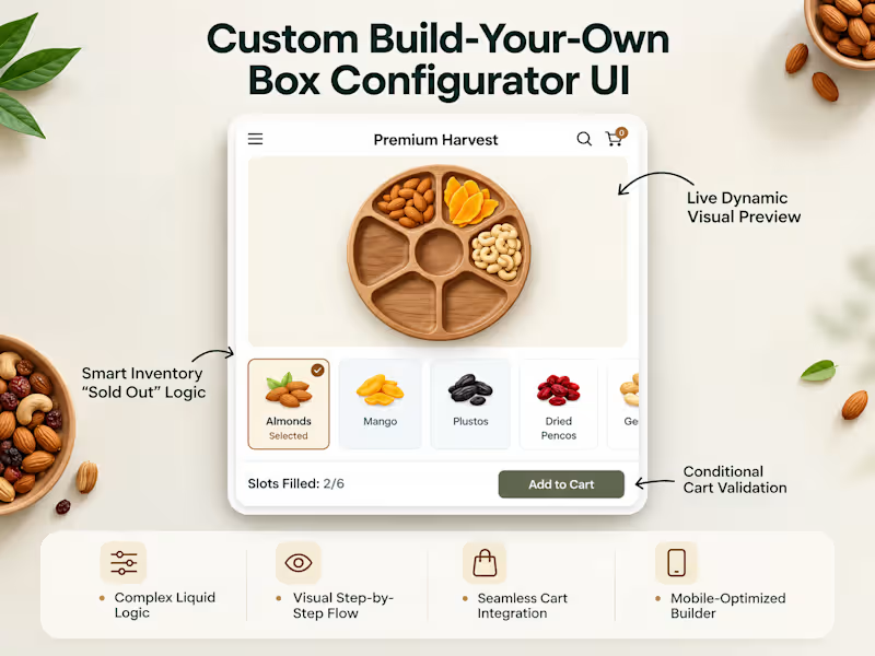
Case Study: Custom Build-Your-Own Box Configurator for Shopify
Building bespoke e-commerce experiences that merge interactive UI with robust backend logic is always a rewarding challenge. Here is how I designed and engineered a dynamic, multi-step bundle builder from the ground up for a premium nuts and dried fruit brand.
The Challenge
The client wanted to move away from a clunky, static custom bundle page and introduce an engaging, visual "Build-Your-Own Tray" experience. The technical hurdles included:
Providing zero-latency, live visual previews as items were selected without page refreshes.
Enforcing dynamic slot constraints based on physical tray sizes (e.g., 6-slot vs. 8-slot layouts).
Preventing inventory discrepancies by dynamically checking real-time stock levels so out-of-stock items couldn't be added.
Ensuring the custom configuration passed cleanly through the cart and checkout pipelines.
The Solution & Architecture
I engineered a lightweight, modular Shopify Liquid and vanilla JavaScript section natively integrated into the theme architecture, avoiding the performance bloat of third-party bundle apps:
Dynamic Visual Staging: Implemented SVG clip-paths and layered asset rendering mapped directly to specific tray compartments. As users tap ingredients, high-resolution visuals render instantly into their corresponding tray slots.
Smart Inventory & Theme Controls: Developed real-time inventory validation that hooks into Shopify's backend stock status. Built a dedicated "Sold Out Manager" schema into the Shopify Theme Editor, allowing store managers to override or adjust product availability on the fly without touching code.
Conditional Cart Validation & Properties: Cart submission remains strictly locked until the exact slot count requirement is fulfilled. Upon completion, the entire bundle payload is structured and transmitted via line-item properties, ensuring precise fulfillment visibility on the backend.
Tech Stack
Shopify Liquid, HTML5, Vanilla JavaScript, CSS3 (Clip-paths & Grid)
Shopify AJAX Cart API & Theme Customizer Schema Integration
0
100
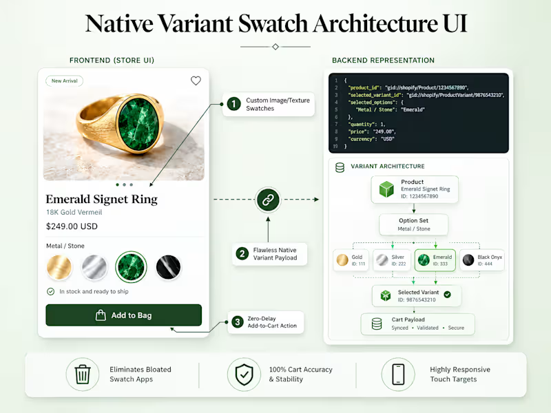
Eliminating Cart Drop-Offs: Custom Native Variant Swatch Sync for Shopify
Are buggy third-party Shopify apps silently killing your checkout conversion rate? 🛑
A jewelry brand approached me with a critical issue: customers were selecting custom color and size variants on product pages, but a conflict with their swatch app meant the wrong items were being added to the cart. The result? Abandoned carts, customer frustration, and lost revenue.
Here is how I solved it natively—without relying on heavy, bloated third-party apps:
🛠️ The Challenge
The store was running a third-party swatch app (Swatch King) that broke the theme’s native size selectors. When a buyer clicked a visual swatch, the script desynced from the backend variant ID, passing incorrect data to the cart payload.
💡 The Solution: Native Variant Swatch Architecture
Instead of patching a broken app script, I eliminated the root cause:
Removed Third-Party Bloat: Uninstalled the conflicting app to boost page load speed.
Custom UI Macro Swatches: Built a bespoke frontend swatch layer supporting rich visual textures (Gold, Silver, Emerald, Onyx).
Direct Liquid / JS Bridge: Bound visual swatch interactions directly to Shopify’s native hidden radio selectors and variant payload.
Zero-Delay Action: Instant, validated variant sync with zero lag or script mismatch.
📈 The Result
100% Cart Accuracy & Stability: The exact selected variant is sent to checkout every single time.
Zero Monthly App Fees: Replaced recurring app costs with clean, maintainable, native code.
Faster Load Times & Mobile UX: Clean touch targets and responsive UI tailored for high-end commerce.
🤝 Need something similar for your store?
If your Shopify store is dealing with:
Variant desync / wrong items added to cart
Slow product pages bogged down by app scripts
Theme conflicts between custom swatches and native option selectors
👉 Send me an inquiry or book a project here on Contra. Let’s audit your product page and build a clean, native solution that converts.
1
188

Just wrapped up a clean and modern portfolio website for a freelance designer and developer 🎨💻.
The goal was to highlight their creative work and technical skills through a visually engaging, responsive design that reflects their personal brand. From smooth navigation to project showcases and contact integration, every detail was crafted to make the portfolio both impressive and functional.
✨ Built for clarity, creativity, and conversion.
📱 Fully responsive across all devices.
#WebDesign #PortfolioWebsite #FreelanceDesigner #WebDeveloper #ResponsiveDesign #UIUX #WebsiteLaunch #DesignShowcase #CreativePortfolio
0
156