Freelancers using CSS in Nankana Sahib
Freelancers using CSS in Nankana Sahib
Sign Up
Post a job
Sign Up
Log In
Filters
2
Projects
People
shumaila anwer
pro
Nankana Sahib, Pakistan
Webflow & Shopify Developer | Brand Identity & 3D Visual
23
Followers
Follow
Message
Webflow & Shopify Developer | Brand Identity & 3D Visual
0
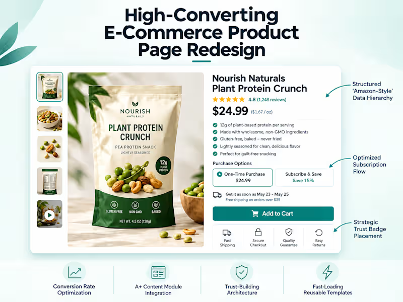
Ever wonder why Amazon converts at such a staggering rate? It all comes down to the ruthless efficiency of their Product Detail Page (PDP). An expanding e-commerce food brand came to me with a clear mission: they wanted that Amazon-level structure to build trust, highlight benefits, and streamline their buying flow. Their existing setup was struggling under the weight of complex product descriptions, multiple variants, and a clunky subscription UI. The Roadblocks Reorganizing massive amounts of product data without shattering their existing theme was the first major hurdle. The client also desperately needed the equivalent of Amazon's visual "A+ Content" modules and dedicated trust signals, which their default theme completely lacked. To top it off, their subscription app's out-of-the-box layout was actively introducing friction. The Overhaul Custom Liquid Architecture: I engineered a highly structured, reusable product page template built to handle dense information cleanly. The Ultimate Buy Box: I completely redesigned the purchase area to clearly separate "One-Time Purchase" from "Subscribe & Save." I wrote custom CSS to override the subscription app's messy default UI, making the choice intuitive and seamless. Visual Conversion Boosters: I integrated custom blocks for Trust Badges and punchy bullet-point USP sections right above the fold so customers instantly see the value. Frictionless Checkout: I replaced the standard, multi-step cart page with a sleek iCart slide-out drawer, which drastically improved the mobile conversion funnel. The final result is a PDP that doesn't just look on-brand—it works incredibly hard. Customers now get a clear, trustworthy, and wildly smooth path to purchase from the second they land on the page. What is the single biggest feature on a product page that makes you instantly trust an e-commerce brand? Drop your thoughts below—I’m always looking to test new conversion drivers! 👇
0
32
0
High CPA and abandoned carts? Here’s how I fixed a high-volume Shopify store's mobile UX in just 48 hours. 🚀 The Challenge Heatmap data revealed a frustrating reality: mobile users were highly engaged but overwhelmed. Cluttered UI elements, mixed signals, and a hidden Add-to-Cart path were causing massive drop-offs right before checkout, leading to an unsustainable Cost Per Acquisition (CPA). The Solution I implemented a strict, data-driven 48-hour Conversion Rate Optimization (CRO) sprint to systematically identify and eliminate buying friction. Sprint 1 Execution: Decluttered the UI: Consolidated multiple distracting announcement bars into a single, clean message to reduce cognitive load. Boosted Speed: Optimized image load times to ensure lightning-fast mobile browsing and keep users engaged. Streamlined Purchasing: Built and deployed a persistent "Sticky Add-to-Cart" bar, keeping the primary action visible at all scroll depths. The Result By removing visual distractions and making the purchase path entirely frictionless, we successfully pushed more users deeper into the checkout funnel, lowering the CPA and recovering lost revenue. Are mobile drop-offs hurting your bottom line? Send me a message and let's map out a customized CRO sprint for your storefront.
3
0
56
0
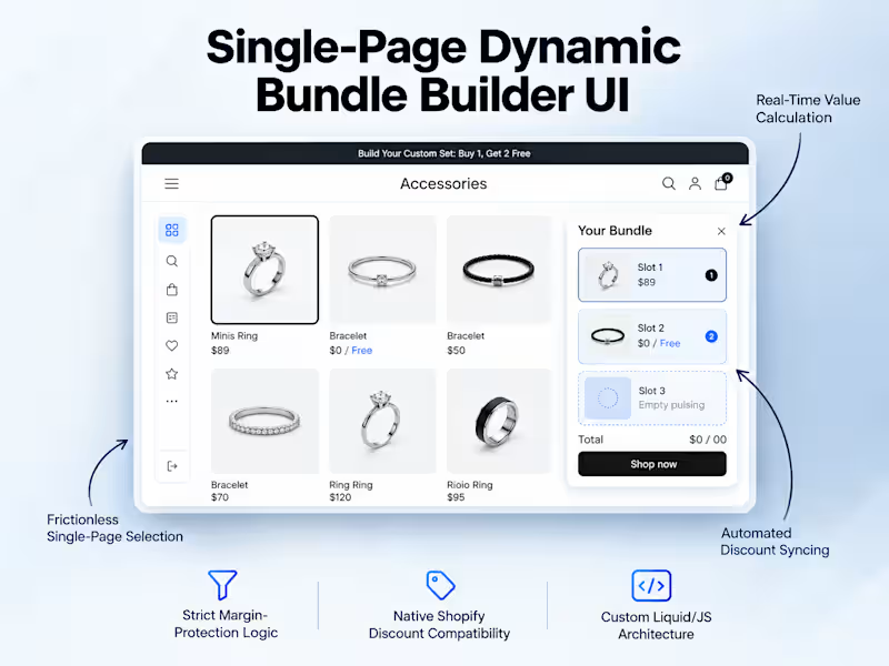
Ever tried building a high-converting "Buy 1, Get 2 Free" offer on Shopify without relying on clunky, multi-step popups? 🤔 Recently, a client wanted a frictionless, premium "Build Your Custom Set" experience on a single landing page. The catch? We needed strict margin-protection logic to prevent offer abuse. The Challenge: Stop customers from bypassing rules (like adding three expensive rings instead of the intended 1 Ring, 1 Bracelet, 1 Pouch combo) while keeping the entire flow on one page. The Solution: I engineered a custom one-page UI with a dynamic, sticky "Your Bundle" summary. Using custom JavaScript validation, categories instantly lock once an item is selected—forcing the exact required combination before the Add-to-Cart button activates. The Result: A flawless, high-converting premium bundle experience that fully integrates with Shopify's native automatic discount engine. The merchant's profit margins are protected, and the customer gets a seamless shopping experience. Looking to upgrade your store's custom UI and conversion rate? Check out the full project details on my profile and let's chat! 👇
0
47
0
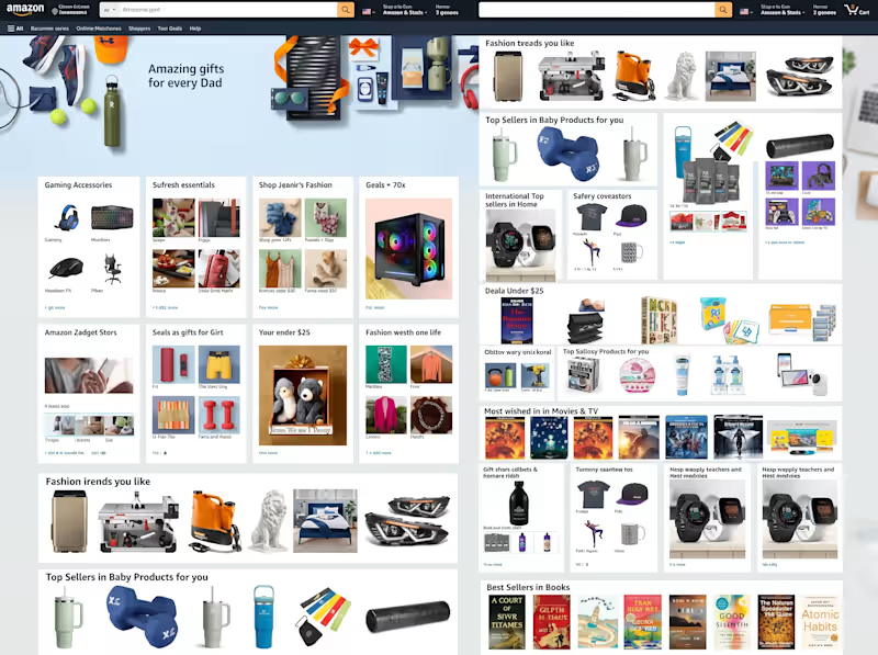
Pixel-Perfect Amazon Homepage UI Clone | Pure HTML5 & CSS3 I recreated the entire layout structure of Amazon’s desktop homepage using vanilla HTML5 and CSS3—focusing on responsive design, modern layout techniques, and strict adherence to brand design specifications. Key Technical Highlights: CSS Grid & Flexbox Architecture: Structured complex multi-column product cards, promo banners, and multi-tier grids without relying on external UI frameworks. Complex Navigation & Search UI: Built a full-width header featuring a nested search bar, dynamic category dropdowns, account controls, and cart counters. Modular Card Components: Engineered reusable CSS classes for varied product showcases, including 4-tile grid cards, single-item banners, deal listings, and horizontal scroll containers. Cross-Browser Styling & Reset: Implemented custom box-sizing and CSS custom variables to ensure consistent spacing, font hierarchy, and color palettes across browsers. Footer & Links System: Built a multi-tier site footer with full alignment accuracy and background styling matching the original Amazon desktop experience. Tech Stack Used: HTML5 (Semantic Markup) CSS3 (Flexbox, CSS Grid, Custom Properties) Tips for Maximum Reach on Contra: Select Relevant Tags: Add tags like HTML5, CSS3, Front-End Development, UI/UX Design, Web Development, and Responsive Design. Include Assets: Upload high-resolution screenshots showing close-ups of the navigation bar, product grid cards, and footer sections alongside the full-page preview. Add a Live Demo Link: If you have GitHub Pages or Vercel hosting the code, include the live link so clients can inspect your code quality firsthand.
0
36
CSS
(7)
Follow
Message
Explore people