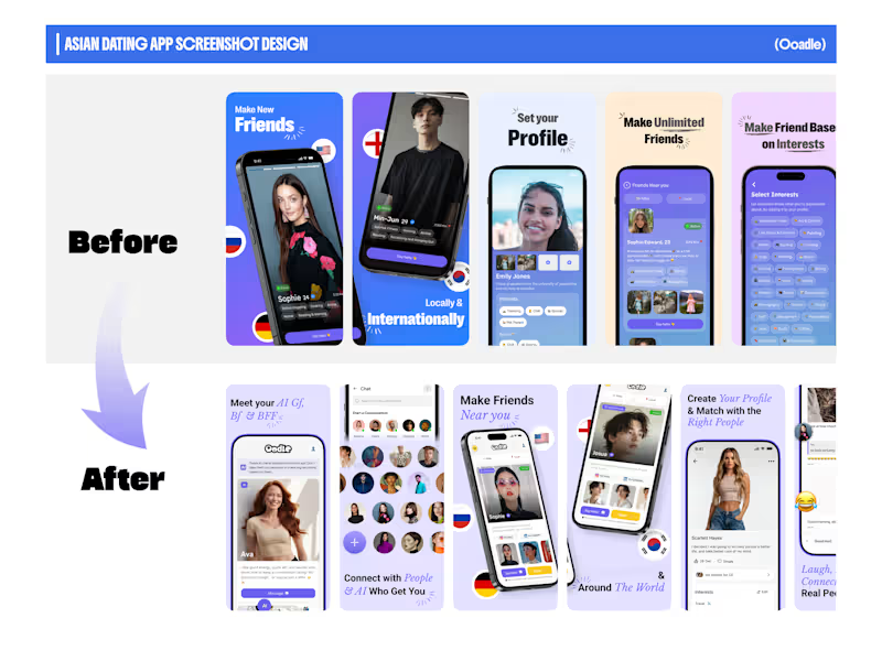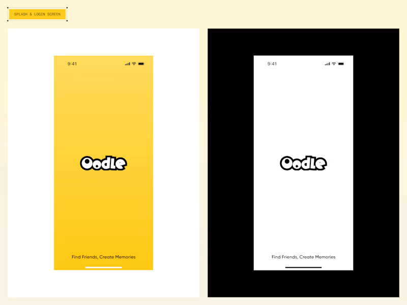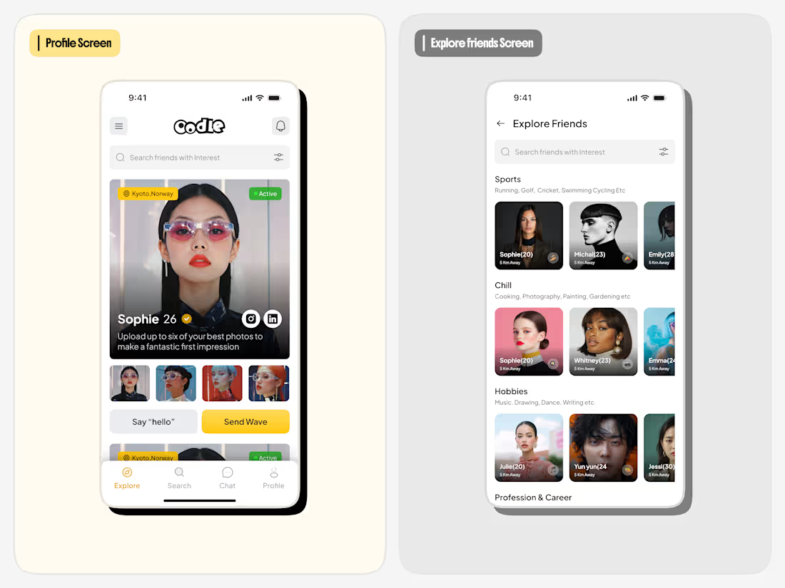
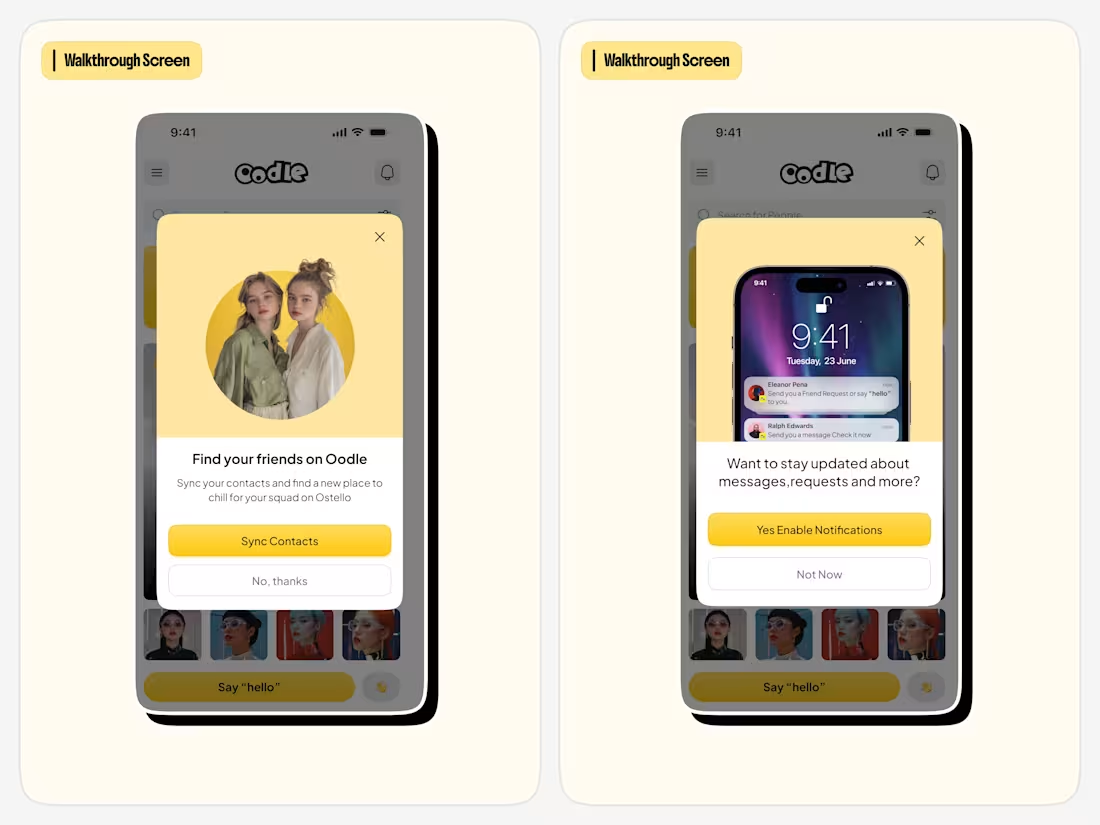
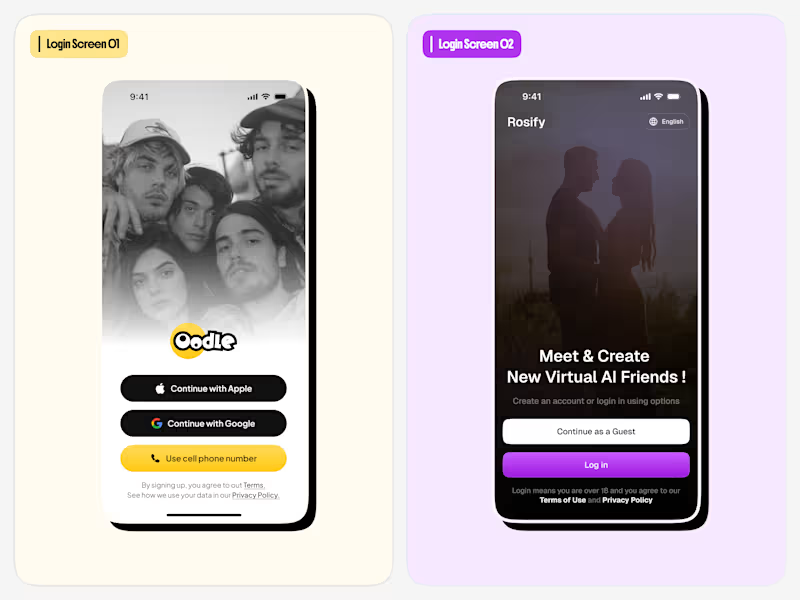
Discover people beyond the profile. 👋
Exploring a fresh social discovery experience with Oodle , where shared interests make connecting with people more meaningful.
From expressive profile screens to interest-based discovery, every interaction is designed to make finding like-minded people feel simple and natural.
A little exploration in social product design. ✨
1
68
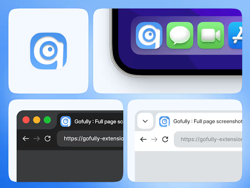
Something is cooking… 👀💙
A logo is just the beginning.
I’ve been working on the complete brand identity for Gofully, a browser extension — from the app icon and visual identity to browser branding and a consistent look across different environments.
The goal? To make Gofully feel like a polished, recognizable product, not just another extension.
From the smallest icon to the overall brand experience, every detail matters.
And this is just a glimpse of what’s coming. 🚀
Full branding reveal soon.
#BrandIdentity #Branding #ProductDesign #VisualDesign #Contra #DesignInProgress
1
103
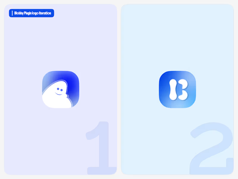
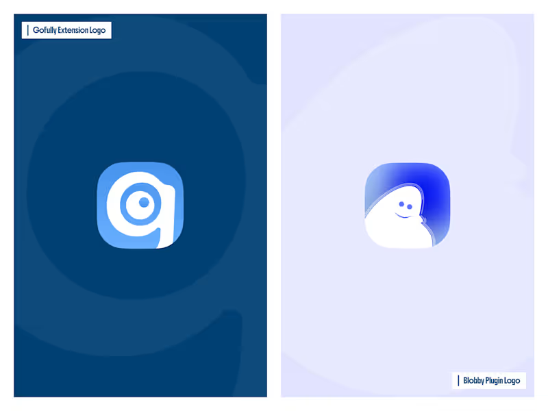
One plugin, two different directions. 💙
Exploring logo ideas for Blobby, my Figma plugin.
Version 1: A friendly, character-based look.
Version 2: A simple, bold icon that feels more like an app brand.
Same plugin, different visual approach. Which one would you choose — 1 or 2? 👀
#Figma #FigmaPlugins #LogoDesign #ProductDesign #VisualDesign
3
144
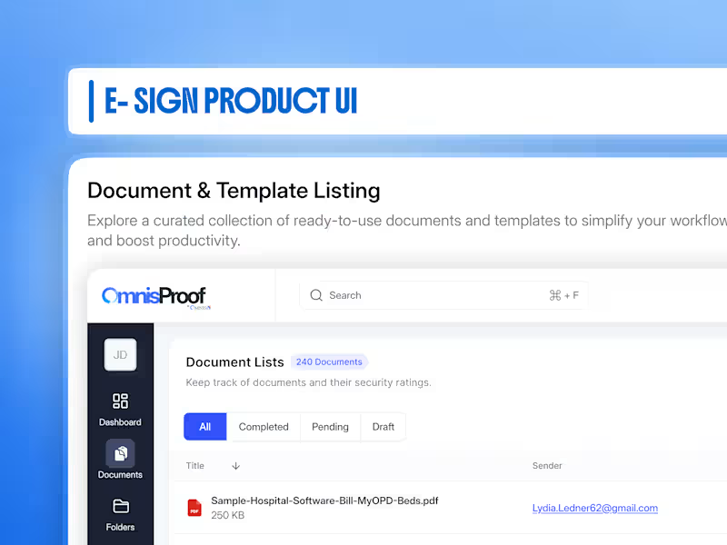
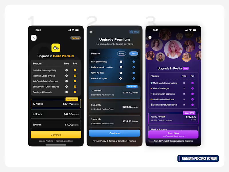
3 pricing screens. 1 goal: make upgrading feel simple. 💳
Exploring different pricing directions for a mobile app — balancing plan comparison, pricing hierarchy, feature visibility, and clear CTAs.
The challenge was to show enough information to help users make a decision without making the screen feel overwhelming.
I explored different approaches for:
→ Free vs Pro comparison
→ Monthly & yearly plans
→ Highlighting the best-value option
→ Clear upgrade messaging
→ Strong, focused CTAs
Which direction would you choose? 👀
1, 2, or 3 — drop your pick 👇
#UIDesign #ProductDesign #PricingUX #MobileDesign
2
180