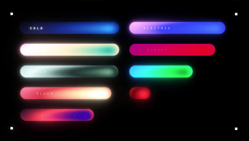



Wore two hats on this one — creative director and animator⚡
The challenge? Taking a SaaS product and making it instantly clear visually, for someone seeing it for the first time. Stripping back the complexity without losing the soul of the product.
And honestly, having a client who trusts the process makes all the difference. Hope you enjoy it!
0
145


Lenskart CGI Campaign – Giant Eyewear Transit Concept
This CGI advertisement features a train transporting an oversized pair of Lenskart spectacles through a cinematic environment, creating a bold and memorable visual metaphor for the brand's scale, innovation, and market presence. The concept transforms an everyday product into a larger-than-life spectacle, designed to capture attention and spark curiosity across digital and social media platforms.
The project combines realistic 3D modelling, environmental design, dynamic train animation, and cinematic camera movements to create a seamless and visually impactful experience. Special attention was given to scale, lighting, textures, and motion to ensure the giant eyewear integrates naturally within the scene while maintaining a premium, advertisement-quality look.
Key Highlights:
CGI Product Advertising
Giant Product Visualisation
3D Modelling & Texturing
Train & Environment Animation
Cinematic Camera Work
Lighting & Rendering
Visual Effects & Compositing
Social Media Marketing Content
This project demonstrates the power of CGI-driven storytelling, turning a simple product showcase into an eye-catching visual experience that strengthens brand recall and audience engagement.
3
3
220

I created a kinetic intro animation inspired by the design evolution from the OnePlus 13 to the upcoming OnePlus 15.
The concept starts with the iconic Plus symbol, then transitions into the outline of the OnePlus 13. I used dynamic line movements to reshape its silhouette into the new OnePlus 15 form factor. The sequence ends with a clean reveal of the OnePlus 15 logo, followed by a smooth wave transition from the static render into the main video.
What I focused on:
Clean logo-driven animation
Shape-to-shape transformation (OP13 ➜ OP15)
Smooth morphing lines for design evolution
Minimal, modern motion language
Wave-style transition into the final video
This intro sets a futuristic, premium tone for smartphone content while keeping the animation short, bold, and visually impactful.
1
85

A 35-second Short built as a proof-of-craft piece: editing advice for other editors, delivered in the format it's teaching. Fast cuts, kinetic captions, on-screen demonstration of the technique being described — the edit is the argument.
Delivered: short-form edit, kinetic captions, motion titles, vertical cut.
#videoediting #motiongraphics #aftereffects #videoeditor #editingtips
0
72

Smooth, modern hover animation for a "Hire" button. The button starts in a neutral gray state and transitions to a vibrant blue with a subtle lift effect when the cursor hovers over it. When the cursor moves away, it gently returns to its original gray state.
This micro-interaction features clean 3D styling, soft shadows, and polished timing to give a premium, responsive feel — perfect for call-to-action buttons on websites, portfolios, or SaaS landing pages.
0
74

Designed a sleek full logo for Pedro — a geometric "p" submark in blue and pink-purple gradient paired with bold, dark navy wordmark typography. The design speaks the visual language of modern tech — precise, premium, and quietly confident. A brand identity that scales from product UI to physical signage without losing its edge.
0
242

