
CASE STUDY
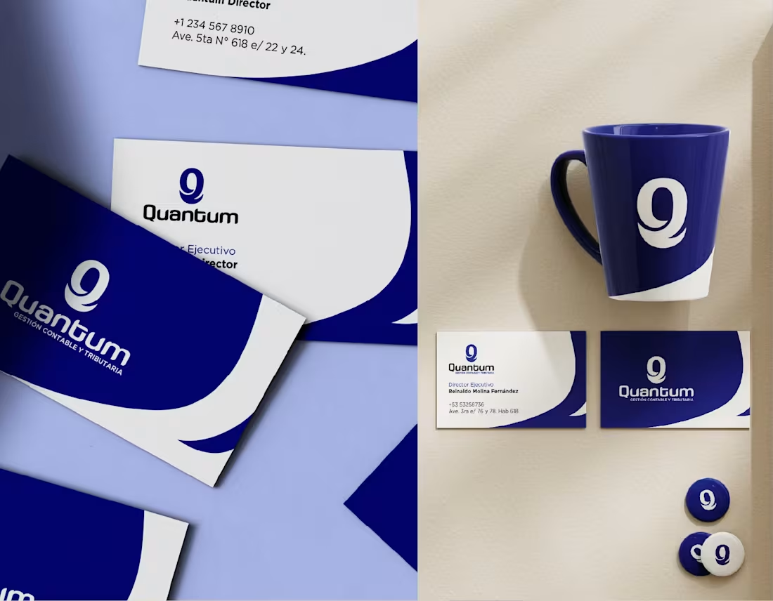
Quantum needed a corporate identity capable of conveying trust, professionalism, and reliability within the accounting and tax sector. The project began with the client’s desire to incorporate the concept of quantum mechanics as a distinguishing feature, combining it with a sober, corporate image.
The main challenge was to translate an abstract idea into a clear and functional visual identity. To achieve this, a logo was developed based on the letter Q, accompanied by a minimalist graphic system that reinforces the precision, order, and credibility characteristic of the financial sector.
The result was an elegant, contemporary, and versatile visual identity capable of setting the company apart without losing the institutional character required by this type of service. The project was delivered on schedule and received high satisfaction ratings from the client.
PROJECT SUMMARY
Development of a corporate identity for Quantum, an accounting and tax firm, creating a logo based on the letter Q and a understated visual system inspired by the concept of quantum mechanics to convey trust and professionalism.
https://angrafista.com/es/project/quantum
1
81


CASE STUDY
This project involved the editorial design of the menu for Havana Rouge, translating the restaurant’s retro-tropical identity into one of the most important communication elements of the customer experience. The goal was to create a visual system that remained consistent with the brand and made the content easy to read and navigate.
Every design decision—from composition and typographic hierarchy to the use of textures, colors, and graphic elements—aligned with the visual language previously defined for the brand. The result was an editorial piece that not only clearly organized the menu offerings but also reinforced the restaurant’s personality and character on every page.
PROJECT SUMMARY
Editorial menu design for Havana Rouge, applying the brand’s visual identity through a coherent composition, hierarchy, and graphic language to enrich the customer experience.
0
83


CASE STUDY
This project involved developing the visual identity for a restaurant inspired by the retro-tropical aesthetic of 1950s and 1960s Cuba, reinterpreted from a contemporary perspective. The proposal sought to evoke nostalgia for an iconic era through a deconstructed graphic language, aimed at a young audience.
My involvement extended beyond visual design, as I was also involved in defining the brand strategy and providing creative direction for the project. Based on a communication vision approved by the client, we established the graphic guidelines that shaped the brand identity and ensured its consistency across all touchpoints.
The result was a solid and coherent brand, capable of conveying a distinctive identity and maintaining a unified visual language across all media, combining strategy, branding, and design.
PROJECT SUMMARY
Development of a brand strategy and visual identity for a retro-tropical-inspired restaurant, creating a consistent graphic system applied coherently across all communication channels.
0
67

💧 Souldrops: Strategic Identity & Packaging
Overview Elevating a sustainable personal care brand through a Premium Visual System. I transformed an emotional concept into a technical, high-end identity that cuts through the "eco-friendly" noise.
Key Deliverables
↘ Strategic Branding: Minimalist logo & grid-based typography for global scalability.
↘ Visual Identity System: Sophisticated palette and clear information hierarchy.
↘ Premium Packaging: Clean, pure-form design focused on shelf-impact.
↘ 3D Visualization: Custom high-fidelity Blender 3D mockups for realistic product staging. 📈
↘ The Result A cohesive, high-end market position ready for industrial production and global scaling. 🚀
↘Skills
Bran Design | Packaging Design | Blender 3D | Visual Systems | Print & Large Format
4
5
510

CASE STUDY
Biomat needed a brand identity system capable of positioning a biotechnology company specializing in biomaterials for the healthcare sector. The project ranged from the corporate visual identity and brand guidelines to a comprehensive wayfinding system and a launch campaign for a new product line.
The main challenge was to develop a consistent identity across multiple media and create a campaign with a distinctive concept: the shadows and reflections of biomaterials were transformed into iconic works of world architecture, drawing an analogy between scientific innovation and humanity’s greatest achievements.
The result was a comprehensive, robust, and scalable branding system that unified communication, spaces, and products under a single visual language, becoming one of the brand’s most complete projects and earning recognition through a design award.
PROJECT SUMMARY
Comprehensive branding system for a biotechnology company, including corporate identity, brand manual, wayfinding system, and product launch campaign featuring an award-winning visual concept.
1
70


CASE STUDY
This personal project explores the relationship between film and graphic design through a series of posters created for an international film festival. The project involved reinterpreting well-known quotes from Cuban cinema using a contemporary visual language, while preserving the legacy of Cuba’s poster-making tradition.
Each piece was developed using graphic elements characteristic of Cuban poster art as a reference, combining composition, typography, and visual synthesis to generate new interpretations of widely known works. The goal was to pay homage to one of the most representative expressions of Cuban cultural design from a contemporary perspective.
The result was a collection of posters with a strong conceptual character that celebrates Cuba’s graphic and cinematic heritage through a unique visual reinterpretation.
PROJECT SUMMARY
A series of conceptual posters for an international film festival, inspired by iconic phrases from Cuban cinema and developed based on the visual legacy of the Cuban poster school.
1
71

CASE STUDY
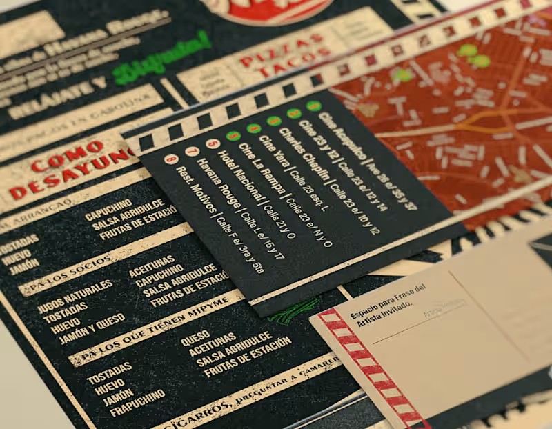
This project involved designing a branding system for a collaboration between a restaurant with a classic Havana aesthetic and a Latin American film festival. The main challenge was to integrate two visual identities with distinct personalities into a coherent and balanced whole.
The proposal drew on the festival’s graphic elements and combined them with the restaurant’s visual language, seeking a natural harmony between the two brands without either one taking center stage. Through a careful visual hierarchy, typographic selection, and graphic treatment, a system was created that effectively communicated the collaboration.
The result was a brochure that served as a meeting point between gastronomy and culture, reinforcing the identity of both institutions within a unified visual experience.
PROJECT SUMMARY
Design of a publishing system for a collaboration between a classic Havana-style restaurant and a Latin American film festival, integrating both identities into a coherent and balanced visual proposal.
1
78
