
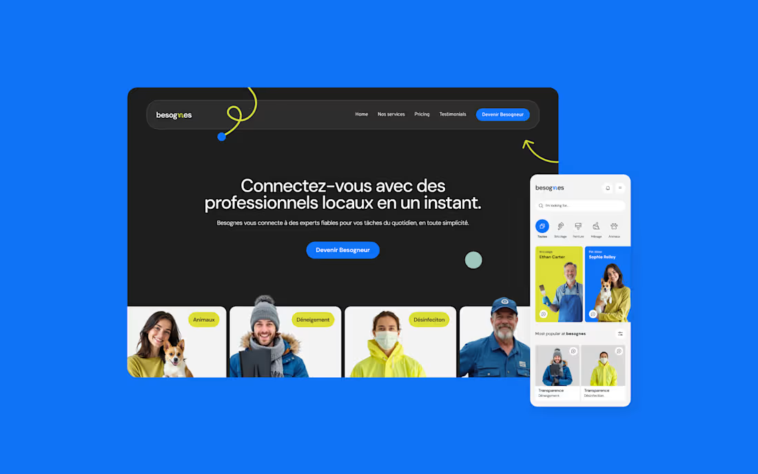
The Client: A Desktop/Mobile app to connect people and their services.
The Issue: Finding reliable help for everyday tasks like cleaning, small repairs, or pet care is often frustrating and time-consuming. People need a simpler, more trustworthy way to get things done.
The Solution: Besognes connects users with verified local service providers, making it easy to book help in just a few taps — fast, secure, and stress-free.
2
136
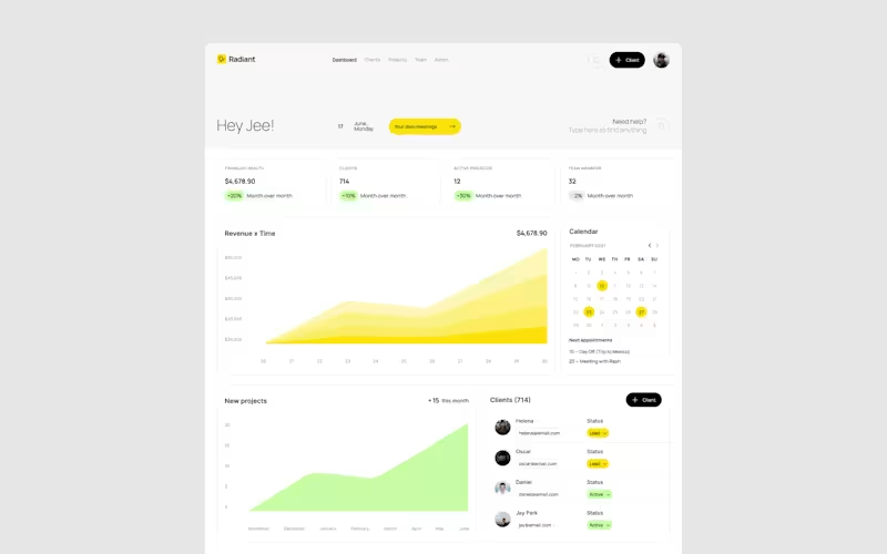
The Client: A platform built for agencies and studios to manage their businesses effectively.
The Issue: The client required a robust platform with detailed information that could streamline project management, billing, and milestones.
The Solution: We delivered an organized, intuitive platform with a consistent design approach. Radiant supports agencies in managing their projects efficiently, ensuring clarity and ease for users to oversee operations and track progress.
1
91
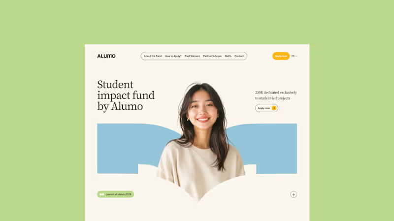
The Client: Alumo is a student impact fund that pools collective influence from influencers and partner schools to deliver a $250,000 annual grant program for student-led projects across Canada.
The Issue: The fund needed a website that could communicate trust and purpose to two very different audiences — students applying for grants and partner schools or influencers considering joining — while also showcasing past winners and guiding applicants through the process clearly.
The Solution: A multi-page website was designed with a warm, approachable visual identity using earthy tones, generous imagery, and clear information hierarchy. Each section — About, Past Winners, and How to Apply — was structured to reduce friction and build confidence, making it easy for students to understand eligibility and take action before the deadline.
51
55
2K
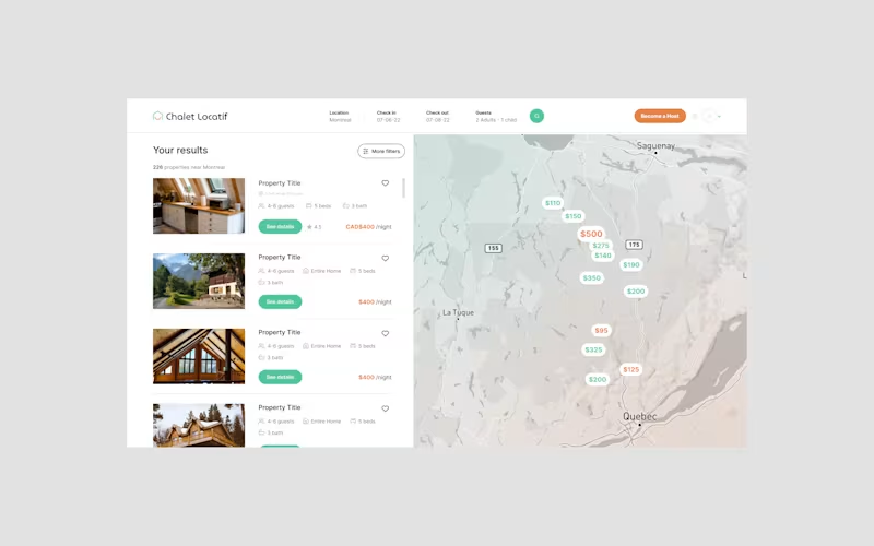
he Client: Chalet Locatif is a Canadian platform for booking and managing short-term chalet rentals, helping both travelers and property owners with seamless reservation and hosting experiences.
The Issue: Despite a growing interest in local tourism and chalet investments, users face friction when searching for, comparing, and booking properties due to scattered information, inconsistent presentation, and lack of intuitive filters or pricing clarity. Hosts, on the other hand, often struggle with visibility, property management, and ensuring their listings attract bookings efficiently.
The Solution: The main challenge was to create a clean, scalable interface that balances the needs of two very different user groups—renters and hosts—while keeping the experience simple and welcoming. The platform needed to support dynamic search functionality, detailed property listings, a responsive map-based UI, and smooth reservation flows without overwhelming users. Additionally, maintaining a cohesive brand identity across all touchpoints, including mobile and desktop, was key to building trust and engagement in a competitive rental market.
2
101
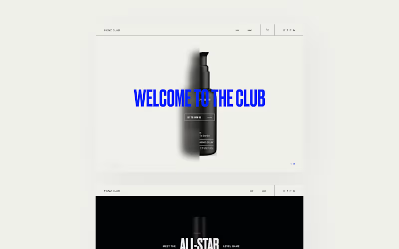
The Client: An e-commerce platform dedicated to selling beauty products for men.
The Issue: Many men feel hesitant or out of place navigating beauty-focused websites, creating a need for a visual tone that feels approachable and aligned with their preferences.
The Solution: Conceived a modern, visually appealing platform with a straightforward design. The interface showcases products prominently while ensuring a seamless, comfortable shopping experience that boosts confidence in purchasing aesthetic items.
2
75
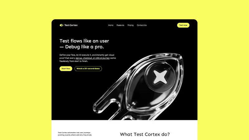
The Client:
Test-Cortex is a user testing and flow validation platform that helps teams create, manage, and execute usability test plans for mobile and desktop applications.
The Issue:
While the platform delivered strong functionality, its visual identity no longer reflected the nature of the product. The existing logo and brand lacked a sense of modernity, precision, and digital-native behavior—failing to communicate the platform as a UI-driven, real-time testing tool. It didn’t evoke the clarity of systems, the logic of flows, or the technical sharpness expected from a product operating at the intersection of UX and performance. As a result, the perception of the product felt more generic and outdated than the experience it actually provided.
The Solution:
The rebranding focused on redefining Test-Cortex as a modern, system-oriented product through a sharper and more intentional visual language. The new identity explores elements inspired by interface logic—such as grids, nodes, connections, and color-coded states—to reflect structure, validation, and flow clarity. The logo was redesigned to feel more precise, modular, and digital-first, supported by a color system that reinforces interaction states and usability feedback. The result is a cohesive identity that aligns with the product’s purpose: a tool built for clarity, control, and confident decision-making in UX validation.
1
127
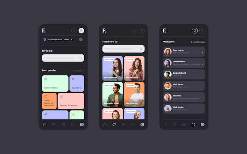
The Client: A platform designed to help users discover services in their area.
The Issue: The platform needed a solid design structure that was modern, visually engaging, and easy to navigate.
The Solution: We created a consistent and user-friendly interface with an intuitive UX. The design approach is fun and visually comforting, ensuring that users can easily find services while enjoying a relaxed experience.
1
66