
AI Video Producer for Ads, Films & Brand Worlds

AI Video Producer for Ads, Films & Brand Worlds
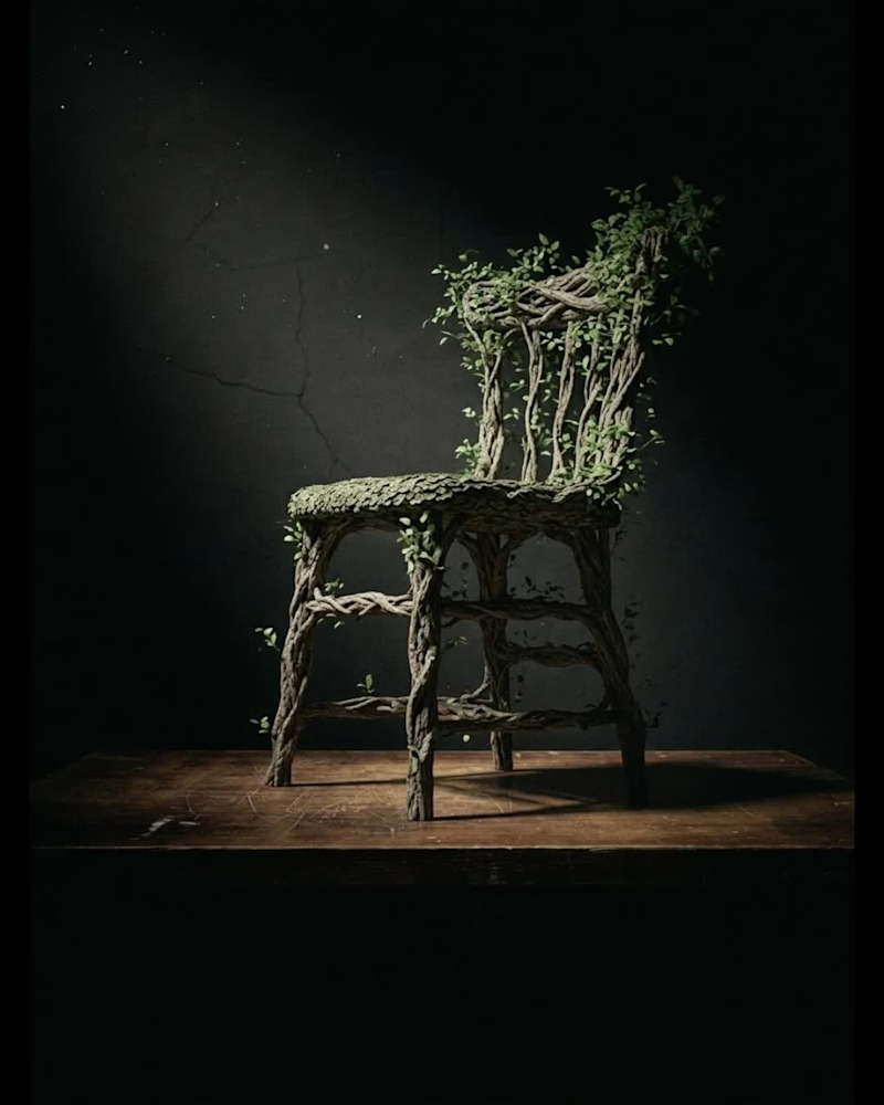
Ideogram 4.5 just launched and I stopped making new images and just kept editing one.
With the early access, I have been testing this new image model.
Most models get worse the longer you stay on one image. Pixel shift, color drift, texture junk. Ideogram 4.5 is built to cut that down, so you can keep going. I tried it across lighting, color, outfits, product shots, interiors, text, and close crops. Fast. And the parts I didn’t ask to change mostly stayed put. Here are some examples I made during the test.
3
21
923


Halloween’s creeping up, and I’m so over the same old spooky posters! I decided to shake things up with Ideogram ’s Style feature and whipped up some unique Halloween posters/invitation cards using one prompt.
Here’s the prompt I used: "a Halloween poster with a luxurious brand aesthetic: a sleek black background with gold and deep burgundy accents, featuring an elegant silhouette of a gothic figure adorned with intricate jewelry. Incorporate subtle shimmer effects. Use a sophisticated font for the text, announcing 'Haunted Elegance: Halloween Gala 2025' with the date and time in smaller, refined lettering. Add a hint of mist for a premium feel. It’s fancy yet spooky, love how it turned out!💜
General Style, The Aura Style, The Dark Aura Style (my fave, those shadows hit different!), and The Nightlife Style.
30
448

