
Problem-Solving Product Designer with 5+ Years Exp.

Problem-Solving Product Designer with 5+ Years Exp.


16+ Years in UX/UI & Product Design


Designed a modern, data-driven mobile experience, focused on simplifying patient monitoring and recovery tracking through a clean, intuitive interface.
The goal was to translate complex health data into clear, actionable insights—helping both practitioners and patients stay informed without feeling overwhelmed.
Key Highlights
• Real-time patient insights with clean data visualization
• Clear hierarchy for quick decision-making
• Dark UI with subtle gradients for a focused, modern feel
• Intuitive navigation for tracking progress, alerts, and sessions
• Designed for clarity, accessibility, and daily usability
This project explores how thoughtful UI can make health tech feel human, calm, and easy to use—even when handling complex data.
Tools: Figma
Focus: UI/UX Design, Mobile App Design, HealthTech, Data Visualization
1
139

Showcasing another UX/UI exploration focused on clarity, trust, and strong visual hierarchy for a healthcare experience.
For Physmo, the goal was to create a clean interface that highlights the message while keeping the product interaction simple and engaging.
Take a look at the full project:
🔗 https://tagntarget.com/works/Physmo
Always excited to design digital experiences that feel intuitive, modern, and purposeful.
1
163

Visual Content Studio for Founders, Startups & Growing Brand
New to Contra
Visual Content Studio for Founders, Startups & Growing Brand
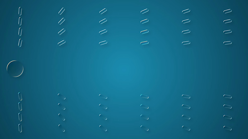
Designing for attention, one frame at a time.
A looping motion experiment exploring timing, visual hierarchy and subtle movement to create an interaction that naturally attracts attention.
Simple idea. Small movements. Deliberate timing.
Motion Design • Interaction • Loop Animation
0
70

What happens when a simple slider becomes an interaction? ✦
A liquid-glass UI interaction experiment exploring how motion, depth and responsive feedback can make a familiar interface element feel more tactile.
I focused on:
• Smooth slider movement
• Mouse-driven interaction
• Liquid-glass depth and transparency
• Subtle micro-interactions
• Responsive visual feedback
The goal wasn't to add motion for the sake of motion. It was to make the interaction feel physical, intuitive and satisfying.
UI Motion • Interaction Design • Micro-interactions • Liquid Glass
0
63
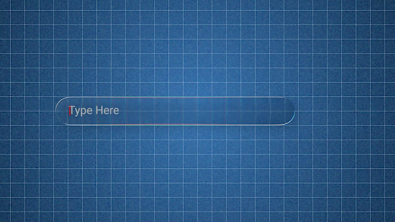
Iteration makes the interaction better.
This is an improved version of my previous Liquid Glass UI animation, refining the motion, interaction and overall visual feel.
I focused on making the experience feel:
• Smoother
• More responsive
• More tactile
• More visually refined
Rather than simply adding more effects, the goal was to improve the relationship between motion, interaction and visual feedback.
Small refinements can completely change how an interface feels.
0
50
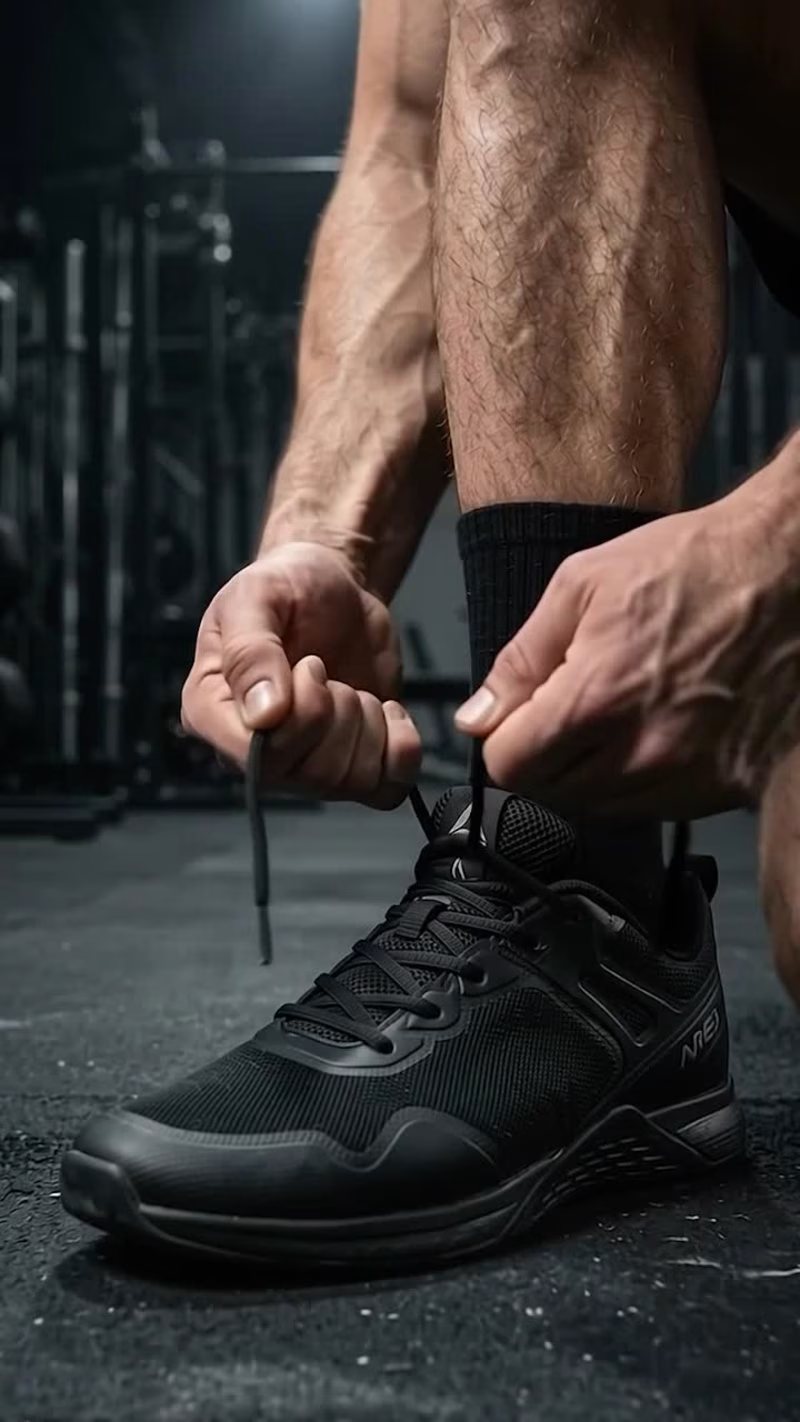
Your next product deserves more than a boring ad. 🔥
Meet FORGE, a gym app concept built around one message: NO EXCUSES.
I created this AI-powered video ad concept to show how strong visuals, cinematic storytelling, and sharp editing can turn a simple app idea into a high-impact product advertisement.
The goal? Make people feel the product before they even download it.
I’m looking to work with SaaS founders, app developers, and brands who want their products to stand out through premium video ads.
Building something worth showing off? Let's make it impossible to scroll past.
#AIVideo #ProductAd #VideoEditing #SaaSMarketing
0
21

Framer expert building conversion-focused sites
Framer expert building conversion-focused sites


Orenda – NGO & Charity Website Template for Framer
Orenda is a premium Framer NGO template designed to help nonprofits, charities, and social organizations build trust and inspire action. Perfect for organizations looking to create meaningful impact, share their mission, and connect with supporters online.
Live Preview: Orenda (https://orenda.framer.website/)
2
4
766
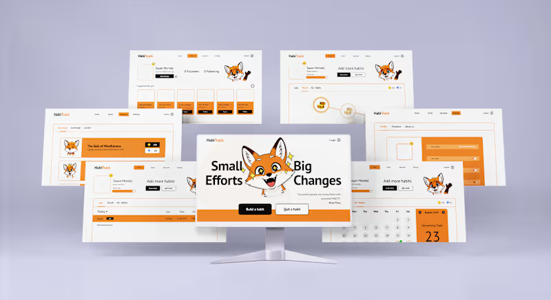


Visual Impacting Design for Your Brand
Visual Impacting Design for Your Brand


