Freelancers using Notion in Khulna
Freelancers using Notion in Khulna
Sign Up
Post a job
Sign Up
Log In
Filters
2
Projects
People
MD SAJIBUZZAMAN
Khulna, Bangladesh
UI/UX Designer building for humans, not just for screens.
21
Followers
Follow
Message
UI/UX Designer building for humans, not just for screens.
1
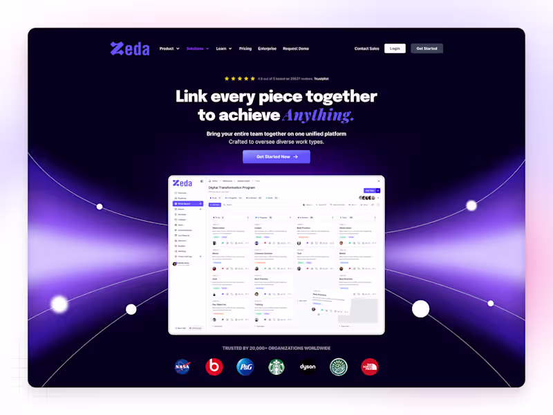
✦ Nax — SaaS Website Homepage (Light Theme) Nax is a modern SaaS homepage built with a light and minimal aesthetic — designed to feel clean, calm, and conversion-focused. The goal was to create a digital space where clarity meets purpose, helping users understand the product instantly without distractions. Each section flows naturally — from the hero headline to the feature highlights — giving the brand a professional yet approachable tone. Soft shadows, balanced typography, and structured spacing keep the interface fresh, elegant, and easy to scan. This design is all about confidence through simplicity. Because sometimes, light design says more.
2
1
125
0
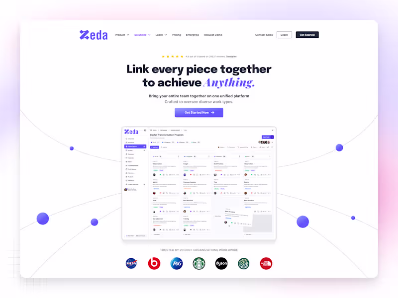
✦ Nax — SaaS Web App Homepage Nax is a sleek and modern SaaS website homepage designed to help digital products stand out through clarity, simplicity, and trust. The concept focuses on structured storytelling — from a bold hero section to clear feature highlights and strong call-to-actions that drive conversions. Every section was built with purposeful spacing, modern typography, and minimal visuals, creating a balance between aesthetics and usability. Soft tones and subtle animations make the interface feel alive yet calm, giving users a sense of confidence while exploring the product. For me, Nax represents what great SaaS design should be — simple, scalable, and human-centered. Because when design tells a story clearly, conversion happens naturally.
0
123
1
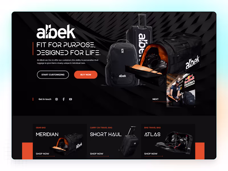
✦ Albek — Luggage & Bag Brand Website Albek is a premium luggage and travel gear website designed for people who value both style and performance. The design blends modern aesthetics with rugged energy, reflecting the brand’s adventurous spirit. From the bold hero visuals to the smooth product grid, every section was crafted to create a luxury retail experience that feels human and aspirational. The layout focuses on clarity, storytelling, and brand emotion — giving users a reason not just to browse, but to connect. I designed Albek with one goal in mind — to make travel gear look as premium as it performs.
2
1
131
1
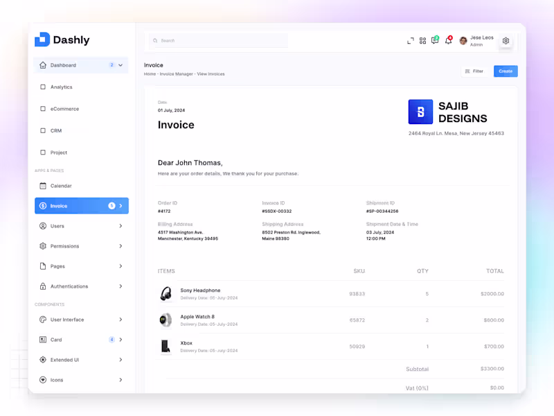
✦ Dashly — Invoice Profile App Dashly Invoice Profile is a modern dashboard app designed to help users manage, track, and view invoices effortlessly — all in one clean and connected experience. From the Home overview to Invoice Manager and View Invoices screens, every detail was built with clarity, consistency, and usability in mind. The interface combines minimal layouts, structured grids, and balanced spacing to simplify financial management while keeping it elegant and professional. Colors and typography were carefully chosen to enhance readability and trust, giving users confidence as they manage their workflow. The goal was simple — to turn a complex process into a calm, focused experience that just works. Because great design isn’t about more features — it’s about making every interaction feel effortless.
1
107
Notion
(6)
Follow
Message
Explore people