Sign Up
Filters
2
Projects
People
MD SAJIBUZZAMAN
Khulna, Bangladesh
UI/UX Designer building for humans, not just for screens.
16
Followers
Follow
Message
2
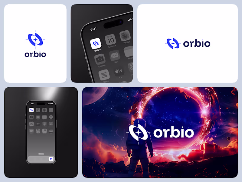
✦ ORBIO — Designed to Navigate the Future ORBIO is a brand identity I designed for a navigation company that helps people explore the world with confidence and clarity. The name “ORBIO” comes from orbit — symbolizing motion, direction, and connection. I wanted the logo to feel modern, balanced, and full of purpose, representing a brand that guides, not just leads. The circular form reflects continuity and trust, while the minimalist style keeps it clean, scalable, and timeless. This project was more than just logo design — it was about creating a visual language that captures guidance, innovation, and discovery all in one mark. Because great navigation isn’t about control — it’s about clarity.
1
2
77
4
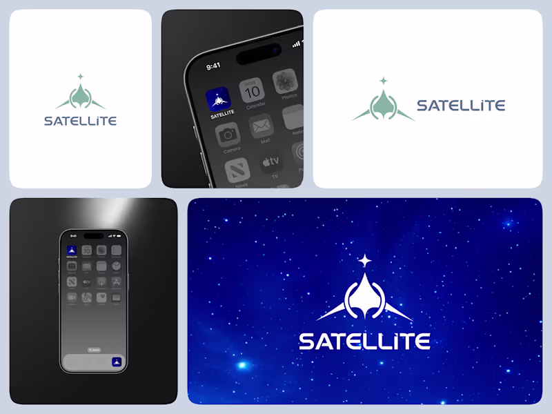
✦ SATELLITE — Connecting the World Through Design SATELLITE is a logo concept I designed for a satellite company that represents connection, communication, and innovation beyond boundaries. The idea behind the mark was to visualize movement and orbit — how technology brings people closer, no matter the distance. Each curve and shape in the design symbolizes precision and global reach, while the clean typography builds a sense of trust and modernity. The goal was to create a logo that feels dynamic yet balanced, technical yet human — just like the satellites that inspire it. For me, this project is a reminder that design, like communication, isn’t just about signals — it’s about connection.
4
109
1
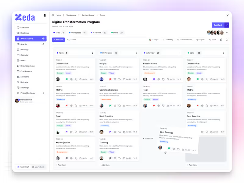
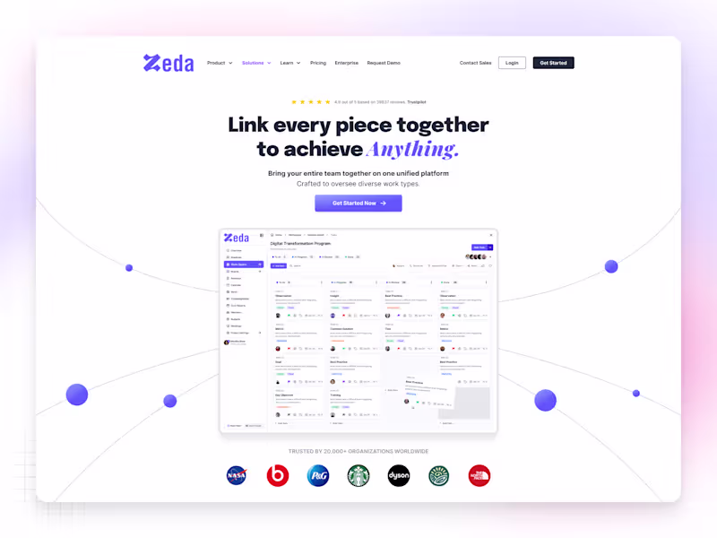
✦ Zeda — Kanban Board Screen Zeda is a SaaS productivity platform built to help teams plan, track, and manage their work with clarity. The Kanban Board screen was designed to make collaboration feel simple, organized, and intuitive — where every task flows naturally from idea to completion. Each card, color, and interaction was crafted to reduce friction and boost focus, giving users a workspace that feels light yet powerful. The design goal was simple — create a system that makes teams move faster, think clearer, and work smarter. Because great design isn’t just about how it looks — it’s about how it keeps people in flow.
1
37
1
✦ Nax — SaaS Website Homepage (Light Theme) Nax is a modern SaaS homepage built with a light and minimal aesthetic — designed to feel clean, calm, and conversion-focused. The goal was to create a digital space where clarity meets purpose, helping users understand the product instantly without distractions. Each section flows naturally — from the hero headline to the feature highlights — giving the brand a professional yet approachable tone. Soft shadows, balanced typography, and structured spacing keep the interface fresh, elegant, and easy to scan. This design is all about confidence through simplicity. Because sometimes, light design says more.
2
1
46
Visual Designer
(2)
Follow
Message
MD. Rakibul Islam
Khulna, Bangladesh
Graphic Designer for B2B Companies
New to Contra
Follow
Message
0
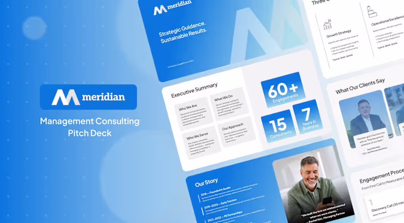
Management Consulting Pitch Deck for Meridian
0
1
0
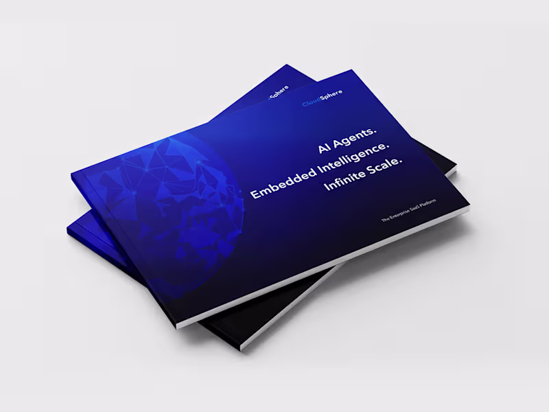
Marketing Brochure for CloudSphere's B2B SaaS Platform
0
0
0
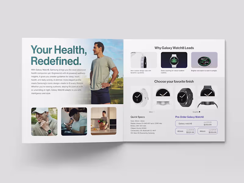
Samsung Galaxy Watch8 Brochure Design
0
2
0
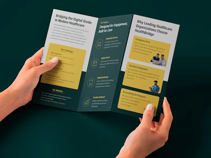
Tri-fold Brochure Design for HealthBridge Solutions
0
2
Visual Designer
(7)
Follow
Message
Explore people