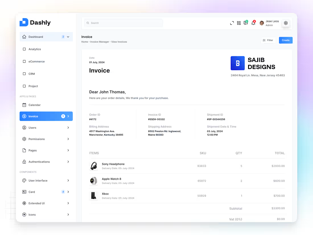
✦ Dashly — Invoice Profile App
Dashly Invoice Profile is a modern dashboard app designed to help users manage, track, and view invoices effortlessly — all in one clean and connected experience.
From the Home overview to Invoice Manager and View Invoices screens, every detail was built with clarity, consistency, and usability in mind.
The interface combines minimal layouts, structured grids, and balanced spacing to simplify financial management while keeping it elegant and professional.
Colors and typography were carefully chosen to enhance readability and trust, giving users confidence as they manage their workflow.
The goal was simple —
to turn a complex process into a calm, focused experience that just works.
Because great design isn’t about more features —
it’s about making every interaction feel effortless.
1
148
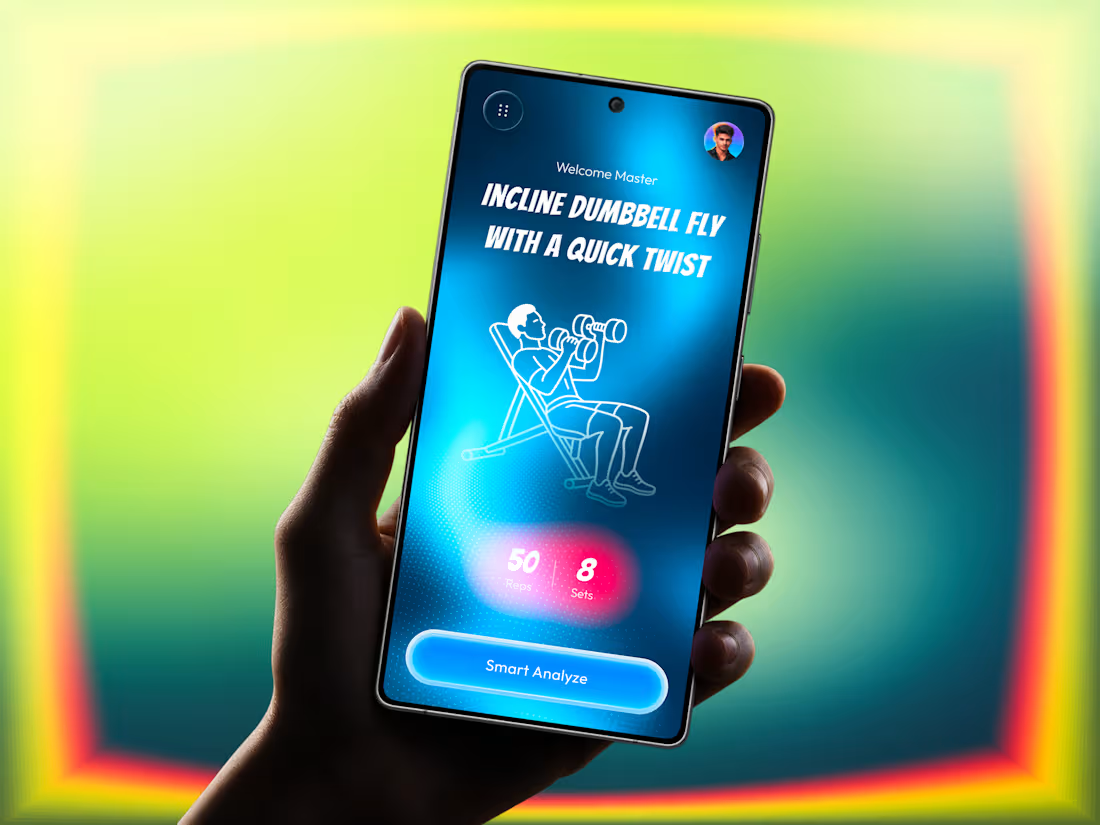
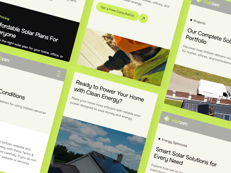
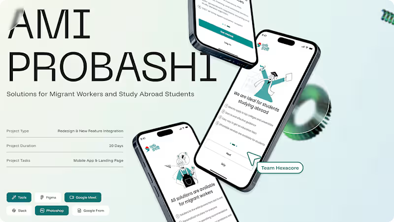
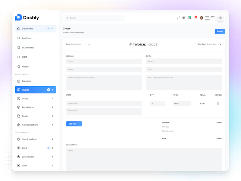
✦ Dashly — Create Invoice Dashboard
Dashly Create Invoice is a simple and intuitive dashboard screen built to help users generate, manage, and track invoices with ease and confidence.
The goal was to design an interface that feels efficient yet elegant — reducing friction in every step of the process, from input to confirmation.
Each element is placed with clarity and purpose, using clean typography, structured grids, and calm tones to make the experience effortless and focused.
The layout highlights usability over complexity —
because even financial tools should feel friendly and intuitive.
For me, this design reflects how simplicity builds trust —
especially when it comes to business operations.
1
137
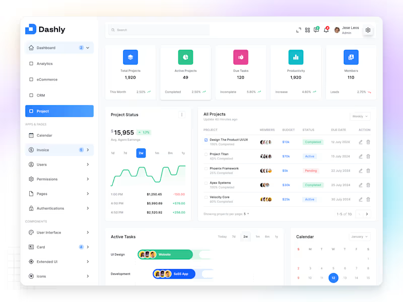
✦ Dashly — Project Dashboard
Dashly Project is a clean and structured dashboard built to help teams manage tasks, track timelines, and monitor progress — all from one organized space.
The design focuses on clarity, hierarchy, and usability, making it easy to switch between projects, view team activity, and stay aligned on goals.
Every section — from project cards to progress charts — was designed with intentional spacing, contrast, and simplicity, ensuring a calm and focused user experience.
The interface blends functionality with aesthetics,
proving that productivity tools can look as good as they work.
Because great dashboards don’t just track progress —
they inspire it.
2
115