Freelance UX Researchers in Khulna
Sign Up
Post a job
Sign Up
Log In
Filters
2
Projects
People
MD SAJIBUZZAMAN
Khulna, Bangladesh
UI/UX Designer building for humans, not just for screens.
19
Followers
Follow
Message
UI/UX Designer building for humans, not just for screens.
1
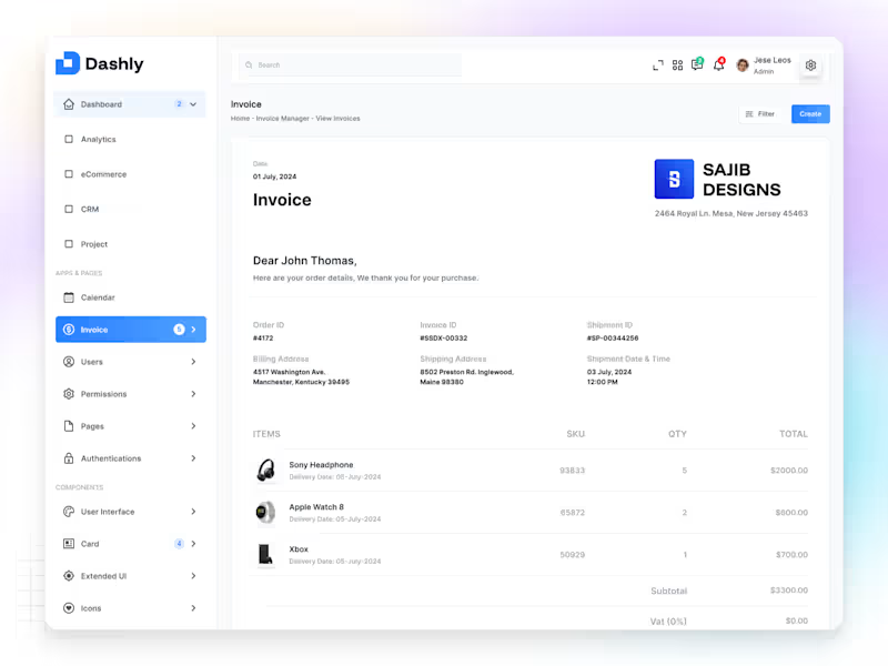
✦ Dashly — Invoice Profile App Dashly Invoice Profile is a modern dashboard app designed to help users manage, track, and view invoices effortlessly — all in one clean and connected experience. From the Home overview to Invoice Manager and View Invoices screens, every detail was built with clarity, consistency, and usability in mind. The interface combines minimal layouts, structured grids, and balanced spacing to simplify financial management while keeping it elegant and professional. Colors and typography were carefully chosen to enhance readability and trust, giving users confidence as they manage their workflow. The goal was simple — to turn a complex process into a calm, focused experience that just works. Because great design isn’t about more features — it’s about making every interaction feel effortless.
1
87
1
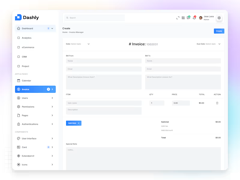
✦ Dashly — Create Invoice Dashboard Dashly Create Invoice is a simple and intuitive dashboard screen built to help users generate, manage, and track invoices with ease and confidence. The goal was to design an interface that feels efficient yet elegant — reducing friction in every step of the process, from input to confirmation. Each element is placed with clarity and purpose, using clean typography, structured grids, and calm tones to make the experience effortless and focused. The layout highlights usability over complexity — because even financial tools should feel friendly and intuitive. For me, this design reflects how simplicity builds trust — especially when it comes to business operations.
1
82
2
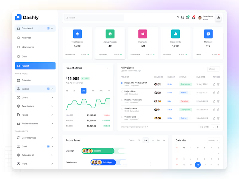
✦ Dashly — Project Dashboard Dashly Project is a clean and structured dashboard built to help teams manage tasks, track timelines, and monitor progress — all from one organized space. The design focuses on clarity, hierarchy, and usability, making it easy to switch between projects, view team activity, and stay aligned on goals. Every section — from project cards to progress charts — was designed with intentional spacing, contrast, and simplicity, ensuring a calm and focused user experience. The interface blends functionality with aesthetics, proving that productivity tools can look as good as they work. Because great dashboards don’t just track progress — they inspire it.
2
73
1
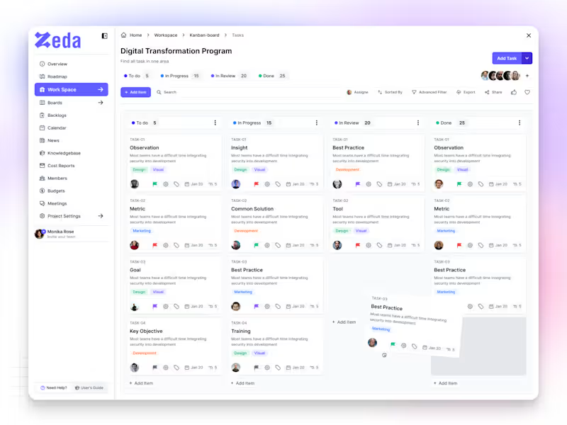
✦ Zeda — Kanban Board Screen Zeda is a SaaS productivity platform built to help teams plan, track, and manage their work with clarity. The Kanban Board screen was designed to make collaboration feel simple, organized, and intuitive — where every task flows naturally from idea to completion. Each card, color, and interaction was crafted to reduce friction and boost focus, giving users a workspace that feels light yet powerful. The design goal was simple — create a system that makes teams move faster, think clearer, and work smarter. Because great design isn’t just about how it looks — it’s about how it keeps people in flow.
1
48
UX Researcher
(3)
Follow
Message
Md Abdur Rouf
Khulna Division, Bangladesh
Full-time freelance UI/UX Designer & Frontend Developer.
37
Followers
Follow
Message
Full-time freelance UI/UX Designer & Frontend Developer.
1
Health Tracking App – App Store Screenshots Design
1
0
0
Pharmacy Management App UI Design
0
0
0
Podcast App UI Design for Enhanced Audio Discovery
0
1
0
AI Personal Assistant App Design
0
3
UX Researcher
(31)
Follow
Message
SAIMUN JUBAYER SHOYEB
Khulna, Bangladesh
UI/UX ✦ AI ✦ BUILD | Product & Business Partner.
New to Contra
Follow
Message
UI/UX ✦ AI ✦ BUILD | Product & Business Partner.
2
Sales Analytics Dashboard
2
1
2
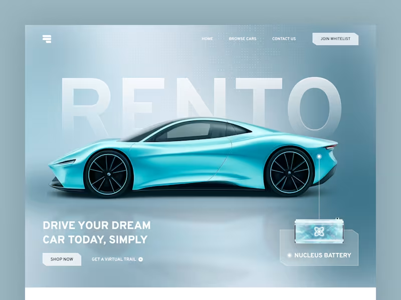
Car Rental Landing Page - Hero Section
2
1
1
Sales Analytics Dashboard Mobile App
1
0
1
Golfy: Smart Golf Assistant App Development
1
0
UX Researcher
(7)
Follow
Message
Explore people