Freelance Graphic Designers in Khulna
Sign Up
Post a job
Sign Up
Log In
Filters
2
Projects
People
Ray Loop
Khulna, Bangladesh
Brand Identity & Guidelines Development
Follow
Message
Brand Identity & Guidelines Development

1
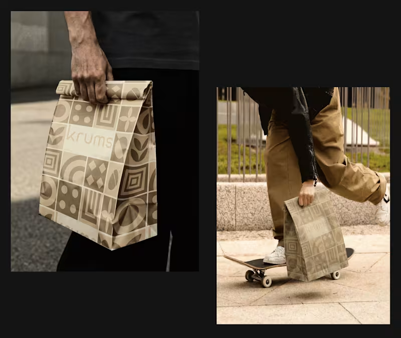
KRUMS- A Confectionery & Bakery Brand
1
6
0
Reforce You- Yoga & Wellness
0
8
2
KASCADE- A Renewable Energy Brand
2
11
1
MODULO- Global Networking Brand
1
5
Graphic Designer
(3)
Follow
Message
MD. Rakibul Islam
Khulna, Bangladesh
Graphic Designer for B2B Companies
Follow
Message
Graphic Designer for B2B Companies
0
Luxury Property Sales Guide Design for Haven Properties
0
6
0
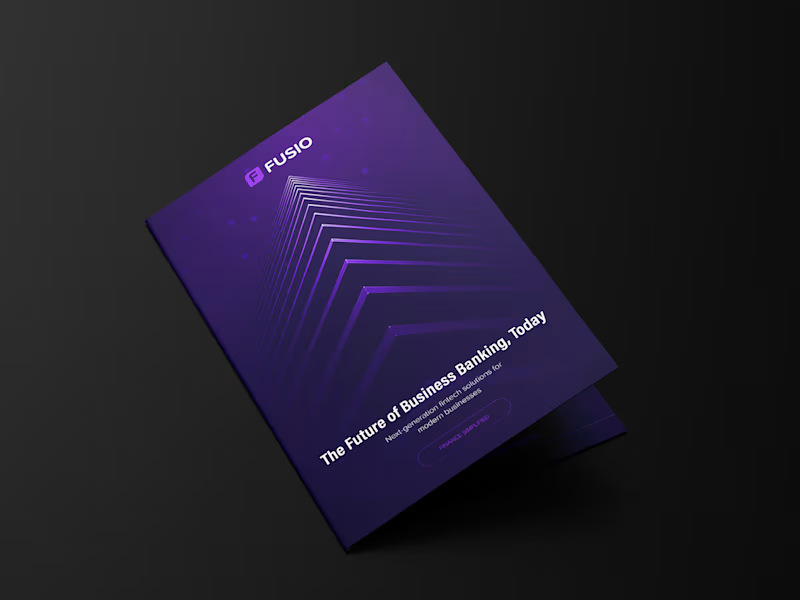
Bi-fold Brochure Design for Fusio
0
3
0
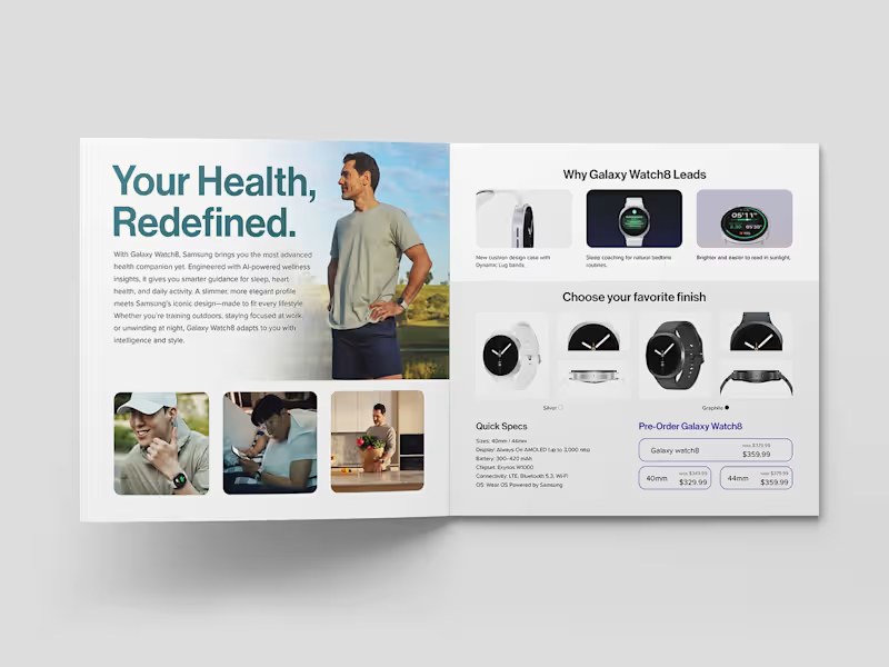
Samsung Galaxy Watch8 Brochure Design
0
6
0
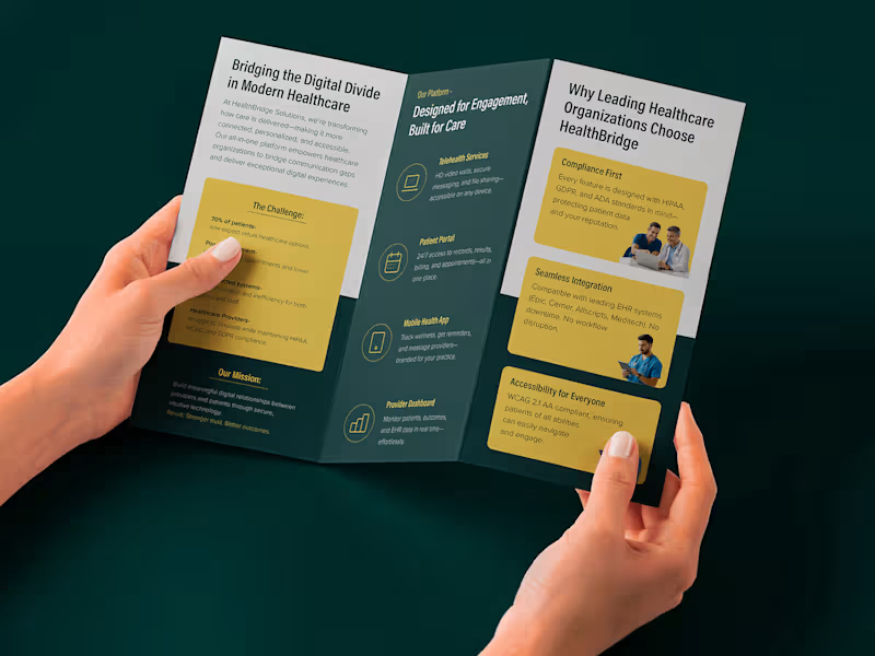
Tri-fold Brochure Design for HealthBridge Solutions
0
6
Graphic Designer
(4)
Follow
Message
Enam Mehedi Sawon
Khulna, Bangladesh
Photoshop Expert
Follow
Message
Photoshop Expert
0
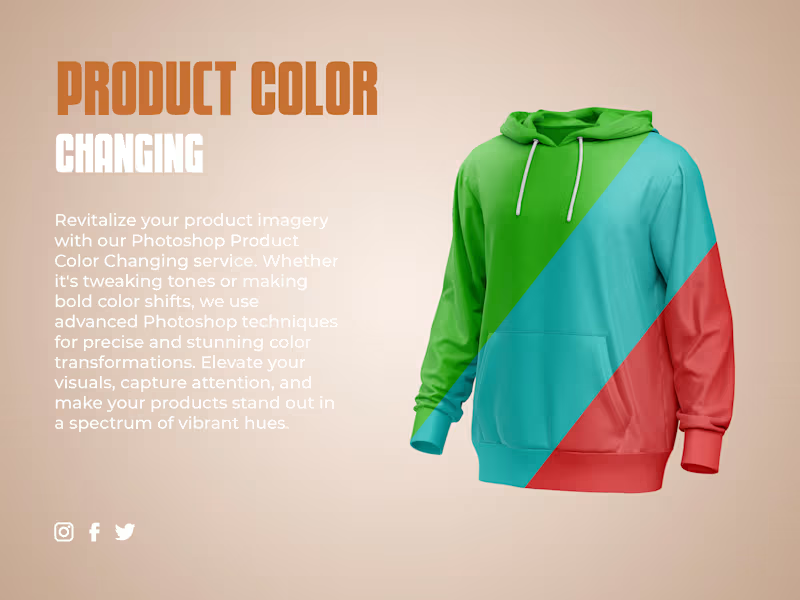
E-commerce Product Color Change
0
11
0
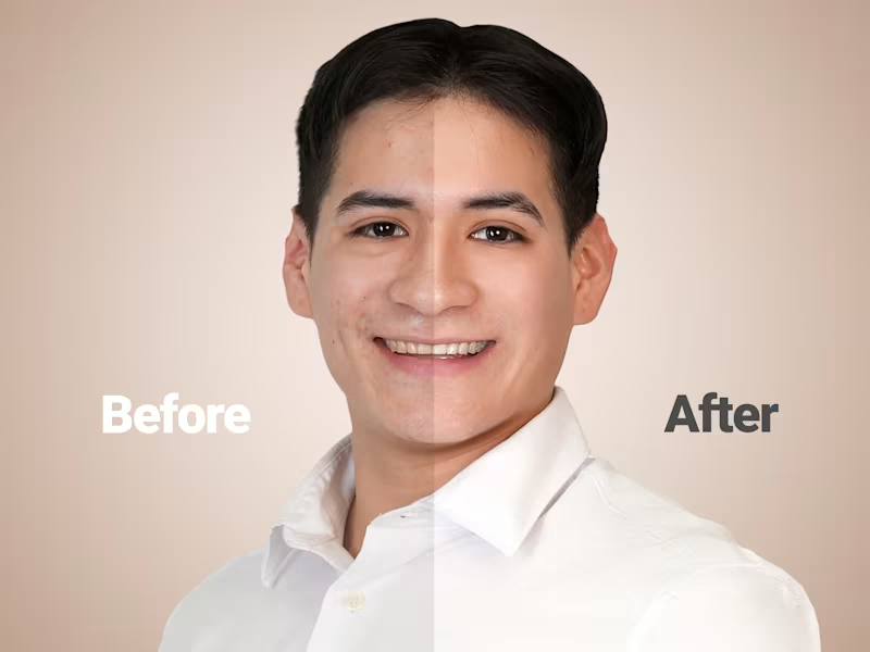
High-End Beauty Photo Retouching
0
15
0
Ecommerce Product Photo Editing | Background Remove
0
6
View more →
Graphic Designer
(3)
Follow
Message
Md Golam Noby
Khulna, Bangladesh
Web Application Developer | WordPress Specialist ⚡
1x
Hired
8
Followers
Follow
Message
Web Application Developer | WordPress Specialist ⚡
0
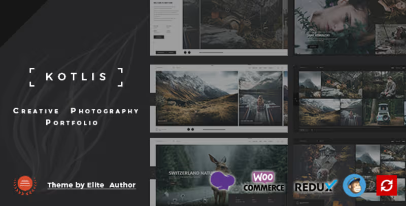
Kotlis - Photography Portfolio WordPress Theme
0
28
0
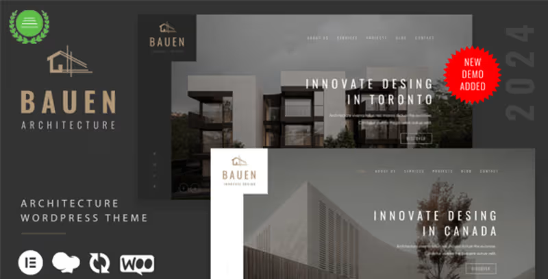
BAUEN - Architecture & Interior Elementor WordPress Theme
0
18
0
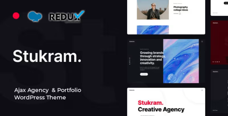
Stukram - AJAX Agency & Portfolio WordPress Theme
0
18
0
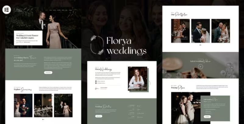
Florya - Wedding and Event Planner Elementor WordPress Theme
0
18
Graphic Designer
(1)
Follow
Message
MD SAJIBUZZAMAN
Khulna, Bangladesh
UI/UX Designer building for humans, not just for screens.
22
Followers
Follow
Message
UI/UX Designer building for humans, not just for screens.
1
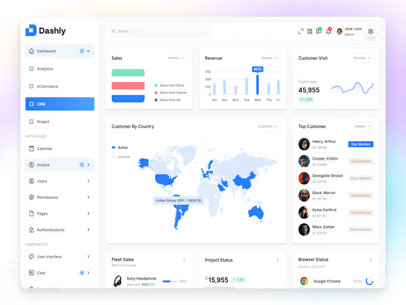
✦ Dashly — CRM Dashboard Dashly CRM is a modern and intuitive dashboard designed to help teams manage leads, track interactions, and build stronger customer relationships in one simple interface. The layout focuses on clarity, accessibility, and flow, giving users a complete overview of their customer pipeline — from first contact to closed deals. Each element, from data cards to activity sections, was designed with purposeful hierarchy and breathing space, ensuring users can focus on what truly matters. Soft tones, consistent grids, and clear typography make the experience feel balanced, reliable, and human-centered. Because great CRM design isn’t just about managing data — it’s about understanding people.
1
81
2
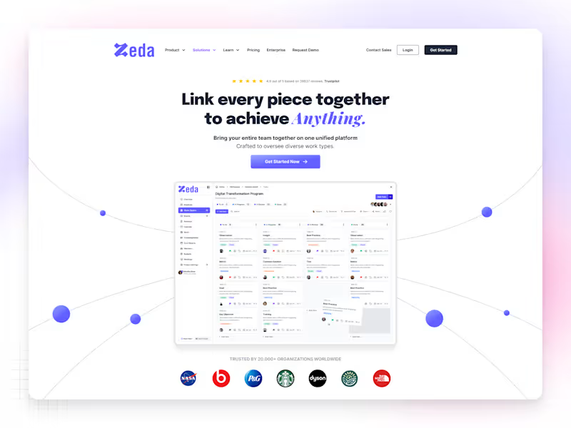
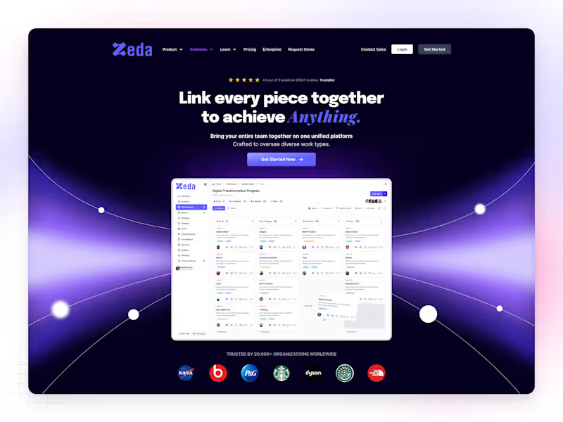
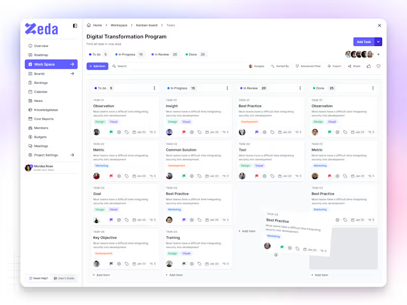
✦ Zeda — Kanban Board Screen Zeda is a SaaS productivity platform built to help teams plan, track, and manage their work with clarity. The Kanban Board screen was designed to make collaboration feel simple, organized, and intuitive — where every task flows naturally from idea to completion. Each card, color, and interaction was crafted to reduce friction and boost focus, giving users a workspace that feels light yet powerful. The design goal was simple — create a system that makes teams move faster, think clearer, and work smarter. Because great design isn’t just about how it looks — it’s about how it keeps people in flow.
2
142
1
✦ Nax — SaaS Website Homepage (Light Theme) Nax is a modern SaaS homepage built with a light and minimal aesthetic — designed to feel clean, calm, and conversion-focused. The goal was to create a digital space where clarity meets purpose, helping users understand the product instantly without distractions. Each section flows naturally — from the hero headline to the feature highlights — giving the brand a professional yet approachable tone. Soft shadows, balanced typography, and structured spacing keep the interface fresh, elegant, and easy to scan. This design is all about confidence through simplicity. Because sometimes, light design says more.
2
1
160
0
✦ Nax — SaaS Web App Homepage Nax is a sleek and modern SaaS website homepage designed to help digital products stand out through clarity, simplicity, and trust. The concept focuses on structured storytelling — from a bold hero section to clear feature highlights and strong call-to-actions that drive conversions. Every section was built with purposeful spacing, modern typography, and minimal visuals, creating a balance between aesthetics and usability. Soft tones and subtle animations make the interface feel alive yet calm, giving users a sense of confidence while exploring the product. For me, Nax represents what great SaaS design should be — simple, scalable, and human-centered. Because when design tells a story clearly, conversion happens naturally.
0
146
Graphic Designer
(1)
Follow
Message
Masudul Amin
Khulna, Bangladesh
Full-Funnel Copywriting Expert for Your Sales Growth

Follow
Message
Full-Funnel Copywriting Expert for Your Sales Growth

0
Gold's Carpet Cleaning
0
32
0
A Beginner’s Guide to Buying A New Violin:
0
15
0
Full-Funnel Copywriting for Athlean-X
0
35
View more →
Graphic Designer
(1)
Follow
Message
Md Nokibul Islam
Khulna, Bangladesh
Strategic Logo & Brand Designer 🎨
Follow
Message
Strategic Logo & Brand Designer 🎨
0
Sportswear Logo Branding:: Behance
0
6
0
Fashion Logo Branding :: Behance
0
9
0
Urban Real Estate Logo & Brand Identity:: Behance
0
5
0
Swanis fashion logo Branding:: Behance
0
6
Graphic Designer
(1)
Follow
Message
Mahmudul Hasan Manik
pro
Khulna, Bangladesh
I Design only cool website, app and saas
30
Followers
expert
Follow
Message
I Design only cool website, app and saas
1
Most people think picking a logo is about which looks better. It's about which option represents the company's voice best. Left or Right?
1
65
0
I designed the homepage hero for Wesendy, an all-in-one WhatsApp growth and marketing platform. This tool is for small business owners, marketers, and agencies using WhatsApp for customer outreach. They often decide quickly if this tool is worth trying. Social proof is placed above the headline so visitors see member counts and faces before reading the pitch. This early trust influences how they view the rest of the page. The headline is large and clear, making it easy to understand what the tool does without needing further explanation. Supporting text is positioned low and left, directing attention to the headline first, then to features such as AI chatbots, bulk campaigns, and team collaboration. The main call-to-action is clearly placed at the bottom right, making it easy to find in an otherwise open layout. Thin grid lines and a soft gradient provide structure without distracting from the text. A consistent green color maintains a WhatsApp connection without mimicking the brand. This design was created in Figma and is suitable for SaaS landing pages and web UI/UX projects.
0
7
2
I designed this screens for Dogify, a personal dog training and care mobile app. It's for dog owners working through a structured training program at home, in short daily sessions, with access to a real trainer when something isn't clicking. The home screen shows today's session clearly, with its time, duration of 10 minutes, and a single Start Session button. This helps returning users know exactly where to start. Live trainers are positioned above the session card for immediate support, addressing issues right where they occur. The streak screen turns finished sessions into a visual moment, featuring a full image of a dog, a large count display, and a seven-day overview of progress — making it easy to see what’s done and what’s left. It also includes a brief note on the importance of consistency, explaining the habit while celebrating achievements. Warm coral for encouragement and streaks, blue reserved for primary actions, applied the same way on both screens. Designed in Figma. Available for mobile app UI/UX design work.
3
2
65
1
I designed Tracklog, an AI powered time tracking and productivity app, across web and mobile app. It's for remote teams, freelancers, and agencies tracking billable and focused hours, people who set up tracking at a desk but check in on it away from one, and need both views to feel like the same product. Designed in Figma. Available for SaaS dashboard, web app, and mobile UI/UX design work 💪
1
44
Graphic Designer
(1)
Follow
Message
Explore people