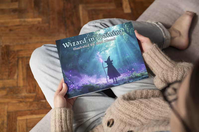
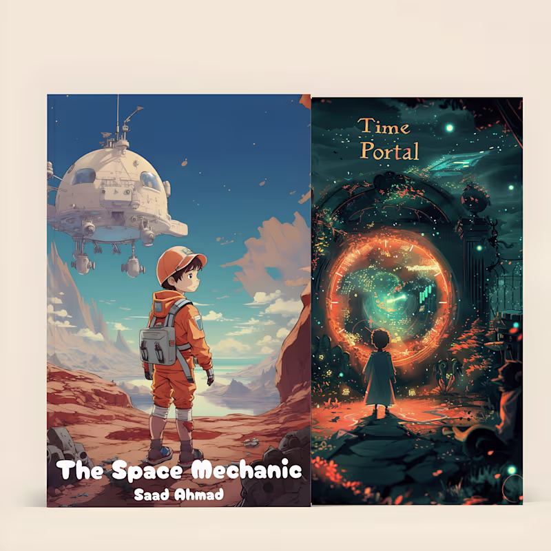
AI Artist: Creating Kids Book Illustrations
- $5k+
- Earned
- 11x
- Hired
- 5.0
- Rating
- 11
- Followers
AI Artist: Creating Kids Book Illustrations


View more →
Graphic Designer, Al-Assisted Web Developer & UI/UX Designer
New to Contra
Graphic Designer, Al-Assisted Web Developer & UI/UX Designer