Projects using Canva in IslamabadProjects using Canva in IslamabadI designed a 25-page NGO Annual Impact Report for a non-profit called Clear Flow Foundation, and then created a short video reel to showcase the document's design, layout, statistics, and photography in an engaging, animated format.
STEY BY STEP 😊😍
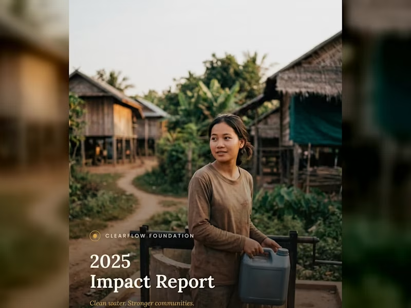
1. Cover Page (1 Page)
Visual Style: Full-bleed, high-impact photo showing a community member carrying clean water in a rural village setting. Soft overlay for high-contrast typography.
Header / Logo: ClearFlow Foundation logo placed subtly at the top center/left.
Title: 2025 Impact Report
Subtitle: Clean water. Stronger communities.
2. Inside Cover / Brand Pattern (1 Page)
Visual Style: Elegant, custom line-art vector pattern representing water ripples, topographic lines, or fluid movement.
Content: Minimalist brand motif that serves as a visual palette cleanser before diving into the report content.
3. Table of Contents (1 Page)
Visual Style: Clean, grid-aligned typography with generous whitespace.
Content Breakdown:
01 — Executive Summary & Leadership Letter
02 — Who We Are & Mission Overview
03 — Our Impact (2025 Key Statistics)
04 — Program 1: Sustainable Water Infrastructure
05 — Program 2: Community Health & Training
06 — Community Voices & Field Stories
07 — Financial Transparency & Performance
08 — Acknowledgments & Strategic Goals
4. Letter from Director/CEO (1–2 Pages)
Headline: "Behind each statistic is a family no longer walking three hours for water."
Content Focus:
Opening: Acknowledging milestones achieved in 2025 across 38 villages.
Core Message: Emphasizing that long-term sustainability and local empowerment—rather than quick fixes—are the foundation of ClearFlow's work.
Sign-off: Warm closing remarks from Sophak Chan (Executive Director).
Sidebar / Image: Professional portrait of the director alongside a highlighted quote pull-out.
5. Who We Are / Mission Overview (2 Pages)
Headline: Our Mission
Core Narrative: > "ClearFlow Foundation exists to ensure every community has reliable access to clean, safe water—and the knowledge to maintain it long after we’ve gone."
Founding Context: Established in 2014, working alongside rural communities across Southeast Asia to combine infrastructure with local education.
Key Metric Highlights:
11 yrs operating in Southeast Asian communities.
3 provinces with active programs.
6. Section Divider — Our Impact (1 Page)
Visual Style: Full-page photographic cover showing clean water flowing from a newly installed filtration system, layered with section header styling.
Text: SECTION 03 — Our Impact
7. Impact Overview + Key Stats Spread (2 Pages)
Headline: 2025 At a Glance
Key Performance Indicators (KPI Grid):
12,400 — People gained access to clean water.
45 — New water points constructed.
38 — Villages reached across two provinces.
96 — Community health workers trained.
Sub-Section — Built to Last:
89% of water points fully operational after 5 years.
6,200 hours of hygiene education delivered.
0.4 km average distance to water (down from 3.2 km).
31% reduction in reported waterborne illnesses.
8. Program 1 Deep Dive: Water Infrastructure (2–3 Pages)
Headline: Where the Wells Went: Sustainable Engineering
Process Explanation: How sites are selected using a structured process evaluating distance, population density, and local readiness.
Program Metrics:
14 villages received their first-ever water point.
6 existing wells rehabilitated and upgraded.
3.5 mo average time from survey to completion.
100% of sites selected with community sign-off.
Testimonial Callout: "The pump is close enough now that my son fills a bucket before school and still makes it on time." — Village Parent, Kampong Thom Province.
9. Program 2 Deep Dive: Community Training (2–3 Pages)
Headline: Training That Stays Local
Core Focus: Building local autonomy by training residents directly in maintenance and sanitation management.
Program Metrics:
62% of trained health workers are women.
4 training modules per certification cycle.
18 ongoing peer-education groups active.
2 wks average certification training length.
Quotes & Data: Quote from a female community health worker on earning trust within her local village.
10. Community Story / Photo Spread (2 Pages)
Visual Style: A 2-page full-bleed photograph capturing children playing near a village green or field after receiving clean water access.
Minimal Overlay: A single narrative caption focusing on human impact rather than numbers.
11. Section Divider — Our Numbers (1 Page)
Visual Style: Serene landscape photo of rice fields and stilt houses at dawn with bold overlay text.
Text: SECTION 07 — Our Numbers
12. Financial Overview (2–3 Pages)
Headline: 2025 Financial Summary
Expense Allocation (Donut Chart/Breakdown):
72% — Program delivery (wells, filtration, training)
14% — Community education & staffing
8% — Administration
6% — Fundraising & operations
Financial Totals:
$482,000 Total Revenue
$398,500 Total Program Expenses
$83,500 Surplus reinvested into 2026 expansion
1,240 Individual and organizational donors in 2025
13. Donor & Partner Acknowledgments (1–2 Pages)
Headline: With Gratitude to Our Partners
Layout: Multi-column list categorizing individual donors, corporate sponsors, and institutional partners who made the year's work possible.
14. Looking Ahead / Future Goals (1–2 Pages)
Headline: Our Goals for 2026
Strategic Roadmap:
Expand into 20 new villages across two additional provinces.
Launch a women-led maintenance technician training track.
Reach 90% five-year operational sustainability across all water points.
Publish our first fully independent impact audit.
15. Closing Photo Spread (1–2 Pages)
Visual Style: Sunset photograph of a local resident looking across a peaceful landscape.
Text: "Thank you for making clean water possible."
16. Back Cover / Contact Info (1 Page)
Visual Style: Clean layout with subtle branding elements.
Content:
Contact email & website address.
Social media handles.
Designer sign-off block / Case study attribution.
If you would like to read the complete document, check out the link below:
https://drive.google.com/file/d/11wYbQoVzxaZNiWcNnYFLDqCluTZ-mTAI/view?usp=sharing
Like this kind of work? Feel free to reach out—let's create something tailored for your business! Title
Premium Static Ad Concepts for Consumer Brands
Short blurb
A set of high-impact static ads exploring different visual directions for ecommerce and tech brands. I handled everything from concept and art direction to layout, lighting, and final production‑ready files.
Project overview
For this self‑initiated project, I designed a series of static ads to demonstrate how I approach brand‑level visuals for ecommerce campaigns. The goal was to create ads that feel polished enough for a global brand while still being performance-ready for use on Meta, display, and website placements. Each piece focuses on clear hierarchy, strong product presence, and a single, memorable visual idea.
I treated this like a real client engagement: establishing a visual direction, building a small system of layouts, and preparing clean exports suitable for paid campaigns and website assets. This aligns closely with the kind of ongoing design support brands need for static ads, banners, and hero imagery.
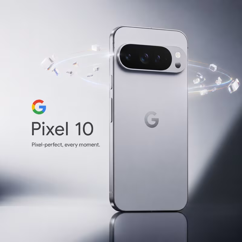
Pixel 10 flagship static ad
This concept imagines a launch visual for a flagship smartphone. I combined a minimal, high-key background with a hero device render and subtle particle effects to create a premium, futuristic feel. The layout puts the product first, with a clear hierarchy from logo to product name to tagline, mirroring how large tech brands structure their campaign key art.
Design focus areas:
Clean typography and generous negative space to keep the ad instantly readable in feed.
Realistic reflections and lighting to emphasize the hardware quality.
A single, simple tagline that reinforces the visual story instead of competing with it.
Lifestyle / audio comfort ad (polar bear)
This static concept explores a softer, lifestyle‑driven direction for an audio or wellness brand. The minimal composition and monochrome palette keep the focus on comfort and calm, while the oversized headphones and character choice immediately communicate the product category without needing heavy copy.
Design focus areas:
Visual storytelling that conveys product benefit (comfort, immersion, warmth) at a glance.
Strong subject isolation and clean background for easy cropping into multiple placements.
Brand‑ready layout that can accommodate logo, short headline, and CTA without clutter.
Music / entertainment poster-style ad (green “LOUDER INSIDE”)
This piece leans into a high-energy, poster‑style static ad for music, gaming, or streaming. The neon green palette, motion blur elements, and layered textures are designed to catch attention in a crowded feed, while the bold typography carries a clear emotional message.
Design focus areas:
Strong type hierarchy with an impactful main headline and supporting details.
Use of color and contrast to create a distinct visual identity for the campaign.
Composition that works both as a full poster and as cropped social placements or website banners.
Process and tools
Across these concepts, I followed a repeatable workflow similar to how I’d work with an ecommerce brand:
Concept development and moodboarding to define visual direction and tone.
Asset creation using AI image generation and/or 3D, followed by manual compositing, retouching, and lighting adjustments.
Typography, layout, and export optimization tailored for static ad placements (social feeds, stories, and website hero sections).
This project shows my ability to independently ideate, design, and deliver high-quality static ads that can plug directly into a marketing team’s campaigns and brand system—exactly what’s required for roles focused on static ads and website assets.