Freelance Artists in India
Sign Up
Post a job
Sign Up
Log In
Filters
2
Projects
People
Afroz Ahmed
Bhubaneswar, India
Creative Director and Brand Designer

5.0
Rating
37
Followers
Partner
Follow
Message
Creative Director and Brand Designer

5
Fragrant Visions: Perfume Bottle Concept & Art Direction
5
27
3
Art Direction and Creative Ideation for Automotive Editorial
3
13
1
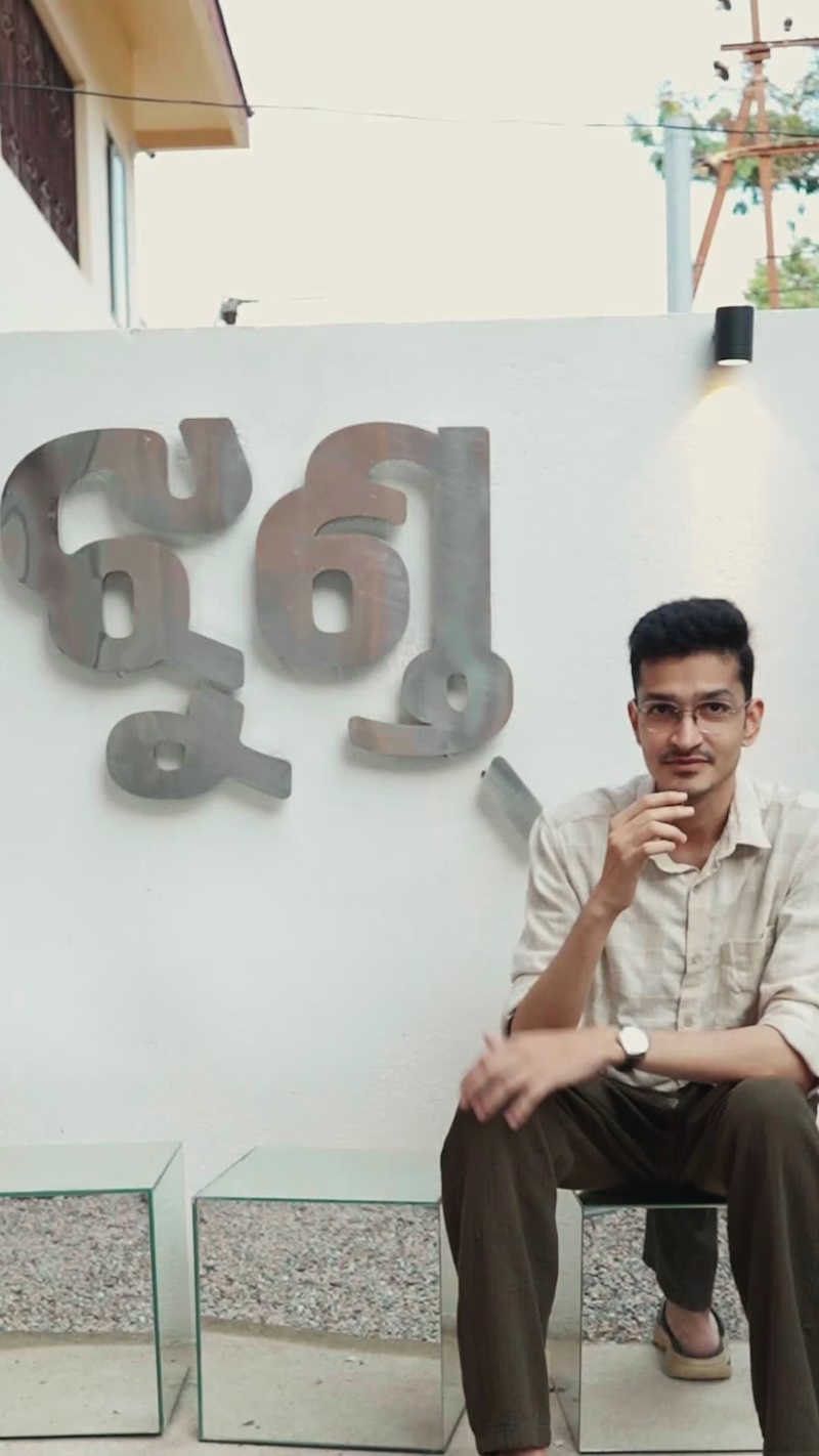
Can a brand identity thrive entirely without a traditional logo mark? For JHUND, we took a calculated risk: stripping the entire visual system down to a single color and a custom-designed typeface. No standalone symbol. No decorative iconography. Just raw, purposeful typography built to carry the entire visual weight of the brand. The Metaphor: Typography as Community Think about an alphabet. Every individual glyph has its own distinct character, personality, and geometry. Yet, despite their differences, they inherently belong to the exact same type family. That is the exact DNA of JHUND. It’s a collective of unique individuals, staff, and creators coming together in Bhubaneswar to build something different. The custom wordmark isn't just a name it’s a literal representation of community. Every letter carries its own identity, but they only reveal their true strength when standing together. From Artboard to Architecture A visual identity shouldn't stay trapped on a screen. We brought this typographic system directly into the physical environment—translating the brand’s energy onto the walls to create a space that feels alive, emotionally grounded, and resonant with today's generation. Scope of Work : - Brand Strategy & Visual Identity - Custom Typeface & Wordmark Design - Spatial Graphic Design & Environmental Murals - Creative Direction Huge thanks to the team at JHUND for believing in a bold, minimalist vision and letting typography speak for an entire community.
1
31
3
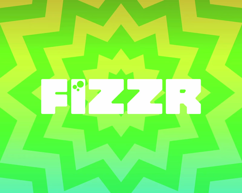
FIZZR Brand Design
3
21
Artist
(2)
Follow
Message
Rucha Desai
Pune, India
AI Ad and creative Designer
New to Contra
Follow
Message
AI Ad and creative Designer
0
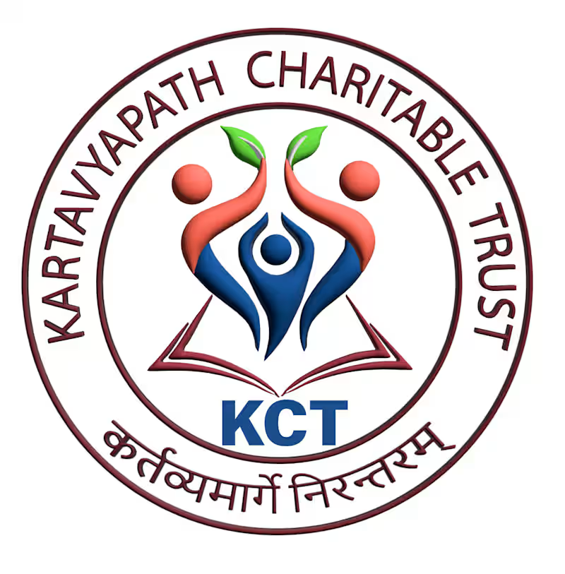
This logo was designed for KartavyaPath Charitable Trust (KCT), a non-profit organization dedicated to education, community welfare, and social empowerment. The goal was to create a meaningful visual identity that reflects the organization's commitment to nurturing lives, creating opportunities, and building a brighter future for those in need. The logo prominently features the organization's name and initials, reinforcing its identity. The concept combines symbolic elements that represent the trust's mission and values. The open book at the base signifies education, knowledge, and lifelong learning, while the three human figures illustrate unity, collaboration, and community support. The central figure represents individuals empowered through the organization's initiatives, while the upward-reaching figures holding green leaves symbolize growth, hope, sustainability, and positive transformation. The circular emblem conveys inclusivity, protection, and the continuous cycle of giving back to society. A palette of blue, red, and green was chosen to represent trust, compassion, vitality, and progress. This project demonstrates my ability to create purpose-driven visual identities that communicate an organization's mission through thoughtful symbolism, balanced composition, and impactful branding, resulting in a logo that is both memorable and meaningful.
0
32
0
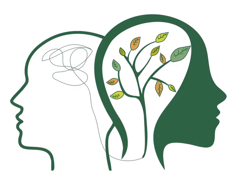
This logo was designed for my friend's Instagram page, SoulSpring Insta page:https://www.instagram.com/soulspringcounseling?utm_source=ig_web_button_share_sheet&igsh=ZDNlZDc0MzIxNw== , a platform focused on mental well-being, self-growth, and emotional healing. The objective was to create a visual identity that communicates transformation, inner peace, and personal development through a clean and meaningful design. The concept features two human profiles representing the journey from mental chaos to emotional clarity. The abstract scribbles inside the first silhouette symbolize stress, overthinking, and internal struggles, while the flourishing tree within the second profile represents healing, growth, resilience, and a renewed mindset. The tree's branches and colorful leaves reflect continuous personal development, balance, and the different stages of emotional well-being. A calming green color palette was chosen to evoke nature, renewal, hope, and tranquility, reinforcing the brand's focus on mindfulness and positive transformation. This project highlights my ability to create thoughtful, concept-driven logos that tell a compelling visual story while aligning with a brand's purpose, values, and audience.
0
26
0
This logo was designed for Scopaf School, a multidisciplinary performing arts academy offering Bharatanatyam, Kathak, Carnatic Music, and other classical art forms. Created during my time at Lemici IQ, the objective was to develop a visual identity that reflects the richness of Indian culture while maintaining a modern and memorable brand presence. The concept combines symbolic elements from multiple performing arts disciplines into a single cohesive mark. The Bharatanatyam dancer represents grace and tradition, the veena symbolizes the heritage of Indian classical music, and the contemporary dancer signifies versatility and artistic expression. A flowing circular form ties these elements together, conveying rhythm, movement, creativity, and the continuous journey of learning. The warm red and gold color palette was chosen to evoke passion, excellence, elegance, and the cultural significance associated with Indian classical arts. This project showcases my ability to translate a brand's vision into a meaningful visual identity by blending storytelling, symbolism, and clean design principles to create a timeless and recognizable logo.
0
31
0
This self-initiated AI commercial was created to explore emotional storytelling through a 3D Pixar-inspired visual style. The concept blends cinematic animation, character-driven storytelling, and premium product placement to create an advertisement that feels both heartwarming and memorable. By combining stylized 3D environments, expressive animation, and seamless AI-generated visuals, the project demonstrates how brands can move beyond traditional product ads and build deeper emotional connections with their audience through narrative-driven marketing.:
0
44
Artist
(2)
Follow
Message
Jagyasini Singh
India
GIF artist, Illustrator and 2D animator
8
Followers
Expert
Follow
Message
GIF artist, Illustrator and 2D animator
0
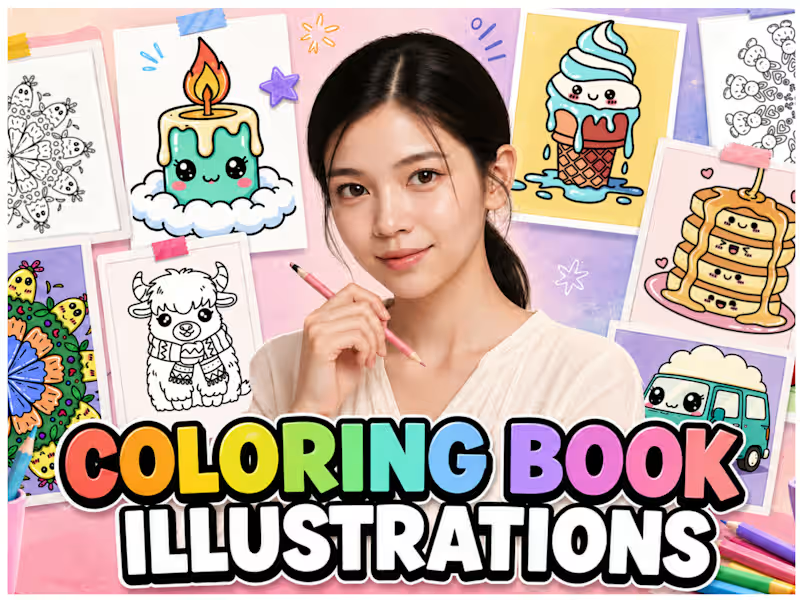
Coloring Book Illustrations
0
22
0
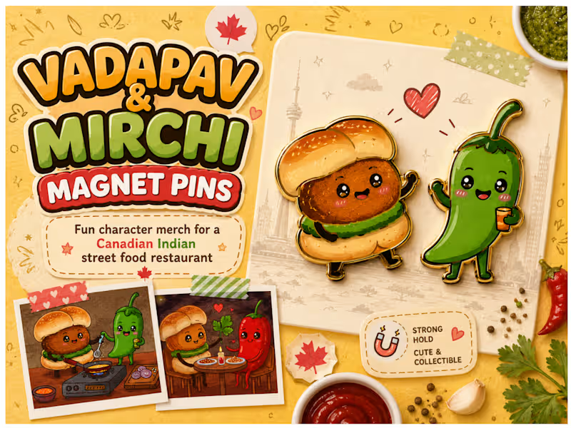
Custom Magnet Pin Designs - Vadapav & Mirchi
0
21
0
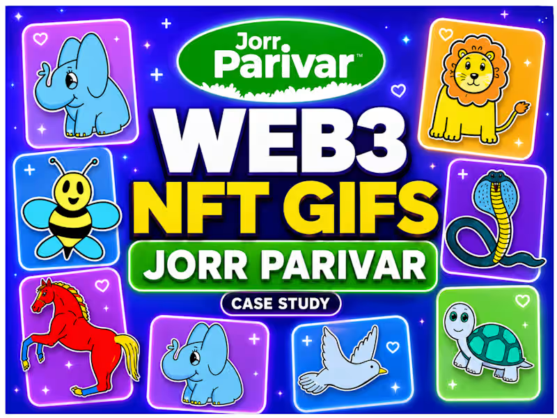
Animated NFT GIFs for JorrParivar Web3 Community
0
79
0
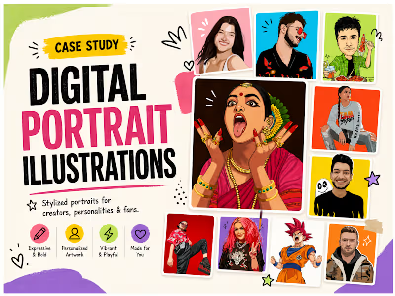
Custom Digital Portrait Illustrations by Jagyasini Singh
0
78
Artist
(4)
Follow
Message
Taruna Shrivastava
India
Creative Textile Print Designer with Global Fashion Brand
10
Followers
Follow
Message
Creative Textile Print Designer with Global Fashion Brand
1
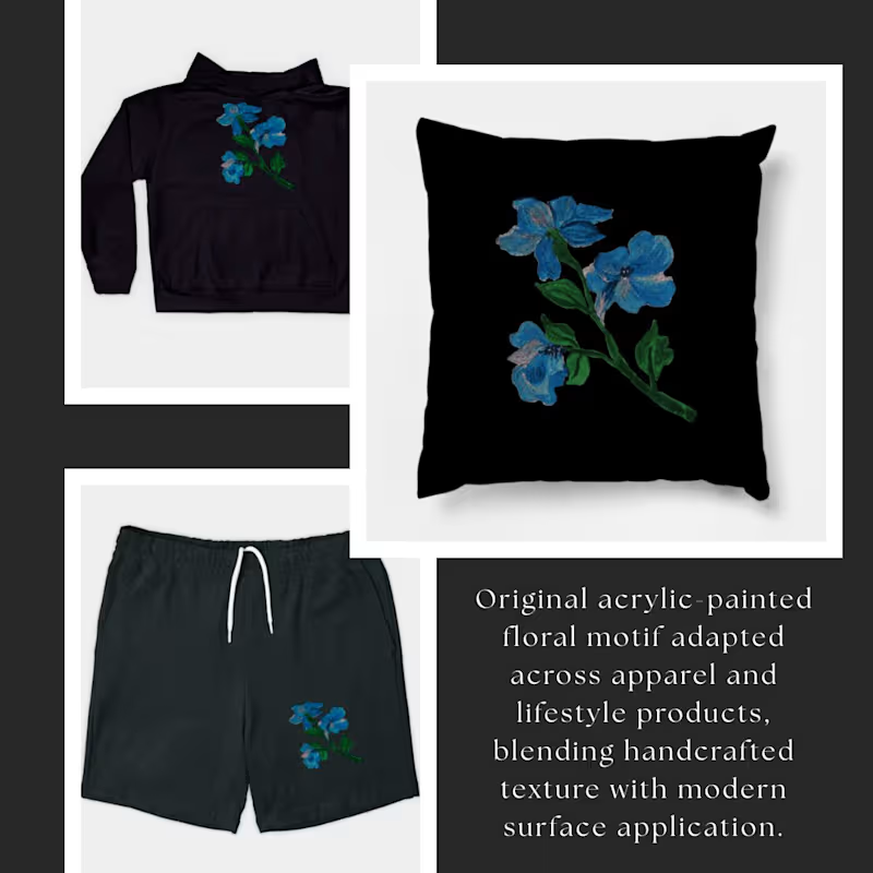
Kraalikaa — Handcrafted Acrylic Surface Motif An original floral motif created through acrylic painting and later adapted into wearable and lifestyle applications. The artwork preserves the organic texture and expressive depth of hand-painted surfaces while translating seamlessly across products through thoughtful placement and composition. Applied across apparel and home décor mockups, this exploration focuses on how handcrafted motifs can retain their character within modern textile and product design. Kraalikaa approaches surface creation as both art and application—where original hand-made expression evolves into adaptable visual storytelling across form and fabric.
1
209
0
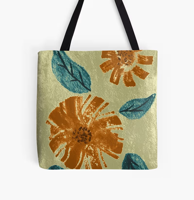
Kraalikaa — Handcrafted Textile Surfaces Two original prints developed through distinct methods—one created using watercolor, and the other through detailed pen linework. Both artworks were later refined through vectorization and adapted into functional textile surfaces. This process bridges hand-drawn expression with digital precision, allowing the designs to translate seamlessly across products while preserving their original character. Kraalikaa focuses on building textile surfaces that carry both craft and clarity—where each print holds its own identity while remaining adaptable for real-world application. Which direction do you prefer — Watercolor Expression or Line Art Structure?
0
196
0
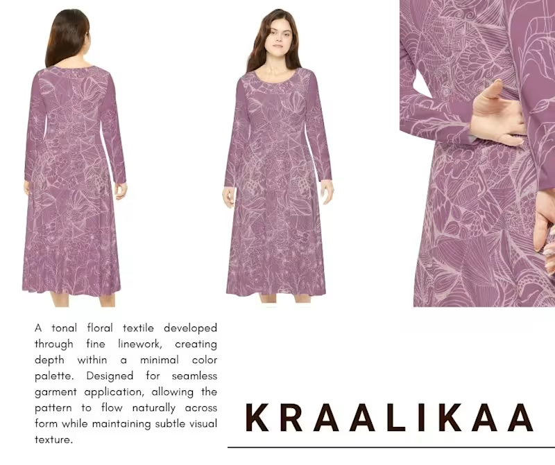
Flora Obscura — Kraalikaa Textile Print Dusty Bloom Symphony — Kraalikaa Textile Print A tonal floral composition built through intricate linework, unfolding in a muted mauve palette. Designed to create quiet depth across fabric, the pattern flows seamlessly over garments while maintaining a soft, continuous surface. This print explores subtle detail, balance, and refined texture within modern apparel application.
0
202
0
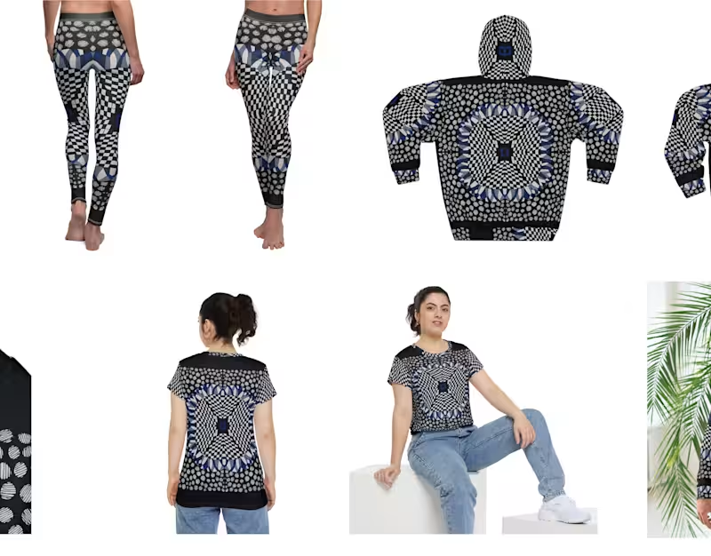
The Wearable Gallery – A Modern Textile Showcase
0
7
Artist
(10)
Follow
Message
Harish Srinivasan
Kattuputhur, India
3D Visual Artist: From Concept to Reality
Follow
Message
3D Visual Artist: From Concept to Reality
1
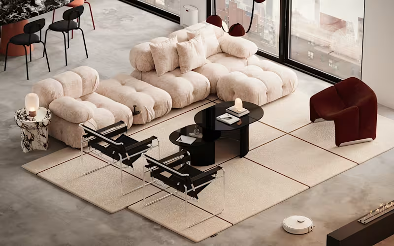
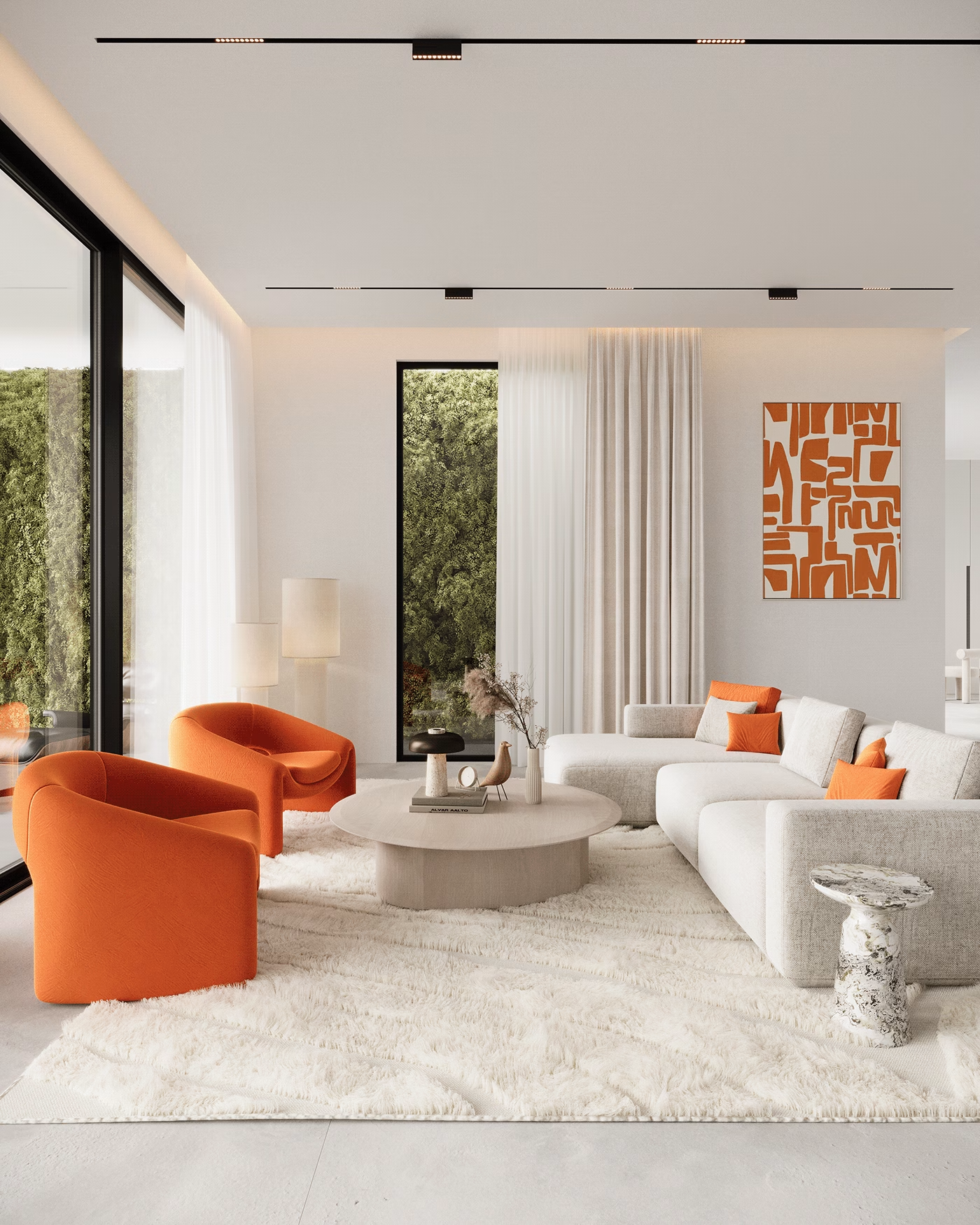
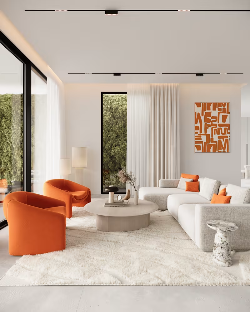
A neutral living
1
19
0
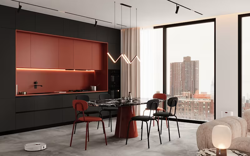
Palette - Kitchen and dining
0
11
0
Palette - Living
0
16
View more →
Artist
(3)
Follow
Message
Siddartha Dandannavar
Bengaluru, India
Strategy-led brand identity for founders who think longterm.
New to Contra
Follow
Message
Strategy-led brand identity for founders who think longterm.

1
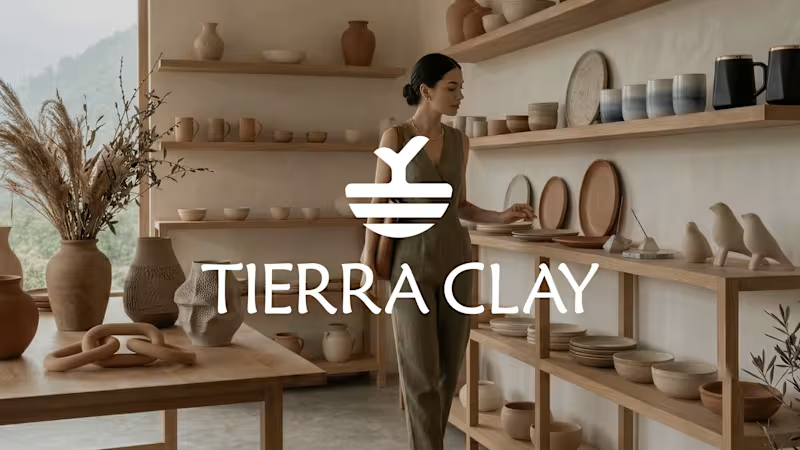
Tierra Clay — Earth in Its Pure Form
1
7
3
Built to connect talent with opportunity. A brand identity designed for clarity, trust, and momentum — introducing HireLoop. Brand Identity & Motion Design for a modern hiring platform.
3
185
1
FarmLink — Fresh, Direct, Reliable
1
5
1
HireLoop — Intelligent Hiring Starts Here
1
5
Artist
(2)
Follow
Message
Divyanshu Kumar
Patna, India
Logo, banner, template & book cover designer.
Follow
Message
Logo, banner, template & book cover designer.
0
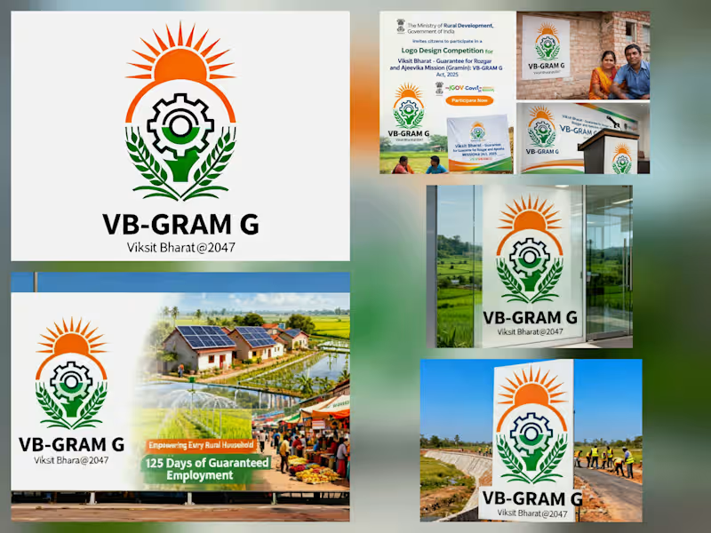
The VB-GRAM G logo is a powerful visual promise of dignity and progress for rural India. My design bridges the gap between traditional roots and the futuristic goal of Viksit Bharat @2047. Design Breakdown: The Rising Sun (Saffron): Represents a new dawn of opportunity and the energy of a developing nation. The Industrial Gear: Symbolizes the 125 days of guaranteed manual work and the building of robust rural infrastructure. The Green Wheat Stalks: Ground the identity in "Gramin" (rural) prosperity, representing agriculture and sustainable livelihoods. Tricolor Frame: Integrates the national identity, showing that rural growth is at the heart of India's success. The Philosophy: it’s a symbol of saturation and convergence, ensuring that every rural household is an equal partner in India’s journey to 2047.
0
50
0
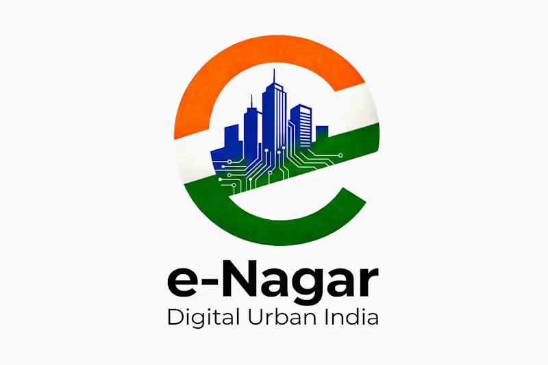
The e-Nagar project is an e-governance initiative launched by the Urban Development and Urban Housing Department, Government of Gujarat in partnership with MyGov. e-Nagar is a centralized digital platform designed to connect all Urban Local Bodies (ULBs) in Gujarat. It helps citizens access municipal services online—such as taxes, certificates, permissions, and complaints—through web portals and mobile apps. The goal is to make urban services faster, transparent, and more efficient using technology.
0
71
0
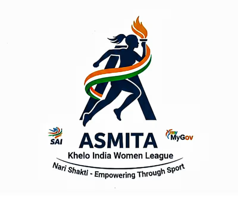
The ASMITA (Achieving Sports Milestone by Inspiring Women Through Action) logo was designed to represent the Khelo India Women’s League. The goal was to create a visual identity that embodies the spirit of Nari Shakti (Women Power) and the transformative impact of sports on Indian women.
0
117
0
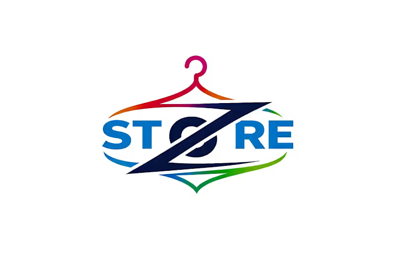
This clever logo integrates a stylized "Z" into a clothes hanger icon, instantly signaling a modern and energetic fashion brand. The vibrant, multi-colored border suggests variety and inclusivity, while the bold typography ensures a professional and highly recognizable identity.
0
75
Artist
(6)
Follow
Message
Kopal Sharma
India
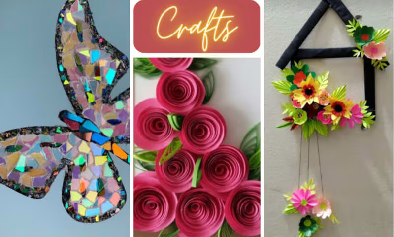
Creative and Innovative art & craft video creator
Follow
Message
Creative and Innovative art & craft video creator
0
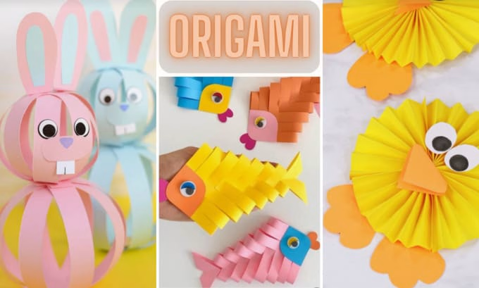
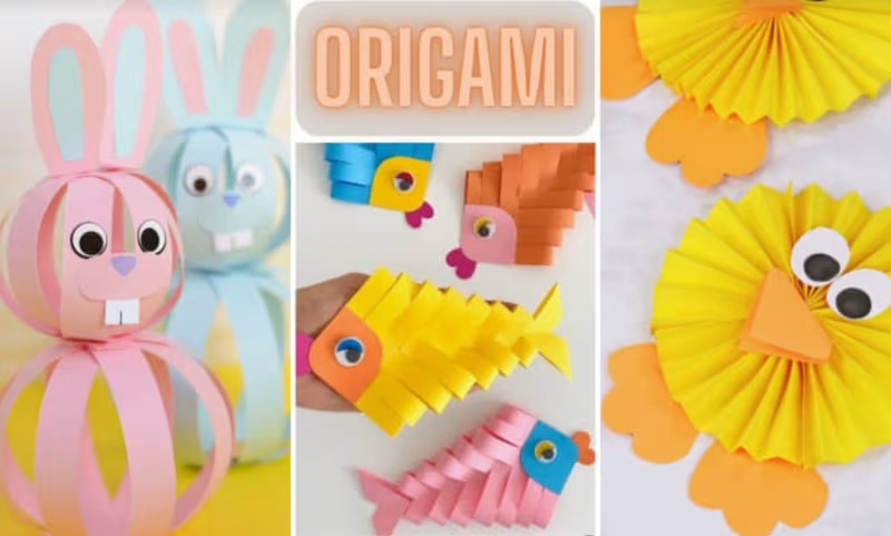
I will make origami or DIY crafts videos for social media
0
5
0
I will make innovative DIY kids crafts and for social platforms
0
8
0
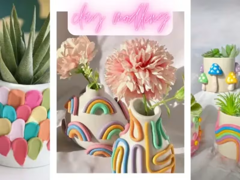
I will make handmade DIY crafts for social platforms
0
6
View more →
Artist
(3)
Follow
Message
Explore people