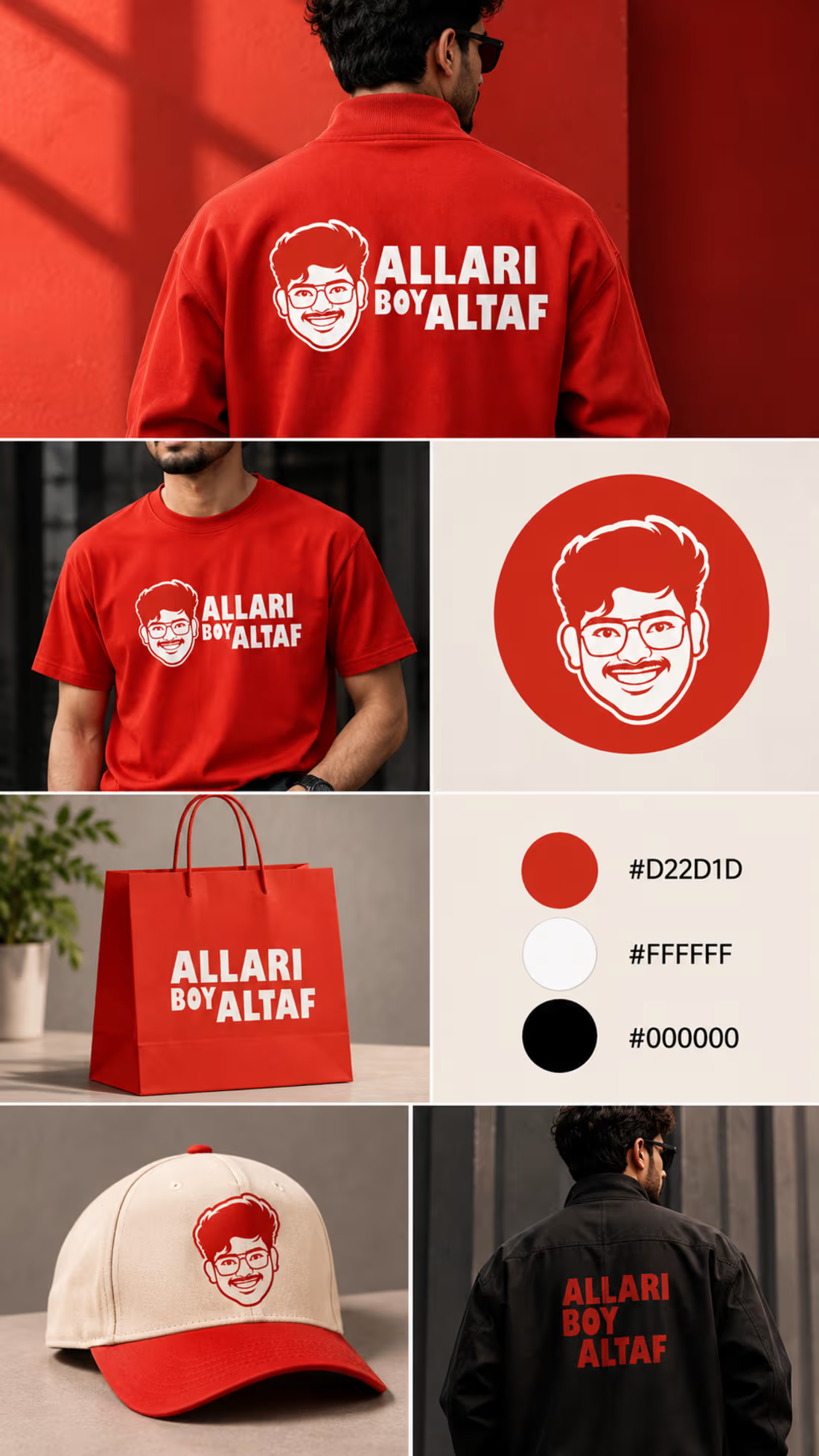
ALLARI BOY ALTAF | Brand Identity & Logo Design
A bold identity for a personality full of humour!
From a distinctive mascot logo to a cohesive brand identity, every element is designed to capture the fun, energy, and character of the brand.
A playful identity with a memorable personality.
Designed by Syed Tabu
Need a logo for your brand? Feel free to message me! Let's create something memorable together. #Mascot Logo #Visual Identity
0
35

Client Project | ALLARI BOY ALTAF
A fun brand deserves a memorable identity!
I had the opportunity to design a custom mascot logo for ALLARI BOY ALTAF, a comedy show brand.
The goal was to create a bold, recognizable character inspired by the owner's personality, paired with strong typography.
Design highlights:
Custom face mascot
Bold black-and-white logo concept
Character and wordmark variations
Versatile logo presentation
Designed with Inkscape.
Thank you for trusting me with this project!
One more brand identity brought to life. ✨
And this review made my day.😍
#LogoDesign #MascotLogo #BrandIdentity #Inkscape #ClientWork #GraphicDesigner
1
103
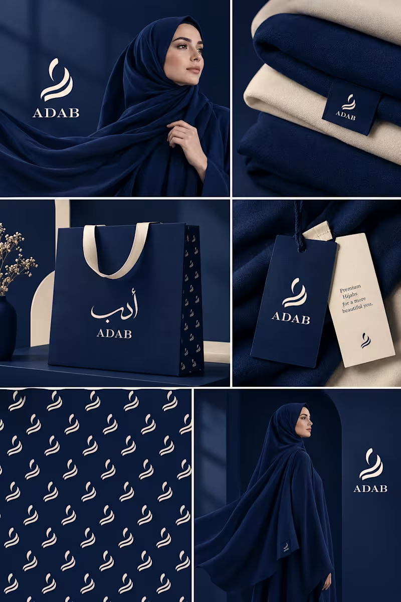
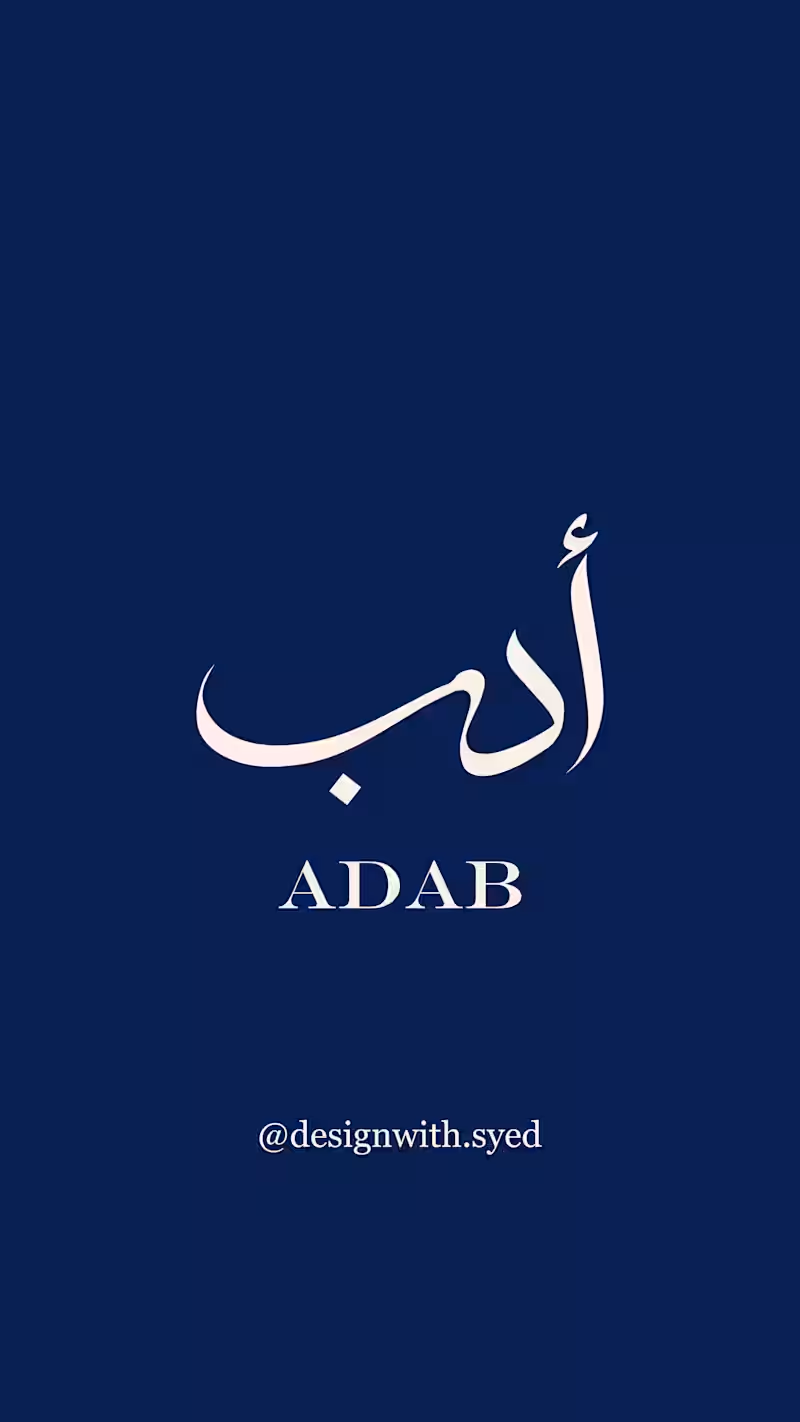
ADAB — a minimal Arabic-inspired logo concept.
This concept explores elegant Arabic lettering with a clean, modern and refined visual direction, designed to feel timeless and versatile.
Originally created as a practice concept, but now available for purchase. If this direction fits your brand, feel free to reach out — I can also customize it to suit your brand’s personality and needs.
Available at a friendly budget. ✨
4
2
234
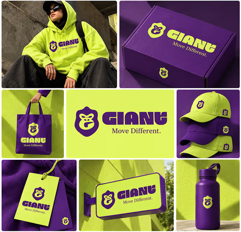
GIANT — Move Different.
Built around a bold gorilla mark, oversized typography, and an electric purple + neon-lime palette.
A streetwear identity designed to feel bold, rebellious, and instantly recognizable — from hoodies and caps to packaging, tags, and everyday brand details.
Concept branding project | Open for custom projects
12
10
932
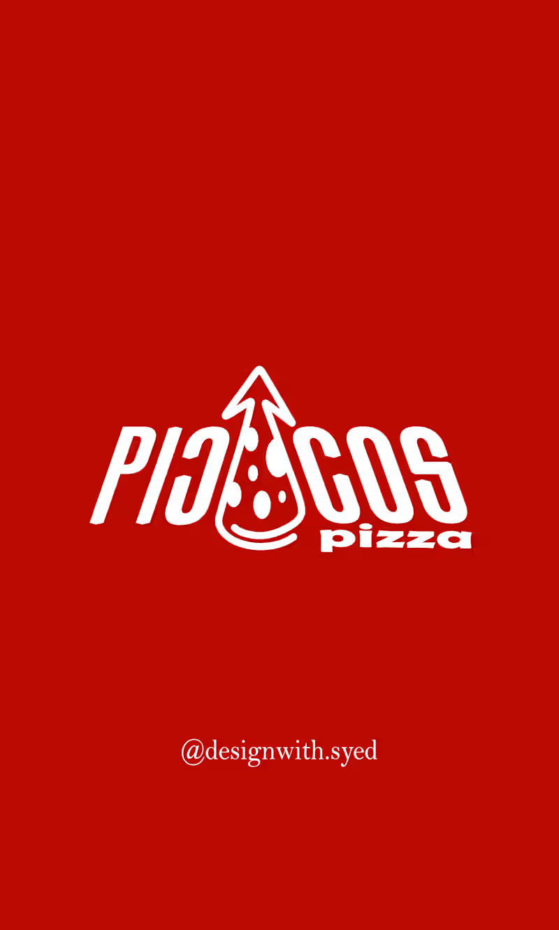
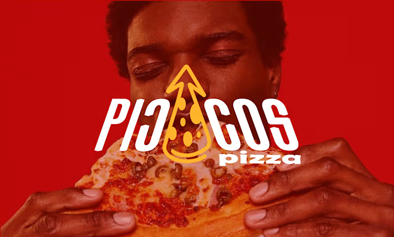
Piccos Pizza — Practice Logo Concept
This is a self-initiated practice logo concept created for Piccos Pizza.
I explored a simple pizza-inspired mark with an upward pointed shape to create a bold and memorable identity. The concept combines the idea of pizza with a sharp, energetic visual direction.
I kept the design minimal, clean, and easy to recognize, with the goal of making it work across social media, packaging, menus, and other brand applications.
This logo concept is available for purchase. If you’re interested in using or customizing this design for your brand, feel free to DM me.
Open to small adjustments based on your brand needs. ✨
2
172
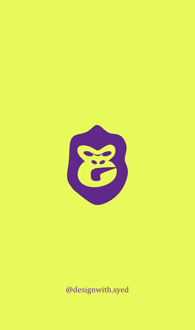
A self-initiated logo project based on a fictional design brief for Giant.
The brief was for a pre-construction apartment brand offering solar-powered homes, targeting millennials. The identity needed to feel delightful and affordable, with a purple pictorial mark that could also work on vehicles.
For my concept, I wanted to move away from the usual house or building symbols. I explored an animal-inspired mark combined with a hook shape to create something bold, playful, and easy to recognize.
I kept the shapes simple and strong so the mark could work well even when printed on the side of a vehicle.
This was a self-initiated practice project where I explored how to turn a given brief into a visual identity concept.
3
219
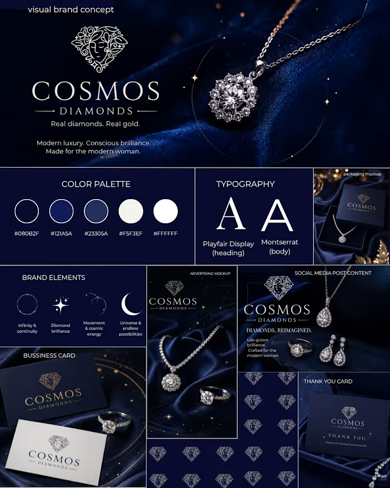
Project Title
Cosmos Diamonds — Celestial Luxury | Visual Brand Concept
Description
The Story Behind the Concept
I came across Cosmos Diamonds and was inspired by its connection to diamonds, modern luxury, and the idea of the cosmos.
As a brand identity designer, I wanted to explore how the feeling of the infinite universe could be translated into a refined and cohesive visual direction for a jewellery brand.
I reached out to Cosmos Diamonds and shared my idea of creating a quick concept inspired by their brand. After receiving a response, I developed this self-initiated visual brand concept.
Creative Direction
The concept is built around four key ideas:
Orbit — representing infinity and continuity.
Stars — symbolising diamond brilliance.
Celestial Curves — representing movement and cosmic energy.
Diamond Brilliance — reflecting the beauty and refinement of jewellery.
Visual Identity Exploration
The concept explores:
Colour palette
Typography
Logo presentation
Celestial graphic elements
Brand pattern
Social media content
Advertising creative
Packaging concept
Business card
Thank-you card
The visual direction uses deep navy, blue and white tones to create a dark, elegant and celestial atmosphere while keeping the overall identity modern and premium.
Design Approach
My goal was not to completely redesign the existing brand, but to explore how its current visual language could be extended into a more cohesive visual system across different brand touchpoints.
Note
The Cosmos Diamonds logo shown in this concept belongs to the original brand and was not designed by me. I used it only for brand context and visual exploration. The logo was sourced from a publicly available profile image, so its resolution may appear lower in some parts of the presentation.
This is a self-initiated visual brand concept, not an official Cosmos Diamonds rebrand or commissioned client project.
1
115
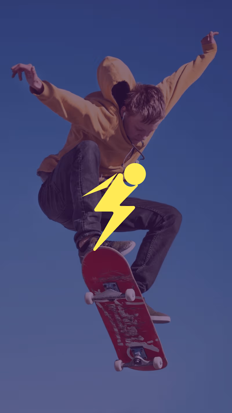
THUNDER — Logo Design
Brand: Thunder
Industry: Snowboarding fan merchandise
About the brand: Thunder is a fictional brand that creates durable, high-quality merchandise for snowboarding fans, targeting college students.
Design brief: Create an abstract logo mark that conveys a sense of victory, energy, and professionalism. The logo should use yellow as the primary color and work effectively on the brand’s website.
Design direction: A bold lightning-inspired symbol combined with strong, modern typography to represent power, motion, and an energetic brand personality.
Project type: Self-initiated concept project
Tools: Inkscape
4
6
330
SHIMMER — Logo Design Concept
A refined logo concept created for SHIMMER, an interior design education brand focused on making design learning approachable, inspiring, and accessible.
The identity explores the relationship between interior spaces, creativity, learning, and architectural forms through a minimal emblem and elegant typography.
I explored three logo variations to test different levels of visual storytelling and simplicity:
Concept 01: Symbol + wordmark — a more expressive and complete identity.
Concept 02: Integrated wordmark — subtle architectural elements incorporated directly into the lettering.
Concept 03: Standalone symbol — a minimal, versatile mark that focuses purely on the architectural form.
Which direction feels strongest to you — 01, 02, or 03?
I'd love to hear which style feels the most memorable, balanced, and suitable for the SHIMMER brand.
Tools: Inkscape
Project: Personal / Practice Branding Concept
Focus: Logo Design · Brand Identity · Typography · Minimalist Branding
1
142
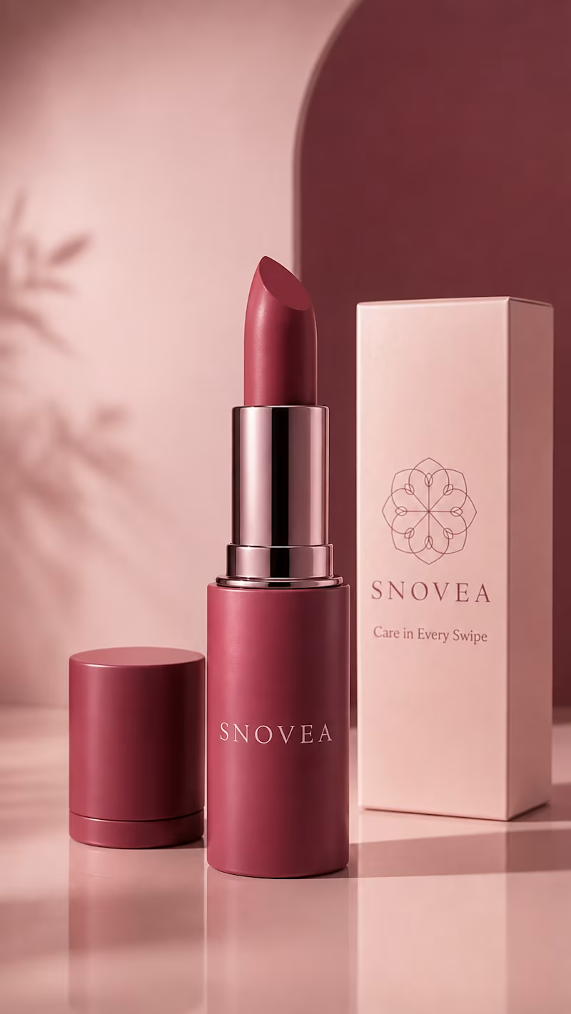
SNOVEA is a personal practice project I created to explore beauty branding and packaging design.
I wanted to experiment with how a simple logo and a soft color palette could come together across different products. I created these mockups to practice building a consistent visual identity and presenting a brand in a more realistic way.
This project helped me explore logo placement, packaging, color consistency, and product presentation while developing my branding skills.
1
143
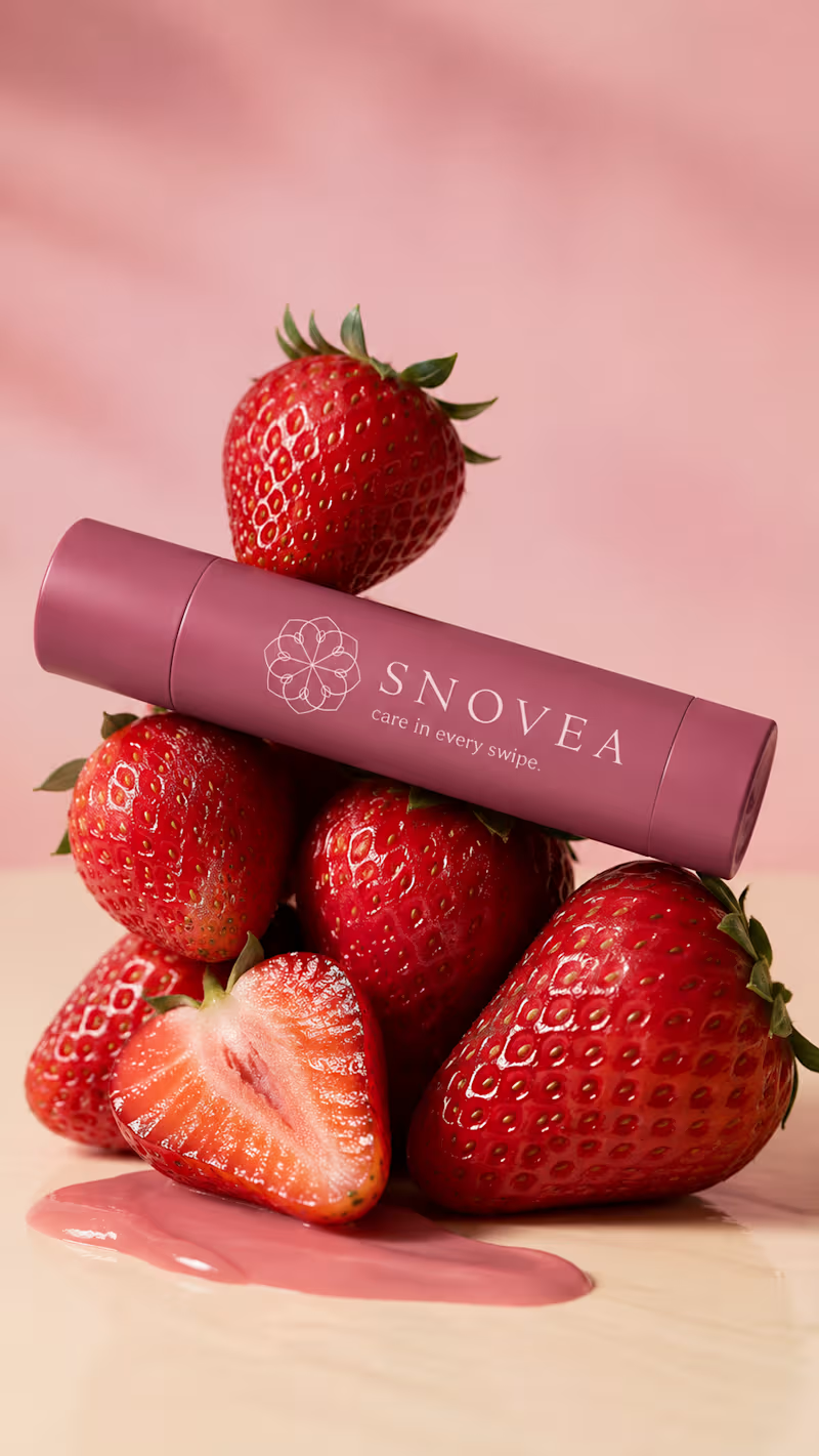
SNOVEA — Logo Concept
For SNOVEA, I wanted the logo to feel as soft and refreshing as snow.
I took inspiration from the simple beauty of snowflakes — their delicate shapes, symmetry, and clean appearance. I translated that feeling into a soft, elegant symbol that feels light and gentle, which fits perfectly with a lip balm brand.
The idea was to keep the logo minimal but still give it a little personality, so it feels both fresh and premium without being too complicated.
1
124
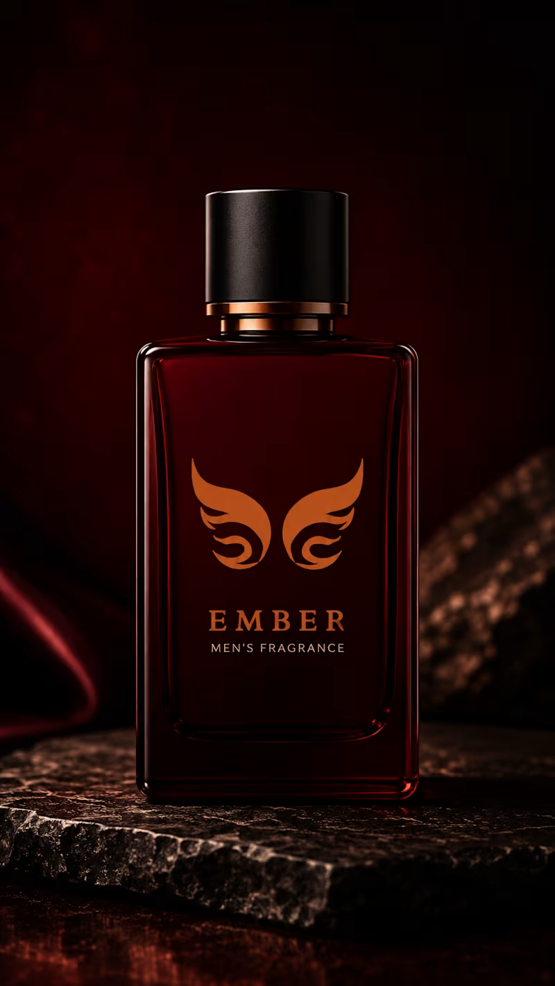
EMBER — Men’s Fragrance Brand Concept
EMBER is a conceptual men’s fragrance brand inspired by the quiet intensity of fire and the warmth that remains after the flame.
For the logo, I wanted to avoid using a literal flame icon. Instead, I created a symmetrical abstract symbol that combines flame-like forms with a subtle hidden “E” structure, representing the first letter of EMBER while keeping the mark minimal and distinctive.
The deep burgundy and burnt orange palette reflects heat, confidence, depth, and sophistication, creating a dark and premium masculine identity.
I extended the concept into a luxury fragrance bottle to visualize how the identity could translate into a real-world brand experience.
Concept: Fire • Warmth • Confidence • Intensity
Industry: Men’s Fragrance
Design Style: Minimal • Premium • Masculine • Contemporary
1
135