UI/UX Designer | 2+ Years | Figma • Adobe • Canva • AI Tools
New to Contra
UI/UX Designer | 2+ Years | Figma • Adobe • Canva • AI Tools
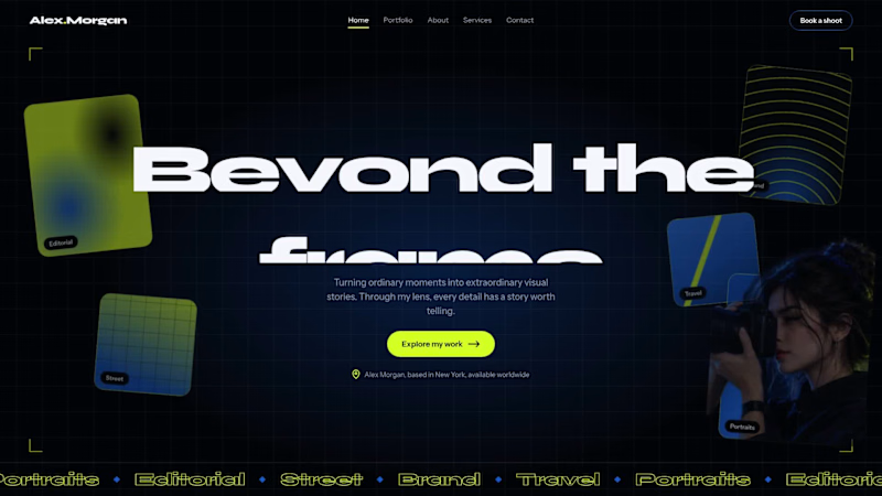
Photographer Portfolio Website: Hero Section Concept
A concept website design for a photographer and visual artist, built around one question: how do you make a portfolio feel like the work itself?
The hero section pairs a dark, high-contrast background with a single lime accent, so photography stays the focus. A subtle animated grid and floating photo tiles (Editorial, Street, Brand, Travel, Portraits) give visitors an instant preview of the photographer’s range, while a bold headline and one clear call to action (“Explore my work”) guide them forward.
Typography uses Syne for headlines and Instrument Sans for body text, keeping the layout modern and easy to read. The navigation includes a “Book a shoot” button to turn visitors into clients.
This is a self-initiated concept project, showing how I approach visual hierarchy, layout, and responsive design
1
22
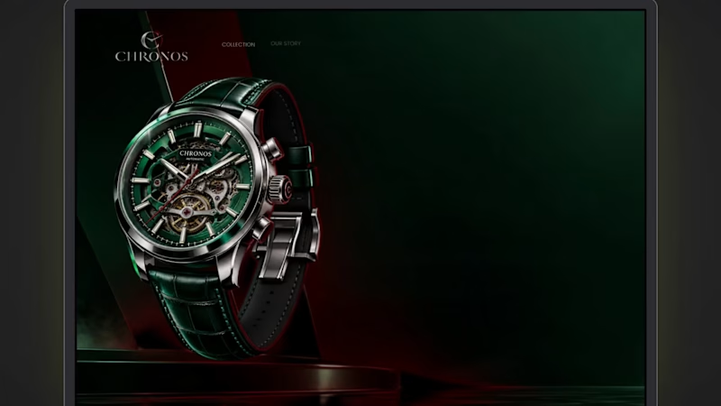
CHRONOS: Dark, Cinematic Landing Page for a Luxury Watch Brand
The brief: A hero section for a luxury watch brand that feels expensive and quiet, and still gives the visitor a clear next step.
What I focused on
Colour: Deep green and black as the base, red used only for the light beam, the first headline word and the button. Limited colour keeps it premium.
Typography: A high-contrast serif for the headline, which gives it a watchmaking feel, and a clean sans-serif for supporting text so it stays easy to read.
Hierarchy: Watch first, headline second, button third. The eye moves in that order, and the animation follows it.
Motion: Slow, controlled movement only: a soft fade-in, a rising headline and a gentle light pulse. No bounce or flashy effects.
Trust: Three short proof points under the button, so the page isn’t only atmosphere.
6
3
156
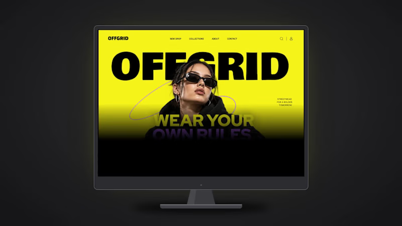
OFFGRID: Bold Landing Page Design for a Streetwear Brand
A hero section for a streetwear label that feels loud, young and confident, and still easy to read.
What I focused on
Typography: A heavy display wordmark for the brand, and a clean sans for the headline and navigation. The contrast gives the page energy without making it messy.
Colour: Yellow, black and purple only. High contrast, so the headline and button are readable at a glance.
Depth: The model overlaps the wordmark, which gives a poster-like layered look.
Motion: Elements load in a clear order (nav, wordmark, model, headline, button), so the eye follows the page naturally.
Tools: Figma
2
3
98
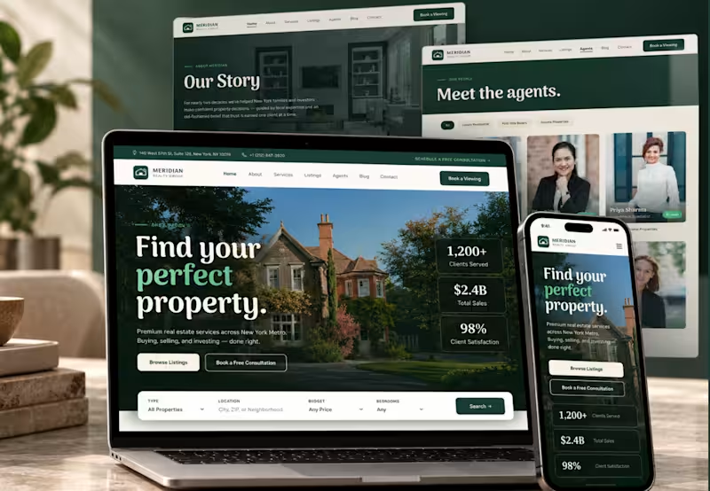
Meriden — Real Estate Website Design
Medrien is a modern real estate website designed to make property discovery feel seamless, intuitive, and premium.
The website features an elegant visual identity with deep forest-green tones, warm neutral backgrounds, refined typography, and high-quality property imagery. From the hero section and property search interface to featured listings, agent profiles, client testimonials, and premium property galleries, every section is designed to create a cohesive and engaging user experience.
I designed the complete website experience with a focus on clear information hierarchy, intuitive navigation, consistent spacing, and a layout that helps users explore properties with ease. The design balances a sophisticated real estate aesthetic with usability, building trust while making property discovery more enjoyable.
Project Highlights
Complete real estate homepage design
Property search and featured listings
Dedicated service and premium property sections
Agent profiles and client testimonials
FAQ section and conversion-focused CTA
Consistent typography, colors, and visual hierarchy
My Role: UI/UX Designer
Tools: Figma
Project Type: Real Estate Website Design
Focus: UI Design, UX Design, Website Layout, Visual Identity, and Responsive Design
The goal was to create a polished digital experience that presents properties beautifully, builds credibility, and helps users take the next step in their property journey.
0
17

Expert 2D Animator & Video Editor
Expert 2D Animator & Video Editor