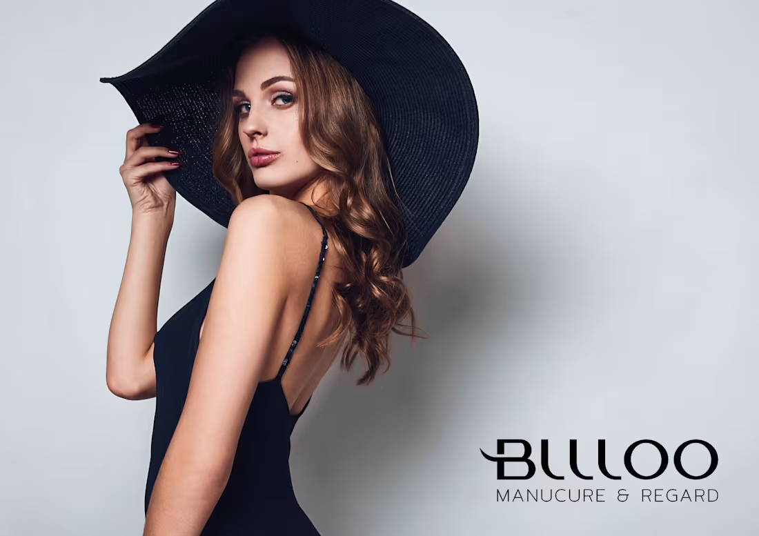
Bllloo — Luxury Brand Identity & Custom Typography
Bllloo is a high-end beauty and aesthetic salon specializing in premium nail care and lash/brow artistry ("Manucure & Regard"). The goal was to construct a bespoke, high-fashion visual identity that elevates the brand to luxury status.
The Challenge
In a saturated beauty market, Bllloo required an identity that stood out from generic cosmetic branding. The brand needed an iconic, timeless signature that communicated precision, elegance, and high-end positioning to a demanding clientele.
The Solution & Art Direction
As Senior Art Director, I engineered a complete visual language rooted in European elegance and custom craftsmanship:
Custom Typography & Emblem: Designed a bespoke logotype with custom-crafted letterforms and extracted a sharp, distinctive icon symbol to serve as the brand's primary mark.
Editorial Art Direction: Paired the sleek typographic system with high-fashion, minimalist photography to build immediate brand authority and prestige.
Cohesive Brand System: Developed a versatile identity system built for premium physical collaterals, signage, and digital presence.
0
84

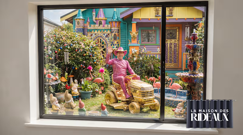
Maison du Rideau — Creative Advertising Campaign & Visual Storytelling
A humor-driven print and billboard advertising campaign designed for La Maison des Rideaux. The objective was to frame high-end curtains not just as decorative textiles, but as an essential shield for home privacy and peace of mind.
The Consumer Insight & Concept
You can't choose your neighbors or their lack of taste, but you can choose what you see from inside your home. The campaign uses visual hyperbole—an over-the-top, eccentric neighbor—to highlight a universal pain point: intrusive vis-à-vis.
The Art Direction & Execution
As Senior Art Director, I conceived and executed a high-impact "Before / After" storytelling visual system:
Visual Storytelling & Contrast: Juxtaposed an absurdly cluttered, colorful exterior scene with a sleek, minimalist interior framed by dark blackout curtains.
Instant Brand Benefit: Positioned the product as the ultimate solution for instant privacy, delivering a clear message through humor rather than traditional product feature listing.
Multi-Format Adaptation: Engineered the concept to scale effectively across large-format OOH billboards, magazine spreads, and digital social ads.
0
84
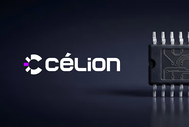
Célion — High-End Tech Brand Identity & Visual System
Célion is an innovative technology brand operating in a fast-evolving digital landscape. The objective was to build a sophisticated, future-proof visual identity designed to convey trust, high performance, and technical expertise.
The Challenge
In the tech and SaaS sector, generic corporate design fails to capture attention. Célion needed a distinct, high-precision visual architecture that could scale seamlessly across digital interfaces, product environments, and marketing touchpoints while commanding immediate authority.
The Solution & Art Direction
As Senior Art Director, I developed a comprehensive brand system tailored for the tech industry:
Precision Identity & Logotype: Engineered a modern, geometric logo system that balances technical rigor with clean, contemporary elegance.
Scalable Design Language: Created a cohesive visual framework—including a targeted color palette, dynamic graphic elements, and a structured typographic hierarchy built for high readability on screens.
UI/UX & Digital Alignment: Established art direction guidelines to ensure flawless brand consistency across web platforms, software dashboards, and marketing collaterals.
0
87
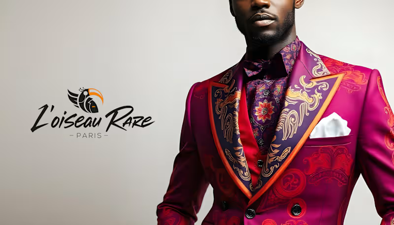
L'Oiseau Rare — Luxury Brand Identity & Bespoke Art Direction
L'Oiseau Rare is an exclusive brand concept crafted for a high-end audience. The objective was to build a distinct, highly curated visual identity that embodies rare craftsmanship, discretion, and timeless elegance.
The Challenge
In the ultra-luxury and boutique segment, visual communication must speak through restraint, precision, and sophistication rather than noise. The brand required an identity that conveys immediate prestige and bespoke quality across both high-touch print collateral and refined digital platforms.
The Solution & Art Direction
As Senior Art Director, I developed an elevated visual system centered around uniqueness and elegance:
Custom Logotype & Symbol: Engineered a bespoke typographic signature and an iconic symbol designed to reflect rarity, balance, and high-end positioning.
Refined Palette & Typography: Curated a sophisticated, understated color range paired with an editorial typographic hierarchy built for premium visual impact.
Brand Guidelines & Touchpoints: Established art direction rules for print, luxury packaging, and digital presence to maintain flawless brand consistency.
0
84
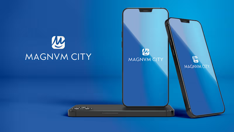
MAGNVM CITY — Tech & Mobile App Brand Identity System
MAGNVM CITY is a modern technology and mobile application initiative requiring a sharp, memorable visual identity. The project aimed to deliver a high-precision brand design capable of positioning the app as a sleek, top-tier digital ecosystem.
The Challenge
In the competitive app and tech market, a brand identity must instantly capture attention on small screens while maintaining authority and versatility across high-resolution displays, app stores, and marketing channels.
The Solution & Art Direction
As Senior Art Director, I crafted an emblem-driven visual system built for digital versatility:
Emblem Logotype & Iconography: Engineered a minimalist, high-precision emblem symbol that functions seamlessly as an app icon, favicon, and brand signature.
App & Tech Visual Hierarchy: Developed a clean typographic structure and high-contrast palette optimized for mobile UI interfaces and digital dark/light modes.
Scalable Brand System: Established clear art direction guidelines to ensure complete brand cohesion across software environments, marketing collateral, and digital touchpoints.
0
58
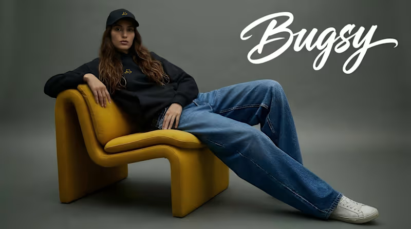
Bugsy — Urban Streetwear Brand Identity & Custom Gestural Typography
Bugsy is a dynamic urban streetwear brand requiring a bold, authentic, yet highly polished brand identity. The goal was to craft a distinctive visual signature driven by custom gestural typography and edgy, high-end streetwear art direction.
The Challenge
The urban fashion and streetwear market demands a visual brand language that feels organic, expressive, and culturally authentic, while maintaining technical precision for complex production methods—from dense apparel embroidery to high-resolution digital storefronts.
The Solution & Art Direction
As Senior Art Director, I developed a custom typography-led visual identity system:
Custom Gestural Lettering: Engineered an original, hand-crafted logotype that balances raw urban energy with refined typographic structure and visual weight.
Apparel & Textile Optimization: Created vector-perfect brand marks specially optimized for screen printing, high-density embroidery, woven labels, and custom hangtags.
Brand Language & Lookbook Direction: Established comprehensive art direction rules for visual campaigns, social media assets, and e-commerce touchpoints.
0
50
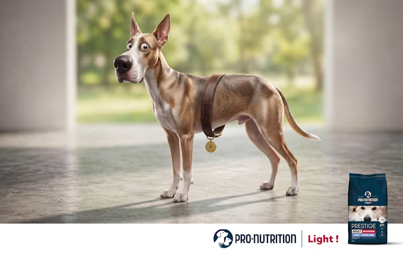
Pro-Nutrition Light — High-Impact Visual Advertising & Creative Direction
A humor-driven advertising campaign crafted for Pro-Nutrition to launch their "Light / Sterilised" pet food range. The campaign leverages visual hyperbole to showcase effective weight loss and pet vitality in a single, memorable shot.
The Creative Concept & Insight
Pet weight-management ads are often overly clinical or generic. The creative objective was to communicate a dramatic transformation through an instantly readable visual punchline: a dog that lost so much weight its collar slipped down to its waist like a belt, now back to peak energy and shape.
The Art Direction & Execution
As Senior Art Director, I conceptualized and oversaw the complete visual storytelling:
Visual Metaphor & Humor: Developed a high-concept visual joke that delivers the core product benefit in under two seconds without relying on heavy copy.
Art Direction & Character Staging: Directed the character expressive design, lighting, and composition to emphasize vitality, health, and a lighter physique.
Commercial Campaign Layout: Engineered a clean, high-impact poster layout balancing narrative humor with clear product hierarchy and brand identity.
0
39