
Brands built from idea to launch, with brains & personality.


Brands built from idea to launch, with brains & personality.

First passion project of 2026, meet LOAFFA;
Your newest obsession when it comes to sleepwear and bedding.
Worth coming home to, and hard to leave in the morning...
4
24
917

Small look at Cinnapop, a gingerbread cookie brand I made for fun... Just in time for the holidays!
5
34
847
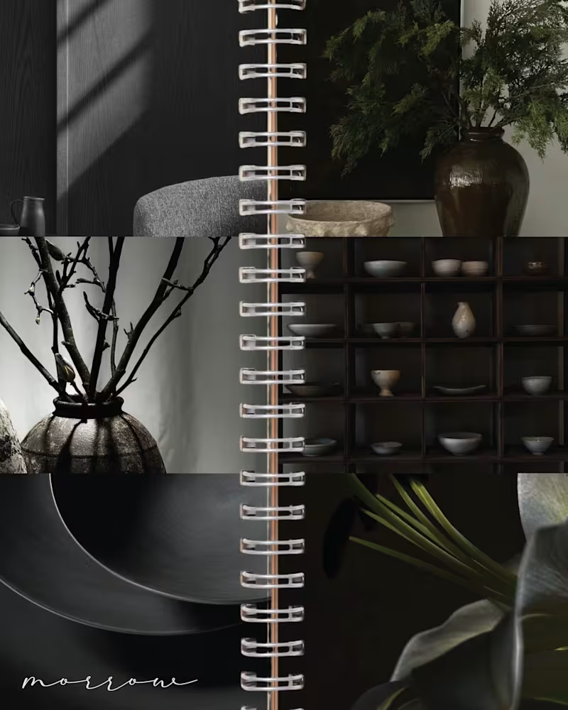
MORROW | Brand Identity & Art Direction
MORROW is a self-directed homeware brand concept built around a slower approach to living. Thoughtful objects, natural materials and a sense of permanence, brought together through a brand designed to feel as considered as the pieces it represents.
The visual direction combines deep greens, warm browns and soft ivory, balancing rustic character with understated luxury. The goal was to create an identity that feels collected rather than overly polished, with a quiet sense of permanence running through every detail.
From the visual identity to the overall art direction, I developed the branding from start to finish, building a cohesive visual world around the idea of slow-made living.
MORROW. Design made to stay.
47
109
4.3K
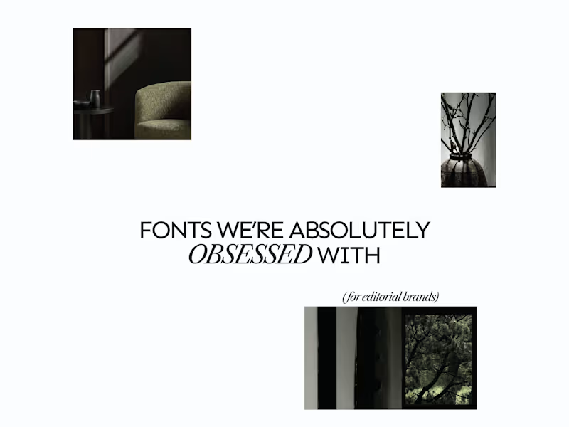
A few editorial typefaces we’re absolutely obsessed with right now.
These are some of the fonts we keep coming back to at Studio Mayze when we want a brand to feel considered, distinctive and a little more editorial without pushing the design too far.
Good type can do a lot of the heavy lifting. The right one can completely change how a brand feels before you’ve even added anything else.
Each slide shows the typeface in use at the top, with the font name underneath, so you can see how it could look in context rather than just as a specimen.
These are three of our favourites at the moment. Want to see the full selection? We’ve shared all of our favourites over on Instagram (https://www.instagram.com/p/Dewd73IkcWw/?img_index=1).
Which one would you pick? 👀
6
21
790