
Framer Expert Pro · Designer at Welcom


Framer Expert Pro · Designer at Welcom
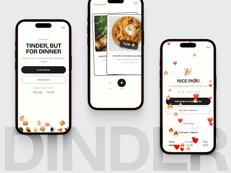
🍝 Hey everyone! Here’s my final submission for the Contra Hackathon!
Deciding what to eat is universal friction. Dinder makes it fast, fun and social.
It’s Tinder for dinner — swipe through meals solo or with a partner, and when you both like the same dish, it’s a match.
Built entirely in Anything, Dinder mixes design polish with real function:
• Partner rooms or solo browse
• Recipe modals with steps and ingredients
• Shopping helpers and takeout finder
• Weekly leaderboard of top meals
• Smart deck that learns from likes
Runs on web and mobile with a shared backend.
Earning potential:
• Dinder Pro with food preferences, leaderboard access
• Affiliate links to grocery and delivery apps
• Light in-app ads
A small, joyful idea that turns dinner indecision into play.
Demo: www.dinder.life (http://www.dinder.life)
16
71
1.6K


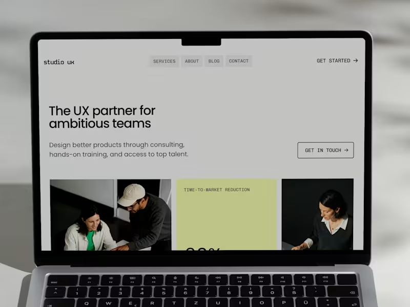


Product Designer, Webflow Developer & Bubble Expert 🚀
- $1k+
- Earned
- 1x
- Hired
- 10
- Followers
Product Designer, Webflow Developer & Bubble Expert 🚀

A few screens from a design I did a while ago. UI for a moving application helping you easily scan rooms to book moves!
Had a great time designing this mobile application⚡️
23
258


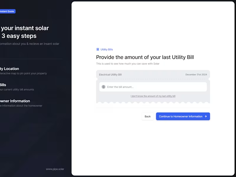

Visual identities, motion systems & brand tools


aktor-e: solution flexes, logo flexes.
The venture explored software that could help factories reduce energy use.
Using only circuit boards and some code, they could make aging machines digital, letting them run smarter and use less energy.
However, they could also connect entire production lines and let factories run in symbiosis.
They weren't just energy optimizers. They could transform entire factories.
The hyphen became the symbol of that journey. It also flexes and adapts just like their solution does.
Team: 2 designers (me), 1 motion (me)
2
588

aktor-e: the hyphen that stuck.
The venture explored software that could help factories modernize aging machines and reduce energy use.
The hyphen became the symbol for the journey from old to new: a–e.
My teammate flipped the a into the e. I thought it broke the readability. He said, “Exactly.”
We tested it; I was happily wrong, and the mark stuck. It makes you stop for a second, without making the brand feel loud.
Team: 2 designers (me), 1 motion (me)
3
566
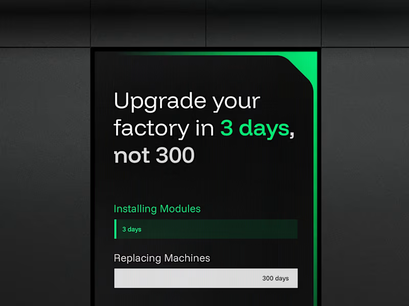
aktor-e: building the brand system.
The venture explored software that could help factories reduce energy use.
The brand system needed to feel engineered, but not cold.
The beveled corner became a simple visual rule that could show up across layouts, icons and interfaces.
It gave the identity a mechanical edge, while the green direction and gradients kept it connected to smarter energy use.
The main learning was that the system didn't need many tricks. One strong behaviour, used consistently, could carry a lot.
Team: 2 designers (me), 1 motion (me)
1
400

Sr Product designer - user, design & biz for Tech
Sr Product designer - user, design & biz for Tech


View more →


Interactive Rive Animations Expert


Transformation studio uniting business with creativity.


From mould remediation to Material Resilience. This is our first case story at Ebb. Some projects feel like milestones. For us, this is one of them: Future, Business, Brand and Experience Design brought together in one transformation.
Defining a future worth fighting for. 🖤
The full case: https://ebbscandinavia.com/fuktab
1
23
261


Designer+Developer


Frontend & UI/UX Engineer, Creative Problem Solver
Frontend & UI/UX Engineer, Creative Problem Solver


View more →