Freelance Responsive Designs in England
Sign Up
Post a job
Sign Up
Log In
Filters
2
Projects
People
George Weatherhead
max
London, UK
I animate interactive, gamified worlds 🚀
$25k+
Earned
11x
Hired
5.0
Rating
249
Followers
expert
Club
Follow
Message
I animate interactive, gamified worlds 🚀
14
Micro-Interactions, Rive
14
326
6
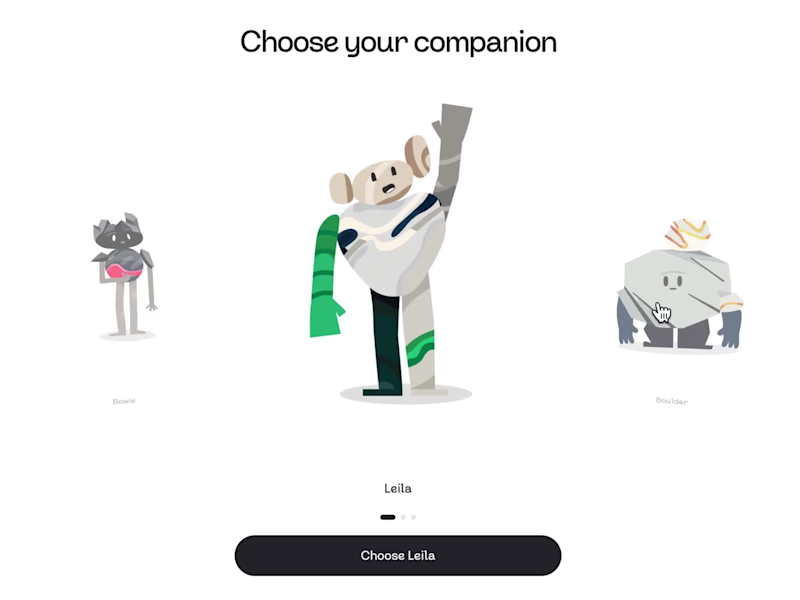
Learning Companions - Pebble
6
186
4
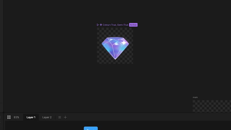
Gems & Stars - Immutable 💎
4
139
4
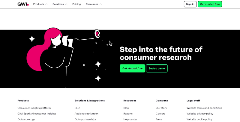
Interactive Headers for GWI's Website
4
68
Responsive Design
(1)
Follow
Message
Anna-Louise Cumming
London, UK
Hello! I’m a freelance UX and UI designer
$1k+
Earned
1x
Hired
5.0
Rating
11
Followers
Follow
Message
Hello! I’m a freelance UX and UI designer
0
3D Interactive Learning Platform for Haleon
0
9
1
Tiffany - Responsive Microsite Design for Feature Films
1
10
1
Specsavers Scrolly-Telling Learning Module
1
9
0
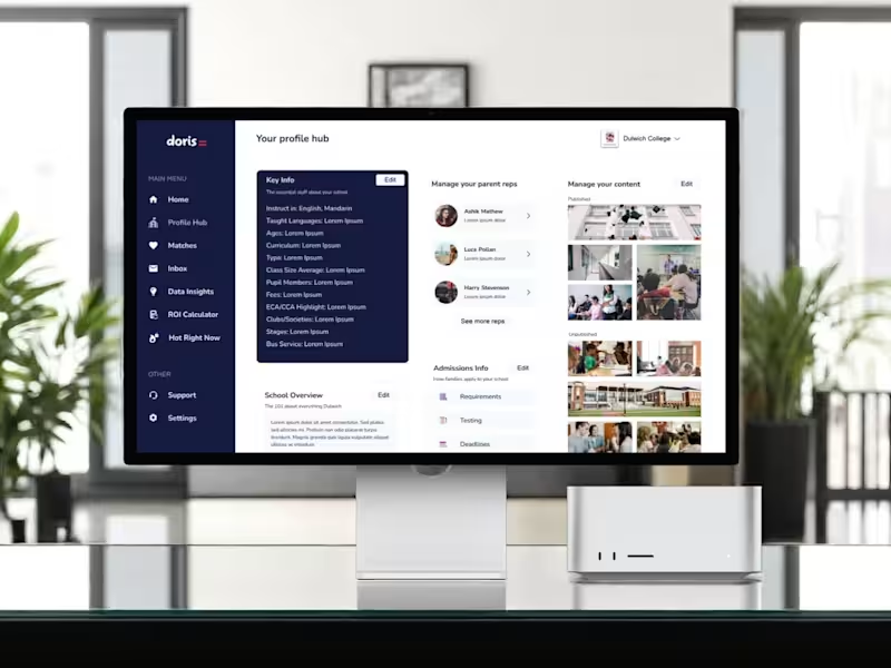
Doris School - UX/UI design, branding
0
21
Responsive Design
(3)
Follow
Message
Dmitriy Shilko
pro
London, UK
Brand Design✦UI design✦Front-end development.
$25k+
Earned
6x
Hired
5.0
Rating
70
Followers
Follow
Message
Brand Design✦UI design✦Front-end development.

0
UI design, Website design, Logo design.
0
37
3
Shopify store for Verma Jewerly Group
3
113
1
Speak Whiskey / Brand design / Logo Design
1
37
1
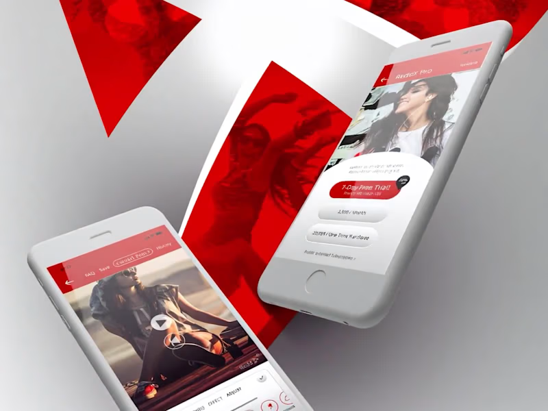
ReddX Mobile app design. Prototyping.
1
73
Responsive Design
(1)
Follow
Message
Cataldo Cappiello
pro
London, UK
Design with purpose: Premium branding for your business
5.0
Rating
9
Followers
Follow
Message
Design with purpose: Premium branding for your business
0
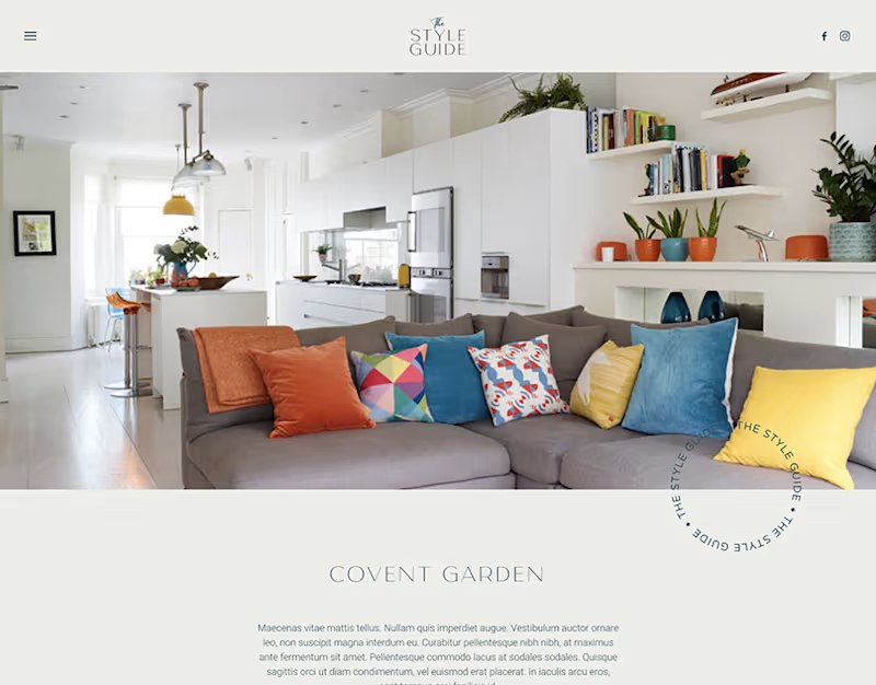
The Style Guide - Website Design
0
17
0
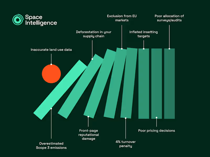
The First Domino (Infographic)
0
4
0
Fictional Podcast Brand in Figma
0
10
0
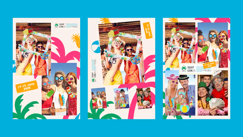
SQUPcon 25 - Brand Collaterals
0
7
Responsive Design
(1)
Follow
Message
Idris Lamina
pro
London, UK
AI Automation & Web Design | n8n · Vapi · Claude API

16
Followers
Follow
Message
AI Automation & Web Design | n8n · Vapi · Claude API
12
A cinematic portfolio concept for a film and motion studio, designed to feel more like an editorial reel than a standard agency website. The site uses a dark visual system, oversized typography, smooth scrolling, restrained motion, and a full-screen project index to make the work feel premium before the user reads a word. The focus was on pacing, atmosphere and confidence: fewer sections, stronger visuals, cleaner movement. Built as a responsive Next.js prototype with Framer Motion and Lenis-style smooth scrolling, including hero, selected work, about and contact sections.
7
12
505
26
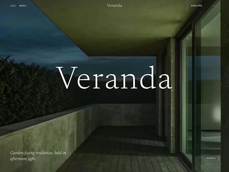
Veranda, a luxury residential concept landing page Veranda is a concept build I created for a fictional luxury residential brand. It is not client work or a real property. The images and hero motion were generated with AI as part of the creative process. I wanted to explore something that matters when building high-fidelity landing pages: after several rounds of changes, how do you make sure the final page still looks like the design that was approved? The site is built in Next.js with responsive layouts, self-hosted fonts, GSAP motion and an interactive walkthrough. I also built in a proper QA process around it, not just checking that the page loads and the buttons work. It compares 12 sections across five screen sizes against approved visual baselines. It flags visual drift, missing baselines and changes that have not been reviewed. I also tested interactions, accessibility, contrast, performance, browser behaviour and reduced-motion states. The main lesson for me was simple: a page can pass functional tests and still no longer be the page that was agreed.
22
26
1.1K
1
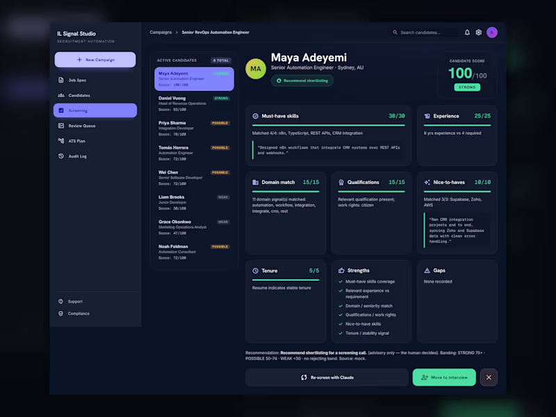
I built a working AI recruitment screening demo that shows how a hiring team can use AI without handing over the final decision. The flow is simple: A job spec goes in. Candidate profiles are screened against a weighted guideline. Each candidate gets a score, band, evidence quotes, and risk flags. Then everything stops at a human review queue. No auto-rejects. No silent ATS updates. No “AI decided this person is out”. The system includes: Candidate pipeline table Evidence-based screening view Human review queue Approve / reject / snooze decisions ATS deployment plan Audit log for compliance n8n workflow export with a human-in-the-loop Wait node Optional live Claude screening path The important part is the architecture: deterministic logic owns the workflow, gating, state and audit trail. The AI helps with judgement and screening, but the human owns the final decision. Built with Next.js, TypeScript, Claude API, n8n workflow architecture, and a gated ATS sync pattern. This is the kind of system I like building: AI that makes the work faster, but still respects the places where people need control. Shorter Version I built an AI recruitment screening pipeline with a human approval gate. It screens candidates against a rubric, shows evidence quotes and risk flags, then routes every candidate into a review queue before anything reaches the ATS. No auto-rejects. No silent updates. Human-in-the-loop by design. Built with Next.js, TypeScript, Claude API and n8n workflow architecture.
1
148
0
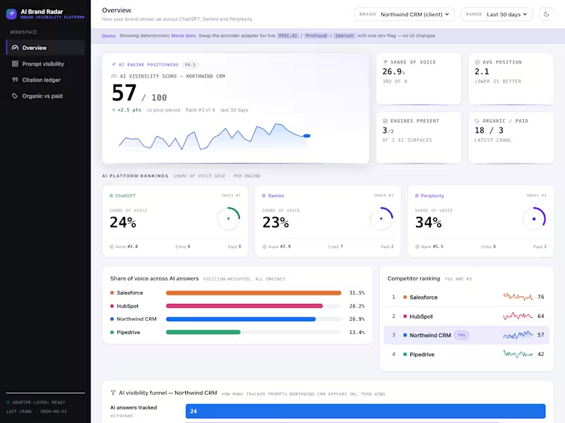
Brands are quietly disappearing from AI answers, and most of them have no idea. So I built something to make it visible. It is a dashboard that shows how a brand turns up across ChatGPT, Gemini and Perplexity, both where it earns a mention and where it pays for one. You get share of voice per engine, the exact prompts you are winning or losing, and the source each model actually pulled from. The part I enjoyed most was the architecture. The data layer sits behind a clean adapter, so PEEC.AI (http://PEEC.AI), Profound or Semrush slot in with a one-line swap. Mock data runs the demo for now, so the whole thing stands on its own. React, TypeScript and Vite, with a dark console look and a light mode for good measure.
0
90
Responsive Design
(1)
Follow
Message
Abby Rose
pro
Sheffield, UK
Your digital design and UX partner
28
Followers
expert
Follow
Message
Your digital design and UX partner
1
Dubai Islamic Bank's Annual Report
1
24
1
E&S Framer Website
1
18
2
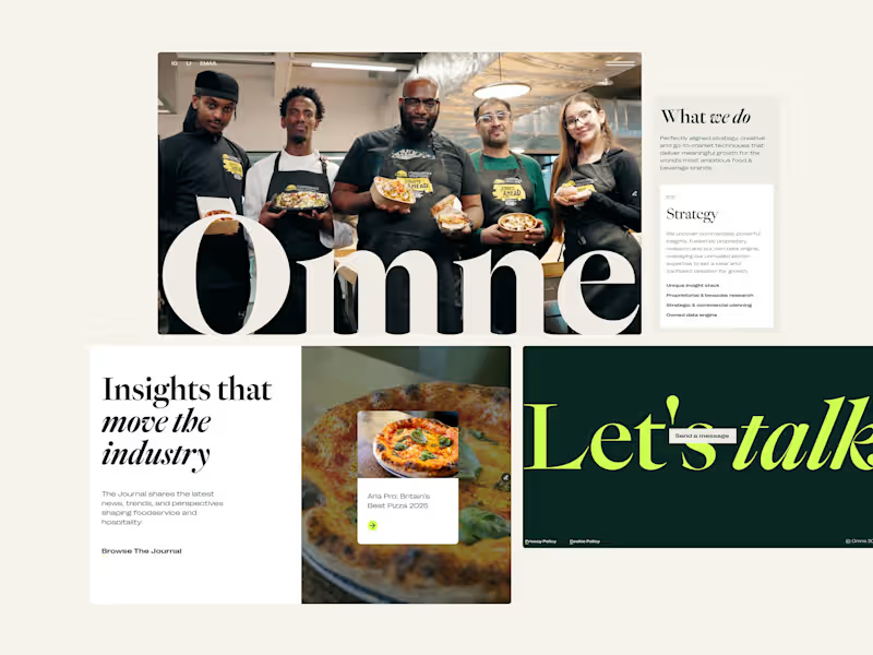
Omne Agency Website
2
11
1
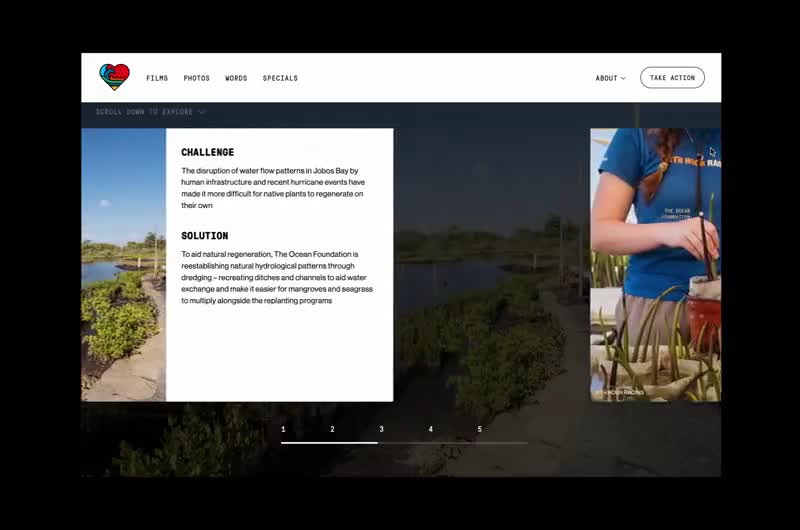
Scrollytelling Design for 11th Hour Charity
1
8
Responsive Design
(2)
Follow
Message
Abdul Kareem
Manchester, UK
Web Designer | Wix Studio Expert
6
Followers
Follow
Message
Web Designer | Wix Studio Expert
0
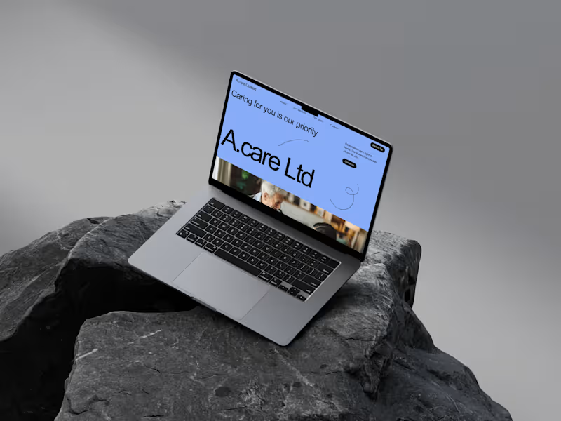
ACare Limited – Custom Website Build I created a custom website for acarelimited.org (http://acarelimited.org), a UK care and support service. The goal was to design a clean, trustworthy and easy-to-use platform that clearly communicates their services while reflecting their values of reliability, quality and compassion. The site was built around: • A professional visual identity – a calm, approachable colour palette with clear typography to build trust. • Service clarity – structured content and simple layouts that help users understand the care services offered. • Straightforward navigation – clear pathways for enquiries, contact details and key information. • Mobile-first thinking – fast, responsive design so families and clients can access details on any device.
0
131
14
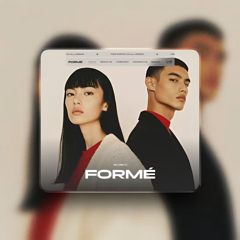
E-commerce Website Template - Wix Studio Designed and built a modern, conversion-focused e-commerce website template using Wix Studio. The layout takes a clean, editorial approach to online retail, prioritising strong visual hierarchy, spacious layouts, and a calm shopping experience. The template is fully responsive, easy to customise, and structured to help products stand out while building trust and clarity for customers. Ideal for fashion, lifestyle, skincare, and concept stores looking for a premium online presence. Deliverables: Custom e-commerce website template (Wix Studio) Product, collection, and checkout-ready layouts Mobile-first, responsive design Clean CMS structure for scalability Conversion-focused UI and UX #ecommercewebsite #webdesign #uixdesign #uxdesign #wixstudio
14
173
25
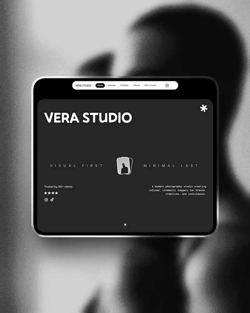
Vera Studio – Creative Studio Website Template (Wix Studio) Why I Designed Vera Studio While working with photographers and creative studios, I noticed many rely on social media or outdated websites that don’t reflect the quality of their work. Vera Studio was designed to change that. The focus was to create a clean, editorial-style website that showcases projects properly, builds credibility, and guides visitors towards enquiries. Built mobile-first in Wix Studio, the template offers a professional, flexible foundation for creatives who want to present their work with confidence. #WixStudio #CaseStudy #CreativeStudio #PhotographerWebsite #PortfolioDesign #WebDesignUK #ServiceBusiness #UXDesign
2
25
285
17
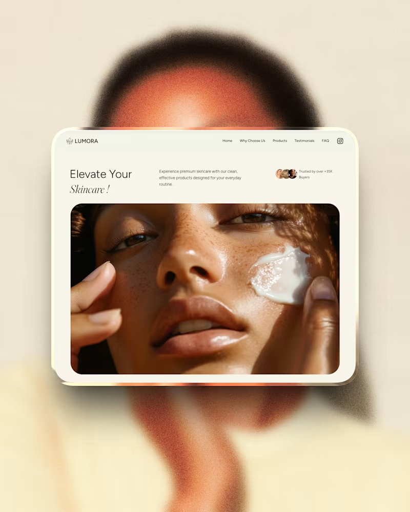
Lumora – Beauty Brand Website Template Built in Wix Studio Why I Designed Lumora While researching skincare and beauty startups, I noticed many brands rely on social media alone or use generic e-commerce layouts that don’t reflect a premium product. Lumora was designed to bridge that gap. The goal was to create a clean, conversion-focused landing page that highlights products clearly, builds trust, and can scale into a full e-commerce store. Built mobile-first in Wix Studio, Lumora helps beauty brands look established and sell with confidence — without the cost of a custom build. #WixStudio #CaseStudy #SkincareBrand #EcommerceDesign #BeautyBusiness #WebDesignUK #ProductWebsite #UXDesign
4
17
259
Responsive Design
(1)
Follow
Message
doris james
London, UK
WordPress & WooCommerce Website Developer
8
Followers
Follow
Message
WordPress & WooCommerce Website Developer
2
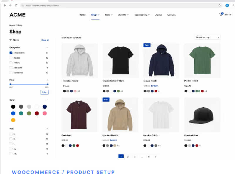
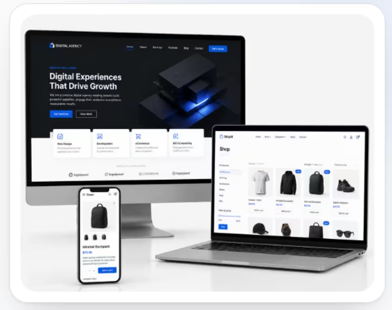
Problem The client needed a professional and user-friendly eCommerce website where customers could easily browse products, filter items, view product details, and shop seamlessly across desktop and mobile devices. The existing online-store experience needed better organization, responsive design, and a more polished shopping experience. Solution I designed and developed a modern WooCommerce eCommerce store with a clean product-focused layout and responsive experience. I organized the shop with intuitive categories, product filters, clear product cards, pricing, and shopping actions. I also optimized the design across desktop, laptop, and mobile screens to provide a consistent and easy-to-use shopping experience. What I worked on WooCommerce store setup Product/shop page design Product categories and filters Responsive desktop and mobile design Product cards and pricing layout Navigation and user experience Clean, conversion-focused eCommerce interface
1
2
96
1
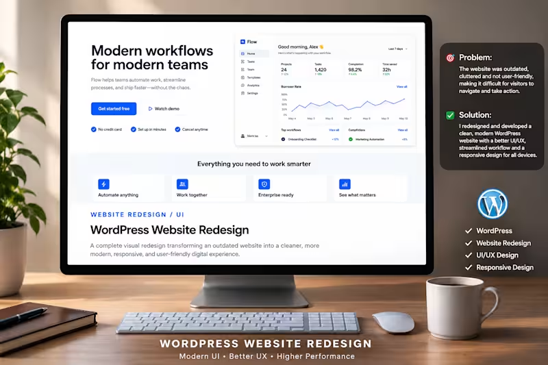
Create a professional Contra portfolio post for a recent WordPress Website Redesign project Project Context The client had an outdated WordPress website with a cluttered layout and poor user experience. The website was difficult for visitors to navigate, understand the service, and take action. issue The old website needed a modern visual direction, clearer navigation, better content organization, and a more responsive experience across different devices. Solution I redesigned the WordPress website with a clean, modern, and user-friendly interface. I improved the visual hierarchy, simplified the navigation, organized the content more effectively, and created a responsive layout that works smoothly across desktop, tablet, and mobile devices. Work Delivered WordPress website redesign Modern UI design Improved UX and navigation Responsive website design Better content structure Clear calls-to-action Professional and conversion-focused layout Keep the writing professional, simple, and client-focused. Avoid sounding exaggerated or overly promotional. Clearly communicate the client's problem, the solution I provided, and the value of the redesign. End with a short statement that invites potential clients who need a similar WordPress redesign to get in touch.
1
24
1
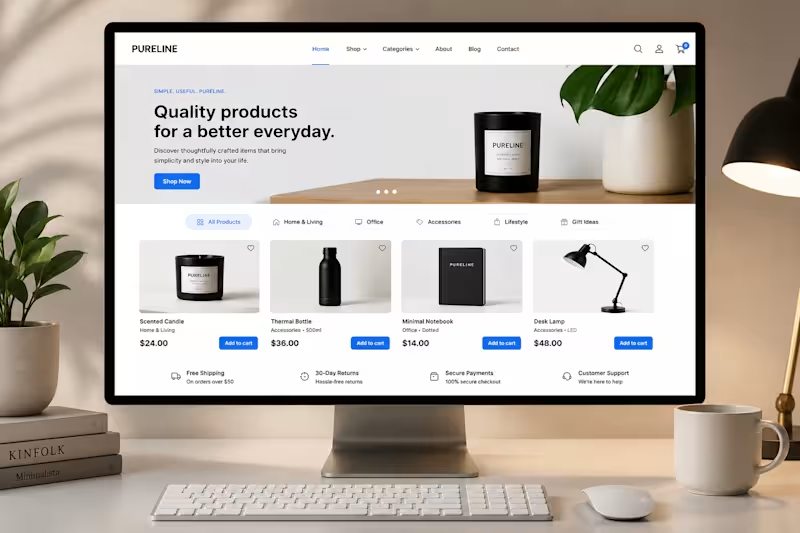
Recent WooCommerce eCommerce Project I recently completed a WooCommerce website project for a client who needed a more professional and user-friendly online store. The client was struggling with an outdated and poorly organized storefront. Products were not being presented clearly, and the overall shopping experience made it difficult for visitors to browse the store and take action. I redesigned and developed a clean, modern WooCommerce storefront with better product presentation, intuitive navigation, clear calls-to-action, and a responsive layout. The goal was to make the store easier to navigate while creating a more professional experience for potential customers. What I worked on: • WooCommerce website design • Homepage design • Product presentation • Navigation and user experience • Responsive design • eCommerce layout and functionality This project focused on creating a storefront that looks professional while making it easier for customers to discover products and shop.
1
34
1
The store needed a cleaner and more organized shopping experience where customers could quickly browse products, use categories and filters, compare product options, and find the items they wanted without feeling overwhelmed. The product listing also needed to look professional and work smoothly across different screen sizes. I designed and developed a structured WooCommerce shop page with a clean product grid, intuitive categories, filtering options, clear pricing, and easy shopping actions. The layout was optimized to make
1
53
Responsive Design
(1)
Follow
Message
Explore people