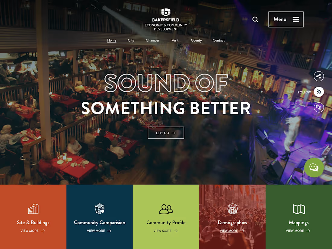
Projects using Adobe Photoshop in DharamshalaProjects using Adobe Photoshop in DharamshalaThe Bakersfield Economic Development website was designed to showcase the region's business opportunities, economic strengths, and community resources through a modern and engaging digital experience. The focus was on creating a clear information hierarchy that allows investors, businesses, and stakeholders to easily access key economic and demographic insights.
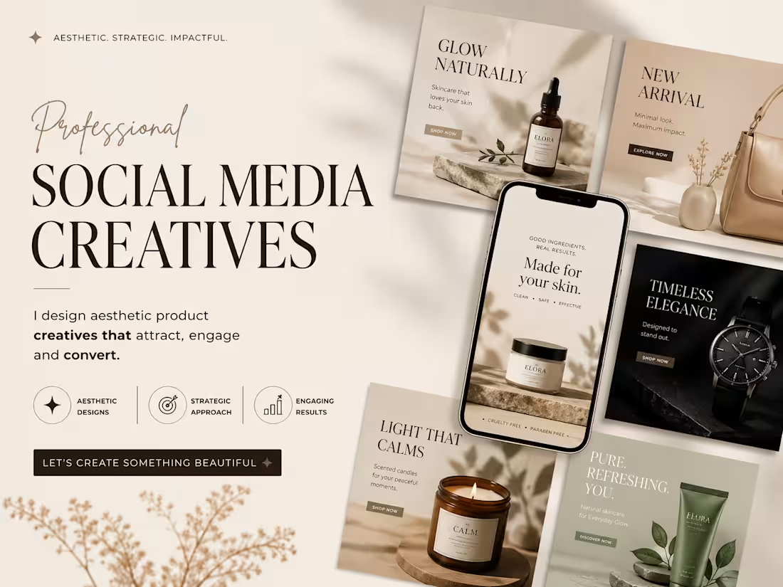
As the UI/UX Designer, I was responsible for the overall user experience, visual design, layout structure, and responsive interface design. The project emphasized intuitive navigation, strong visual storytelling, and a user-friendly experience across all devices while effectively highlighting Bakersfield's growth and investment potential. This project showcases a premium presentation layout highlighting a series of high-conversion Social Media Creatives. The design approach is engineered for direct-to-consumer (DTC) e-commerce brands in the wellness, beauty, and luxury lifestyle sectors, focusing on a seamless blend of elevated aesthetics and strategic marketing.
Design Strategy & Layout Highlights
Typography Hierarchy: The main presentation utilizes an elegant, high-contrast serif typeface for the headers ("SOCIAL MEDIA CREATIVES"), paired with a fluid, organic script accent for a touch of luxury. The ad creatives use clean, accessible sans-serif typography designed for maximum readability on mobile feeds.
Color Story & Tone: A deeply cohesive, warm neutral color palette dominates the canvas—utilizing soft cream, warm beige, muted sage green, and striking contrast accents of deep charcoal and rich espresso brown.
Multi-Product Mockup Integration: As showcased in the image, the composition features an array of modular square grid layouts alongside a central smartphone UI mockup. This setup effectively demonstrates how the campaign assets transition seamlessly from Instagram grid posts to high-impact mobile stories or reels.
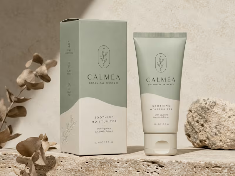
Visual Styling: The entire layout leverages soft, natural leaf and window-pane shadow overlays, raw stone styling elements, and warm, minimalist photography to communicate a sense of "quiet luxury" and organic purity. This project showcases the visual identity and packaging design for CALMÉA Botanical Skincare. The goal was to translate the brand’s core philosophy- gentle, plant-based, and science-backed skin nutrition—into a physical product experience that feels deeply calming and luxurious.
Design Strategy & Key Elements
Color Palette: A soothing, nature-inspired palette featuring a muted sage green and a warm, textured cream tone. The split-tone layout uses organic, fluid curves that mimic natural landscapes or gentle waves.
Typography & Visual Assets: The brand name "CALMÉA" is set in an elegant, high-contrast serif typeface, paired with clean, architectural sans-serif typography for product details. The primary logo icon features a minimalist botanical branch enclosed in a delicate arch.
Packaging Layout: As seen in the image, the outer box features structured side-panel iconography ("Clean Ingredients," "Plant Based," and "Cruelty Free") and a subtle line-art botanical illustration on the lower section. The theme carries over seamlessly to a matte-finish squeeze tube.
Art Direction: The staging emphasizes raw, tactile textures - rough travertine stone, natural direct sunlight, and dried eucalyptus branches- to highlight the organic origin of the product. Project Overview
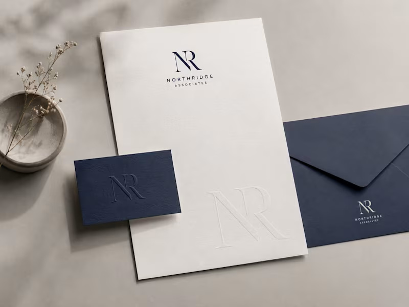
This project features a comprehensive brand identity system showcased through a premium corporate stationery suite. The design focuses on a refined, sophisticated aesthetic tailored for professional services.
Design Elements & Execution
Palette: A high-end color scheme pairing textured, crisp off-white stock with deep corporate navy blue.
Typography & Assets: The brand utilizes a sharp, intertwined "NR" serif monogram, balanced by a clean, geometric sans-serif for the primary logotype ("Northridge Associates").
Mockup Highlights: Featured items include a minimalist letterhead with a subtle, blind-debossed watermark of the monogram, an elegant textured business card with a matching deep-deboss finish, and a coordinating corporate envelope.
Aesthetic: The presentation relies on soft, natural organic shadows, tactile paper grains, and a minimalist stone accent to bring a modern, premium feel to the final presentation as shown in the image.