
Addicted to Advanced Custom Product Design
- 1x
- Hired
- 5.0
- Rating
- 358
- Followers
Addicted to Advanced Custom Product Design



Brand / Graphic Design

Frumkit Brand Identity
Frumkit is a modular brand identity designed for AI-powered digital services — from web and app development to marketing automation. This system includes six bold service icons, a geometric logo, and a scalable visual language built for tech-forward platforms.
The concept: “One brand. Six kits. Infinite scale.”
Designed for clarity, adaptability, and resale potential across SaaS, startup, and agency markets
Services covered: • Web Development • Code Solutions • UI/UX Design • App Development • AI Tools • Marketing Automation
#brandingforsale #unusedlogo #resalebrand #saasbranding #techstartup #minimaldesign #aiidentity #creativeassets #modularbranding #uidesign #uxdesign #dribbble #behance #envato #contra #frumkit
6
4
185

I designed the brand identity for Playvidi, a modern video streaming platform. The logo combines a stylized video camera silhouette with a negative-space play button to create a distinctive, instantly recognizable symbol.
A vibrant pink, coral, and purple gradient palette expresses creativity and innovation. The system covers the logo mark, a 20-second logo motion, app icons, UI elements, merchandise, and marketing assets, built to stay consistent and scalable across every touchpoint.
0
62
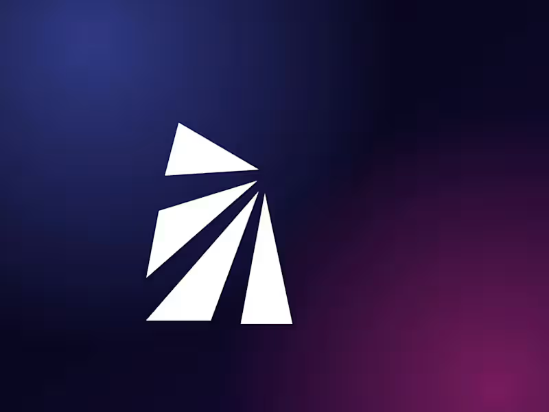
Brand identity and logo animation for Raycore AI, a futuristic technology brand.
What I did: concept, logo design (vector, Pen Tool), color and gradient system, logo variations, social media kit, mockups and a short logo animation.
The idea: a bold geometric "R" built from light beams radiating out of one core point, a visual for intelligence, speed and scalable innovation.
Open to AI, SaaS and tech brand projects.
2
1
153
Excited to share a brand and motion project: vetave, an intelligent media platform. 🚀
The idea behind the brand is simple: video, audio, images and live content shouldn’t live in separate tools. They should work in one flow.
What this piece covers:
→ Kinetic typography opening (“Audio. Image.”)
→ Logo and wordmark reveal
→ UI moments: Connect every media, Play anything, Go live. Anywhere.
→ App icon and closing line: “All media in one flow.”
Design approach:
Bold, friendly typography for personality
A focused palette of electric purple, black and lavender
Clean UI cards and pill tags that make the product easy to understand
Smooth, rhythmic motion to keep a 30-second story clear
Good brand motion explains the product before a single word of copy is read. If you’re building a SaaS or media product and need a brand identity or product animation, let’s connect.
What would you improve or add? I’d love your thoughts. 👇
#BrandIdentity #MotionDesign #Branding #UIDesign #SaaS #LogoDesign #ProductDesign #DesignThinking #Startup
0
146