
Crafting experiences at intersection of design & technology

Crafting experiences at intersection of design & technology


Senior Brand Designer for Product Brands & Startups
- $10k+
- Earned
- 7x
- Hired
- 5.0
- Rating
- 113
- Followers
Senior Brand Designer for Product Brands & Startups

Vibrant Life Chiropractic - bringing wellness to life through design.
Created a calming yet confident brand identity for a chiropractic and wellness clinic that wanted to move away from the typical “clinical” look and feel.
Soft, modern tones and clean typography were used to communicate trust, care, and holistic healing, all while keeping the visuals fresh and approachable.
A brand that feels as rejuvenating as the service it represents. 🌿
2
6
165
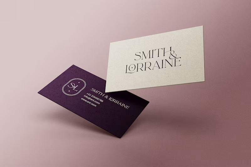
✨ Smith & Lorraine - a brand born inside a castle.
This project was for two business partners who recently bought Killoskehane Castle in Ireland and wanted to create a timeless personal brand around it.
I crafted their full visual identity, from logo concepts to business cards, social media banners, and merchandise.
The goal was clear: build a brand that feels luxurious, elegant, and quietly powerful... just like the castle itself.
Deep plum tones, graceful typography, and subtle metallic accents came together to form the final look.
2
5
195
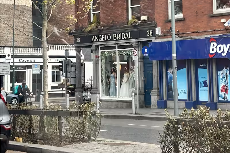
Angelo Bridal - A Luxury Rebrand close to my heart ✨ 🥹
Earlier this year, I visited this boutique in Dublin 🇮🇪 the same one I had rebranded from scratch a while back.
Seeing my work in person, from the signage to the business cards displayed inside was surreal.
This project was about more than design. It was about redefining elegance and building a brand that felt timeless, luxurious, and true to their brides. 💍
Scope:
→ Full Brand Identity
→ Website Design
→ Print & Business Collateral
(will be sharing more about the project in upcoming posts. 👀)
For now, here’s a glimpse into the new identity that became the foundation for everything else.
9
10
242


"AI Brand Commercial Creator"
"AI Brand Commercial Creator"
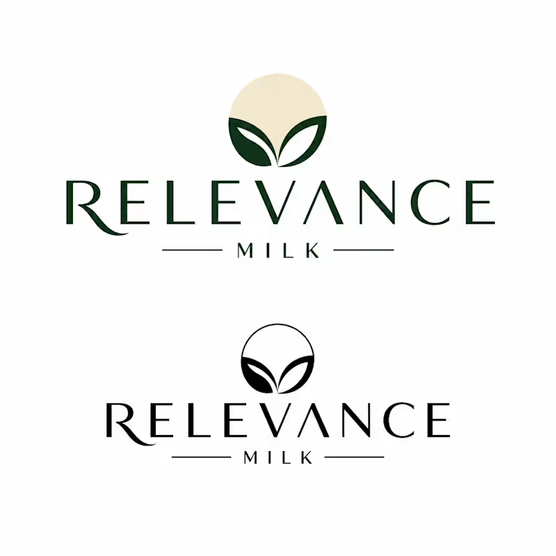
RELEVANCE — Brand Identity & Packaging Design
Case Study | AI-Assisted Design Process
👋 About Me & My Approach
I am a brand identity designer who uses AI as a core creative tool — not to replace design thinking, but to accelerate it. My process combines strategic human direction with the speed and breadth of AI-generated exploration, resulting in distinctive brand systems delivered faster and at higher quality than traditional methods alone.
What this means for you as a client:
Faster turnaround — full brand systems in 1–2 weeks instead of 4–6
More creative directions to choose from — AI lets us explore 10x more concepts
Lower cost without sacrificing quality
Full transparency — you always know exactly how the work was made
📋 Project Overview
Brand Name: RELEVANCE
Product: Natural Milk / Dairy
Target Audience: Everyone — families, young adults, health-conscious consumers
Brand Mood: Natural, clean, wholesome, modern, trustworthy
Deliverables: Logo, Icon, Packaging, Colour Strategy, Typography, Guidelines
Timeline: 7–10 working days
⚙️ My Design Process (AI-Assisted)
Here is exactly how I would approach the RELEVANCE brand identity — with full transparency on where AI is used and where human judgment takes over.
PHASE 1 — Discovery & Strategy
Brief analysis using Claude AI to define brand personality, tone, and positioning
Competitor research (Innocent, Oatly, Arla, local premium dairy brands)
Creative brief writing — target audience, brand values, visual direction
Mood board creation using Midjourney + Pinterest
PHASE 2 — Visual Exploration
20–30 logo concept variations generated via Midjourney with custom prompts
3 distinct creative directions shortlisted and presented to client
Symbol / icon mark exploration — abstract forms combining milk + nature
Colour palette strategy built using Adobe Color + Coolors AI
PHASE 3 — Refinement (Human Design Work)
Winning concepts redrawn as clean vectors in Adobe Illustrator
Typography system selected and paired (Playfair Display + DM Sans)
Packaging design built in Figma with realistic product mockups
All assets exported in correct professional formats (SVG, PNG, PDF, AI)
PHASE 4 — Brand Guidelines
Full brand guidelines document — logo usage, colours, typography, do's & don'ts
Packaging system rules — label hierarchy, size variations, material guidance
Final delivery in both editable source files and print-ready formats
🤖 AI Tools Used — Full Transparency
I believe in being completely open about AI usage. Here is every tool used and exactly what role it played:
Midjourney
Used for: Logo concepts, icon exploration, packaging visuals, lifestyle imagery
My contribution: Selecting, directing, refining, and vectorising all outputs
Claude AI
Used for: Creative brief, brand strategy, colour psychology, guidelines writing
My contribution: All strategic decisions, client communication, final judgment
Adobe Color
Used for: Colour palette generation and harmony analysis
My contribution: Final palette selection based on brand strategy
Fontjoy
Used for: Typography pairing suggestions
My contribution: Final font selection and spacing decisions
Smartmockups
Used for: Realistic packaging and product mockup photography
My contribution: Composition, selection, and presentation design
Figma
Used for: Final layout, packaging design, brand guidelines document
My contribution: All layout, spacing, and design execution work
🎨 RELEVANCE — Brand Identity System
Colour Strategy
The RELEVANCE colour palette is built around nature, trust, and freshness — communicating purity without being clinical.
Forest Green #2D5016 — Primary, trust
Cream White #F5F0E8 — Background, pure
Warm Beige #C8A96E — Accent, warmth
Charcoal #1A1A1A — Text, strong
Typography System
Heading: Playfair Display — Elegant serif, premium feel
Subheading: DM Sans Bold — Clean geometric, modern
Body: DM Sans Regular — Humanist, highly readable
📦 What You Will Receive
Design Files
Primary logo (SVG, PNG, PDF, AI)
Logo variations (dark, light, icon only)
Symbol / icon mark
Packaging design files (Figma)
Colour palette swatches
Brand Documents
Brand guidelines PDF (20–30 pages)
Typography guide
Colour usage rules
Packaging system guide
2 rounds of revisions included
💡 Why AI-Assisted Design Is an Advantage
Traditional Design Only vs AI-Assisted Design:
3–5 logo concepts explored → 20–30 concepts explored
4–6 week timeline → 7–10 day timeline
Higher cost for same output → Better value, same quality
Limited visual exploration speed → Rapid iteration and refinement
🤝 Let's Work Together
I am excited about the opportunity to build the RELEVANCE brand identity. This is exactly the kind of project where AI-assisted design delivers outstanding results — a consumer product brand that needs to be both commercially strong and visually distinctive.
I bring to this project:
Full transparency — you will always know every tool used and every decision made
Strategic thinking — AI generates, but I direct, curate, and refine everything
Professional delivery — all files in industry-standard formats, ready to use
Open communication — regular updates, fast responses, and revision rounds included
1
137
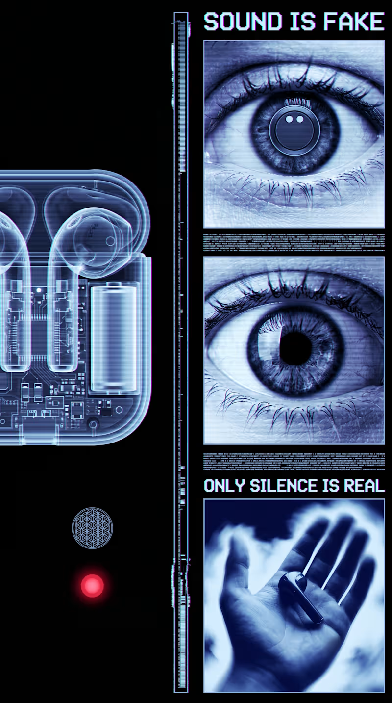
The eye itself is the anchor of the whole piece. Eyes are one of the few images the human brain is hardwired to fixate on instantly, infants track eyes within days of birth, so opening on one guarantees attention before any concept lands. But this isn't just an eye, it's an eye in monochrome cyan with scanlines crossing it, which reads as a "broken sensor" rather than a living organ. That's an important distinction psychologically: a closed eye suggests sleep or death, a crying eye suggests pain, but a glitching eye suggests something stranger, that the very apparatus of seeing has been compromised. It puts the viewer in the position of distrusting their own perception, which is a deeply uncomfortable, almost vertiginous feeling.
The chromatic aberration and scanlines aren't just texture, they're borrowed directly from broken transmission, old televisions losing signal, damaged VHS tape, dying CRT monitors. Visually this maps onto a very specific cultural memory of "something is wrong with the feed" and the brain reads that as urgency even without conscious recognition. It's the same instinct that makes static on a baby monitor unsettling, the noise itself implies a connection that's failing.
The sacred geometry, the flower of life, the circular mandala-like patterns, functions almost as a counterweight to the digital decay. These shapes carry thousands of years of association with order, cosmic structure, and meaning-making. Placing them inside a corrupted, glitching frame creates a quiet tension between the eternal and the failing, like ancient wisdom trying to transmit itself through a dying machine. That contrast is what gives the piece its cult or ritual undertone rather than just feeling like generic tech-glitch art.
The text fragments work almost like intrusive thoughts. Short, declarative, ungrounded statements like "reality is false" mimic the kind of thought spirals people experience during anxiety or derealization episodes, where the mind starts questioning the basic premise of experience itself. Presented in a flickering, semi-corrupted font, the text doesn't feel authoritative, it feels like something glitching its way into consciousness rather than a calm statement of fact, which makes it feel more like a symptom than a slogan.
The hand, when it enters in the product version, is the emotional pivot point. After several seconds of synthetic, ocular, mechanical imagery, a hand is the most embodied, human, tactile thing you can introduce. Psychologically it signals safety and agency, hands are how humans manipulate and trust the physical world, so the moment it appears the entire emotional register shifts from disorientation toward groundedness. That's why placing the product literally into an open palm lands as resolution rather than just product placement, it's mimicking the felt sense of coming back into your body after a dissociative moment.
And the product itself, glowing, transparent, suspended in light, benefits from all of that buildup by contrast. Because everything preceding it has felt corrupted or untrustworthy, the object that finally appears clean, intentional, and stable reads as desirable almost by relief alone. It's less "look how cool this is" and more "finally, something solid," which is a much stickier emotional hook than straightforward aspirational advertising usually achieves.
1
179


Creative Director for Brand Identity & Visual Design
Creative Director for Brand Identity & Visual Design


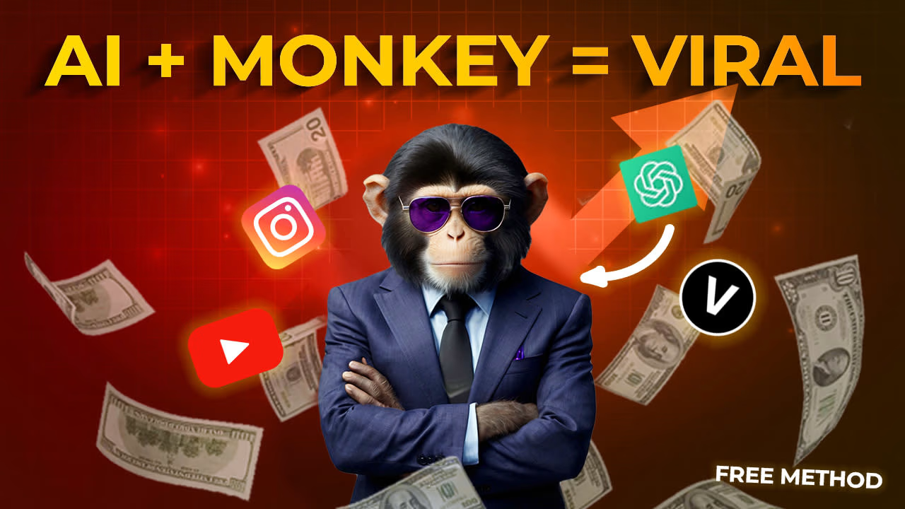
Designing scroll-stopping social media visuals that go viral
Designing scroll-stopping social media visuals that go viral


View more →

Brand apart from time
Brand apart from time



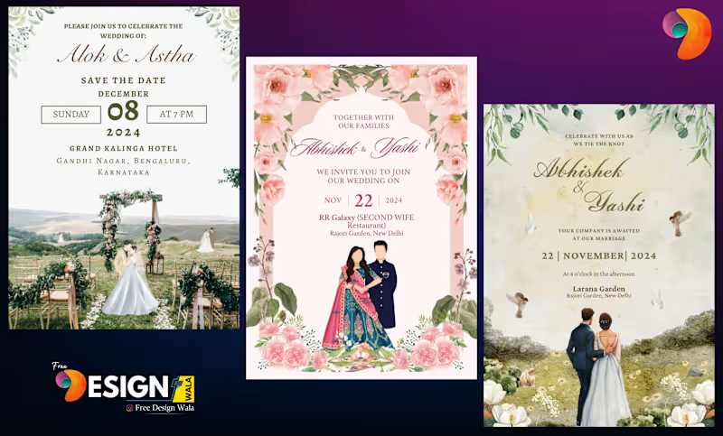
Versatile Canva Designer for Your Unique Needs
Versatile Canva Designer for Your Unique Needs


View more →

Content Writing | Creative Design | SEO | Website
Content Writing | Creative Design | SEO | Website


View more →